Downloaded 34 times


![.containter {
display: grid;
grid-gap: 20px;
grid-template-columns: repeat(4, [col]
100px);
grid-template-rows: repeat(3, [row] auto);
padding: 1rem;
}
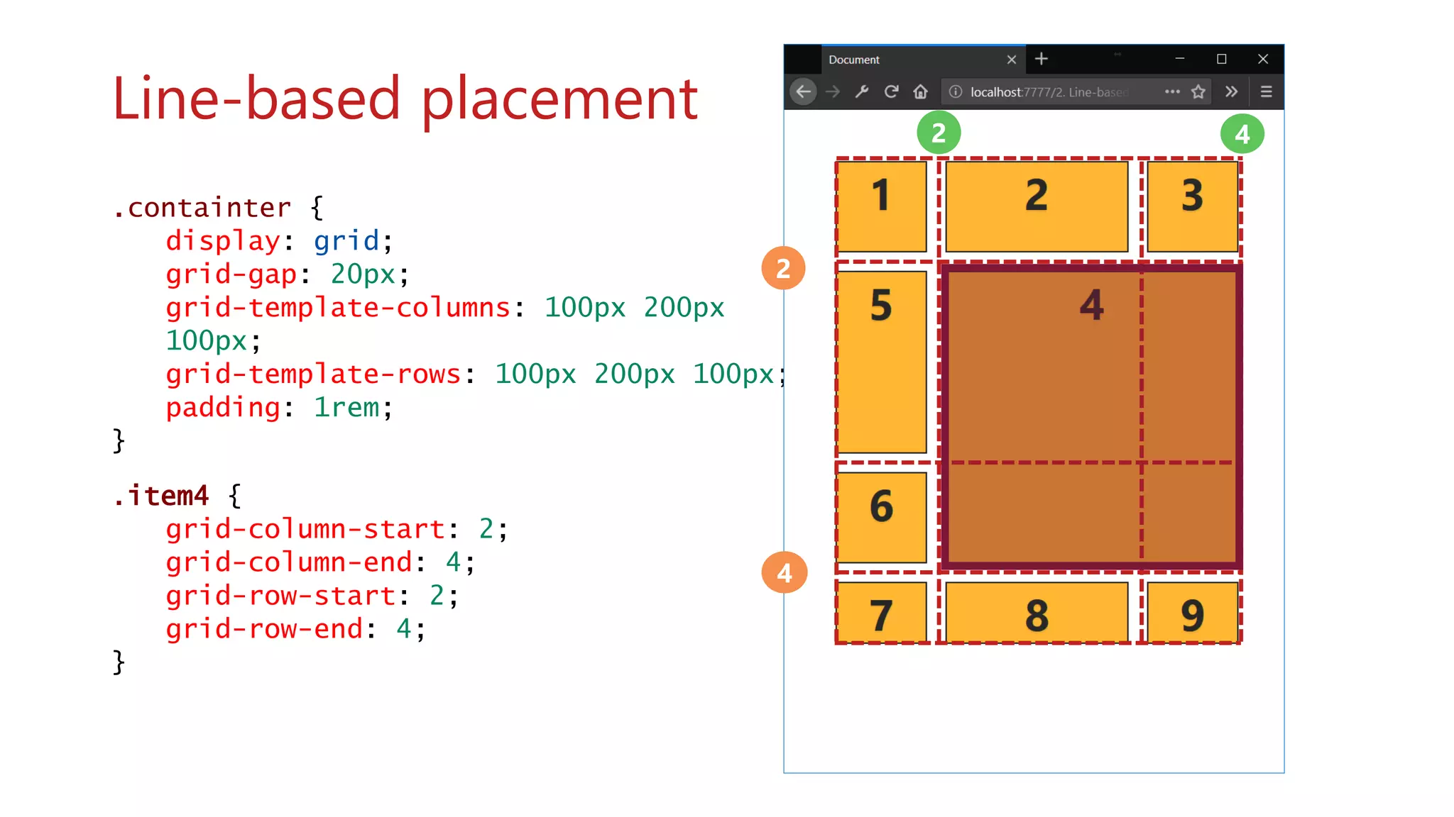
.item4 {
grid-column: col 2 / span 2;
grid-row: row 2 / span 2;
}
Using repeat notation
col col col col](https://image.slidesharecdn.com/dnscrumbreakfastflexboxandcssgrid-180808085111/75/CSS-Flexbox-and-Grid-The-future-of-website-layouts-DN-Scrum-Breakfast-August-28-2018-72-2048.jpg)

![.containter {
display: grid;
grid-gap: 20px;
grid-template-columns: repeat(3, [col]
150px);
grid-template-rows: repeat(3, [row]
100px);
grid-auto-flow: column;
padding: 1rem;
}
wwww
Grid auto-flow column grid-auto-flow:
column;](https://image.slidesharecdn.com/dnscrumbreakfastflexboxandcssgrid-180808085111/75/CSS-Flexbox-and-Grid-The-future-of-website-layouts-DN-Scrum-Breakfast-August-28-2018-77-2048.jpg)
![.containter {
display: grid;
grid-gap: 20px;
grid-template-columns: repeat(4, [col]
150px);
grid-template-rows: minmax(80px, auto);
grid-auto-flow: row; /* Default value */
padding: 1rem;
}
wwww
Grid auto-flow row grid-auto-flow: row;](https://image.slidesharecdn.com/dnscrumbreakfastflexboxandcssgrid-180808085111/75/CSS-Flexbox-and-Grid-The-future-of-website-layouts-DN-Scrum-Breakfast-August-28-2018-78-2048.jpg)
![.containter {
display: grid;
grid-gap: 20px;
grid-template-columns: repeat(4, [col]
150px);
grid-template-rows: minmax(80px, auto);
grid-auto-flow: dense;
padding: 1rem;
}
wwww
Grid auto-flow dense grid-auto-flow:
dense;](https://image.slidesharecdn.com/dnscrumbreakfastflexboxandcssgrid-180808085111/75/CSS-Flexbox-and-Grid-The-future-of-website-layouts-DN-Scrum-Breakfast-August-28-2018-79-2048.jpg)

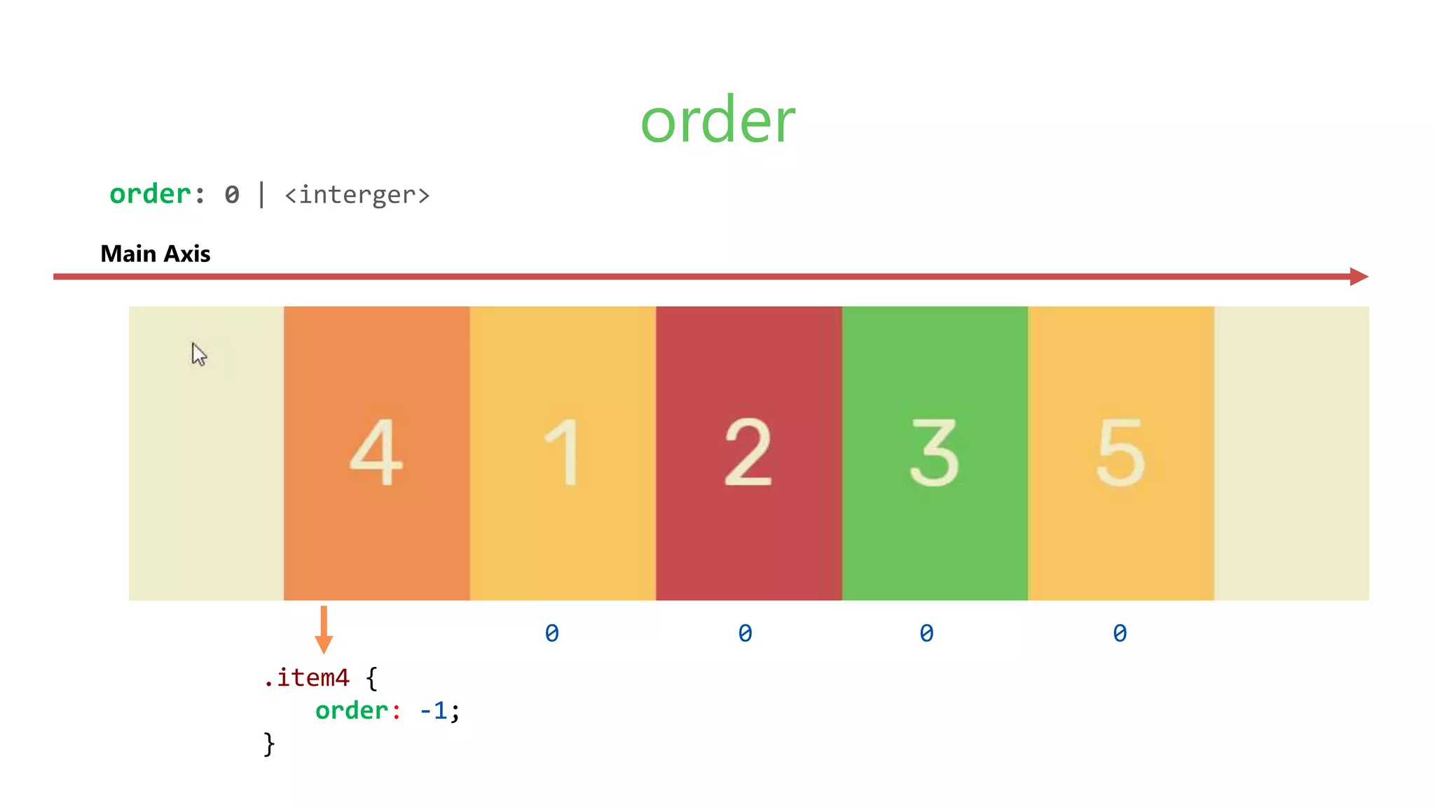
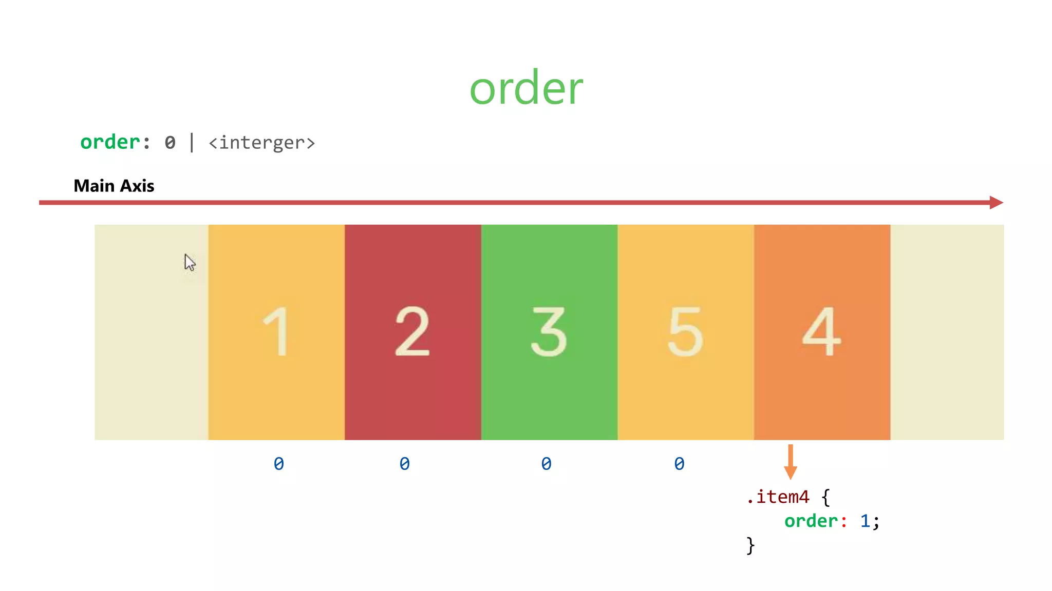
![.containter {
display: grid;
grid-gap: 20px;
grid-template-columns: repeat(3, [col]
100px);
padding: 1rem;
}
.item1 {
order: 1;
}
.item4 {
order: 2;
}
.item9 {
order: 2;
}
wwww
Using Order](https://image.slidesharecdn.com/dnscrumbreakfastflexboxandcssgrid-180808085111/75/CSS-Flexbox-and-Grid-The-future-of-website-layouts-DN-Scrum-Breakfast-August-28-2018-81-2048.jpg)
![.containter {
display: grid;
grid-gap: 20px;
grid-template-columns: repeat(4, [col]
150px);
grid-template-rows: repeat(4, [row]
100px);
align-items: center;
}
.item2 {
grid-column: 3 / span 2;
grid-row: 1 / span 4;
align-self: stretch;
}
wwww
align align-items: center;](https://image.slidesharecdn.com/dnscrumbreakfastflexboxandcssgrid-180808085111/75/CSS-Flexbox-and-Grid-The-future-of-website-layouts-DN-Scrum-Breakfast-August-28-2018-82-2048.jpg)
![.containter {
display: grid;
grid-gap: 20px;
grid-template-columns: repeat(4, [col]
150px);
grid-template-rows: repeat(4, [row]
100px);
align-items: start;
}
.item2 {
grid-column: 3 / span 2;
grid-row: 1 / span 4;
align-self: stretch;
}
wwww
align align-items: start;](https://image.slidesharecdn.com/dnscrumbreakfastflexboxandcssgrid-180808085111/75/CSS-Flexbox-and-Grid-The-future-of-website-layouts-DN-Scrum-Breakfast-August-28-2018-83-2048.jpg)
![.containter {
display: grid;
grid-gap: 20px;
grid-template-columns: repeat(4, [col]
150px);
grid-template-rows: repeat(4, [row]
100px);
align-items: end;
}
.item2 {
grid-column: 3 / span 2;
grid-row: 1 / span 4;
align-self: stretch;
}
wwww
align align-items: end;](https://image.slidesharecdn.com/dnscrumbreakfastflexboxandcssgrid-180808085111/75/CSS-Flexbox-and-Grid-The-future-of-website-layouts-DN-Scrum-Breakfast-August-28-2018-84-2048.jpg)
![.containter {
display: grid;
grid-gap: 20px;
grid-template-columns: repeat(4, [col]
150px);
grid-template-rows: repeat(4, [row]
100px);
justify-items: center;
}
.item2 {
grid-column: 3 / span 2;
grid-row: 1 / span 4;
justify-self: stretch;
}
wwww
justify justify-items: end;](https://image.slidesharecdn.com/dnscrumbreakfastflexboxandcssgrid-180808085111/75/CSS-Flexbox-and-Grid-The-future-of-website-layouts-DN-Scrum-Breakfast-August-28-2018-85-2048.jpg)
![.containter {
display: grid;
grid-gap: 20px;
grid-template-columns: repeat(4, [col]
150px);
grid-template-rows: repeat(4, [row]
100px);
justify-items: start;
}
.item2 {
grid-column: 3 / span 2;
grid-row: 1 / span 4;
justify-self: stretch;
}
wwww
justify justify-items: end;](https://image.slidesharecdn.com/dnscrumbreakfastflexboxandcssgrid-180808085111/75/CSS-Flexbox-and-Grid-The-future-of-website-layouts-DN-Scrum-Breakfast-August-28-2018-86-2048.jpg)
![.containter {
display: grid;
grid-gap: 20px;
grid-template-columns: repeat(4, [col]
150px);
grid-template-rows: repeat(4, [row]
100px);
justify-items: end;
}
.item2 {
grid-column: 3 / span 2;
grid-row: 1 / span 4;
justify-self: stretch;
}
wwww
justify justify-items: end;](https://image.slidesharecdn.com/dnscrumbreakfastflexboxandcssgrid-180808085111/75/CSS-Flexbox-and-Grid-The-future-of-website-layouts-DN-Scrum-Breakfast-August-28-2018-87-2048.jpg)

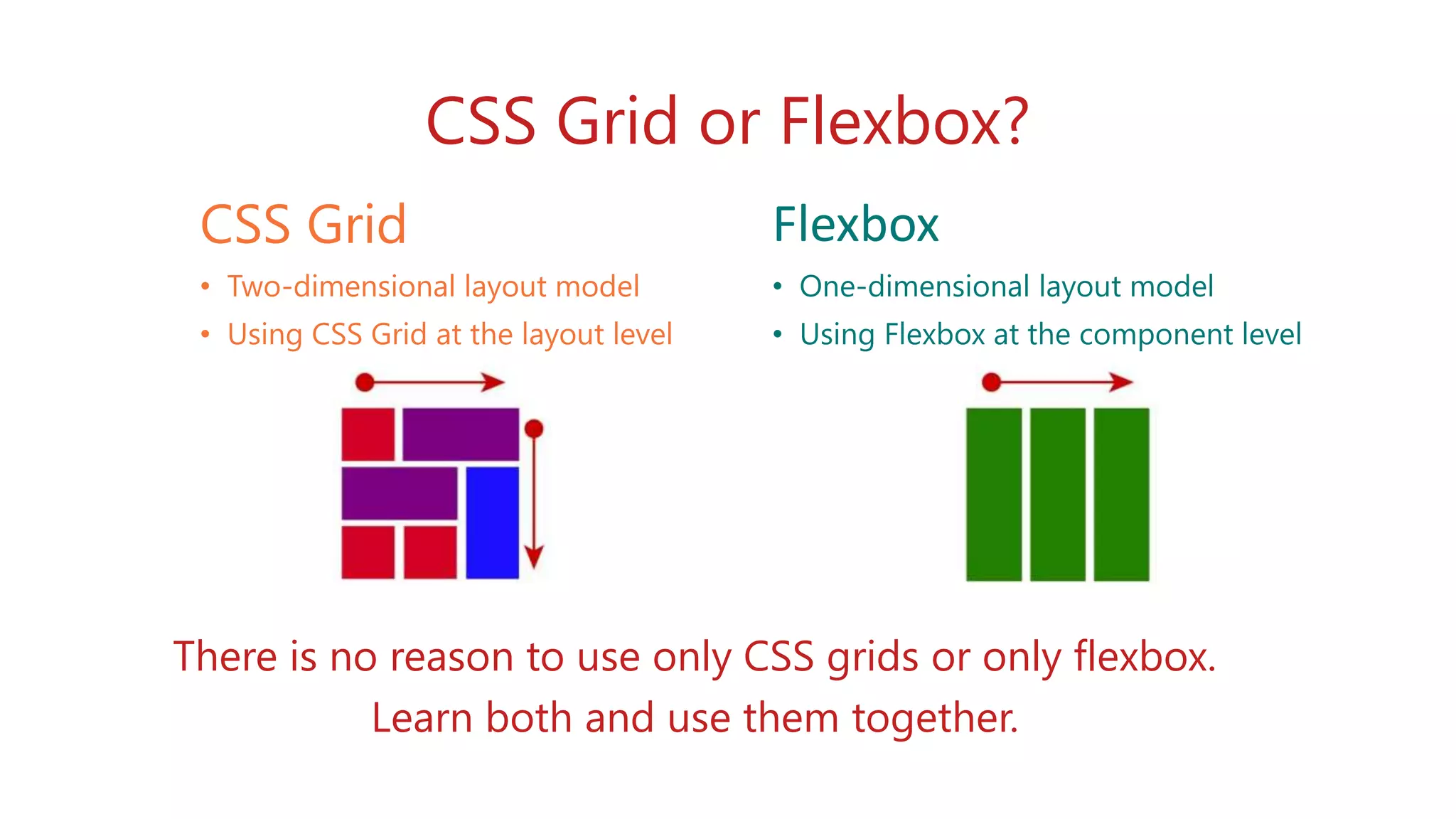


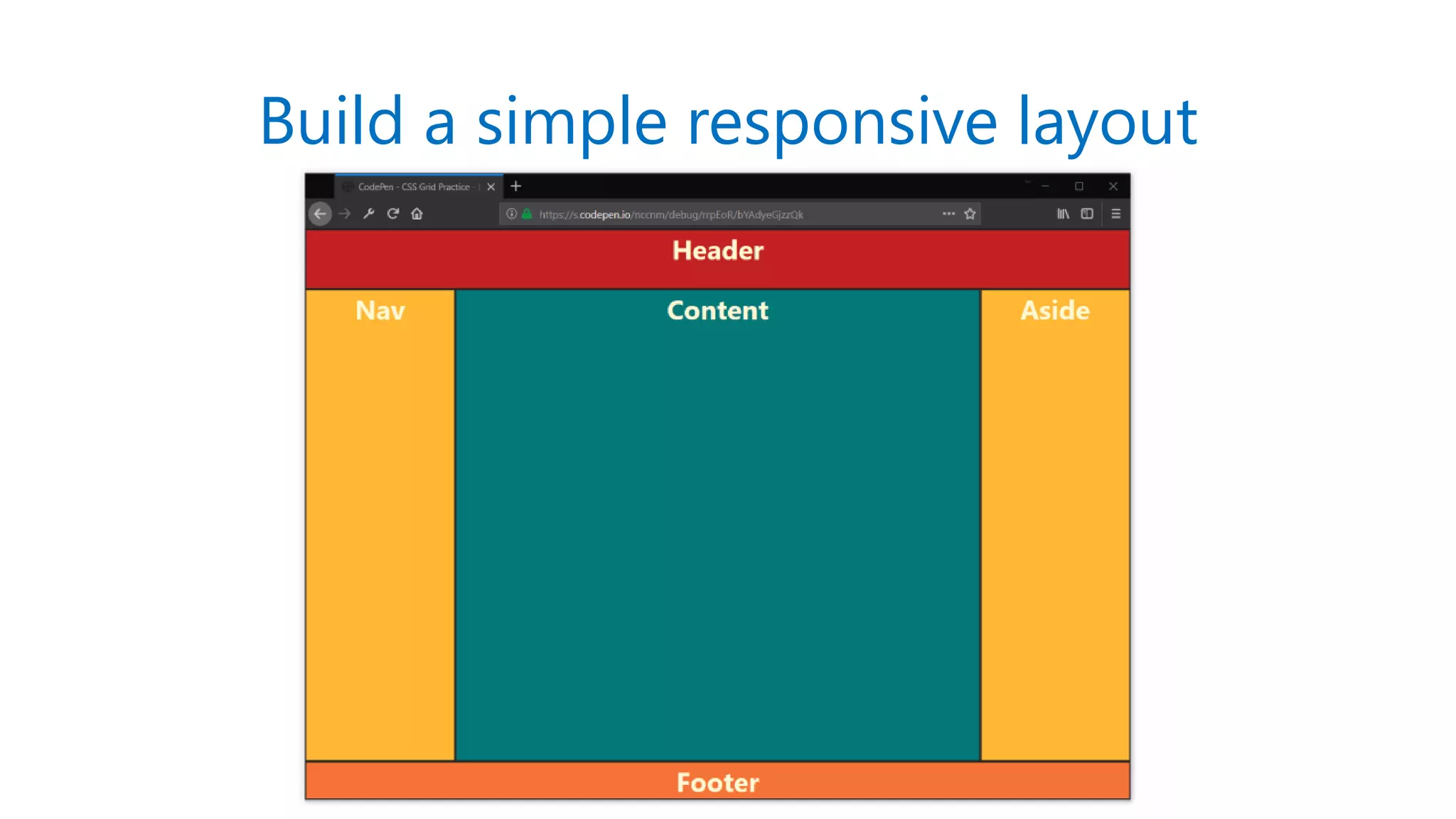


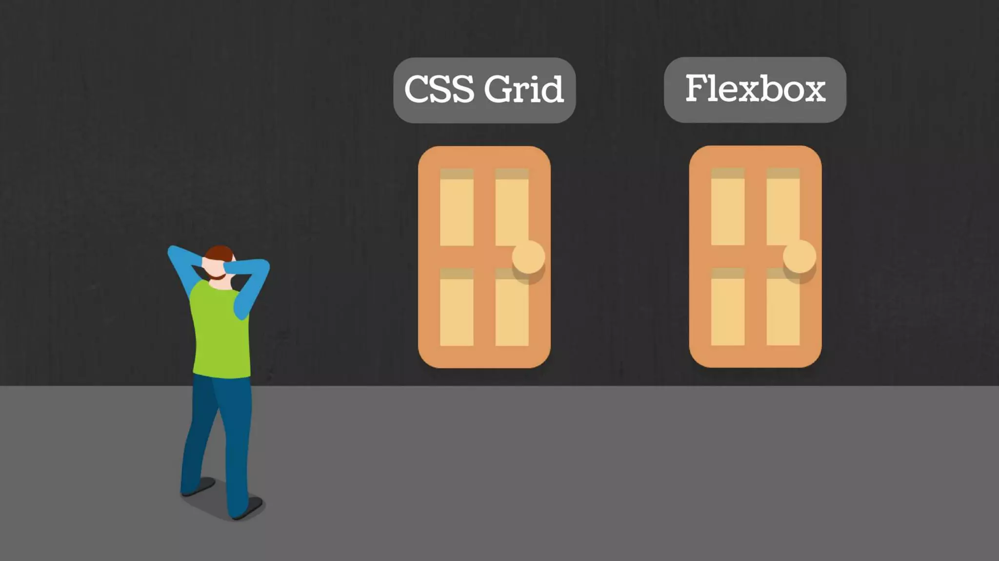
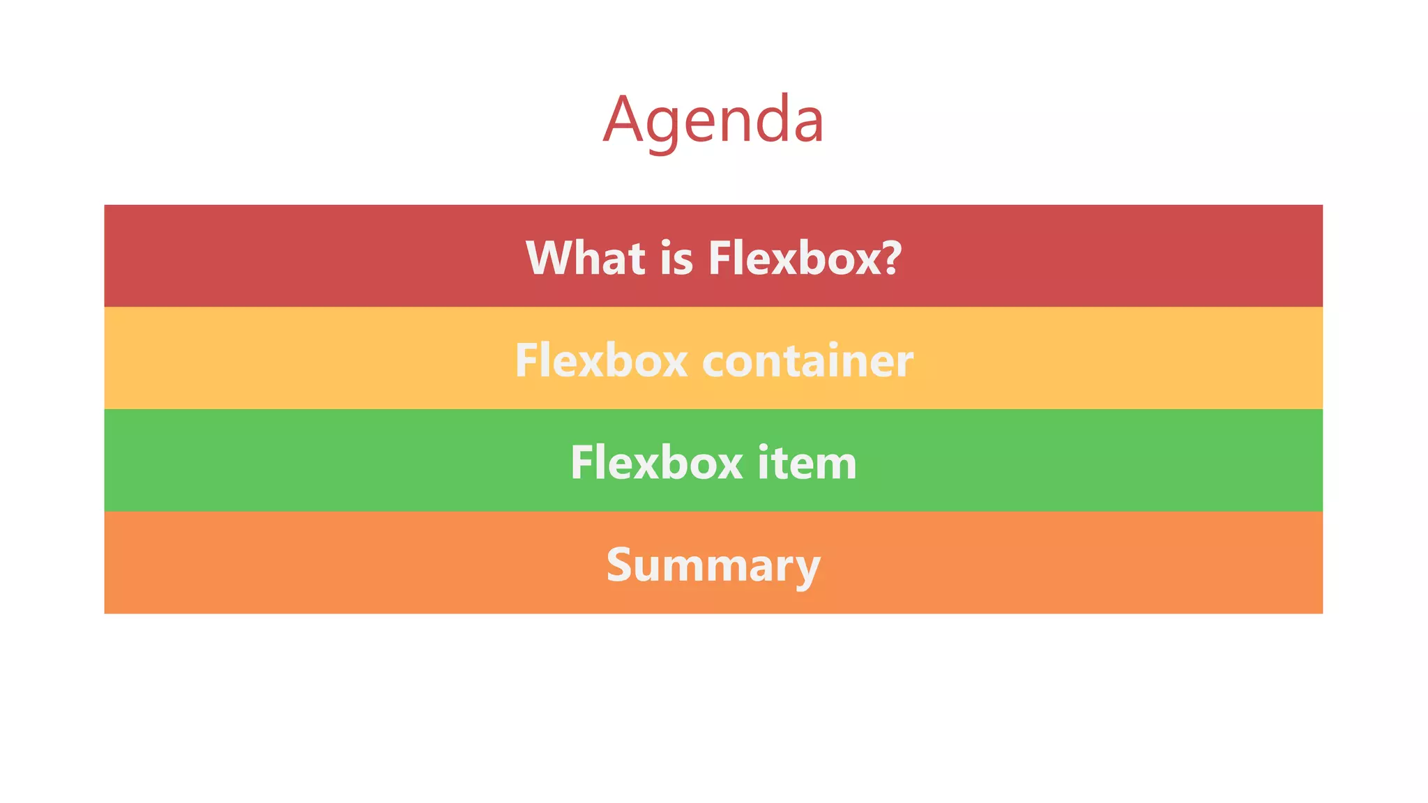
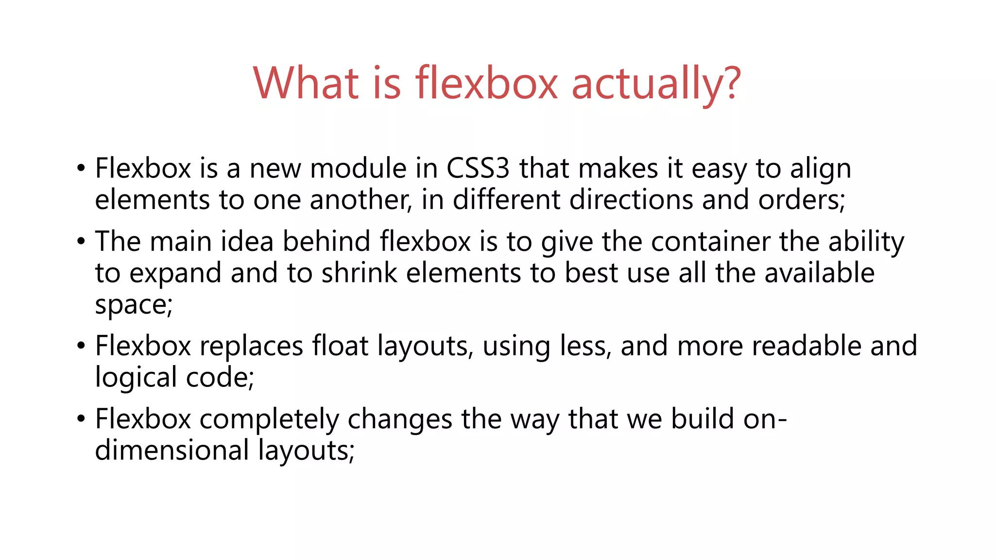
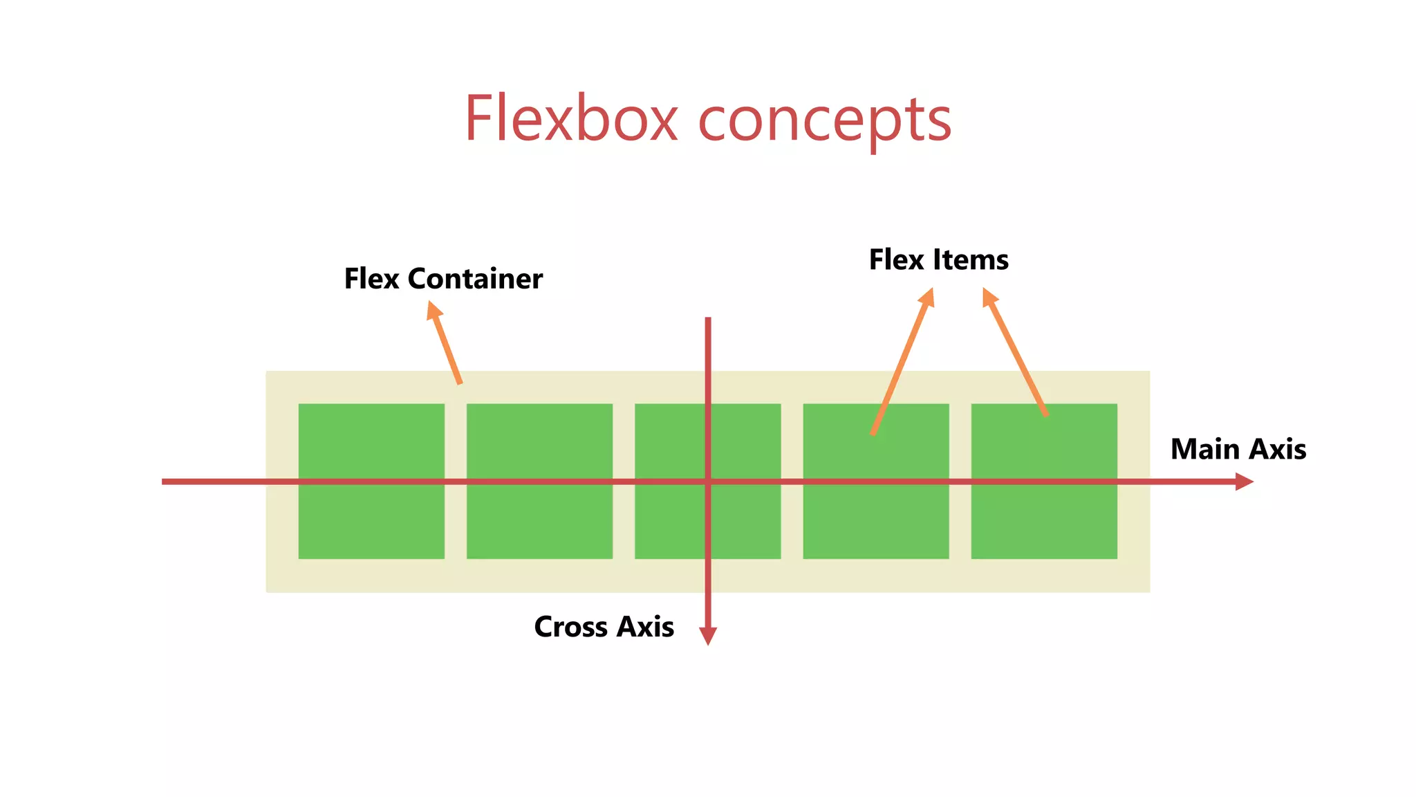
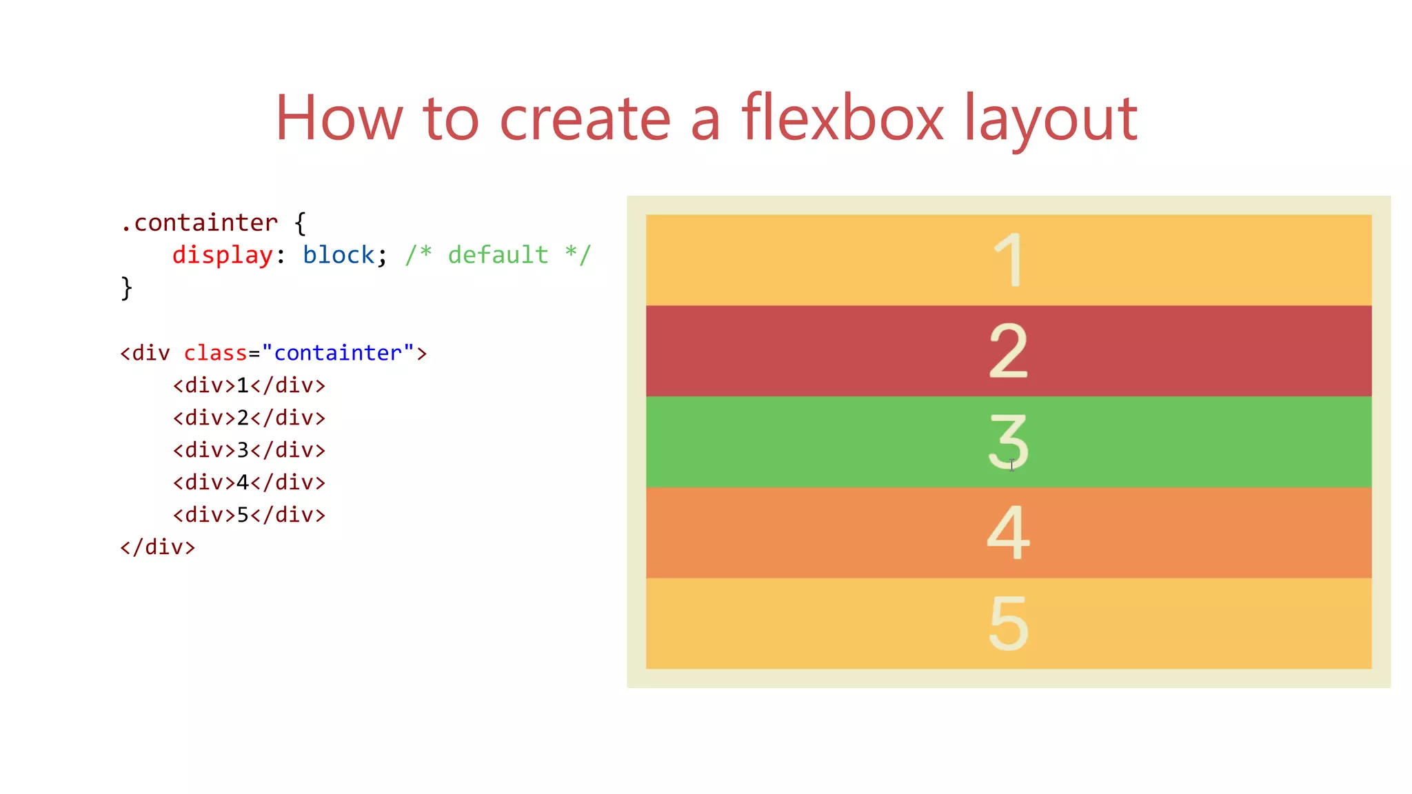
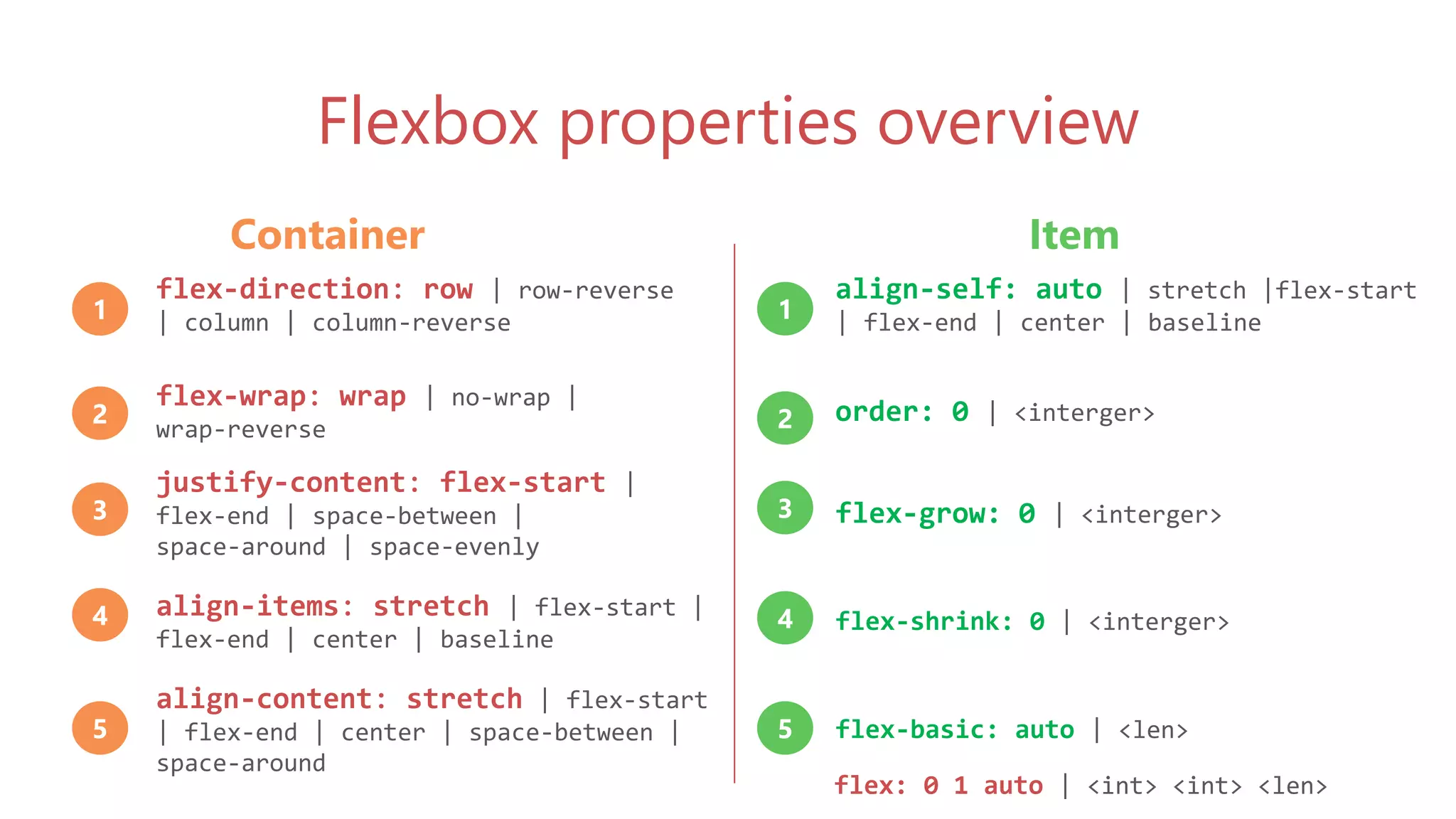
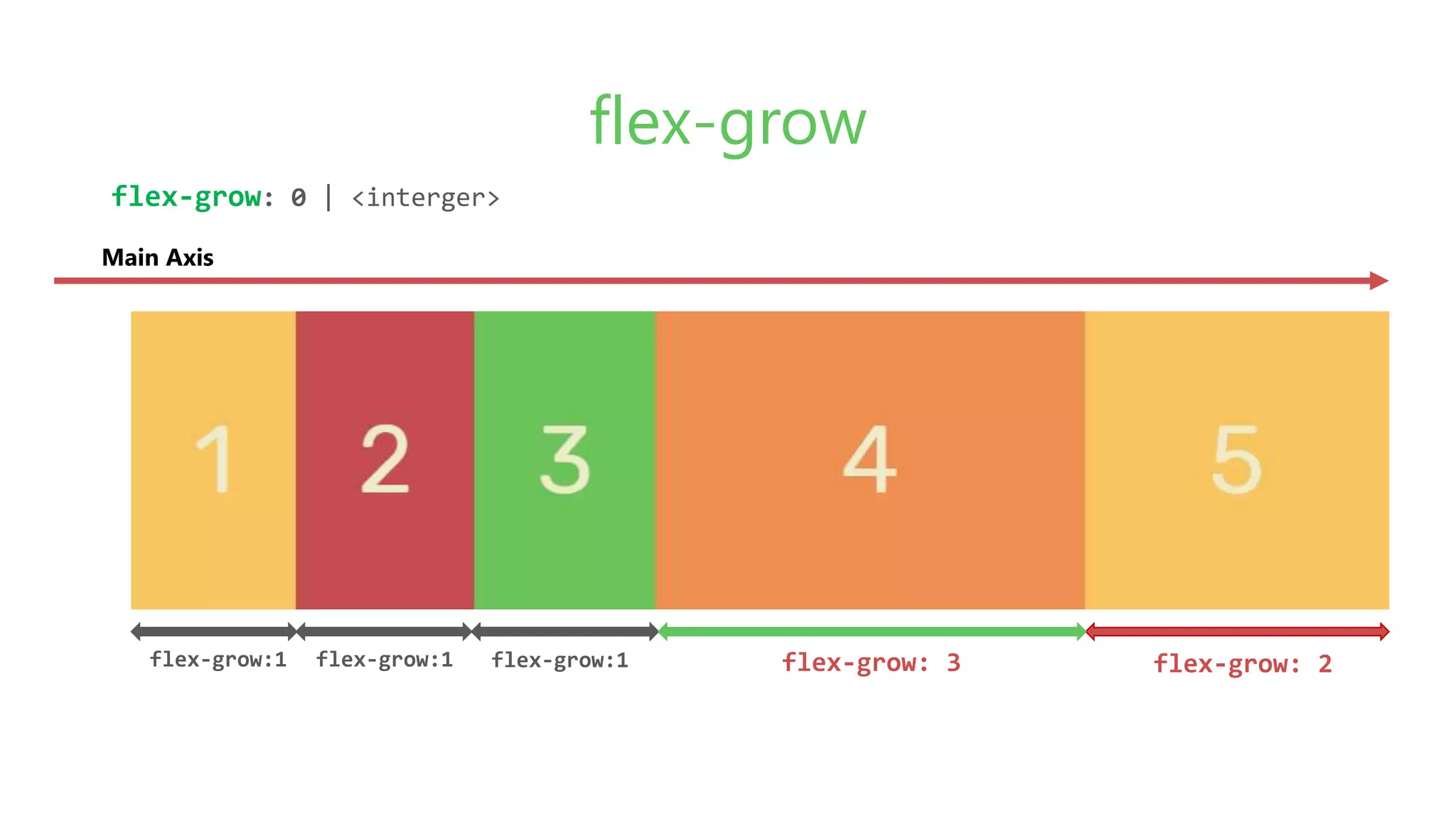
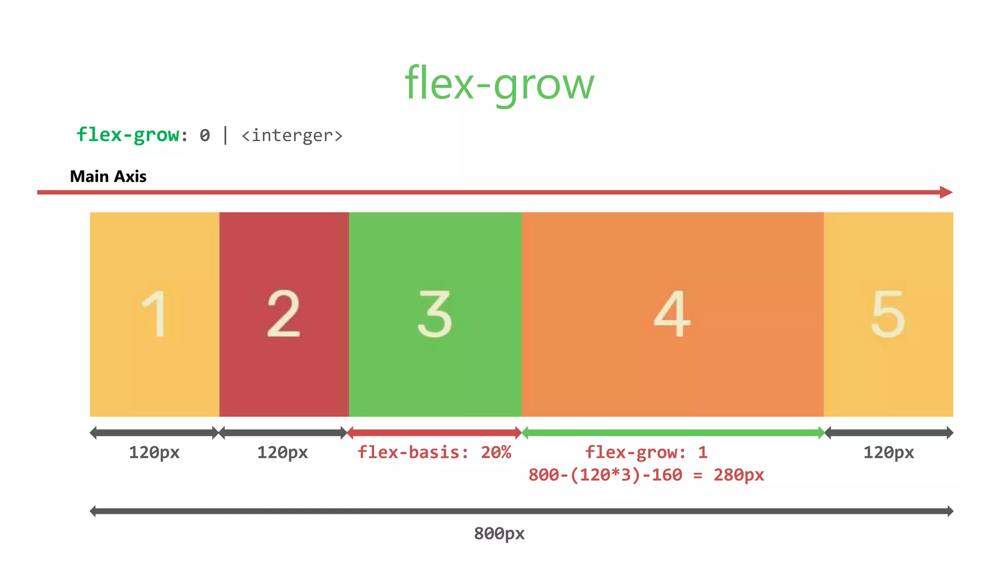
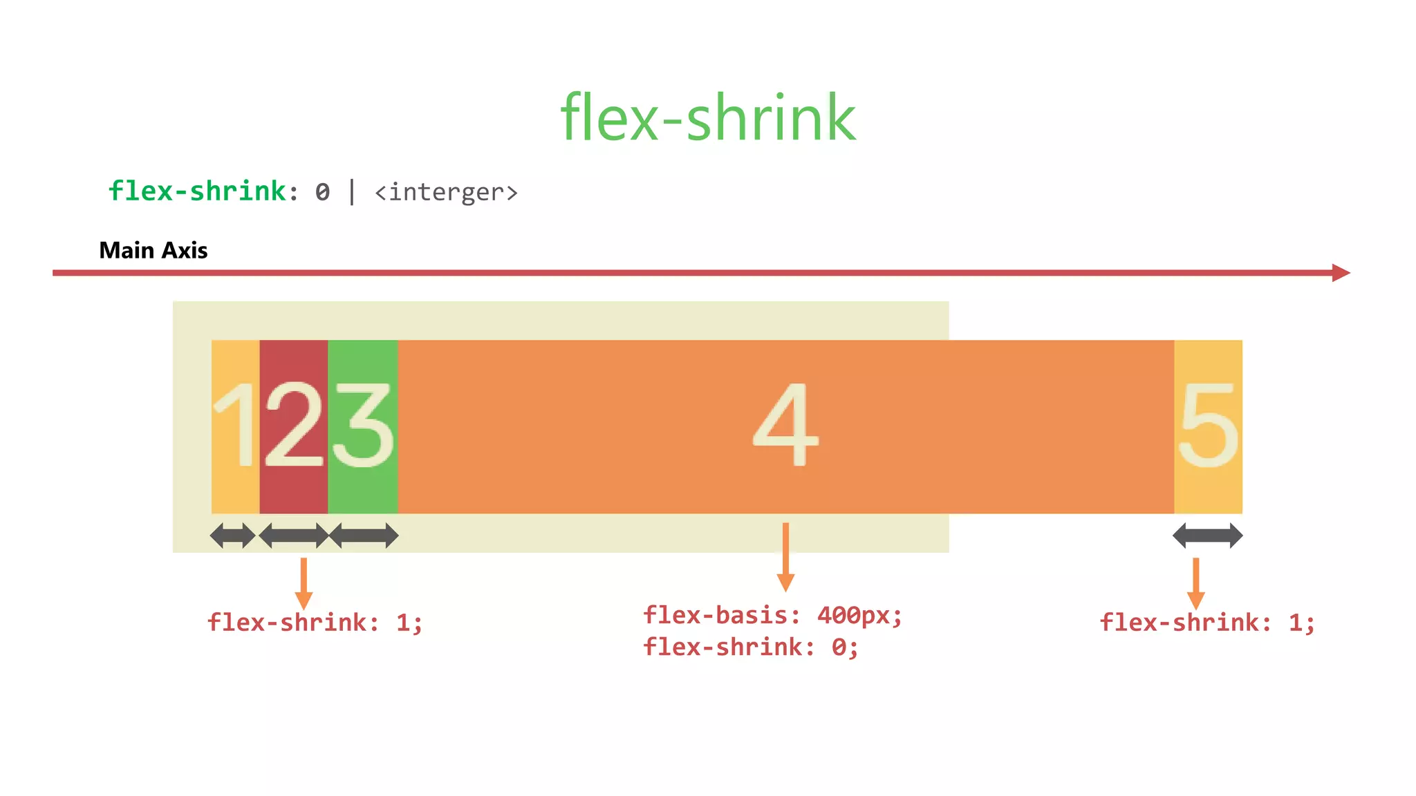
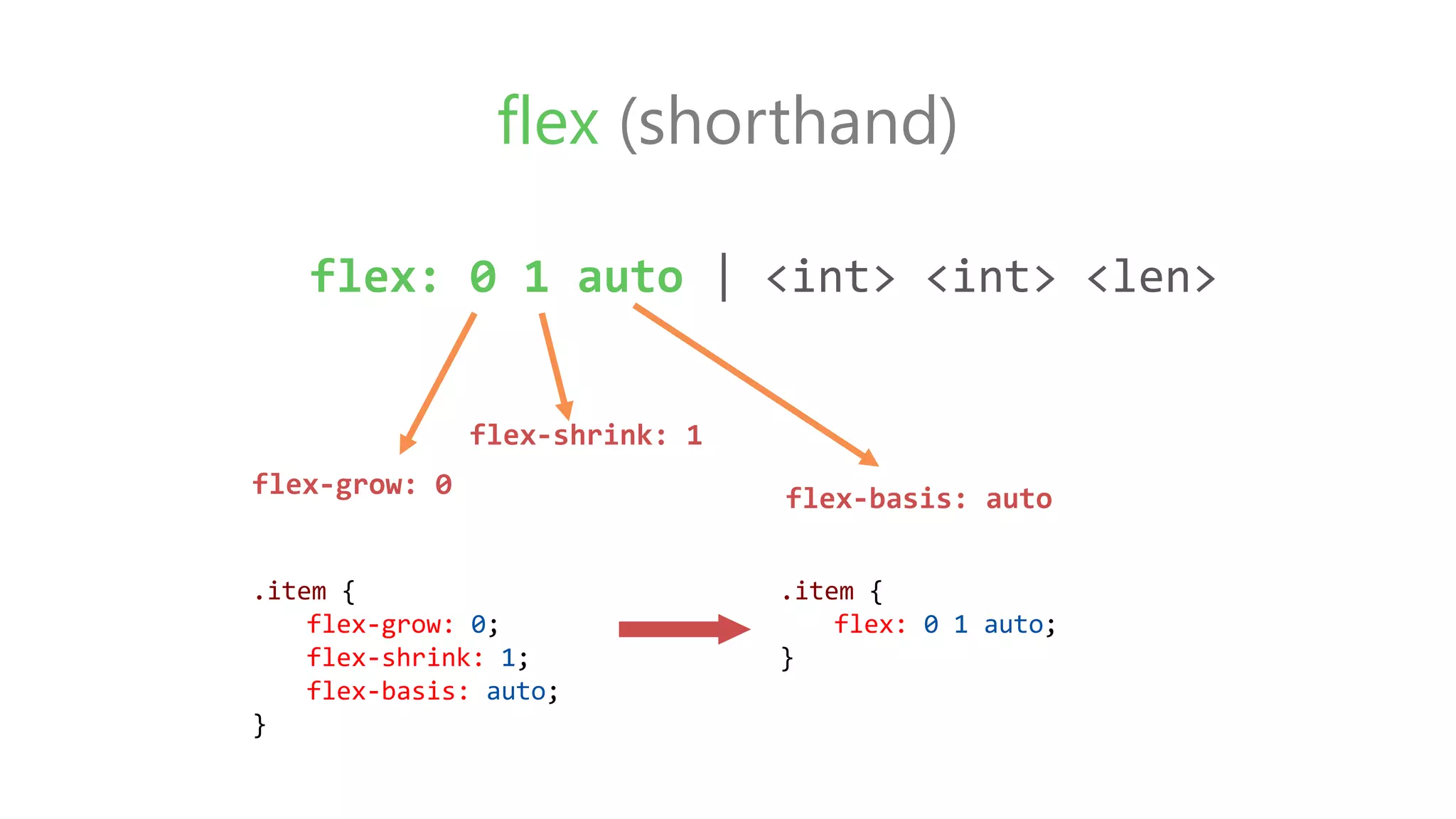
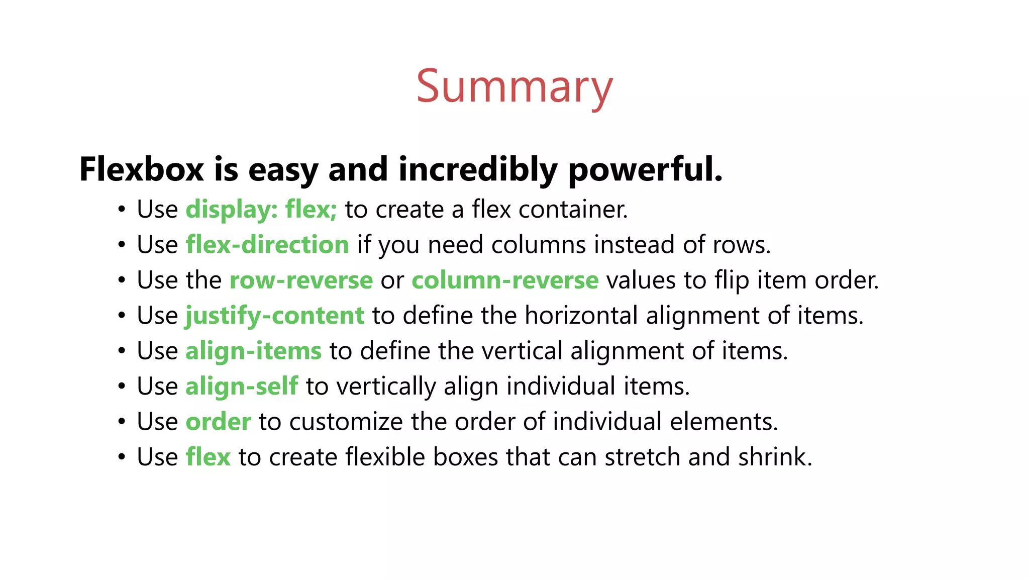
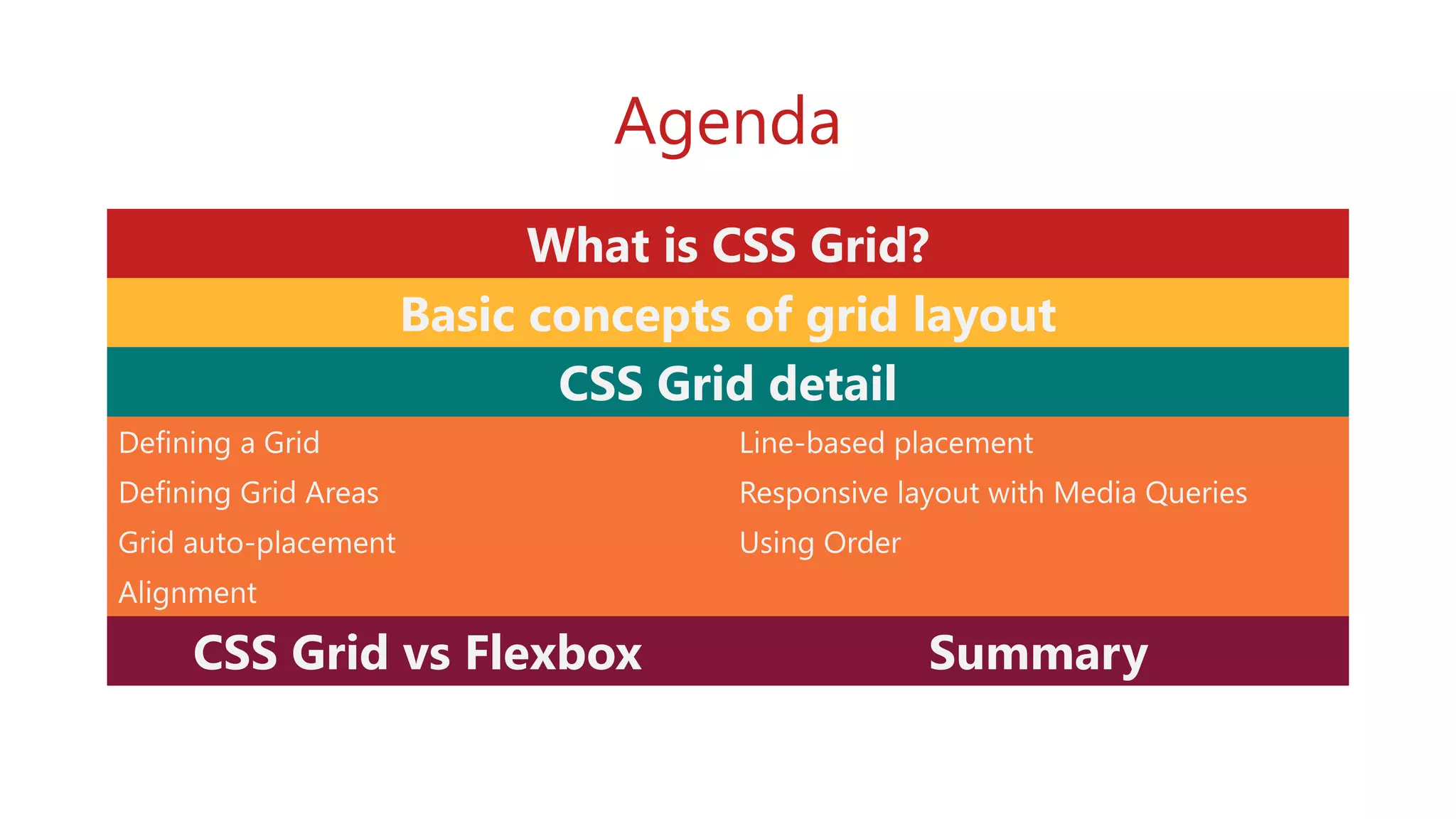
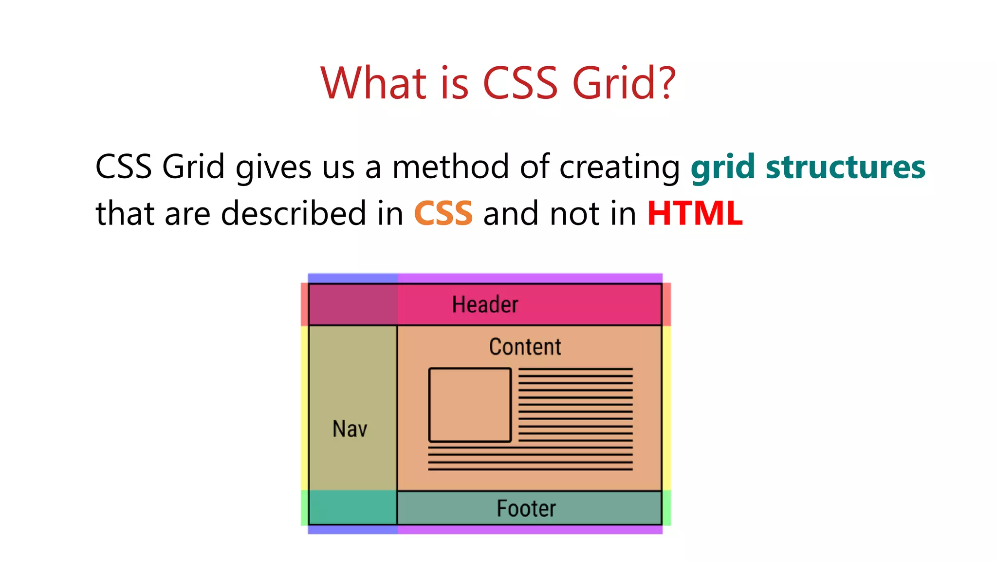
The document provides an overview of CSS layout techniques, focusing on Flexbox and CSS Grid. It explains Flexbox as a method for creating one-dimensional layouts that can easily adapt and align items in rows or columns, while CSS Grid is introduced as a two-dimensional layout model that allows for grid structures directly in CSS. Additionally, the document covers key properties and examples for both methodologies to help developers understand their applications.


![[DN Scrum Breakfast] API Automation Testing Using Retrofit & Cucumber](https://cdn.slidesharecdn.com/ss_thumbnails/apiautomationtestingusingserenityretrofit-180604065501-thumbnail.jpg?width=640&height=640&fit=bounds)


![[HCM Scrum Breakfast - January 2018] ElasticSearch In Action](https://cdn.slidesharecdn.com/ss_thumbnails/aavnscrumbreakfastjan2018elasticsearchinaction-180108024725-thumbnail.jpg?width=640&height=640&fit=bounds)
![[DN Scrum Breakfast] Protractor: E2E Testing for AngularJS (by Thuy Nguyen)](https://cdn.slidesharecdn.com/ss_thumbnails/protractorthuynguyen-170930044242-thumbnail.jpg?width=640&height=640&fit=bounds)

![[Da Nang Scrum Breakfast] Angular Tour](https://cdn.slidesharecdn.com/ss_thumbnails/danangscrumbreakfastangulartour-170729075653-thumbnail.jpg?width=640&height=640&fit=bounds)
![[DN Scrum Breakfast] Automation E2E Testing with Chimp Framework and WebdriverIO](https://cdn.slidesharecdn.com/ss_thumbnails/sb-2017-11-chimpframework-171202100419-thumbnail.jpg?width=640&height=640&fit=bounds)
![[DN Scrum Breakfast] Scrum Master, do we really need one_by Nam Dang_Mar2016](https://cdn.slidesharecdn.com/ss_thumbnails/sbmar2016smdoweneedone-171002070707-thumbnail.jpg?width=640&height=640&fit=bounds)
![[Scrum Breakfast DN] Is it possible to make 100% Unit Test coverage for your ...](https://cdn.slidesharecdn.com/ss_thumbnails/unittestingsb-200708042448-thumbnail.jpg?width=640&height=640&fit=bounds)
![[DN Scrum Breakfast] Effective Cloud Computing](https://cdn.slidesharecdn.com/ss_thumbnails/effectivecloudcomputing-180331065424-thumbnail.jpg?width=640&height=640&fit=bounds)
![[HCM Scrum Breakfast - April 2018] Teamwork: The Leader Job (Pt.1)](https://cdn.slidesharecdn.com/ss_thumbnails/teamwork-theleaderjob-pt1-180420100118-thumbnail.jpg?width=640&height=640&fit=bounds)
![[HCM Scrum Breakfast - June 2017] Distributed Team](https://cdn.slidesharecdn.com/ss_thumbnails/scrumbreakfast201706-170624053248-thumbnail.jpg?width=640&height=640&fit=bounds)


