Download as PDF, PPTX


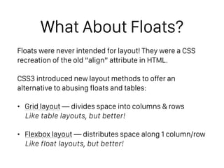
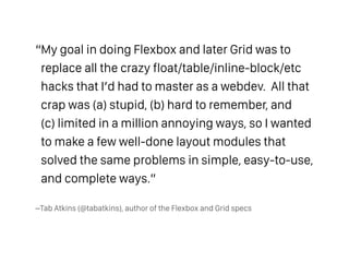
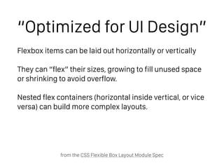
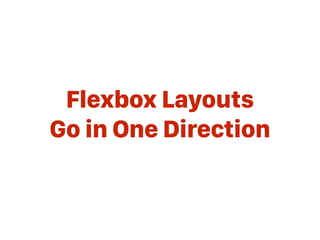


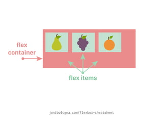
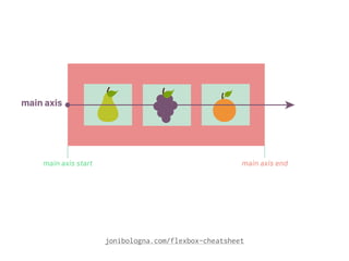
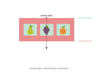
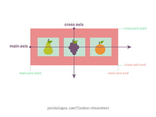


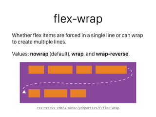
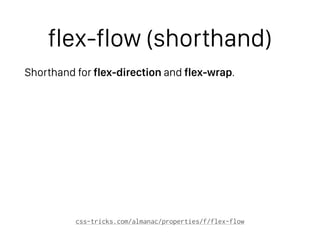
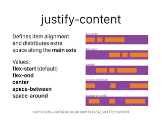
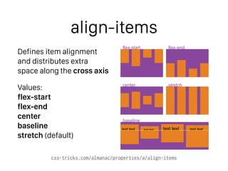

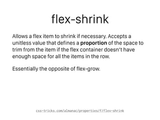
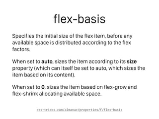
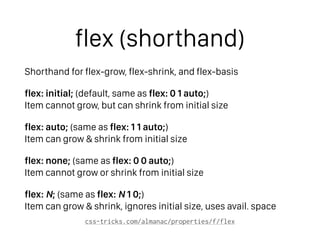
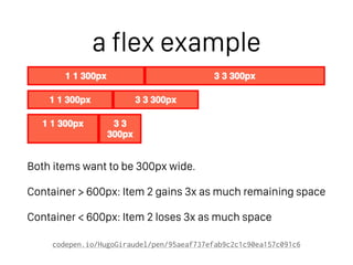

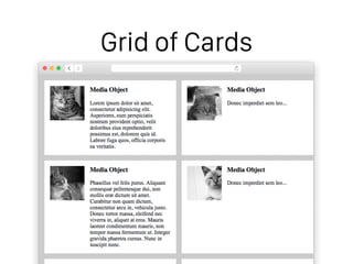
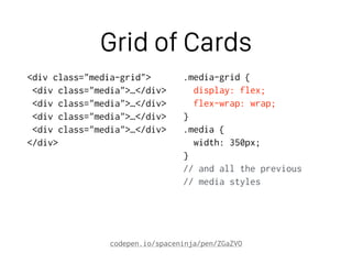
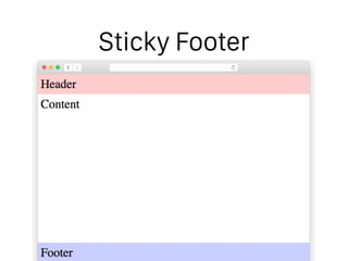
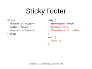
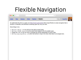
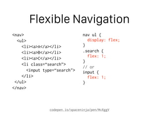

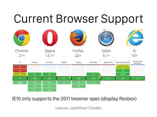


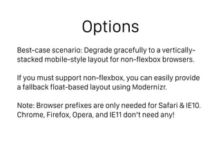
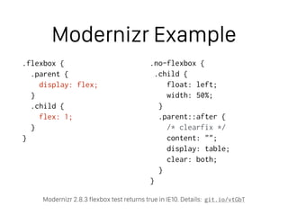

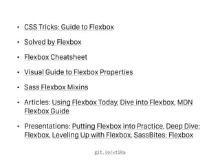

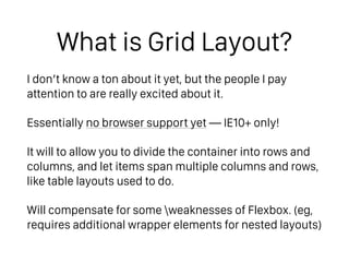
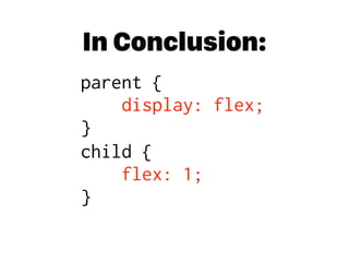

This document discusses the CSS Flexbox layout, which is designed to provide a more efficient way to create complex layouts without relying on floats or tables. It highlights the advantages of Flexbox over previous methods, detailing its properties and capabilities for aligning and distributing space among items. Additionally, it touches upon browser support and provides resources for learning Flexbox and introduces grid layout as a future development in CSS layout design.


