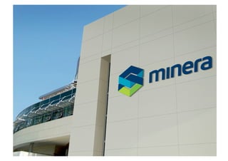
KSPL-Building a Path-Breaking Brand
Creating path breaking brands in India


Trancend’s recent interventions
Minera Group
 Tuesday, October 6, 2009
With over three decades of mining experience, KMMI Steel was a major player in mining,
sponge iron steel, power generation, agriculture and retail in India.

The rebranding exercise with Trancend was commissioned because of the changing
stakeholder relationships that existed in this highly competitive global business. The project
included developing a brand strategy, brand naming system, seamless brand architecture ,
brand identity & brand design language.

Minera Group is the new name that they adopted. The name Minera is inspired from the
Arabic word Minaret and also mean’s the source in Italian.
Project Scope for Minera     (Formerly known as KMMI Steel)


•  Brand strategy
•  Vision, Mission & Value
•  Brand Naming
•  Brand Architecture
•  New Category Development
•  Brand Identity
•  Brand Look and Feel
•  Training of Brand Custodians
•  Developing a corporate film
Tuesday, October 6, 2009
The new brand identity comprises seamlessly forging links and reflects the idea of a strong
bond & consistent performance. It is a representation of the close ties between its many
stakeholders - from customers and employees to investors, institutions and the society at
large.

The simple logotype has been handcrafted sans serif letterforms communicating strength &
stature. The rich tones blues connotes stability, scale and source credibility and the green
depicts optimism and resources.

Trancend is currently involved developing a brand strategy & naming for new category.
Tuesday, October 6, 2009
Click October 6, 2009 Seperator slide
 Tuesday, to edit
Click October 6, 2009 Seperator slide
 Tuesday, to edit
Tuesday, October 6, 2009
Klf Nirmal
 Tuesday, October 6, 2009
Nirmal today is leader in several markets in India and Middle East and is exported to
many parts of the world making them one of largest producers of pure coconut oil in the
world. Nirmal was the first pioneer the transparent bottle and is the only Amway
certified vendor for the procurement of pure coconut oil .

Over the past few years the brand found itself in the highly competitive category which
has more than 400 brands vying for the top spot. To reinforce its strength in the
category and to explore new categories the rebranding exercise was commissioned with
Trancend.

This rebranding extensive exercise encompassed developing a brand strategy, a brand
new product architecture, new bottle & structure design , new brand mark and
packaging graphics for the cooking and hair care range.
Project Scope for Nirmal


•  Brand strategy
•  Vision, Mission & Value
•  Brand Architecture
•  New Structure & packaging design for 3 categories
•  Brand Identity
•  Brand Look and Feel
•  Training of Brand Custodians
•  New Category Development
Tuesday, October 6, 2009
The new identity uses a simple ellipse to showcase this pure product. The hand crafted
Nirmal serif logotype conveys authenticity while depicting a high readability quotient. The
category specific blue half tone conveys trust & credibility. The packaging master has many
eye capturing signoff’s to make it stand out in a cluttered shelf. The produce of Kerala seal
mark is a stamp of authority critical to the coconut oil category and conveys source
credibility.

Trancend is currently engaged to develop a new innovation in the personal care space. This
includes brand strategy & naming for the new range.
Nirmal


  Tuesday, October 6, 2009


                                    CO                             L
                                          CO                  OI
                                                NUT COOKING


                                         E OF K
                                    UC          E


                              D


                                                RA
                             P RO


                                                    LA
                                00              E


                              1
                                     % PUR
The New Nirmal Range


  Tuesday, October 6, 2009
Website
Point of Sale
TVC’s
Back
Page
8
   Cover
Page
1

Loiee
 Tuesday, October 6, 2009
The brand is a leading chain of restaurants serving north Indian cuisine, sweets & savories in
Chennai. The brand was as Sree Gupta Bhavan established in 1987. The energetic top
management has an endeavor to expand into several key cities including New Delhi, Mumbai,
Bangalore, Hyderabad, Kuala Lampur and Singapore. They planned a chain of several formats
including twin store , fine dining & express counters.


Trancend was commissioned to develop a brand strategy, naming & architecture system ,
brand identity & brand design language .

The new name has been inspired from Loi Bazar one of the oldest marketplace in Mathura
region in India . It also means part of a dough in Devnagari. The naming architecture acts as
a prefix for its formats. Loiee in the near future plans to introduce a range of packaged
snack food and bakery products marking their entry into the FMCG space.
Project Scope for Loiee      ( formerly known as Sree Gupta Bhavan)


•  Brand strategy
•  Vision, Mission & Value
•  Brand Naming
•  Brand Architecture
•  New Category Development
•  Brand Identity
•  Brand Look and Feel
•  Training of Brand Custodians
Tuesday, October 6, 2009
The new identity embodies the “Kalpavriksha” the wish fulfilling tree from the Rig Veda. The
colors red signifies energy and vitality. The colours in the identity are also representative of
the ketchup & mustard theory of the organized fast food business. The serif type has been
hand crafted conveying stature and authenticity.

Trancend is engaged to develop the brand strategy & design for the snack food as well.
OPTION 2
OPTION 2
Who we are


 Tuesday, October 6, 2009


        Transforming Ideas
What we do

 Consulting Services           Design Services       Management Services

 Brand Strategy &                                    Web design
 Positioning              Brand identity

 Brand Architecture       Packaging design           In-store Marketing

 Brand Naming & Titling   Product structure design   Brand Manual
 services
                          Architectural Modeling
 Brand Research
                          Set Design
 Category Insights
why we
    do what
 we do
       We love coming to work every morning knowing that our ideas will make a
 difference, we will get to work on a new problem, meet new people in new industries
           and see how we can create memorable transformation for them .


           We love to see our
             Ideas Trancend
  Businesses , People and Quality of life
Tuesday, October 6, 2009the
Trancend is part of    ID Holland brand experts global network spread
across San Francisco, London, Jo berg, Dubai, Istanbul, Cairo, Singapore,
Jakarta, Tokyo & Bangalore .
If you’d like to see your brand transcend , do call us.


    Tuesday, October 6, 2009


Your contact at Trancend

Prathish Nair
prathish@trancendconsulting.com
www.trancendconsulting.com
www.trancendconsultingtalks.blogspot.com
+91 98451 78092

Creating Path Breaking Brands In India Trancend Consulting

  • 1.
    KSPL-Building a Path-BreakingBrand Creating path breaking brands in India Trancend’s recent interventions
  • 2.
    Minera Group Tuesday,October 6, 2009
  • 3.
    With over threedecades of mining experience, KMMI Steel was a major player in mining, sponge iron steel, power generation, agriculture and retail in India. The rebranding exercise with Trancend was commissioned because of the changing stakeholder relationships that existed in this highly competitive global business. The project included developing a brand strategy, brand naming system, seamless brand architecture , brand identity & brand design language. Minera Group is the new name that they adopted. The name Minera is inspired from the Arabic word Minaret and also mean’s the source in Italian.
  • 4.
    Project Scope forMinera (Formerly known as KMMI Steel) •  Brand strategy •  Vision, Mission & Value •  Brand Naming •  Brand Architecture •  New Category Development •  Brand Identity •  Brand Look and Feel •  Training of Brand Custodians •  Developing a corporate film
  • 5.
  • 6.
    The new brandidentity comprises seamlessly forging links and reflects the idea of a strong bond & consistent performance. It is a representation of the close ties between its many stakeholders - from customers and employees to investors, institutions and the society at large. The simple logotype has been handcrafted sans serif letterforms communicating strength & stature. The rich tones blues connotes stability, scale and source credibility and the green depicts optimism and resources. Trancend is currently involved developing a brand strategy & naming for new category.
  • 7.
  • 8.
    Click October 6,2009 Seperator slide Tuesday, to edit
  • 9.
    Click October 6,2009 Seperator slide Tuesday, to edit
  • 12.
  • 16.
  • 17.
  • 18.
  • 19.
    Klf Nirmal Tuesday,October 6, 2009
  • 20.
    Nirmal today isleader in several markets in India and Middle East and is exported to many parts of the world making them one of largest producers of pure coconut oil in the world. Nirmal was the first pioneer the transparent bottle and is the only Amway certified vendor for the procurement of pure coconut oil . Over the past few years the brand found itself in the highly competitive category which has more than 400 brands vying for the top spot. To reinforce its strength in the category and to explore new categories the rebranding exercise was commissioned with Trancend. This rebranding extensive exercise encompassed developing a brand strategy, a brand new product architecture, new bottle & structure design , new brand mark and packaging graphics for the cooking and hair care range.
  • 21.
    Project Scope forNirmal •  Brand strategy •  Vision, Mission & Value •  Brand Architecture •  New Structure & packaging design for 3 categories •  Brand Identity •  Brand Look and Feel •  Training of Brand Custodians •  New Category Development
  • 22.
  • 23.
    The new identityuses a simple ellipse to showcase this pure product. The hand crafted Nirmal serif logotype conveys authenticity while depicting a high readability quotient. The category specific blue half tone conveys trust & credibility. The packaging master has many eye capturing signoff’s to make it stand out in a cluttered shelf. The produce of Kerala seal mark is a stamp of authority critical to the coconut oil category and conveys source credibility. Trancend is currently engaged to develop a new innovation in the personal care space. This includes brand strategy & naming for the new range.
  • 24.
    Nirmal Tuesday,October 6, 2009 CO L CO OI NUT COOKING E OF K UC E D RA P RO LA 00 E 1 % PUR
  • 25.
    The New NirmalRange Tuesday, October 6, 2009
  • 26.
  • 27.
  • 28.
  • 29.
    Back
Page
8
 Cover
Page
1

  • 30.
  • 31.
    The brand isa leading chain of restaurants serving north Indian cuisine, sweets & savories in Chennai. The brand was as Sree Gupta Bhavan established in 1987. The energetic top management has an endeavor to expand into several key cities including New Delhi, Mumbai, Bangalore, Hyderabad, Kuala Lampur and Singapore. They planned a chain of several formats including twin store , fine dining & express counters. Trancend was commissioned to develop a brand strategy, naming & architecture system , brand identity & brand design language . The new name has been inspired from Loi Bazar one of the oldest marketplace in Mathura region in India . It also means part of a dough in Devnagari. The naming architecture acts as a prefix for its formats. Loiee in the near future plans to introduce a range of packaged snack food and bakery products marking their entry into the FMCG space.
  • 32.
    Project Scope forLoiee ( formerly known as Sree Gupta Bhavan) •  Brand strategy •  Vision, Mission & Value •  Brand Naming •  Brand Architecture •  New Category Development •  Brand Identity •  Brand Look and Feel •  Training of Brand Custodians
  • 33.
  • 34.
    The new identityembodies the “Kalpavriksha” the wish fulfilling tree from the Rig Veda. The colors red signifies energy and vitality. The colours in the identity are also representative of the ketchup & mustard theory of the organized fast food business. The serif type has been hand crafted conveying stature and authenticity. Trancend is engaged to develop the brand strategy & design for the snack food as well.
  • 39.
  • 43.
  • 45.
    Who we are Tuesday, October 6, 2009 Transforming Ideas
  • 46.
    What we do Consulting Services Design Services Management Services Brand Strategy & Web design Positioning Brand identity Brand Architecture Packaging design In-store Marketing Brand Naming & Titling Product structure design Brand Manual services Architectural Modeling Brand Research Set Design Category Insights
  • 47.
    why we do what we do We love coming to work every morning knowing that our ideas will make a difference, we will get to work on a new problem, meet new people in new industries and see how we can create memorable transformation for them . We love to see our Ideas Trancend Businesses , People and Quality of life
  • 48.
    Tuesday, October 6,2009the Trancend is part of ID Holland brand experts global network spread across San Francisco, London, Jo berg, Dubai, Istanbul, Cairo, Singapore, Jakarta, Tokyo & Bangalore .
  • 49.
    If you’d liketo see your brand transcend , do call us. Tuesday, October 6, 2009 Your contact at Trancend Prathish Nair prathish@trancendconsulting.com www.trancendconsulting.com www.trancendconsultingtalks.blogspot.com +91 98451 78092