
Recommended
More Related Content
What's hot
What's hot (20)
Similar to Stylistic Analysis of Khaadi’s Advertisement
Similar to Stylistic Analysis of Khaadi’s Advertisement (20)
Recently uploaded
Recently uploaded (20)
Stylistic Analysis of Khaadi’s Advertisement
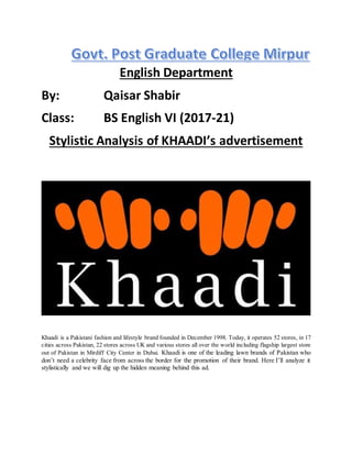
- 1. English Department By: Qaisar Shabir Class: BS English VI (2017-21) Stylistic Analysis of KHAADI’s advertisement Khaadi is a Pakistani fashion and lifestyle brand founded in December 1998. Today, it operates 52 stores, in 17 cities across Pakistan, 22 stores across UK and various stores all over the world including flagship largest store out of Pakistan in Mirdiff City Center in Dubai. Khaadi is one of the leading lawn brands of Pakistan who don’t need a celebrity face from across the border for the promotion of their brand. Here I’ll analyze it stylistically and we will dig up the hidden meaning behind this ad.
- 2. Meaning of the name: Khaadi is an Urdu word which means 'hand-woven'. Weaving, an intricate process requiring patience and attention to detail, creates fabric whose characteristics are dependent on the threads and the method in which those threads are woven. Khadi and Khaadi: The name of Khaadiis associated with an ancient concept Khadi or Khaddar, a term for handspun and hand woven in India and Pakistan. The raw material (cotton, silk or wool) spun into threads on a spinning wheel called Charkha. Why Khaadi choose this name? Khaadi tries to reflect itself as holistic brand which provides a diverse range of all hand crafted products under one roof in a very simple yet traditional atmosphere. Why Khadi to Khaadi? The term Khadi was difficult to pronounce in English Language because the stress pattern is of Urdu and Hindi language so they added one “E” in it and stress would be on “Kha” and made weak the last syllable of the word , for purpose of easy pronunciation in English. Borrowing terminology used in this process.
- 3. Font of Khaadi: If one looksatits fontclosely,sophisticatedkindof fontuse for the name of brand whichillustrate seriousness,sobernessandalsoregularity. Hands logo in the ad: These orange color lines illustrating a hands and these are symbol of moving forward and of a passion that stems from the very beginning of the process. They signify the perseverance,tradition, pushing limits and hard work that go into the final product. Psychology of Color Scheme: “Colors portrays meaning” If we study the use of color in a society, colors portray some kind of meaning and the use of effective color scheme may have great effect on the ad as well as the customers of that particular brand similarly here in this ad the colors are portraying some kind of meaning, as white black and orange color scheme is used. White: In the ad the word Khaadi and now often its logo in white color, which gives meaning of innocence, goodness, good quality, simplicity, cleanliness and humility. It illustrates the good and simple quality of the products in the brand. Black: Here the black color is used in contrast of white to foreground the brand name and it signifying energy power, class, productivity and protectiveness of the product produces by the brand.
- 4. Orange. Orange color combines the energy of red and happiness of yellow. It is a eye catching color which attracts the most. It symbolizes joy, sun shine, labor, hard work, hard work behind their productivity and it representing fascination, happiness, creativity, attraction and success. GraphologicalDeviation: If we see thisadonthe signboardasinMirpur,we observethatthe text“Khaadi”iswrittencomparatively in huge size that deviates from the standards and norms of ordinary size of writing the words . It is an example of Graphlogical Deviationthatmeansa variationthatdeviatesfromthe standardsornorms.The writer deliberately uses his/her own style, marked by the non-respect of grammar rules to attract the attention of his/her readers. Foregrounding: Since the font is in white color, so they’ve used its contrast color to emphasize the name of the brand. Parallelism: Contrasting color scheme used as: White is contrast of black The use of opposite colors raises the concept of parallelism.