Ray+Keshavan | The Brand Union – Infrastructure
•
6 likes•2,636 views

Ray+Keshavan is a brand design consultancy that is part of The Brand Union network. They have helped build brands in India's infrastructure sector by developing brand strategies, identities, and communications. Some of the infrastructure companies they have worked with include ACC, Chettinad Cement, GMR Group, GVK, and NCC.

Recommended
More Related Content
What's hot
What's hot (20)
Viewers also liked
Viewers also liked (19)
Similar to Ray+Keshavan | The Brand Union – Infrastructure
Similar to Ray+Keshavan | The Brand Union – Infrastructure (20)
Recently uploaded
Recently uploaded (20)
Ray+Keshavan | The Brand Union – Infrastructure
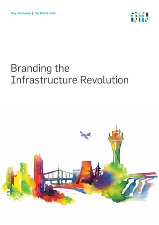
- 1. Ray+Keshavan The Brand Union Branding the Infrastructure Revolution
- 2. 3Ray+Keshavan | The Brand Union WHY CLIENTS SEEK US • To develop powerful strategies to create new brands or rejuvenate existing ones • To bring modern, world-class design solutions to Indian brands • To create compelling and memorable brand visual identities to enable employees and stakeholders to understand and live their brands • To rationalise brand portfolios and create robust, enduring architecture systems • To provide companies with tools to manage their brands WHO WE ARE Ray+Keshavan has been voted as India’s No 1 Brand Design Consultancy by The Economic Times four years in a row from 2008 to 2011 (every single year since the survey began). We are part of WPP’s global brand agency, The Brand Union. Together, we offer more than 35 years of brand building experience with about 500 strategists, designers and researchers across 21 offices serving every major market This means that our clients benefit from the best of both worlds: a global network and knowledge pool combined with deep experience and understanding of the Indian context. The Brand Union Abu Dhabi India Beijing Cairo Dubai Dublin Hamburg Hong Kong Jakarta Johannesburg London Madrid Miami New York Paris San Francisco Shanghai Singapore Stockholm Tokyo
- 3. 5Ray+Keshavan | The Brand Union BRANDS WE HAVE HELPED TO BUILD IN INDIA
- 4. 7Ray+Keshavan | The Brand Union BRANDS WE HAVE HELPED TO BUILD WORLDWIDE
- 5. 9Ray+Keshavan | The Brand Union OUR INDIAN CLIENTS IN INFRASTRUCTURE SECTOR THE GRAY REVOLUTION A country’s image is often defined by its infrastructure. Its importance in the development of a country cannot be over-emphasized. As a matter of fact infrastructure is the lifeline of the economy of a country. Post-independence, in the initial decades, India had struggled to build a world class infrastructure. Plans needed to be put in place to target the building of adequate infrastructure to put India’s economy on a high growth path. Post the 1991 liberalization policy, significant steps were taken in bringing about systematic growth in the country. One of the key derivatives of the liberalization is the PPP model of infrastructure development. This led to the genesis of many leading infrastructure companies of this country. There cannot be a greater privilege than working with entrepreneurs who have had the courage, vision, gumption and guts to undertake large transformational infrastructure projects. These projects have completely redefined India’s image in the eyes of self and outsiders, be it airports, roads, power plants, mining etc… We worked with many ‘Andhraprunures’ and leading promoters, our own proud contribution in shaping the vision of these entrepreneurs. In face of the global financial crisis and the economic downturn, infrastructure sector plays an important role to counter balance against slowing economic activity. There is an empirical need to focus on the basics. Sooner or later the legal and operating environments will get more structured and a well prepared organization can create sustainable shareholder value by building an admired corporate brand. As Indian infrastructure companies are globalizing, there is a need to have the right vision, image and culture to achieve stable and sustainable growth.
- 6. 11Ray+Keshavan | The Brand Union Ray+Keshavan was voted India’s No 1 Brand Design Agency by The Economic Times four years in a row- in 2008, 2009, 2010 and 2011. We are part of WPP’s global brand agency, The Brand Union. Together, we offer more than 35 years of brand building experience with about 500 strategists, designers and researchers across 21 offices serving every major market. This means that our clients benefit from the best of both worlds: a global network and knowledge pool combined with deep experience and understanding of the Indian context. WHO WE ARE 10 RESEARCH Brand audit Competitive analysis Insight research STRATEGY Brand naming Brand positioning Brand model Brand architecture DESIGN Corporate design Packaging design Information design Brand language Brand environments Interactive design Brand communications and collaterals Brand guidelines ENGAGEMENT Employee insight and diagnostics Internal communications Employee engagement EVALUATION Measurement, assessment and evaluation
- 7. 13Ray+Keshavan | The Brand Union WHY CLIENTS SEEK US
- 8. 15Ray+Keshavan | The Brand Union To develop powerful strategies to create new brands or rejuvenate existing ones To bring modern, world-class design solutions to Indian brands To create compelling and memorable brand visual identities to enable employees and stakeholders to understand and live their brands To rationalise brand portfolios and create robust, enduring architecture systems To provide companies with tools to manage their brands
- 9. 17Ray+Keshavan | The Brand Union Associated Cement Company had a rare heritage of being a company once owned by the Tata’s when Mr. Palkhivala was the chairman. When Holcim acquired ACC, they decided the brand needed reinvigoration. We partnered with ACC in 2006 to refresh the brand and give it a new start. Our first step was to change the name from Associated Cement Company Ltd to ACC Ltd. In the light of doing only what is right for the brand, we evolved the word-mark logo for ACC and introduced a new colour making the brand look more dynamic, energetic and strong. We introduced their new positioning ‘Build with Confidence’. In the process of the re-brand we introduced a huge supply chain innovation that allowed the brand to move to using a two colour cement bag, rather than four colour- in turn saving them a lot on overheads. We produced effective and creative communication material that helped build the brand amongst all rungs of consumers – including masons and contractors. This was an additional facet of the educator brand that was ACC. For the first time ACC launched service centers. Ready-mix being a strategic channel, we followed this with branding ACC Concrete. Our work has endured because of the impact of 360 degree branding ad the impact on premium market share. TRUST IS A THREE LETTER WORD OLD LOGO
- 10. 19Ray+Keshavan | The Brand Union
- 11. 21Ray+Keshavan | The Brand Union
- 12. 23Ray+Keshavan | The Brand Union The name Chettinad has a strong cultural connotation in South India. It bears a heritage of trust, strong family values and dependability. Geographic focus being one of the KRAs of the cement industry, the name Chettinad was already a good note to start on. However, the brand lacked vital nourishment. R+K partnered with Chettinad to develop a new strategy, identity, brand system and packaging. We developed new product ideas that drove premium and refreshed the distribution channel. We also worked on an effective employee engagement programme and a mason-contractor-architech engagement plan linking them to KRAs. MAKING THE MOST OF BEING A REGIONAL BRAND OLD LOGO
- 13. 25Ray+Keshavan | The Brand Union
- 14. 27Ray+Keshavan | The Brand Union OLD LOGOS The Mehta group is a reputed business house with diversified business interests. Cement being the significant value driver among businesses, their two cement brands required an impactful, long-term brand solution. The names Sidhee and Haathi had a rich heritage in their local markets and equity among trade and consumers. We gave both brands new identities. FITTER, YOUNGER, STRONGER
- 15. 29Ray+Keshavan | The Brand Union We positioned Haathi to be the more premium of the two brands. The new Haathi kept in pace with the times and living up to the promise of quality and reliability. It not only appeals to its loyal customers, but a brand that is definite to draw to the younger consumers as well. Sidhee’s value-for-money appeal was enhanced and highlighted, exploiting its potential to the fullest. It was positioned as a young, dynamic and accessible brand- clearly identifiable as the smart choice.
- 16. 31Ray+Keshavan | The Brand Union A GLOBAL INDIAN
- 17. 33Ray+Keshavan | The Brand Union In the year 2000, when Mr. G. M. Rao approached us to help refresh GMR, he chose to focus on building something bigger than just construction. We took GMR and made it a multi sector infrastructure brand- and we did this in three phases. In 2000, we redesigned the GMR visual identity. The idea of the apex stood for ambition, achievement and excellence. Since scalability is critical for an infrastructure company, we partnered together again in 2005 to develop a cohesive brand architecture, visual language and brand system. In continuation with this proud partnership, we had a rare opportunity to brand India’s new generation airports. This is a key piece of branding in this country that opened another chapter in the Indian branding domain. GMR Agri Business GMR Airports GMR Energy GMR Foundation GMR Highways GMR Urban Infrastructure
- 18. 35Ray+Keshavan | The Brand Union
- 19. 37Ray+Keshavan | The Brand Union Rajiv Gandhi International Airport is the gateway to southern India. While the structure clearly speaks the vision of the promoters, graphics, modern-day signage and design significantly elevate the airport experience. The brand identity and environmental graphics were designed to showcase the rich heritage and splendor of this region, while staying true to GMR’s broader visual language. The result was a visual feast of colour and form that blends into the airport’s cutting edge architecture to create a unique experience that has been widely acclaimed.
- 20. 39Ray+Keshavan | The Brand Union
- 21. 41Ray+Keshavan | The Brand Union An infographic panel at the Domestic Departures Lounge engages the interest of passengers with distances between Hyderabad and other Indian and international cities. (Below) Life-size silhouettes of passengers, interspersed with travel quotes, engage interest and add a sense of fun to the Domestic Departures Lounge. (Across) You can’t cross the sea merely by standing and staring at the water. RABINDRANATH TAGORE The World is a book, and those who do not travel read only a page. SAINT AUGUSTINE A traveller without observation is a bird without wings. MUSLIH-UDDIN SADI
- 22. 43Ray+Keshavan | The Brand Union Large prints of richly coloured Thol Bommalata puppets of Andhra Pradesh serve as a dramatic backdrop at the International Arrival zone.
- 23. 45Ray+Keshavan | The Brand Union
- 24. 47Ray+Keshavan | The Brand Union Rows of graceful south Indian classical dancers greet international passengers on arrival at the Immigration Hall.
- 25. 49Ray+Keshavan | The Brand Union GVK is amongst the greatest eponymous corporations with a big vision, tremendous courage and ability to execute in a manner that redefines Indian infrastructure. Our relationship with began with branding GVK Bio many years ago and only grew stronger over the years. With Chattrapati Shivaji International Airport in Mumbai, GVK became the first conglomerate to completely redefine airports in developing countries and move them from being a mere infrastructural necessities to societal assets. Mumbai airport became an iconic of being the gateway to India. We are proud to have branded CSIA – India’s first Greenfield and Brownfield airport. We designed the brand identity, developed a visual language and environmental graphics. We established a clear brand architecture. We also had the privilege of branding Bangalore International Airport – now an iconic South Indian infrastructural landmark. Again in 2008, we worked with GVK to refresh their own brand identity and establish a sector specific brand architecture, develop a brand system and language. After the world-class airports wave hit India in 2006, airports have transitioned to becoming societal assets and brands. Despite the fact that we have only one airport in each city, privatization has significantly invested in building iconic brands. Be it the ‘coffee trails’ concept in BIAL or the peacock feather of CSIA - each airport has interwoven in its brand, the nuances of Indian culture and heritage. BRANDING THE VISION
- 26. 51Ray+Keshavan | The Brand Union
- 27. 53Ray+Keshavan | The Brand Union
- 28. 55Ray+Keshavan | The Brand Union Bengaluruthegarden city Gateway to South India
- 29. 57Ray+Keshavan | The Brand Union Can a company’s purpose and profits be aligned with a nation’s progress? Ideal, but rare, Naveen Jindal, the man known for democratising the right to hoist the national flag, wanted to rebrand his power and steel conglomerate to accelerate his institution building and global expansion plan. ‘Taking India Forward’, the new positioning, was representative of the great contribution Jindal’s mining, steel and power resources to contribute to the growth of GDP. Invoking the nation’s pride and Jindal’s contribution to it, we developed a message rich identity and visual language. We also moved them from a multi-brand to a monolithic brand architecture across geographies, companies and sectors. NATION’S PRIDE AS PURPOSE
- 30. 59Ray+Keshavan | The Brand Union
- 31. 61Ray+Keshavan | The Brand Union It is rare in the 21st century to come across first generation infrastructure companies in India – most of them have evolved from contracting to construction and then to Build-Operate-Transfer. KMC is a young, first generation company with an asset portfolio that balanced construction, contracting and BOT. We articulated a rallying cry positioning of this young and restless company. We worked with the top management to shape the institutional roadmap and digital presence. We crafted their vision, mission and designated brand identity system. BIG IDEAS IN ACTION
- 32. 63Ray+Keshavan | The Brand Union
- 33. 65Ray+Keshavan | The Brand Union
- 34. 67Ray+Keshavan | The Brand Union3 Ray+Keshavan | The Brand Union Like others peers and ‘Andhrapreneurs’ in the infrastructure sector, Nagarjuna Construction Company had a rich heritage, boldness, breadth and depth. Despite all the strength and positivity it carried, the brand was not as stronger as it deserved to be. A large part of the problem lay in the name itself. The name ‘Nagarjuna’ is very common in Andhra Pradesh and is shared across many business groups. While NCC is of good repute, other companies bearing the name Nagarjuna were as grey clouds over their reputations. After considerable debate, we changed the name from Nagarjuna Construction Company Ltd to NCC Ltd. This opened up two areas of opportunity for the brand – the first being a de coupling of the diluted equity of the name Nagarjuna and the second was removing the connotations of them being a ‘construction only’ company. The name change worked in their favour to protect the long term brand equity. The identity stemmed from the thought that ‘the whole is greater than the sum of its parts’ and the positioning ‘The power of integration’ borrowed from the identity. BUILDING A BRIGHTER WORLD
- 35. 69Ray+Keshavan | The Brand Union
- 36. 71Ray+Keshavan | The Brand Union Gayatri was a listed company which focused on very specific verticals. The name Gayatri throws up some rich visual connotations. We reinterpreted a name drawn from Indian heritage in a modern context. Using the brand launch, a chain management programme was initiated simultaneously. Agenda for change for all departments was finalized. We developed their vision, mission and values and helped them build a performance oriented culture. BUILDING INFRASTRUCTURE ADVANTAGE
- 37. 73Ray+Keshavan | The Brand Union
- 38. 75Ray+Keshavan | The Brand Union Soma, a closely held unlisted company with a business plan approached us to help build their brand. In a world full of infrastructure giants, we wanted Soma to be seen as a quiet, understated performer. We focused on their sector specific strengths and organized their vertical specialisations, which despite being just a trend at the time, worked perfectly to help build an execution focused, agile institution. We articulated values, vision mission, positioning, developed the brand identity, look and feel, visual language, institutional development plans by linking it to brand building. Positioning (promise is kept). SAY EQUALS DO
- 39. 77Ray+Keshavan | The Brand Union
- 40. 79Ray+Keshavan | The Brand Union3 Ray+Keshavan | The Brand Union Rapid expansion meant that Punj Lloyd’s portfolio had a mix of joint ventures acquisitions and subsidiary companies - including well-established brands like Sembawang in Singapore and Simon Carves in UK. BRANDING AN INTERNATIONAL CONGLOMERATE
- 41. 81Ray+Keshavan | The Brand Union Building sustainable infrastructure across the globe demands cutting-edge technology, experienced people and the highest standards of safety and quality. For instance we successfully completed the Dhahej-Vijapur pipeline ahead of schedule, laying 506 km in 9 months. At Punj Lloyd, we get it done. we get it done. As a part of a comprehensive branding exercise, we developed a robust brand architecture system and brand model that resonated across cultures and geographies. This was also translated into a new brand identity that is now used by all companies within the Group. The result? Punj Lloyd has successfully made the transition from being seen as a pipeline company to a complete EPC player.
- 42. 83Ray+Keshavan | The Brand Union Contact us arvind.hegde@rayandkeshavan.com M +91 98450 64414 tasneem.ali@rayandkeshavan.com M +91 99204 03968
- 43. 22 Brunton Road Bangalore 560 025 India +91 (0)80 2555 0486 T +91 (0)80 2555 0487 T +91 (0)80 2558 1465 F rayandkeshavan.com thebrandunion.com Ray+Keshavan | The Brand Union