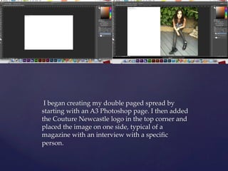
I began creating a double paged magazine spread in Photoshop using an A3 page. I added the publication logo and placed an image on one side with an interview-style article. I formatted the pages with a script title font, black and white image, and typical interview conventions like bold questions. I continued building the article sticking to conventions while also moving the logo and adding page numbers for continuity across the spread.