Download to read offline


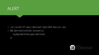
![ALERT
Framework7 provides methods to display alerts.
To open Alert modal we should call one of the following App methods:
alert(text, [title, callbackOk]);
alert(text, [callbackOk]);](https://image.slidesharecdn.com/day6-uidevelopmentusingframework7-170502044434/85/Cordova-training-Day-6-UI-development-using-Framework7-7-320.jpg)
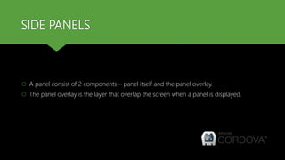
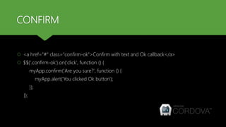
![CONFIRM
Confirm modal usually used when it is required to confirm some action.
To open Confirm modal we should also call one of the following App methods:
confirm(text, [title, callbackOk, callbackCancel]);
confirm(text, [callbackOk, callbackCancel]);](https://image.slidesharecdn.com/day6-uidevelopmentusingframework7-170502044434/85/Cordova-training-Day-6-UI-development-using-Framework7-9-320.jpg)
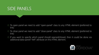
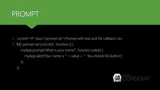
![PROMPT
Prompt modal used when it is required to get some data/answer from user.
To open Prompt modal we should also call one of the following App methods:
prompt(text, [title, callbackOk, callbackCancel]);
prompt(text, [callbackOk, callbackCancel]);](https://image.slidesharecdn.com/day6-uidevelopmentusingframework7-170502044434/85/Cordova-training-Day-6-UI-development-using-Framework7-11-320.jpg)
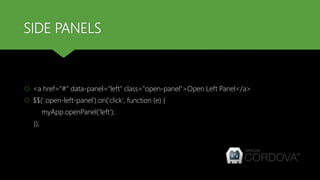
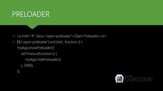
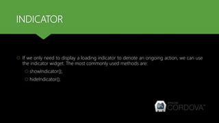
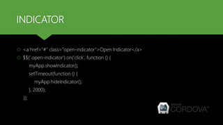
![PRELOADER
Preloader Modal is used to indicate some background activity (like Ajax request) and to
block any user actions during this activity.
To open Preloader modal we should also call appropriate App method:
showPreloader([title]);
Because Preloader modal has not any buttons, it should be closed by JavaScript using
hidePreloader() method.](https://image.slidesharecdn.com/day6-uidevelopmentusingframework7-170502044434/85/Cordova-training-Day-6-UI-development-using-Framework7-13-320.jpg)

![ACTION SHEET
<p><a href="#" class="ac-1">One group, three buttons</a></p>
$$('.ac-1').on('click', function () {
var buttons = [
{text: 'Button1', onClick: function (){}},
{text: 'Button2‘, onClick: function (){}},
{text: 'Cancel', onClick: function (){}},
];
myApp.actions(buttons);
});](https://image.slidesharecdn.com/day6-uidevelopmentusingframework7-170502044434/85/Cordova-training-Day-6-UI-development-using-Framework7-21-320.jpg)


This document provides an overview of various user interface components in Framework7, including side panels, alerts, confirms, prompts, preloaders, indicators, popups, action sheets, tabs, and lazy loading. It describes how to implement each component using Framework7 methods like myApp.openPanel(), myApp.alert(), myApp.confirm(), etc. It also provides code examples for opening and closing each interface element programmatically.


![20260201 [FOSDEM] gomodjail - library sandboxing for Go modules.pdf](https://cdn.slidesharecdn.com/ss_thumbnails/20260201fosdemgomodjail-librarysandboxingforgomodules-260201225659-76609ec4-thumbnail.jpg?width=640&height=640&fit=bounds)


