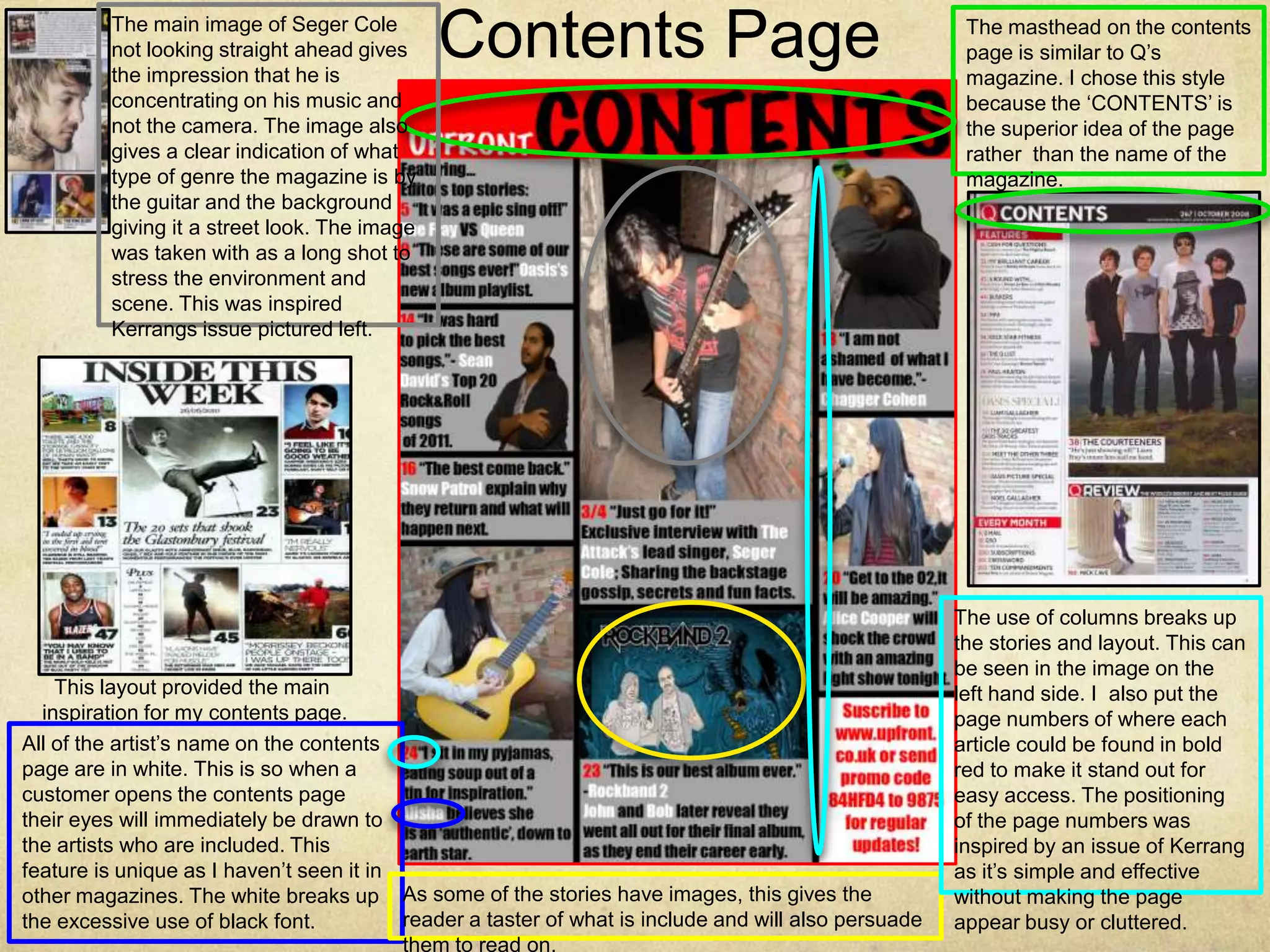
The main image of Seger Cole
         not looking straight ahead gives
         the impression that he is
                                              Contents Page                                            The masthead on the contents
                                                                                                       page is similar to Q’s
                                                                                                       magazine. I chose this style
         concentrating on his music and                                                                because the ‘CONTENTS’ is
         not the camera. The image also                                                                the superior idea of the page
         gives a clear indication of what                                                              rather than the name of the
         type of genre the magazine is by                                                              magazine.
         the guitar and the background
         giving it a street look. The image
         was taken with as a long shot to
         stress the environment and
         scene. This was inspired
         Kerrangs issue pictured left.


                                                                                                      The use of columns breaks up
                                                                                                      the stories and layout. This can
                                                                                                      be seen in the image on the
    This layout provided the main                                                                     left hand side. I also put the
  inspiration for my contents page.                                                                   page numbers of where each
All of the artist’s name on the contents                                                              article could be found in bold
page are in white. This is so when a                                                                  red to make it stand out for
customer opens the contents page                                                                      easy access. The positioning
their eyes will immediately be drawn to                                                               of the page numbers was
the artists who are included. This                                                                    inspired by an issue of Kerrang
feature is unique as I haven’t seen it in                                                             as it’s simple and effective
other magazines. The white breaks up As some of the stories have images, this gives the               without making the page
the excessive use of black font.          reader a taster of what is include and will also persuade   appear busy or cluttered.
                                          them to read on.

3

  • 1.
    The main imageof Seger Cole not looking straight ahead gives the impression that he is Contents Page The masthead on the contents page is similar to Q’s magazine. I chose this style concentrating on his music and because the ‘CONTENTS’ is not the camera. The image also the superior idea of the page gives a clear indication of what rather than the name of the type of genre the magazine is by magazine. the guitar and the background giving it a street look. The image was taken with as a long shot to stress the environment and scene. This was inspired Kerrangs issue pictured left. The use of columns breaks up the stories and layout. This can be seen in the image on the This layout provided the main left hand side. I also put the inspiration for my contents page. page numbers of where each All of the artist’s name on the contents article could be found in bold page are in white. This is so when a red to make it stand out for customer opens the contents page easy access. The positioning their eyes will immediately be drawn to of the page numbers was the artists who are included. This inspired by an issue of Kerrang feature is unique as I haven’t seen it in as it’s simple and effective other magazines. The white breaks up As some of the stories have images, this gives the without making the page the excessive use of black font. reader a taster of what is include and will also persuade appear busy or cluttered. them to read on.