
Recommended
More Related Content
What's hot
What's hot (20)
Viewers also liked
Viewers also liked (12)
Similar to How effective is the combination of your main product and ancilliary texts?
Similar to How effective is the combination of your main product and ancilliary texts? (20)
Recently uploaded
Recently uploaded (20)
How effective is the combination of your main product and ancilliary texts?
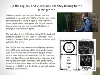
- 1. Do the Digipak and Video look like they belong to the same genre? I believe they do, the ideas and themes that are expressed in video strongly fit the style that was trying to be achieve that fitting the genre style and other music videos in the same genre, the digipak has also been crafted in a way that ensures it looks like it belongs to the indie rock genre. The video has a very gritty style to it with the dark and destaurated look that was used for the video I think really fits the style of the genre and the trends of music videos in that genre. The digipak also has a very urban and gritty style with the graffiti style outlines and the black white colours used it really looks like an indie rock digipak. I made sure to have this link as it was important for the video to fit the style of genre so its important to ensure that the digipak follows the same style and genre trends, some inspirations that were used for the video and the digipak were Catfish and the Bottlemen as well as Artic Monkeys album covers.
- 2. Digipak – How does it relate to the genre The final design that I have chosen is shown on the left, throughout the different panels the same style is used that being a very urban and almost graffiti style. I chose this style because of how I felt it reflected the genre of music that was chosen for the music video and the band. The colours, I chose to only have black and white on all of the panels due to research other popular indie rock bands the trend that I saw was that very little to no colour is used in the images of the band also the designs are not normally filled with different colours, So I chose to have only black and white as the colours of the digipak design. In the end I am happy with that decision and I think it adds to making it look like an indie rock album/digipak. The font/logo design, I had designed the logo prior to designing this digipak so I did have something to go off of when designing the digipak. I was very happy with how the logo turned out and felt that it strongly represented the indie rock genre, so it gave me inspiration on where to go with the digipak design. As a result I am very happy with how it has turned out and feel as thought the logo fits very well with the overall design of the digipak.
- 3. Mise en scene Mise en scene was addressed in the product of the video as the group thought hard about how we would ensure that our video fitted the genre of the music that we had picked. We based the entire video around a narrative idea which we felt would go well with a indie rock song that being a boxer training. The video follows the idea of the theorist Rick Altman as he says that music videos/films contain semantic and syntactic elements that give away the genre of the video, such as the colours used as we have in the video chose to use de-saturated colours this was an attempt at using semantic elements to define our genre in our video This conclusion as shown from some of the audience feedback was good most of the people agreed that the style of the narrative fitted the genre of music well due to the pacing of the music it allowed us to have a certain editing style that fitted both the narrative and the music. Overall the Mise en scene of the video I believe was successfully in making sure the video stylistically fit the genre of the music.
- 4. Mise en scene – Camera operation style & Locations When planning the shooting of the video as the camera operator, I had thought about the kind of style that we wanted for the camera movements. When shooting began I had experimented with different amounts of stabilisation and the amount of handheld shake that we wanted. In the end once we had shot the first sequence the style that was chosen was this natural look with a minor amount of shake this would allow for a similar style to what other music videos within the same genre contain. At one point in the shooting of the performance, the camera was on a tripod and I actually moved the camera tripod around slightly to add that little bit of shake so that the shots from different sequences would cut together well and follow the stylistic trend used for the entire video. The locations looked great in the end and we were happy with how the locations looked run down almost with a very used look as this fit the genre of our music and also added to the style that was picked for the video visually (colour grading etc.).
- 5. Mise en scene - Clothing The clothing was address a large amount in the planning of the production as it was important for us to have clothing on the band members that fit the style of genre, so we first looked at other music videos for inspiration on what would fit the genre, and the conclusion we made from that was that the clothing is very dark and almost black and white. So we provided various dark clothing for the band members on the day of the performance shooting. Overall I feel as though the choice of dark clothing for the band members has worked well in capturing that style of the indie rock genre. In terms of the digipak we had ensured the band members wore similar clothing to which had been wore in the video shoot to ensure a consistent style from the video and the digipak covers.