SlideShare a Scribd company logo
42 Adobe Magazine November 1996
olor is so much a part of our lives, our culture,
and even our language that we tend to take it for
granted. Until, that is, we start running into problems
with its communication and reproduction. It’s prob-
ably safe to say that anyone making a living in a field
that involves communicating color information—be
they a designer, an artist, a printer, a photographer, or
a color scientist—runs into plenty of such problems in
the course of their work. We wind up wrestling with
color-as-RGB, or with color-as-CMYK, or, if we’re of
a more adventurous bent, with YCC or LAB or some
other TLA (three-letter acronym). What we all too
often lose sight of is the simple fact that RGB and
CMYK aren’t color: they’re colorants (and often very
ambiguous ones) that will, at the end of our wrestling
match, produce the sensation
of color in the minds of the
viewers at which they’re aimed.
color
in
cBy Bruce Fraser
Despite all the advances in
technology and science,our
perception of color is a complex
and mysterious process
43Adobe Magazine November 1996
With the growing trend toward managed color
and measured color, one might think that color-
matching problems are merely due to shortcomings in
current technology, and that they’ll soon be a thing of
the past. But while colorimetry, spectrophotometry,
process control, and all the other tools at our disposal
can help make our color manufacturing processes
more controllable and more predictable, it’s important
to recognize that our measuring instruments and our
computers deal with color at one remove. In fact, it
could be argued that they don’t deal with color at all.
What is color? It’s a sensation—like hunger or fa-
tigue—that exists only in our minds. Like hunger and
fatigue, it’s caused by external factors that we can mea-
sure and quantify, but measuring those external factors
is no more measuring color than counting calorie in-
take tells us how hungry we are, or measuring exercise
tells us how fatigued. Color is our response to certain
wavelengths of electromagnetic energy that make up
the visible spectrum of light, and while we can mea-
sure quite precisely the stimuli that cause us to per-
ceive color—the wavelengths of light—our response
to those wavelengths is affected by a whole host of fac-
tors that we cannot. Physiology, psychology, culture,
and even the language we speak all influence our color
perception in subtle ways that resist quantification.
The discussion that follows isn’t designed to turn de-
signers into color scientists; while some of it is techni-
cal in nature, it’s intended to entertain, to inform, to
provoke thoughts, and—no pun intended—to illumi-
nate. For anyone working with color, it also has prac-
tical implications that go beyond simply explaining
why things sometimes go horribly wrong. First, we’ll
look at the objective aspects of color—the things we
can measure and quantify—and then we’ll turn to the
ways in which objective models of color fail to match
our experience.
Taking light’s measure
Light is a form of electromagnetic energy, a sibling
of X-rays and radio waves. Our eyes are sensitive to
a narrow slice of the electromagnetic spectrum, and
color is our response to being stimulated by energy at
those wavelengths. If color can be said to exist outside
our heads, it’s as a property of light. The light that’s
transmitted through or reflected from the objects in
our world is the part of color that we can measure.
We can describe light in terms of its wavelength;
the unit we use is the nanometer (nm), which is one-
millionth of a meter. Visible light is that part of the
electromagnetic spectrum whose wavelengths range
from approximately  nm to about  nm. Im-
mediately below this range lies ultraviolet radiation,
while immediately above it lies infrared radiation, or
heat. The hue we think of as blue lies below about
 nm, green is approximately between  and 
nm, yellow is between  and  nm, orange is be-
tween  and  nm, and red lies at wavelengths
longer than  nm. Purple is the one common hue
that isn’t found in the visible spectrum—it’s formed
by mixing red and blue light from the two extremes
of the spectrum.
But light doesn’t exist as a single wavelength—
at least, not outside the physics laboratory. Sir Isaac
Newton’s OPTICKS: or A Treatise of the Reflections,
Refractions, Inflections & Colours of Light (London,
) isn’t exactly an easy read, but it’s amazing to
see how many of the basic principles of color were
first uncovered by his genius. He showed that when
a beam of daylight is passed through a prism, the
white light is dispersed into a spectrum: white light,
therefore, is normally made up of all the visible wave-
lengths. Newton went further, and passed the spec-
trum produced by the prism through a narrow slit
into a second prism, thereby isolating a region of
the spectrum. He found that there was no further
dispersion, and the color did not change. He had
isolated part of the spectrum and confirmed that
it didn’t contain any of the other colors. He also re-
versed the process, and passed the dispersed spectrum
through a prism to reconstitute white light. The be-
havior of prisms was well known before Newton’s
time, but it had been assumed that the prism some-
how added color to the light; Newton’s discovery was
mind
44 Adobe Magazine November 1996
colorinthat the colors were actually present in white light all along.
If we look a little closer, we find that “white light” is itself
something of an abstraction. The light from a northern sky—
sometimes called “painter’s light”—is quite a bit bluer than direct
sunlight, which is in turn bluer than the light from an incandes-
cent light bulb. These light sources differ in the relative intensities
of the different wavelengths. We can characterize the makeup of
a light source by plotting the relative amount of energy at each
wavelength: the resulting graph is called a spectral power distri-
bution curve (see Figure ).
How light interacts with objects
Even though we can talk about light having a certain color, the
light itself isn’t colored. Rather, it’s the way the light interacts
with objects that causes the stimulus that provokes our sensation
of color. As Newton put it, “For the Rays to speak properly are
not coloured. In them there is nothing else than a certain Power
and Disposition to stir up a Sensation of this or that Colour.”
When light strikes an object, one
or more of these things can happen:
the light can be transmitted through
the object, absorbed by it, or re-
flected by it.
When the light is transmitted
through the object, we say that the
object is transparent. In a colorless
object, all the light is transmitted
except for a small amount that is
reflected at its surface. (That’s why
we can see transparent objects like
glass or water—if all the light were
transmitted they’d be invisible.)
This kind of reflection happens
whenever there’s a change in the
refractive index of the material
through which light is passing. Re-
fractive index, which is sometimes
thought of as an indication of trans-
parency, is really a measure of how
much light slows down as it passes
through the material, relative to the
speed of light in a vacuum. When-
ever light encounters a change in
refractive index, some light gets
reflected, and the direction of the
transmitted light beam changes.
When you put one end of a stick
into water, it appears to bend; but it
isn’t the stick that’s bending, just the
light that allows us to see the stick.
Refractive index is itself something
of an abstraction, because it has a
different effect on each wavelength
of light: short waves slow down
more than long ones, which is why
a prism splits white light into a
spectrum. This also explains why
the sun seems to turn red at dawn
and sunset—
the shorter blue
and green wave-
lengths get de-
flected more
than the longer
red ones. Although we know the theoretical times of sunrise and
sunset exactly, we can’t actually predict exactly when an observer
will see the sun appear to rise or set, because what the observer
actually sees are the longer red wavelengths emitted by the sun,
and the amount by which they’re bent depends on the atmos-
pheric conditions.
Light can also be absorbed by an object. If the material absorbs
part of the light and transmits the rest, it appears colored but still
transparent. If all the light is absorbed, the material appears black
and opaque. Some of the light energy that’s absorbed is usually
converted to heat: black objects get hotter than white ones when
exposed to intense light energy because they absorb more light.
Lastly, light can be reflected by an
object. A glossy surface will produce
specular reflection, where the incoming
or incident beam and the outgoing or
reflected beam are at equal angles rela-
tive to the surface. Mirrors are specu-
lar reflectors. But when we’re dealing
with the scale of light wavelengths,
perfectly smooth surfaces are rare: the
irregularities in the surface of the fin-
est astronomical telescope mirrors are
around a tenth of the wavelength.
Most surfaces are much more ir-
regular, and hence they scatter light
in many different directions. Scattered
light is termed diffuse reflection. If
some light is scattered and some is
transmitted, the object appears trans-
lucent; if all the light that strikes an
object is either scattered or absorbed,
the object appears opaque.
Spectral behavior and color
Almost all objects exhibit a mixture
of all the aforementioned behaviors
with regard to light: they absorb some
wavelengths and reflect or scatter oth-
ers. The color appearance of the ob-
ject depends on the degree to which
different wavelengths are absorbed or
scattered. An object that scatters all
wavelengths equally appears white or
gray, depending on the accompanying
amount of light absorption. Light
scattering by the molecules of the at-
mosphere produces the blue color of
the sky; scattering from larger par-
ticles makes the clouds appear white.
We can characterize the color be-
havior of an object by plotting the
These graphs, called “spectral power distribution
curves,” show the relative amounts of energy at dif-
ferent wavelengths that make up the light from an
incandescent bulb (top) and daylight (bottom). While
both might be called “white light,” their spectral make-
up—and thus the way they’ll make colored objects
look—varies considerably.
385•
425•
465•
505•
585•
705•
545•
625•
665•
wavelength (nm)
Figure 1
385•
425•
465•
505•
585•
705•
545•
625•
665•
wavelength (nm)
45Adobe Magazine November 1996
mind relative amounts of energy
that it reflects or transmits at
each wavelength, to produce
a spectral transmittance curve
(for transparent materials) or
spectral reflectance curve (for
opaque materials). These curves describe the spectral behavior of
an object just as the spectral power distribution curve describes
a light source. The stimulus our eyes receive depends on both the
spectral makeup of the light source and the spectral behavior of
the object that light source illuminates. If we know both, we can
predict the nature of the stimulus exactly: this, in a nutshell, is
what we measure when we talk about measuring color.
Before we turn to our response to light, we should look at one
more phenomenon that has important implications for color re-
production. If we know the spectral makeup of both the light
source and the object, we can predict the color appearance; but
by the same token, altering the spectral makeup of the light is
sure to change the apparent color of the object—sometimes
drastically. In other words, an object’s color appearance will vary
depending on the makeup of the light that illuminates it. This
is why it’s vitally important to use a known standard of lighting
when you’re working on critical color matching; it also explains
why, despite the best efforts of the prepress industry, the single
most common reason dissatisfied users cite when they return
clothing purchased from a mail-order catalog is that the color
wasn’t what they expected. We can control the light source used
in the production of the catalog, but we can’t control the light
source under which the consumer views it.
Another less obvious but more troubling phenomenon is that
two objects that match in color under one light source may ap-
pear quite different under another light source. This phenomenon
is known as metamerism, and two objects that exhibit this behav-
ior are termed a metameric pair. The packaging that exactly
matches the distinctive color of a plastic action figure under stan-
dard proofing lights may not match nearly as well under the very
different lighting in the supermarket, and the paint that so exactly
matches your fabric swatch in the paint store may surprise and
disappoint when you use it in your home. Spectrophotometry
can help us avoid these kinds of surprises, but it’s considerably
more likely to be found in a prepress or manufacturing environ-
ment than at your local paint store.
The physiology and culture of color
So once you know the spectral makeup of both your light source
and your object, you can predict exactly how the object’s color
will look, right? Unfortunately, no—not exactly. Knowing the
spectral makeup of the stimulus that reaches an observer’s eyes
allows us to make a good prediction of the color sensation it will
produce, but it isn’t absolutely accurate because our human re-
sponses to that stimulus vary from individual to individual, and
because even a single individual’s response varies according to a
host of other factors.
We still have a great deal to learn about the mechanism by
which we see color, but it’s clear that the eye is only a part of this
mechanism: the signal from the eye is subject to a great deal
of interpretation by the brain. We know that the retinas in our
eyes—the areas on which the image is formed—contain two
different kinds of photoreceptors, rods and cones. The rods are
more prevalent at the edges of the image area; they are very sen-
sitive to dim light and to movement, but they don’t contribute
much to color vision. That’s the task of the cones, which are
more prevalent in the fovea centralis, the area in the center of the
retina. It’s generally accepted that our eyes contain three different
kinds of cones, each sensitized to wavelengths that correspond
approximately to red, green, and blue. This theory was first put
forth by Thomas Young in , on the simple grounds that the
eye couldn’t contain sensors for every possible wavelength, and
was more thoroughly explored by Hermann von Helmholtz, who
first described the red, green, and blue receptors in the eye and
their spectral curves.
A huge number of color matching experiments have been car-
ried out by the Commission Internationale de l’Éclairage (CIE)
and other bodies, which have allowed us to arrive at a good statis-
The light that our eyes can see—the visible
spectrum—is a relatively tiny slice of the electro-
magnetic spectrum. Gamma rays, at the left side
of the diagram, have a wavelength of smaller
than 10 trillionths of a meter; at the other end,
radio waves range in wavelength from less than
a centimeter to tens, or even hundreds, of meters.
Visible light’s wavelengths are measured in
hundreds of nanometers (each wave is around
a 10,000th of a meter long).
○
○
○
○
○
○
○
○
○
○
○
○
○
○ ○
○
○
○
○
○
○
○
○
○
○
○
○
○
○
○
○
○
○
○
○
○
○
○
○
○
○
○
○
○
○
○
○
○
○
○
○
○
○
○
○
○
○
○
○
○
○
○
○
○
○
○
○
○
○
•
400 nm
•
500 nm
•
600 nm
•
700 nm
gamma rays x-rays
ultraviolet rays
visible spectrum
infrared rays
microwaves
radio waves
Figure 2
46 Adobe Magazine November 1996
colorin
The way we see any color
is profoundly affected by
context—by the other
colors around it. As this
example demonstrates,
a pure hue appears very
different on a back-
ground of its own hue
and on a background
of its complement.
Not only hue is affected
by context, but apparent
lightness or darkness
as well. These two blue
squares are the same
color, yet the one on
the left appears lighter
because it’s on a dark
background.
Color relationships can
affect how large an ob-
ject looks. Here the inner
squares are the same
size, but the inner orange
square, which is brighter
than its background,
appears larger than the
inner dark-green square.
Figure 3
47Adobe Magazine November 1996
tical picture of the range of
human color vision. Almost
all these experiments involve
the observer viewing a split
screen through an aperture.
One half of the screen is
illuminated by a target color while the other half is illuminated
by three primary-colored sources, typically red, green, and blue,
over which the observer has control. The observer manipulates
the primary colors until they match the target color.
About  percent of men and fewer than half a percent of
women have some degree of color blindness, caused either by
the lack of some of the necessary cones or by some defect in the
neural pathway from the eye to the brain. The majority of color-
blindness sufferers have some difficulty distinguishing between
reds and greens; total color blindness is very rare indeed. But
color blindness aside, “normal” color vision varies considerably
—not only from individual to individual, but also even for a
single individual.
One easily explicable physical factor that affects color sensitivity
is the field of view. Since the color-sensitive cones are concentra-
ted in the central area of the retina, we tend to see colors some-
what more acutely when they’re displayed in a narrow field of
view, about  degrees, than we do when they’re spread out
over a larger area.
The CIE was forced to take note of this when it developed the
CIE family of perceptually based color spaces. CIE Lab is often
thought of as a single color space, but it’s really a whole family of
color spaces with different illuminants and, since , different
observers. The original CIE XYZ  color space defined a Stan-
dard Observer, but in  discrepancies in the blue-green area
of the spectrum for angles of view wider than  degrees led them
to define two Standard Observers, which became known as the
Two-degree Observer and the Ten-degree Observer.
Our color vision is also affected by fatigue, and by common
drugs such as nicotine and caffeine, which reduce the amount
of oxygen in the bloodstream. Emotional states may also have an
effect on color vision. Phrases such as “seeing red,” “feeling blue,”
“green with envy,” “black humor,” and “brown study” may con-
tain more literal truth than one might think, since it’s clear that
emotions have demonstrable physiological effects.
All these physiological factors affect the signal that the eye
sends to the brain. What our minds do with those signals is still
another story. Perception isn’t a passive act. In many ways, we see
what we expect to see, filtering out that which we deem extrane-
ous and concentrating on the patterns that are familiar to us.
This is as true with color as with anything else.
Property rights
Many attempts have been made over the years to provide a way
of thinking about and discussing color relationships. The vast
majority of these systems define color in terms of three proper-
ties, which have various different names in the different systems.
The fact that so many independent thinkers have come up with
variations of the same system suggests that it models our innate
color perception system—that our minds actually interpret the
signals our eyes generate in terms of these three attributes. One
of the most highly developed and widely used systems was the
one developed by Albert Munsell, who codified these three basic
attributes of color as hue, value, and chroma.
Hue is the property that distinguishes a pure color from other
pure colors, the property that gives a color its name. It’s the prop-
erty that’s conferred by wavelength. Value is the property of a
color that makes it appear to contain more or less light, from
black at one extreme to white at the other. Note that it’s based
on appearance, not on actual measured light energy: yellow has
a higher value than blue, even if the samples of yellow and blue
contain exactly the same amount of energy. Chroma is the purity
of a color: neutral gray has the lowest possible chroma, while
pure hues have the highest possible chroma.
One reason Munsell’s system is noteworthy is that it separates
the achromatic component, value, from the clearly colorful hue
and chroma. This allows us to represent colors two-dimension-
ally, as a color wheel. Newton transformed the spectrum into a
circle centuries before Munsell, but Munsell’s color wheel, unlike
Newton’s, is perceptually uniform—that is, the distance between
two points in the wheel always corresponds to the same amount
of perceived difference between colors. Other color wheels, such
as the one found in Apple’s hue-saturation-brightness Color
Picker, aren’t perceptually uniform, but they show the same
relationships among colors.
The combination of yellow and black has
been shown to provide the highest contrast
under varying lighting conditions. That’s why
it was chosen for international warning signs.
It’s also probably no coincidence that sting-
ing insects like bees and wasps have that
color scheme: stinging is their last resort,
since it kills them. They want to be noticed.
Figure 4
mind
48 Adobe Magazine November 1996
colorinmindLike anything else,
color is subject to fads
—how many Harvest
Gold or Avocado appli-
ances are manufactured
today?—but the color
wheel reveals some basic color relationships at a glance. For in-
stance, complementary colors lie opposite one another. Many
simple but effective color schemes use the softer of the two colors
as the dominant color and the brighter one as an accent. Colors
that lie one-third of the way around the wheel from one another
are contrasting colors: some combinations clash violently, where
others can be quite harmonious. Hues that lie close together on
the wheel are called analogous colors. Colors that lie along a line
from the center to the circumference share the same hue, and
differ only in saturation or purity: brick red and tomato red share
hue, but tomato red lies closer to the wheel’s edge.
These relationships are innate, not dictated by fashion or cul-
ture, and they give rise to some interesting optical illusions (see
the illustrations in Figure , on page , and Figure  at right).
Designers can and do exploit these illusions in many different
ways. For example, light-colored type on a dark-colored back-
ground always seems to jump off the page toward the reader,
while dark-colored type on a light background tends to recede
into the page.
Even the language we speak affects our perception of color.
Newton divided the rainbow into seven color regions—red, or-
ange, yellow, green, blue, indigo, and violet—but he took pains
to point out that the spectrum is in fact continuous, not bunched
into bands, something more casual observers often overlook. The
Russian language divides the rainbow into eight colors rather
than seven, distinguishing between those pale blues that tend
toward cyan and the darker ones that head toward indigo.
Some rain-forest languages don’t contain words for the concept
of hue at all: they describe objects in terms of their greenness or
brownness, their lightness or darkness, and their shininess or
matteness, since those are the characteristics of the environment
in which they’re found.
Learning to see color
We should learn several lessons from all this. The most important
is that it’s dangerous if not futile to pick colors in isolation: we
see colors in context, and that context includes the surrounding
colors. If you use a brightly colored Hawaiian-shirt desktop pat-
tern on your monitor, it will almost certainly skew the way you
see colors. So, for that matter, will wearing a Hawaiian shirt!
Lighting is critical, too. If your lighting changes constantly, so
will your color perception. Prepress houses use light booths with
a standard color “temperature”: this is useful in keeping color
consistent, but it’s important for designers to bear in mind that
the ultimate consumers of their work probably won’t have
proofing-standard lighting. It’s usually a good idea to look at
roughs under a variety of lighting conditions. If you can antici-
pate the lighting conditions under which your work will be seen,
design for them—a restaurant usually has very different lighting
from an office, for example.
Color measurement can help us keep color consistent through-
out the production chain, but its limitations are important to
remember. We can measure colors only in isolation from one
another; we see color only in context. I’ve seen many a project
in which the color science was “right,” but the outcome looked
wrong. When we design with color, we can use color science and
color measurement to remove what uncertainties we can. But in
the end, we must use our eyes to decide what looks good—while
remembering the tricks they can play. 
Bruce Fraser is a San Francisco–based writer specializing in color-
publishing issues. He is a contributing editor for MacWEEK and
MacUser, and is coauthor of Real World Photoshop , from
Peachpit Press (reviewed on page 37).
The light-colored dot appears to “pop out”
of the dark background, while the dark dot
on light seems to sit further back than its
surrounding field. Both effects can be ex-
ploited when placing colored type on a
colored background.
Figure 5

More Related Content

What's hot

light
lightlight
lightseqqq
 
Light Lesson 1
Light    Lesson 1Light    Lesson 1
Light Lesson 1
dhmcmillan
 
Characteristic Of light and Visible Spectrum
Characteristic Of light and Visible SpectrumCharacteristic Of light and Visible Spectrum
Characteristic Of light and Visible Spectrum
KathNiel Bernadilla
 
L1 seeingthings
L1 seeingthingsL1 seeingthings
L1 seeingthingsBoat Dock
 
Chapter 3 Psych. 1
Chapter 3 Psych. 1Chapter 3 Psych. 1
Chapter 3 Psych. 1ldelzeit
 
Light and optics notes
Light and optics notesLight and optics notes
Light and optics notes
Google
 
Light and sound daily power point
Light and sound daily power pointLight and sound daily power point
Light and sound daily power pointcbelldes
 
Light Theory 2- Color and Light
Light Theory 2- Color and LightLight Theory 2- Color and Light
Light Theory 2- Color and Light
Lucylle Bianca Cawaling
 
Light
LightLight
Colour
ColourColour
Lights lesson plan
Lights lesson planLights lesson plan
Lights lesson plan
WELFREDO LUBRICO YU,JR.
 
Urban Interlude ( Lund Sweden )
Urban Interlude ( Lund Sweden )Urban Interlude ( Lund Sweden )
Urban Interlude ( Lund Sweden )
Mauricio Navarro
 
Ray Model of Light
Ray Model of LightRay Model of Light
Ray Model of Light
Suta Pinatih
 
Light
LightLight

What's hot (20)

light
lightlight
light
 
Light Lesson 1
Light    Lesson 1Light    Lesson 1
Light Lesson 1
 
Light.ppt
Light.pptLight.ppt
Light.ppt
 
Light presentation Physics
Light presentation PhysicsLight presentation Physics
Light presentation Physics
 
Characteristic Of light and Visible Spectrum
Characteristic Of light and Visible SpectrumCharacteristic Of light and Visible Spectrum
Characteristic Of light and Visible Spectrum
 
L1 seeingthings
L1 seeingthingsL1 seeingthings
L1 seeingthings
 
Chapter 3 Psych. 1
Chapter 3 Psych. 1Chapter 3 Psych. 1
Chapter 3 Psych. 1
 
Light
LightLight
Light
 
Light and optics notes
Light and optics notesLight and optics notes
Light and optics notes
 
Light and sound daily power point
Light and sound daily power pointLight and sound daily power point
Light and sound daily power point
 
Light Theory 2- Color and Light
Light Theory 2- Color and LightLight Theory 2- Color and Light
Light Theory 2- Color and Light
 
Light
LightLight
Light
 
Light
LightLight
Light
 
Colour
ColourColour
Colour
 
Light
LightLight
Light
 
Lights lesson plan
Lights lesson planLights lesson plan
Lights lesson plan
 
Urban Interlude ( Lund Sweden )
Urban Interlude ( Lund Sweden )Urban Interlude ( Lund Sweden )
Urban Interlude ( Lund Sweden )
 
Light Energy
Light  EnergyLight  Energy
Light Energy
 
Ray Model of Light
Ray Model of LightRay Model of Light
Ray Model of Light
 
Light
LightLight
Light
 

Viewers also liked

Eight stages of development MIND MAP
Eight stages of development   MIND MAPEight stages of development   MIND MAP
Eight stages of development MIND MAP
candyvdv
 
Tietoisku k16
Tietoisku k16Tietoisku k16
Tietoisku k16
Maikku Sarvas
 
First day ppt
First day pptFirst day ppt
First day ppt
StaceyBarkhouse
 
Chhattisgarh development
Chhattisgarh developmentChhattisgarh development
Chhattisgarh development
Jayant_Mathur
 
How to boost your Facebook marketing with custom audiences
How to boost your Facebook marketing with custom audiencesHow to boost your Facebook marketing with custom audiences
How to boost your Facebook marketing with custom audiences
Bozboz-digital
 
Nicole Puccio Resume
Nicole Puccio ResumeNicole Puccio Resume
Nicole Puccio ResumeNicole Puccio
 
5-13-15_West Chester Investment Policy
5-13-15_West Chester Investment Policy5-13-15_West Chester Investment Policy
5-13-15_West Chester Investment PolicyBill Rivers
 
Метеоприборы
МетеоприборыМетеоприборы
Метеоприборы
Elena Borsch
 
Числа Фибоначчи в географии
Числа Фибоначчи в географииЧисла Фибоначчи в географии
Числа Фибоначчи в географии
Elena Borsch
 
Золотое сечение на карте России
Золотое сечение  на карте РоссииЗолотое сечение  на карте России
Золотое сечение на карте России
Elena Borsch
 
Touchdown! A Facebook Ad Playbook for Your Franchise (A Franchise Marketing W...
Touchdown! A Facebook Ad Playbook for Your Franchise (A Franchise Marketing W...Touchdown! A Facebook Ad Playbook for Your Franchise (A Franchise Marketing W...
Touchdown! A Facebook Ad Playbook for Your Franchise (A Franchise Marketing W...
Bluewater
 
Twitter s16 espoo
Twitter s16 espooTwitter s16 espoo
Twitter s16 espoo
Maikku Sarvas
 
Рабочая программа по географии 5-9 класс
Рабочая программа по географии 5-9 класс Рабочая программа по географии 5-9 класс
Рабочая программа по географии 5-9 класс
Ольга Бутонакова
 

Viewers also liked (14)

Eight stages of development MIND MAP
Eight stages of development   MIND MAPEight stages of development   MIND MAP
Eight stages of development MIND MAP
 
Tietoisku k16
Tietoisku k16Tietoisku k16
Tietoisku k16
 
First day ppt
First day pptFirst day ppt
First day ppt
 
Chhattisgarh development
Chhattisgarh developmentChhattisgarh development
Chhattisgarh development
 
CV
CVCV
CV
 
How to boost your Facebook marketing with custom audiences
How to boost your Facebook marketing with custom audiencesHow to boost your Facebook marketing with custom audiences
How to boost your Facebook marketing with custom audiences
 
Nicole Puccio Resume
Nicole Puccio ResumeNicole Puccio Resume
Nicole Puccio Resume
 
5-13-15_West Chester Investment Policy
5-13-15_West Chester Investment Policy5-13-15_West Chester Investment Policy
5-13-15_West Chester Investment Policy
 
Метеоприборы
МетеоприборыМетеоприборы
Метеоприборы
 
Числа Фибоначчи в географии
Числа Фибоначчи в географииЧисла Фибоначчи в географии
Числа Фибоначчи в географии
 
Золотое сечение на карте России
Золотое сечение  на карте РоссииЗолотое сечение  на карте России
Золотое сечение на карте России
 
Touchdown! A Facebook Ad Playbook for Your Franchise (A Franchise Marketing W...
Touchdown! A Facebook Ad Playbook for Your Franchise (A Franchise Marketing W...Touchdown! A Facebook Ad Playbook for Your Franchise (A Franchise Marketing W...
Touchdown! A Facebook Ad Playbook for Your Franchise (A Franchise Marketing W...
 
Twitter s16 espoo
Twitter s16 espooTwitter s16 espoo
Twitter s16 espoo
 
Рабочая программа по географии 5-9 класс
Рабочая программа по географии 5-9 класс Рабочая программа по географии 5-9 класс
Рабочая программа по географии 5-9 класс
 

Similar to Color in Out Life

COLORS OF LIGHT.pptx GRADE 8 SCIENCE (quarter1)
COLORS OF LIGHT.pptx GRADE 8 SCIENCE (quarter1)COLORS OF LIGHT.pptx GRADE 8 SCIENCE (quarter1)
COLORS OF LIGHT.pptx GRADE 8 SCIENCE (quarter1)
ryzaagostocanonigo
 
Shade selection
Shade selectionShade selection
Shade selection
Yasser Alnakib
 
Geometrical Optics for high school English
Geometrical Optics for high school EnglishGeometrical Optics for high school English
Geometrical Optics for high school English
tattikotasatish
 
Light final for me
Light final for meLight final for me
Light final for me
Md EnaMul HaQ
 
Physics Light.pptx
Physics Light.pptxPhysics Light.pptx
Physics Light.pptx
Ana Maria Montaño
 
Sceince of colour and Shade Selection by Dr. Vaibhav Budakoti
Sceince of colour and Shade Selection by Dr. Vaibhav BudakotiSceince of colour and Shade Selection by Dr. Vaibhav Budakoti
Sceince of colour and Shade Selection by Dr. Vaibhav Budakoti
VAIBHAVBUDAKOTI1
 
light and sight
light and sightlight and sight
light and sight
julmajir salipmugdar
 
Ps300 Waves
Ps300 WavesPs300 Waves
Ps300 Wavesplenning
 
Color theoryhuman eye
Color theoryhuman eyeColor theoryhuman eye
Color theoryhuman eyeneeraj kapoor
 
Students guide
Students guideStudents guide
Students guide
balastslide
 
light grade 8.pptx
light grade 8.pptxlight grade 8.pptx
light grade 8.pptx
paolo Macarayo
 
Light energy short 2012
Light energy short 2012Light energy short 2012
Light energy short 2012lryan61
 
slm on Refraction class 8th
slm on Refraction class 8th slm on Refraction class 8th
slm on Refraction class 8th
angelbindusingh
 
electromagnetic spectrum and light ppt.pptx
electromagnetic spectrum and light ppt.pptxelectromagnetic spectrum and light ppt.pptx
electromagnetic spectrum and light ppt.pptx
Vangie Esquillo
 
Ch.12.less.12.how does light travel and interact with matter
Ch.12.less.12.how does light travel and interact with matterCh.12.less.12.how does light travel and interact with matter
Ch.12.less.12.how does light travel and interact with matter
bassantnour
 

Similar to Color in Out Life (20)

IVC - Lesson 17
IVC - Lesson 17IVC - Lesson 17
IVC - Lesson 17
 
COLORS OF LIGHT.pptx GRADE 8 SCIENCE (quarter1)
COLORS OF LIGHT.pptx GRADE 8 SCIENCE (quarter1)COLORS OF LIGHT.pptx GRADE 8 SCIENCE (quarter1)
COLORS OF LIGHT.pptx GRADE 8 SCIENCE (quarter1)
 
Shade selection
Shade selectionShade selection
Shade selection
 
Geometrical Optics for high school English
Geometrical Optics for high school EnglishGeometrical Optics for high school English
Geometrical Optics for high school English
 
Light final for me
Light final for meLight final for me
Light final for me
 
Physics Light.pptx
Physics Light.pptxPhysics Light.pptx
Physics Light.pptx
 
Sceince of colour and Shade Selection by Dr. Vaibhav Budakoti
Sceince of colour and Shade Selection by Dr. Vaibhav BudakotiSceince of colour and Shade Selection by Dr. Vaibhav Budakoti
Sceince of colour and Shade Selection by Dr. Vaibhav Budakoti
 
16 color 1
16   color 116   color 1
16 color 1
 
light and sight
light and sightlight and sight
light and sight
 
Ps300 Waves
Ps300 WavesPs300 Waves
Ps300 Waves
 
Ps300 waves3717
Ps300 waves3717Ps300 waves3717
Ps300 waves3717
 
Color theoryhuman eye
Color theoryhuman eyeColor theoryhuman eye
Color theoryhuman eye
 
Students guide
Students guideStudents guide
Students guide
 
light grade 8.pptx
light grade 8.pptxlight grade 8.pptx
light grade 8.pptx
 
Light energy short 2012
Light energy short 2012Light energy short 2012
Light energy short 2012
 
slm on Refraction class 8th
slm on Refraction class 8th slm on Refraction class 8th
slm on Refraction class 8th
 
Light
LightLight
Light
 
Light
LightLight
Light
 
electromagnetic spectrum and light ppt.pptx
electromagnetic spectrum and light ppt.pptxelectromagnetic spectrum and light ppt.pptx
electromagnetic spectrum and light ppt.pptx
 
Ch.12.less.12.how does light travel and interact with matter
Ch.12.less.12.how does light travel and interact with matterCh.12.less.12.how does light travel and interact with matter
Ch.12.less.12.how does light travel and interact with matter
 

Recently uploaded

EASY TUTORIAL OF HOW TO USE CAPCUT BY: FEBLESS HERNANE
EASY TUTORIAL OF HOW TO USE CAPCUT BY: FEBLESS HERNANEEASY TUTORIAL OF HOW TO USE CAPCUT BY: FEBLESS HERNANE
EASY TUTORIAL OF HOW TO USE CAPCUT BY: FEBLESS HERNANE
Febless Hernane
 
RTUYUIJKLDSADAGHBDJNKSMAL,D
RTUYUIJKLDSADAGHBDJNKSMAL,DRTUYUIJKLDSADAGHBDJNKSMAL,D
RTUYUIJKLDSADAGHBDJNKSMAL,D
cy0krjxt
 
一比一原版(Bristol毕业证书)布里斯托大学毕业证成绩单如何办理
一比一原版(Bristol毕业证书)布里斯托大学毕业证成绩单如何办理一比一原版(Bristol毕业证书)布里斯托大学毕业证成绩单如何办理
一比一原版(Bristol毕业证书)布里斯托大学毕业证成绩单如何办理
smpc3nvg
 
20 slides of research movie and artists .pdf
20 slides of research movie and artists .pdf20 slides of research movie and artists .pdf
20 slides of research movie and artists .pdf
ameli25062005
 
一比一原版(LSE毕业证书)伦敦政治经济学院毕业证成绩单如何办理
一比一原版(LSE毕业证书)伦敦政治经济学院毕业证成绩单如何办理一比一原版(LSE毕业证书)伦敦政治经济学院毕业证成绩单如何办理
一比一原版(LSE毕业证书)伦敦政治经济学院毕业证成绩单如何办理
jyz59f4j
 
Maximize Your Content with Beautiful Assets : Content & Asset for Landing Page
Maximize Your Content with Beautiful Assets : Content & Asset for Landing Page Maximize Your Content with Beautiful Assets : Content & Asset for Landing Page
Maximize Your Content with Beautiful Assets : Content & Asset for Landing Page
pmgdscunsri
 
一比一原版(毕业证)长崎大学毕业证成绩单如何办理
一比一原版(毕业证)长崎大学毕业证成绩单如何办理一比一原版(毕业证)长崎大学毕业证成绩单如何办理
一比一原版(毕业证)长崎大学毕业证成绩单如何办理
taqyed
 
一比一原版(Glasgow毕业证书)格拉斯哥大学毕业证成绩单如何办理
一比一原版(Glasgow毕业证书)格拉斯哥大学毕业证成绩单如何办理一比一原版(Glasgow毕业证书)格拉斯哥大学毕业证成绩单如何办理
一比一原版(Glasgow毕业证书)格拉斯哥大学毕业证成绩单如何办理
n0tivyq
 
一比一原版(BU毕业证)波士顿大学毕业证如何办理
一比一原版(BU毕业证)波士顿大学毕业证如何办理一比一原版(BU毕业证)波士顿大学毕业证如何办理
一比一原版(BU毕业证)波士顿大学毕业证如何办理
peuce
 
Research 20 slides Amelia gavryliuks.pdf
Research 20 slides Amelia gavryliuks.pdfResearch 20 slides Amelia gavryliuks.pdf
Research 20 slides Amelia gavryliuks.pdf
ameli25062005
 
SECURING BUILDING PERMIT CITY OF CALOOCAN.pdf
SECURING BUILDING PERMIT CITY OF CALOOCAN.pdfSECURING BUILDING PERMIT CITY OF CALOOCAN.pdf
SECURING BUILDING PERMIT CITY OF CALOOCAN.pdf
eloprejohn333
 
PORTFOLIO FABIANA VILLANI ARCHITECTURE.pdf
PORTFOLIO FABIANA VILLANI ARCHITECTURE.pdfPORTFOLIO FABIANA VILLANI ARCHITECTURE.pdf
PORTFOLIO FABIANA VILLANI ARCHITECTURE.pdf
fabianavillanib
 
Moldes de letra 3D Alfabeto completo esp
Moldes de letra 3D Alfabeto completo espMoldes de letra 3D Alfabeto completo esp
Moldes de letra 3D Alfabeto completo esp
Hess9
 
Technoblade The Legacy of a Minecraft Legend.
Technoblade The Legacy of a Minecraft Legend.Technoblade The Legacy of a Minecraft Legend.
Technoblade The Legacy of a Minecraft Legend.
Techno Merch
 
UNIT IV-VISUAL STYLE AND MOBILE INTERFACES.pptx
UNIT IV-VISUAL STYLE AND MOBILE INTERFACES.pptxUNIT IV-VISUAL STYLE AND MOBILE INTERFACES.pptx
UNIT IV-VISUAL STYLE AND MOBILE INTERFACES.pptx
GOWSIKRAJA PALANISAMY
 
一比一原版(UW毕业证)西雅图华盛顿大学毕业证如何办理
一比一原版(UW毕业证)西雅图华盛顿大学毕业证如何办理一比一原版(UW毕业证)西雅图华盛顿大学毕业证如何办理
一比一原版(UW毕业证)西雅图华盛顿大学毕业证如何办理
kecekev
 
Impact of Fonts: in Web and Apps Design
Impact of Fonts:  in Web and Apps DesignImpact of Fonts:  in Web and Apps Design
Impact of Fonts: in Web and Apps Design
contactproperweb2014
 
PDF SubmissionDigital Marketing Institute in Noida
PDF SubmissionDigital Marketing Institute in NoidaPDF SubmissionDigital Marketing Institute in Noida
PDF SubmissionDigital Marketing Institute in Noida
PoojaSaini954651
 
Коричневый и Кремовый Деликатный Органический Копирайтер Фрилансер Марке...
Коричневый и Кремовый Деликатный Органический Копирайтер Фрилансер Марке...Коричневый и Кремовый Деликатный Органический Копирайтер Фрилансер Марке...
Коричневый и Кремовый Деликатный Органический Копирайтер Фрилансер Марке...
ameli25062005
 
Portfolio.pdf
Portfolio.pdfPortfolio.pdf
Portfolio.pdf
garcese
 

Recently uploaded (20)

EASY TUTORIAL OF HOW TO USE CAPCUT BY: FEBLESS HERNANE
EASY TUTORIAL OF HOW TO USE CAPCUT BY: FEBLESS HERNANEEASY TUTORIAL OF HOW TO USE CAPCUT BY: FEBLESS HERNANE
EASY TUTORIAL OF HOW TO USE CAPCUT BY: FEBLESS HERNANE
 
RTUYUIJKLDSADAGHBDJNKSMAL,D
RTUYUIJKLDSADAGHBDJNKSMAL,DRTUYUIJKLDSADAGHBDJNKSMAL,D
RTUYUIJKLDSADAGHBDJNKSMAL,D
 
一比一原版(Bristol毕业证书)布里斯托大学毕业证成绩单如何办理
一比一原版(Bristol毕业证书)布里斯托大学毕业证成绩单如何办理一比一原版(Bristol毕业证书)布里斯托大学毕业证成绩单如何办理
一比一原版(Bristol毕业证书)布里斯托大学毕业证成绩单如何办理
 
20 slides of research movie and artists .pdf
20 slides of research movie and artists .pdf20 slides of research movie and artists .pdf
20 slides of research movie and artists .pdf
 
一比一原版(LSE毕业证书)伦敦政治经济学院毕业证成绩单如何办理
一比一原版(LSE毕业证书)伦敦政治经济学院毕业证成绩单如何办理一比一原版(LSE毕业证书)伦敦政治经济学院毕业证成绩单如何办理
一比一原版(LSE毕业证书)伦敦政治经济学院毕业证成绩单如何办理
 
Maximize Your Content with Beautiful Assets : Content & Asset for Landing Page
Maximize Your Content with Beautiful Assets : Content & Asset for Landing Page Maximize Your Content with Beautiful Assets : Content & Asset for Landing Page
Maximize Your Content with Beautiful Assets : Content & Asset for Landing Page
 
一比一原版(毕业证)长崎大学毕业证成绩单如何办理
一比一原版(毕业证)长崎大学毕业证成绩单如何办理一比一原版(毕业证)长崎大学毕业证成绩单如何办理
一比一原版(毕业证)长崎大学毕业证成绩单如何办理
 
一比一原版(Glasgow毕业证书)格拉斯哥大学毕业证成绩单如何办理
一比一原版(Glasgow毕业证书)格拉斯哥大学毕业证成绩单如何办理一比一原版(Glasgow毕业证书)格拉斯哥大学毕业证成绩单如何办理
一比一原版(Glasgow毕业证书)格拉斯哥大学毕业证成绩单如何办理
 
一比一原版(BU毕业证)波士顿大学毕业证如何办理
一比一原版(BU毕业证)波士顿大学毕业证如何办理一比一原版(BU毕业证)波士顿大学毕业证如何办理
一比一原版(BU毕业证)波士顿大学毕业证如何办理
 
Research 20 slides Amelia gavryliuks.pdf
Research 20 slides Amelia gavryliuks.pdfResearch 20 slides Amelia gavryliuks.pdf
Research 20 slides Amelia gavryliuks.pdf
 
SECURING BUILDING PERMIT CITY OF CALOOCAN.pdf
SECURING BUILDING PERMIT CITY OF CALOOCAN.pdfSECURING BUILDING PERMIT CITY OF CALOOCAN.pdf
SECURING BUILDING PERMIT CITY OF CALOOCAN.pdf
 
PORTFOLIO FABIANA VILLANI ARCHITECTURE.pdf
PORTFOLIO FABIANA VILLANI ARCHITECTURE.pdfPORTFOLIO FABIANA VILLANI ARCHITECTURE.pdf
PORTFOLIO FABIANA VILLANI ARCHITECTURE.pdf
 
Moldes de letra 3D Alfabeto completo esp
Moldes de letra 3D Alfabeto completo espMoldes de letra 3D Alfabeto completo esp
Moldes de letra 3D Alfabeto completo esp
 
Technoblade The Legacy of a Minecraft Legend.
Technoblade The Legacy of a Minecraft Legend.Technoblade The Legacy of a Minecraft Legend.
Technoblade The Legacy of a Minecraft Legend.
 
UNIT IV-VISUAL STYLE AND MOBILE INTERFACES.pptx
UNIT IV-VISUAL STYLE AND MOBILE INTERFACES.pptxUNIT IV-VISUAL STYLE AND MOBILE INTERFACES.pptx
UNIT IV-VISUAL STYLE AND MOBILE INTERFACES.pptx
 
一比一原版(UW毕业证)西雅图华盛顿大学毕业证如何办理
一比一原版(UW毕业证)西雅图华盛顿大学毕业证如何办理一比一原版(UW毕业证)西雅图华盛顿大学毕业证如何办理
一比一原版(UW毕业证)西雅图华盛顿大学毕业证如何办理
 
Impact of Fonts: in Web and Apps Design
Impact of Fonts:  in Web and Apps DesignImpact of Fonts:  in Web and Apps Design
Impact of Fonts: in Web and Apps Design
 
PDF SubmissionDigital Marketing Institute in Noida
PDF SubmissionDigital Marketing Institute in NoidaPDF SubmissionDigital Marketing Institute in Noida
PDF SubmissionDigital Marketing Institute in Noida
 
Коричневый и Кремовый Деликатный Органический Копирайтер Фрилансер Марке...
Коричневый и Кремовый Деликатный Органический Копирайтер Фрилансер Марке...Коричневый и Кремовый Деликатный Органический Копирайтер Фрилансер Марке...
Коричневый и Кремовый Деликатный Органический Копирайтер Фрилансер Марке...
 
Portfolio.pdf
Portfolio.pdfPortfolio.pdf
Portfolio.pdf
 

Color in Out Life

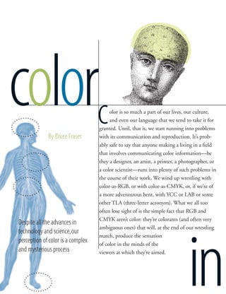
  • 1. 42 Adobe Magazine November 1996 olor is so much a part of our lives, our culture, and even our language that we tend to take it for granted. Until, that is, we start running into problems with its communication and reproduction. It’s prob- ably safe to say that anyone making a living in a field that involves communicating color information—be they a designer, an artist, a printer, a photographer, or a color scientist—runs into plenty of such problems in the course of their work. We wind up wrestling with color-as-RGB, or with color-as-CMYK, or, if we’re of a more adventurous bent, with YCC or LAB or some other TLA (three-letter acronym). What we all too often lose sight of is the simple fact that RGB and CMYK aren’t color: they’re colorants (and often very ambiguous ones) that will, at the end of our wrestling match, produce the sensation of color in the minds of the viewers at which they’re aimed. color in cBy Bruce Fraser Despite all the advances in technology and science,our perception of color is a complex and mysterious process
  • 2. 43Adobe Magazine November 1996 With the growing trend toward managed color and measured color, one might think that color- matching problems are merely due to shortcomings in current technology, and that they’ll soon be a thing of the past. But while colorimetry, spectrophotometry, process control, and all the other tools at our disposal can help make our color manufacturing processes more controllable and more predictable, it’s important to recognize that our measuring instruments and our computers deal with color at one remove. In fact, it could be argued that they don’t deal with color at all. What is color? It’s a sensation—like hunger or fa- tigue—that exists only in our minds. Like hunger and fatigue, it’s caused by external factors that we can mea- sure and quantify, but measuring those external factors is no more measuring color than counting calorie in- take tells us how hungry we are, or measuring exercise tells us how fatigued. Color is our response to certain wavelengths of electromagnetic energy that make up the visible spectrum of light, and while we can mea- sure quite precisely the stimuli that cause us to per- ceive color—the wavelengths of light—our response to those wavelengths is affected by a whole host of fac- tors that we cannot. Physiology, psychology, culture, and even the language we speak all influence our color perception in subtle ways that resist quantification. The discussion that follows isn’t designed to turn de- signers into color scientists; while some of it is techni- cal in nature, it’s intended to entertain, to inform, to provoke thoughts, and—no pun intended—to illumi- nate. For anyone working with color, it also has prac- tical implications that go beyond simply explaining why things sometimes go horribly wrong. First, we’ll look at the objective aspects of color—the things we can measure and quantify—and then we’ll turn to the ways in which objective models of color fail to match our experience. Taking light’s measure Light is a form of electromagnetic energy, a sibling of X-rays and radio waves. Our eyes are sensitive to a narrow slice of the electromagnetic spectrum, and color is our response to being stimulated by energy at those wavelengths. If color can be said to exist outside our heads, it’s as a property of light. The light that’s transmitted through or reflected from the objects in our world is the part of color that we can measure. We can describe light in terms of its wavelength; the unit we use is the nanometer (nm), which is one- millionth of a meter. Visible light is that part of the electromagnetic spectrum whose wavelengths range from approximately  nm to about  nm. Im- mediately below this range lies ultraviolet radiation, while immediately above it lies infrared radiation, or heat. The hue we think of as blue lies below about  nm, green is approximately between  and  nm, yellow is between  and  nm, orange is be- tween  and  nm, and red lies at wavelengths longer than  nm. Purple is the one common hue that isn’t found in the visible spectrum—it’s formed by mixing red and blue light from the two extremes of the spectrum. But light doesn’t exist as a single wavelength— at least, not outside the physics laboratory. Sir Isaac Newton’s OPTICKS: or A Treatise of the Reflections, Refractions, Inflections & Colours of Light (London, ) isn’t exactly an easy read, but it’s amazing to see how many of the basic principles of color were first uncovered by his genius. He showed that when a beam of daylight is passed through a prism, the white light is dispersed into a spectrum: white light, therefore, is normally made up of all the visible wave- lengths. Newton went further, and passed the spec- trum produced by the prism through a narrow slit into a second prism, thereby isolating a region of the spectrum. He found that there was no further dispersion, and the color did not change. He had isolated part of the spectrum and confirmed that it didn’t contain any of the other colors. He also re- versed the process, and passed the dispersed spectrum through a prism to reconstitute white light. The be- havior of prisms was well known before Newton’s time, but it had been assumed that the prism some- how added color to the light; Newton’s discovery was mind
  • 3. 44 Adobe Magazine November 1996 colorinthat the colors were actually present in white light all along. If we look a little closer, we find that “white light” is itself something of an abstraction. The light from a northern sky— sometimes called “painter’s light”—is quite a bit bluer than direct sunlight, which is in turn bluer than the light from an incandes- cent light bulb. These light sources differ in the relative intensities of the different wavelengths. We can characterize the makeup of a light source by plotting the relative amount of energy at each wavelength: the resulting graph is called a spectral power distri- bution curve (see Figure ). How light interacts with objects Even though we can talk about light having a certain color, the light itself isn’t colored. Rather, it’s the way the light interacts with objects that causes the stimulus that provokes our sensation of color. As Newton put it, “For the Rays to speak properly are not coloured. In them there is nothing else than a certain Power and Disposition to stir up a Sensation of this or that Colour.” When light strikes an object, one or more of these things can happen: the light can be transmitted through the object, absorbed by it, or re- flected by it. When the light is transmitted through the object, we say that the object is transparent. In a colorless object, all the light is transmitted except for a small amount that is reflected at its surface. (That’s why we can see transparent objects like glass or water—if all the light were transmitted they’d be invisible.) This kind of reflection happens whenever there’s a change in the refractive index of the material through which light is passing. Re- fractive index, which is sometimes thought of as an indication of trans- parency, is really a measure of how much light slows down as it passes through the material, relative to the speed of light in a vacuum. When- ever light encounters a change in refractive index, some light gets reflected, and the direction of the transmitted light beam changes. When you put one end of a stick into water, it appears to bend; but it isn’t the stick that’s bending, just the light that allows us to see the stick. Refractive index is itself something of an abstraction, because it has a different effect on each wavelength of light: short waves slow down more than long ones, which is why a prism splits white light into a spectrum. This also explains why the sun seems to turn red at dawn and sunset— the shorter blue and green wave- lengths get de- flected more than the longer red ones. Although we know the theoretical times of sunrise and sunset exactly, we can’t actually predict exactly when an observer will see the sun appear to rise or set, because what the observer actually sees are the longer red wavelengths emitted by the sun, and the amount by which they’re bent depends on the atmos- pheric conditions. Light can also be absorbed by an object. If the material absorbs part of the light and transmits the rest, it appears colored but still transparent. If all the light is absorbed, the material appears black and opaque. Some of the light energy that’s absorbed is usually converted to heat: black objects get hotter than white ones when exposed to intense light energy because they absorb more light. Lastly, light can be reflected by an object. A glossy surface will produce specular reflection, where the incoming or incident beam and the outgoing or reflected beam are at equal angles rela- tive to the surface. Mirrors are specu- lar reflectors. But when we’re dealing with the scale of light wavelengths, perfectly smooth surfaces are rare: the irregularities in the surface of the fin- est astronomical telescope mirrors are around a tenth of the wavelength. Most surfaces are much more ir- regular, and hence they scatter light in many different directions. Scattered light is termed diffuse reflection. If some light is scattered and some is transmitted, the object appears trans- lucent; if all the light that strikes an object is either scattered or absorbed, the object appears opaque. Spectral behavior and color Almost all objects exhibit a mixture of all the aforementioned behaviors with regard to light: they absorb some wavelengths and reflect or scatter oth- ers. The color appearance of the ob- ject depends on the degree to which different wavelengths are absorbed or scattered. An object that scatters all wavelengths equally appears white or gray, depending on the accompanying amount of light absorption. Light scattering by the molecules of the at- mosphere produces the blue color of the sky; scattering from larger par- ticles makes the clouds appear white. We can characterize the color be- havior of an object by plotting the These graphs, called “spectral power distribution curves,” show the relative amounts of energy at dif- ferent wavelengths that make up the light from an incandescent bulb (top) and daylight (bottom). While both might be called “white light,” their spectral make- up—and thus the way they’ll make colored objects look—varies considerably. 385• 425• 465• 505• 585• 705• 545• 625• 665• wavelength (nm) Figure 1 385• 425• 465• 505• 585• 705• 545• 625• 665• wavelength (nm)
  • 4. 45Adobe Magazine November 1996 mind relative amounts of energy that it reflects or transmits at each wavelength, to produce a spectral transmittance curve (for transparent materials) or spectral reflectance curve (for opaque materials). These curves describe the spectral behavior of an object just as the spectral power distribution curve describes a light source. The stimulus our eyes receive depends on both the spectral makeup of the light source and the spectral behavior of the object that light source illuminates. If we know both, we can predict the nature of the stimulus exactly: this, in a nutshell, is what we measure when we talk about measuring color. Before we turn to our response to light, we should look at one more phenomenon that has important implications for color re- production. If we know the spectral makeup of both the light source and the object, we can predict the color appearance; but by the same token, altering the spectral makeup of the light is sure to change the apparent color of the object—sometimes drastically. In other words, an object’s color appearance will vary depending on the makeup of the light that illuminates it. This is why it’s vitally important to use a known standard of lighting when you’re working on critical color matching; it also explains why, despite the best efforts of the prepress industry, the single most common reason dissatisfied users cite when they return clothing purchased from a mail-order catalog is that the color wasn’t what they expected. We can control the light source used in the production of the catalog, but we can’t control the light source under which the consumer views it. Another less obvious but more troubling phenomenon is that two objects that match in color under one light source may ap- pear quite different under another light source. This phenomenon is known as metamerism, and two objects that exhibit this behav- ior are termed a metameric pair. The packaging that exactly matches the distinctive color of a plastic action figure under stan- dard proofing lights may not match nearly as well under the very different lighting in the supermarket, and the paint that so exactly matches your fabric swatch in the paint store may surprise and disappoint when you use it in your home. Spectrophotometry can help us avoid these kinds of surprises, but it’s considerably more likely to be found in a prepress or manufacturing environ- ment than at your local paint store. The physiology and culture of color So once you know the spectral makeup of both your light source and your object, you can predict exactly how the object’s color will look, right? Unfortunately, no—not exactly. Knowing the spectral makeup of the stimulus that reaches an observer’s eyes allows us to make a good prediction of the color sensation it will produce, but it isn’t absolutely accurate because our human re- sponses to that stimulus vary from individual to individual, and because even a single individual’s response varies according to a host of other factors. We still have a great deal to learn about the mechanism by which we see color, but it’s clear that the eye is only a part of this mechanism: the signal from the eye is subject to a great deal of interpretation by the brain. We know that the retinas in our eyes—the areas on which the image is formed—contain two different kinds of photoreceptors, rods and cones. The rods are more prevalent at the edges of the image area; they are very sen- sitive to dim light and to movement, but they don’t contribute much to color vision. That’s the task of the cones, which are more prevalent in the fovea centralis, the area in the center of the retina. It’s generally accepted that our eyes contain three different kinds of cones, each sensitized to wavelengths that correspond approximately to red, green, and blue. This theory was first put forth by Thomas Young in , on the simple grounds that the eye couldn’t contain sensors for every possible wavelength, and was more thoroughly explored by Hermann von Helmholtz, who first described the red, green, and blue receptors in the eye and their spectral curves. A huge number of color matching experiments have been car- ried out by the Commission Internationale de l’Éclairage (CIE) and other bodies, which have allowed us to arrive at a good statis- The light that our eyes can see—the visible spectrum—is a relatively tiny slice of the electro- magnetic spectrum. Gamma rays, at the left side of the diagram, have a wavelength of smaller than 10 trillionths of a meter; at the other end, radio waves range in wavelength from less than a centimeter to tens, or even hundreds, of meters. Visible light’s wavelengths are measured in hundreds of nanometers (each wave is around a 10,000th of a meter long). ○ ○ ○ ○ ○ ○ ○ ○ ○ ○ ○ ○ ○ ○ ○ ○ ○ ○ ○ ○ ○ ○ ○ ○ ○ ○ ○ ○ ○ ○ ○ ○ ○ ○ ○ ○ ○ ○ ○ ○ ○ ○ ○ ○ ○ ○ ○ ○ ○ ○ ○ ○ ○ ○ ○ ○ ○ ○ ○ ○ ○ ○ ○ ○ ○ ○ ○ ○ ○ • 400 nm • 500 nm • 600 nm • 700 nm gamma rays x-rays ultraviolet rays visible spectrum infrared rays microwaves radio waves Figure 2
  • 5. 46 Adobe Magazine November 1996 colorin The way we see any color is profoundly affected by context—by the other colors around it. As this example demonstrates, a pure hue appears very different on a back- ground of its own hue and on a background of its complement. Not only hue is affected by context, but apparent lightness or darkness as well. These two blue squares are the same color, yet the one on the left appears lighter because it’s on a dark background. Color relationships can affect how large an ob- ject looks. Here the inner squares are the same size, but the inner orange square, which is brighter than its background, appears larger than the inner dark-green square. Figure 3
  • 6. 47Adobe Magazine November 1996 tical picture of the range of human color vision. Almost all these experiments involve the observer viewing a split screen through an aperture. One half of the screen is illuminated by a target color while the other half is illuminated by three primary-colored sources, typically red, green, and blue, over which the observer has control. The observer manipulates the primary colors until they match the target color. About  percent of men and fewer than half a percent of women have some degree of color blindness, caused either by the lack of some of the necessary cones or by some defect in the neural pathway from the eye to the brain. The majority of color- blindness sufferers have some difficulty distinguishing between reds and greens; total color blindness is very rare indeed. But color blindness aside, “normal” color vision varies considerably —not only from individual to individual, but also even for a single individual. One easily explicable physical factor that affects color sensitivity is the field of view. Since the color-sensitive cones are concentra- ted in the central area of the retina, we tend to see colors some- what more acutely when they’re displayed in a narrow field of view, about  degrees, than we do when they’re spread out over a larger area. The CIE was forced to take note of this when it developed the CIE family of perceptually based color spaces. CIE Lab is often thought of as a single color space, but it’s really a whole family of color spaces with different illuminants and, since , different observers. The original CIE XYZ  color space defined a Stan- dard Observer, but in  discrepancies in the blue-green area of the spectrum for angles of view wider than  degrees led them to define two Standard Observers, which became known as the Two-degree Observer and the Ten-degree Observer. Our color vision is also affected by fatigue, and by common drugs such as nicotine and caffeine, which reduce the amount of oxygen in the bloodstream. Emotional states may also have an effect on color vision. Phrases such as “seeing red,” “feeling blue,” “green with envy,” “black humor,” and “brown study” may con- tain more literal truth than one might think, since it’s clear that emotions have demonstrable physiological effects. All these physiological factors affect the signal that the eye sends to the brain. What our minds do with those signals is still another story. Perception isn’t a passive act. In many ways, we see what we expect to see, filtering out that which we deem extrane- ous and concentrating on the patterns that are familiar to us. This is as true with color as with anything else. Property rights Many attempts have been made over the years to provide a way of thinking about and discussing color relationships. The vast majority of these systems define color in terms of three proper- ties, which have various different names in the different systems. The fact that so many independent thinkers have come up with variations of the same system suggests that it models our innate color perception system—that our minds actually interpret the signals our eyes generate in terms of these three attributes. One of the most highly developed and widely used systems was the one developed by Albert Munsell, who codified these three basic attributes of color as hue, value, and chroma. Hue is the property that distinguishes a pure color from other pure colors, the property that gives a color its name. It’s the prop- erty that’s conferred by wavelength. Value is the property of a color that makes it appear to contain more or less light, from black at one extreme to white at the other. Note that it’s based on appearance, not on actual measured light energy: yellow has a higher value than blue, even if the samples of yellow and blue contain exactly the same amount of energy. Chroma is the purity of a color: neutral gray has the lowest possible chroma, while pure hues have the highest possible chroma. One reason Munsell’s system is noteworthy is that it separates the achromatic component, value, from the clearly colorful hue and chroma. This allows us to represent colors two-dimension- ally, as a color wheel. Newton transformed the spectrum into a circle centuries before Munsell, but Munsell’s color wheel, unlike Newton’s, is perceptually uniform—that is, the distance between two points in the wheel always corresponds to the same amount of perceived difference between colors. Other color wheels, such as the one found in Apple’s hue-saturation-brightness Color Picker, aren’t perceptually uniform, but they show the same relationships among colors. The combination of yellow and black has been shown to provide the highest contrast under varying lighting conditions. That’s why it was chosen for international warning signs. It’s also probably no coincidence that sting- ing insects like bees and wasps have that color scheme: stinging is their last resort, since it kills them. They want to be noticed. Figure 4 mind
  • 7. 48 Adobe Magazine November 1996 colorinmindLike anything else, color is subject to fads —how many Harvest Gold or Avocado appli- ances are manufactured today?—but the color wheel reveals some basic color relationships at a glance. For in- stance, complementary colors lie opposite one another. Many simple but effective color schemes use the softer of the two colors as the dominant color and the brighter one as an accent. Colors that lie one-third of the way around the wheel from one another are contrasting colors: some combinations clash violently, where others can be quite harmonious. Hues that lie close together on the wheel are called analogous colors. Colors that lie along a line from the center to the circumference share the same hue, and differ only in saturation or purity: brick red and tomato red share hue, but tomato red lies closer to the wheel’s edge. These relationships are innate, not dictated by fashion or cul- ture, and they give rise to some interesting optical illusions (see the illustrations in Figure , on page , and Figure  at right). Designers can and do exploit these illusions in many different ways. For example, light-colored type on a dark-colored back- ground always seems to jump off the page toward the reader, while dark-colored type on a light background tends to recede into the page. Even the language we speak affects our perception of color. Newton divided the rainbow into seven color regions—red, or- ange, yellow, green, blue, indigo, and violet—but he took pains to point out that the spectrum is in fact continuous, not bunched into bands, something more casual observers often overlook. The Russian language divides the rainbow into eight colors rather than seven, distinguishing between those pale blues that tend toward cyan and the darker ones that head toward indigo. Some rain-forest languages don’t contain words for the concept of hue at all: they describe objects in terms of their greenness or brownness, their lightness or darkness, and their shininess or matteness, since those are the characteristics of the environment in which they’re found. Learning to see color We should learn several lessons from all this. The most important is that it’s dangerous if not futile to pick colors in isolation: we see colors in context, and that context includes the surrounding colors. If you use a brightly colored Hawaiian-shirt desktop pat- tern on your monitor, it will almost certainly skew the way you see colors. So, for that matter, will wearing a Hawaiian shirt! Lighting is critical, too. If your lighting changes constantly, so will your color perception. Prepress houses use light booths with a standard color “temperature”: this is useful in keeping color consistent, but it’s important for designers to bear in mind that the ultimate consumers of their work probably won’t have proofing-standard lighting. It’s usually a good idea to look at roughs under a variety of lighting conditions. If you can antici- pate the lighting conditions under which your work will be seen, design for them—a restaurant usually has very different lighting from an office, for example. Color measurement can help us keep color consistent through- out the production chain, but its limitations are important to remember. We can measure colors only in isolation from one another; we see color only in context. I’ve seen many a project in which the color science was “right,” but the outcome looked wrong. When we design with color, we can use color science and color measurement to remove what uncertainties we can. But in the end, we must use our eyes to decide what looks good—while remembering the tricks they can play.  Bruce Fraser is a San Francisco–based writer specializing in color- publishing issues. He is a contributing editor for MacWEEK and MacUser, and is coauthor of Real World Photoshop , from Peachpit Press (reviewed on page 37). The light-colored dot appears to “pop out” of the dark background, while the dark dot on light seems to sit further back than its surrounding field. Both effects can be ex- ploited when placing colored type on a colored background. Figure 5