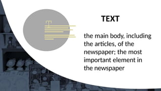
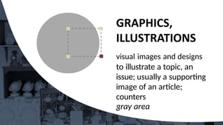
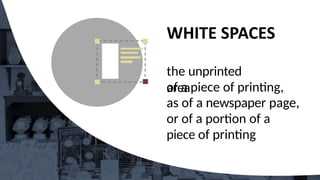
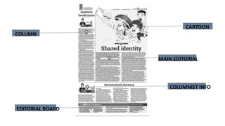
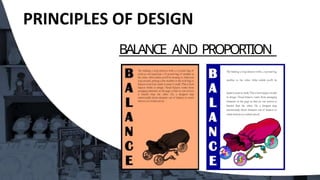
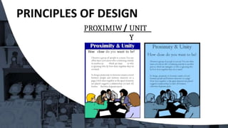
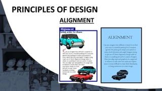
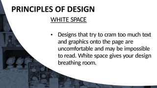
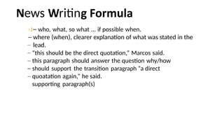
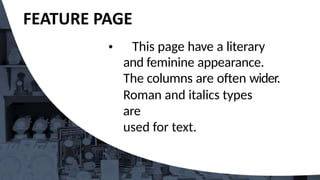
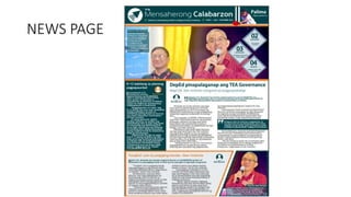
Collaborative desktop publishing is a group
category
wherein a team composed of seven members,
DepEd Memorandum No. 25, s. 2024 is tasked with
creating a four-page newspaper that includes;
news, editorial, features, and sports pages.
COLLABORATIVE
I and skil of
each
This category tests the
flexi
individual from the
team
nder time
pressure.
i ics the real situation happening
dai
ications
ewspaper
the
business.
COLLABORATIVE
Each team is allowed to bring only the following:
*two digital/DSLR cameras
•one printer with scanner
•one card reader
•one blank flash drive
•extension cords
•a maximum of four laptops installed with either
PAGEMAKER or IN DESIGN and Photoshop (for the
secondary level) and Microsoft Publisher (for the
elementary level) for the layout of the group's final output
•A4 size bond paper
M
A
S
T
H
E
A
D N E W S PA P E R
Details of the publisher, place of publication, and information about
the newspaper.
FLAG
The printed title (i.e., name and logo) of a newspaper at the top of
the
front page.
FOLD
Name used to literally mean the line caused by where a
printed newspaper was folded over.
WHITE SPACE
Areas of a page free of any type or objects.
HEADLINE
Brief description of the
story.
BANNER
A headline stretching across the top of a page
PHOTOGRAPS
The main illustration of the news.
CUTLINES
Tells the reader what is going on in the photo, this is also called as
caption.
NEWSPAPER
SUBHEAD An additional summary printed beneath the headline in smaller, but st//I
in large font as a way of both clarifying the headline and as a way of
leading the reader into the story.
BYLINE Lists the name of the writer or organization that prepared the
story.
SIDEBARS Information related to the story that is significant on its own, pertinent to
the reader and fills out the whole news package.
JUMPLINE Used to continue a story on another
page.
PULLQUOTES Interesting quotes from the story that can be understood without reading
the story, but makes the reoder want to.
MUGSHOTS Tightly cropped photos of a person‘s head that are used to identify the
main players in the ort"c/e.
BREAKOUT BOXES Similar to sidebars but contain information from the story that calls
the reader to action.
INFOGRAPHICS is a type of picture that blends data with design, helping individuals
and organizations concisely communicate messages to their audience.
SXYBOX Teasers that run above the flag on page one.
PACKAGE A bundle of related stories and photos.
EWSPA
at is outin
Newspaper layouting
essentially combines journalism
with graphic arts. It is the
process “designing” or
putting together the various
newspaper elements in an
orderly manner.
Any header for an
article; may run up to
three lines deep and
contain between five to
nine words.
They should not be
separated from the
start
of the story.
the main body, including
the articles, of the
newspaper; the most
important element in
the newspaper
visual images and designs
to illustrate a topic, an
issue; usually a supporting
image of an article;
counters
gray area
a graphic representation
or description
of an actual event
mainiy
by photography
the unprinted
area
of a piece of printing,
as of a newspaper page,
or of a portion of a
piece of printing
TOURIST
BOOMS
ef Msubms
Nurtsts
MdseayBnts
I “
’ B h a r a t
term
eT¥z*¥c
* eriBxxtW^s
a
aaeaaie•t
'
,
-¥eza•d•ei
W•u•ee
•
fadsa
‹t
. maotiaa
@ •e
^ •'•s•^
••
”
ines
in
es
i
ines in
esi • Have a focal point.
• Design with a purpose.
• Keep it simple.
• Maintain design, unity and
consistency.
• Design should have contrast
and balance.
Unity
Consistency
• Balance
• Proximity
• Alignment
• Repetitio
n
• Contrast
• Emphasis
• White Space
• Movement
BALANCE AND
PROPORTION
Visual balance comes
from arranging elements
on the page so that no
section is heavier than
the other.
BALANCE AND PROPORTION
PROXIMITY
UNITY
In design, proximity or closeness
creates a bond between people and
between elements on a page.
Use consistent external and internal
margins
• Other graphics can create unity, even
simple rules (lines)
PROXIMIW UNIT
Y
How close do you want to be?
PRINCIPLES OF
DESIGN ALIGNMENT
• Alignment brings order to chaos, in a
parking lot and on a piece of paper. How
you align type and graphics on a page and
in relation to each other can make your
layout easier or more difficult to read,
foster familiarity, or bring excitement to
a stale design.
REPETITION CONSISTENCY
Repeating design elements and
consistent use of type and
graphics styles within a document
shows a reader where to go and
helps them navigate your designs
and layouts safely.
REPETITION CONSISTENCY
& consistency
L¥"JBf'tgtdepCEldL¥tg
iT't
ck« E » g u gehuo of
gmphm s8 kc w6tktEl
1
d o o r s ches
CONTRAST
In design, the use of opposites
in size, shape and weight—big
and small elements, black and
white text, squares and circles,
can ali create contrast in design.
PRINCIPLES OF DESIGN
EMPHASIS
• In order to achieve emphasis, news should
be displayed according to importance. The
news value of every story must determine
on what page it should find print, its
position on the page, and the style , and
size of its headline.
WHITE SPACE
Designs that try to cram too much text
and graphics onto the page are
uncomfortable and may be impossible
to read. White space gives your design
breathing room.
WHITE SPACE
ews ritin
‹J who, what, so what ... if possible when.
where (when), clearer explanation of what was stated in the
lead.
“this should be the direct quotation,” Marcos said.
this paragraph should answer the question why/how
should support the transition paragraph “a direct
quoatation again,” he said.
supporting paragraph(s)
Makeup of Inside
Pages: While it is true that the front page of
the newspaper is it shows window,
attractive makeup should not be
confined to this page alone. The
inside and back pages should be
given the same tender care,
treatment and attention by the layout
artist.
EDITORIAL PAGE
• This page should have a distinctive, dignified,
and formal appearance. The masthead or
editorial box which should be relatively small,
may be anchored in any corner as done in
streamlined newspapers.
• Traditionally, the editorials appear in the first
two columns. They are of larger types. Heads or
title of editorials, just like the headline of news
stories, should be of the masculine appearance,
ot the italic or script type.
ito riti
State the problem
newspeg) Position (stand
Evidences (claims, facts...
strong to strongest)
conclusion
solutions
This page have a literary
and feminine appearance.
The columns are often wider.
Roman and italics types
are
used for text.
•This page has a bolder but
more lively appearance than the
other pages. Its makeup should
suggest its content, action,
speed, and color. Large bold
heads and even streamers are
used.
orts ritin
ea
How + who won + who loss + score + what event + where +
when
Banking on sharp drops and lightning-quick
smashes, Lin Dac reigned supreme bombarding a
hapless Sony Dwi, 2-0 (21-11, 22-20), in the Proton-
BWF World Badminton Championship at Putra
Stadium in Bakit-Jalil, Kula Lumpur last August 19.
First impressions are important. An
attractive newsletter which
appears relevant and
uncomplicated will encourage
people to read further.
Don't make the newsletter overly
complex.
Design your newsletter before
you
begin formatting.
Take into account your newsletter's
graphic content in relation to the
textual content.
Decide how many columns your
newsletter will be. Try a
simple, three-column
newsletter.
Add couple of graphic images
to
break up the text.
Blank empty template is the
easiest
way to make a newsletter
Using a columns layout, devote one
column to photographs, diagrams
and short topics.
Check the quality of your photos.
Use color with moderation. Color
can be used for your
school/company logo, your
newsletter title, or as background.
Use a maximum of 3 colors for
design.
Write article/text concisely and in the
active voice. Edit for clarity,
conciseness, jargon, length and
accuracy.
Remember to quote your sources.
Article titles should be short and
eye- catching. The introduction to an
article should ideally answer the
following three questions about the
article topic: Who? What? and
Where?
• The lead article should be
devoted to the most recent news
and present a summary of pertinent
points, rather than a detailed report.
NEWSLETTER
PRODUCTION
• Use different typefaces for the
headlines and the text.
• Choose a common typeface for
all of your headlines and limit
headlines to two sizes. Use one size
for headlines of primary importance
and another, smaller, size for
headlines of lesser importance.
Subheads break up a long text
and make it easier to read. Ideally,
subheads should have the same
typeface used in the headlines, but
smaller.
Columns or boxes are ideal for
short
topics.
NEWSLETTER
PRODUCTION
• Working with other writers helps
increase the variety of newsletter
content.
• Newsletter editors should provide
clear directions to writers about
each article's topic, structure, length
and deadline, as well as the main
points that the text will address.
Include writers' by-lines, since this
can help increase future
contributions and also gain credibility
for your publication.
Single space for line spacing
and
between paragraphs.
Font size should be consistent from
front to back pages for title and
text. Left alignment for text is best.
Graphics or photos should be
facing
inside or into the page.
Larger graphics/photos signifies as
the most important.
Use drop caps in the upper part
only.
Use the rule of thirds.
Place your masthead in a
visible
place.
Don't forget to number and
date each issue. ;
Consider an acknowledgment box
that lists everyone who
contributed to an issue;
Your output is a four-page A4
newsletter. 1 Page each for News,
Editorial, Feature and Sports
Articles will be school based
activities.
OUTPUT
NEWS Page
three news articles
EDITORIAL Page
Editorial proper 2
columns Editorial
cartoon
FEATURES Page
Three (3) articles
Personality Sketch
of your layout
artist
Topic from Press Conference
SPORTS Page
Three (3) articles
Coverage Sports
editorial Sports
Analysis
Generals dinakip ang
Warri
R
T
S P
A
G
Thaibnd,wa
u
FACI
P
A
G
LA
Y
O
TEA: Panlaban
sa Xorapsyon
Wa.la sa
Papel
Sources:
Designing your School Paper by Aris
Solis
Page Design Fundamentals
Collaborative Publishing
Angelito G.
Belmonte
Raymund S. Bermudez
Campus Journalism by Ceciliano —Jose B. Cruz
Layout and Page Design Kim Navaja
Campus Journalism in the New Generation by Gelly Elegio
Alkuino Campus Journalism Fundamentals by Alex M.
Magsino, et.aI Collaborative Publishing by Irlo L. Dumo

Collaborative desktop publishing power point

  • 1.
    Collaborative desktop publishingis a group category wherein a team composed of seven members, DepEd Memorandum No. 25, s. 2024 is tasked with creating a four-page newspaper that includes; news, editorial, features, and sports pages. COLLABORATIVE
  • 2.
    I and skilof each This category tests the flexi individual from the team nder time pressure. i ics the real situation happening dai ications ewspaper the business. COLLABORATIVE
  • 3.
    Each team isallowed to bring only the following: *two digital/DSLR cameras •one printer with scanner •one card reader •one blank flash drive •extension cords •a maximum of four laptops installed with either PAGEMAKER or IN DESIGN and Photoshop (for the secondary level) and Microsoft Publisher (for the elementary level) for the layout of the group's final output •A4 size bond paper
  • 5.
    M A S T H E A D N EW S PA P E R Details of the publisher, place of publication, and information about the newspaper. FLAG The printed title (i.e., name and logo) of a newspaper at the top of the front page. FOLD Name used to literally mean the line caused by where a printed newspaper was folded over. WHITE SPACE Areas of a page free of any type or objects.
  • 6.
    HEADLINE Brief description ofthe story. BANNER A headline stretching across the top of a page PHOTOGRAPS The main illustration of the news. CUTLINES Tells the reader what is going on in the photo, this is also called as caption. NEWSPAPER
  • 7.
    SUBHEAD An additionalsummary printed beneath the headline in smaller, but st//I in large font as a way of both clarifying the headline and as a way of leading the reader into the story. BYLINE Lists the name of the writer or organization that prepared the story. SIDEBARS Information related to the story that is significant on its own, pertinent to the reader and fills out the whole news package. JUMPLINE Used to continue a story on another page. PULLQUOTES Interesting quotes from the story that can be understood without reading the story, but makes the reoder want to. MUGSHOTS Tightly cropped photos of a person‘s head that are used to identify the main players in the ort"c/e. BREAKOUT BOXES Similar to sidebars but contain information from the story that calls the reader to action. INFOGRAPHICS is a type of picture that blends data with design, helping individuals and organizations concisely communicate messages to their audience. SXYBOX Teasers that run above the flag on page one. PACKAGE A bundle of related stories and photos. EWSPA
  • 8.
    at is outin Newspaperlayouting essentially combines journalism with graphic arts. It is the process “designing” or putting together the various newspaper elements in an orderly manner.
  • 10.
    Any header foran article; may run up to three lines deep and contain between five to nine words. They should not be separated from the start of the story.
  • 11.
    the main body,including the articles, of the newspaper; the most important element in the newspaper
  • 12.
    visual images anddesigns to illustrate a topic, an issue; usually a supporting image of an article; counters gray area
  • 13.
    a graphic representation ordescription of an actual event mainiy by photography
  • 14.
    the unprinted area of apiece of printing, as of a newspaper page, or of a portion of a piece of printing
  • 15.
    TOURIST BOOMS ef Msubms Nurtsts MdseayBnts I “ ’B h a r a t term eT¥z*¥c * eriBxxtW^s a aaeaaie•t ' , -¥eza•d•ei W•u•ee • fadsa ‹t . maotiaa @ •e ^ •'•s•^ •• ”
  • 17.
  • 18.
    ines in esi •Have a focal point. • Design with a purpose. • Keep it simple. • Maintain design, unity and consistency. • Design should have contrast and balance.
  • 20.
    Unity Consistency • Balance • Proximity •Alignment • Repetitio n • Contrast • Emphasis • White Space • Movement
  • 21.
    BALANCE AND PROPORTION Visual balancecomes from arranging elements on the page so that no section is heavier than the other.
  • 22.
  • 23.
    PROXIMITY UNITY In design, proximityor closeness creates a bond between people and between elements on a page. Use consistent external and internal margins • Other graphics can create unity, even simple rules (lines)
  • 24.
    PROXIMIW UNIT Y How closedo you want to be?
  • 25.
    PRINCIPLES OF DESIGN ALIGNMENT •Alignment brings order to chaos, in a parking lot and on a piece of paper. How you align type and graphics on a page and in relation to each other can make your layout easier or more difficult to read, foster familiarity, or bring excitement to a stale design.
  • 27.
    REPETITION CONSISTENCY Repeating designelements and consistent use of type and graphics styles within a document shows a reader where to go and helps them navigate your designs and layouts safely.
  • 28.
    REPETITION CONSISTENCY & consistency L¥"JBf'tgtdepCEldL¥tg iT't ck«E » g u gehuo of gmphm s8 kc w6tktEl 1 d o o r s ches
  • 29.
    CONTRAST In design, theuse of opposites in size, shape and weight—big and small elements, black and white text, squares and circles, can ali create contrast in design.
  • 31.
    PRINCIPLES OF DESIGN EMPHASIS •In order to achieve emphasis, news should be displayed according to importance. The news value of every story must determine on what page it should find print, its position on the page, and the style , and size of its headline.
  • 32.
    WHITE SPACE Designs thattry to cram too much text and graphics onto the page are uncomfortable and may be impossible to read. White space gives your design breathing room.
  • 33.
  • 35.
    ews ritin ‹J who,what, so what ... if possible when. where (when), clearer explanation of what was stated in the lead. “this should be the direct quotation,” Marcos said. this paragraph should answer the question why/how should support the transition paragraph “a direct quoatation again,” he said. supporting paragraph(s)
  • 36.
    Makeup of Inside Pages:While it is true that the front page of the newspaper is it shows window, attractive makeup should not be confined to this page alone. The inside and back pages should be given the same tender care, treatment and attention by the layout artist.
  • 37.
    EDITORIAL PAGE • Thispage should have a distinctive, dignified, and formal appearance. The masthead or editorial box which should be relatively small, may be anchored in any corner as done in streamlined newspapers. • Traditionally, the editorials appear in the first two columns. They are of larger types. Heads or title of editorials, just like the headline of news stories, should be of the masculine appearance, ot the italic or script type.
  • 38.
    ito riti State theproblem newspeg) Position (stand Evidences (claims, facts... strong to strongest) conclusion solutions
  • 39.
    This page havea literary and feminine appearance. The columns are often wider. Roman and italics types are used for text.
  • 40.
    •This page hasa bolder but more lively appearance than the other pages. Its makeup should suggest its content, action, speed, and color. Large bold heads and even streamers are used.
  • 41.
    orts ritin ea How +who won + who loss + score + what event + where + when Banking on sharp drops and lightning-quick smashes, Lin Dac reigned supreme bombarding a hapless Sony Dwi, 2-0 (21-11, 22-20), in the Proton- BWF World Badminton Championship at Putra Stadium in Bakit-Jalil, Kula Lumpur last August 19.
  • 43.
    First impressions areimportant. An attractive newsletter which appears relevant and uncomplicated will encourage people to read further. Don't make the newsletter overly complex.
  • 44.
    Design your newsletterbefore you begin formatting. Take into account your newsletter's graphic content in relation to the textual content.
  • 45.
    Decide how manycolumns your newsletter will be. Try a simple, three-column newsletter. Add couple of graphic images to break up the text.
  • 46.
    Blank empty templateis the easiest way to make a newsletter Using a columns layout, devote one column to photographs, diagrams and short topics. Check the quality of your photos.
  • 47.
    Use color withmoderation. Color can be used for your school/company logo, your newsletter title, or as background. Use a maximum of 3 colors for design.
  • 48.
    Write article/text conciselyand in the active voice. Edit for clarity, conciseness, jargon, length and accuracy. Remember to quote your sources.
  • 49.
    Article titles shouldbe short and eye- catching. The introduction to an article should ideally answer the following three questions about the article topic: Who? What? and Where?
  • 50.
    • The leadarticle should be devoted to the most recent news and present a summary of pertinent points, rather than a detailed report.
  • 51.
    NEWSLETTER PRODUCTION • Use differenttypefaces for the headlines and the text. • Choose a common typeface for all of your headlines and limit headlines to two sizes. Use one size for headlines of primary importance and another, smaller, size for headlines of lesser importance.
  • 52.
    Subheads break upa long text and make it easier to read. Ideally, subheads should have the same typeface used in the headlines, but smaller. Columns or boxes are ideal for short topics.
  • 53.
    NEWSLETTER PRODUCTION • Working withother writers helps increase the variety of newsletter content. • Newsletter editors should provide clear directions to writers about each article's topic, structure, length and deadline, as well as the main points that the text will address.
  • 54.
    Include writers' by-lines,since this can help increase future contributions and also gain credibility for your publication.
  • 55.
    Single space forline spacing and between paragraphs. Font size should be consistent from front to back pages for title and text. Left alignment for text is best.
  • 56.
    Graphics or photosshould be facing inside or into the page. Larger graphics/photos signifies as the most important. Use drop caps in the upper part only. Use the rule of thirds.
  • 57.
    Place your mastheadin a visible place. Don't forget to number and date each issue. ; Consider an acknowledgment box that lists everyone who contributed to an issue;
  • 58.
    Your output isa four-page A4 newsletter. 1 Page each for News, Editorial, Feature and Sports Articles will be school based activities.
  • 59.
    OUTPUT NEWS Page three newsarticles EDITORIAL Page Editorial proper 2 columns Editorial cartoon FEATURES Page Three (3) articles Personality Sketch of your layout artist Topic from Press Conference Topic from Press Conference SPORTS Page Three (3) articles Coverage Sports editorial Sports Analysis Generals dinakip ang Warri
  • 63.
  • 64.
  • 65.
  • 66.
    Sources: Designing your SchoolPaper by Aris Solis Page Design Fundamentals Collaborative Publishing Angelito G. Belmonte Raymund S. Bermudez Campus Journalism by Ceciliano —Jose B. Cruz Layout and Page Design Kim Navaja Campus Journalism in the New Generation by Gelly Elegio Alkuino Campus Journalism Fundamentals by Alex M. Magsino, et.aI Collaborative Publishing by Irlo L. Dumo