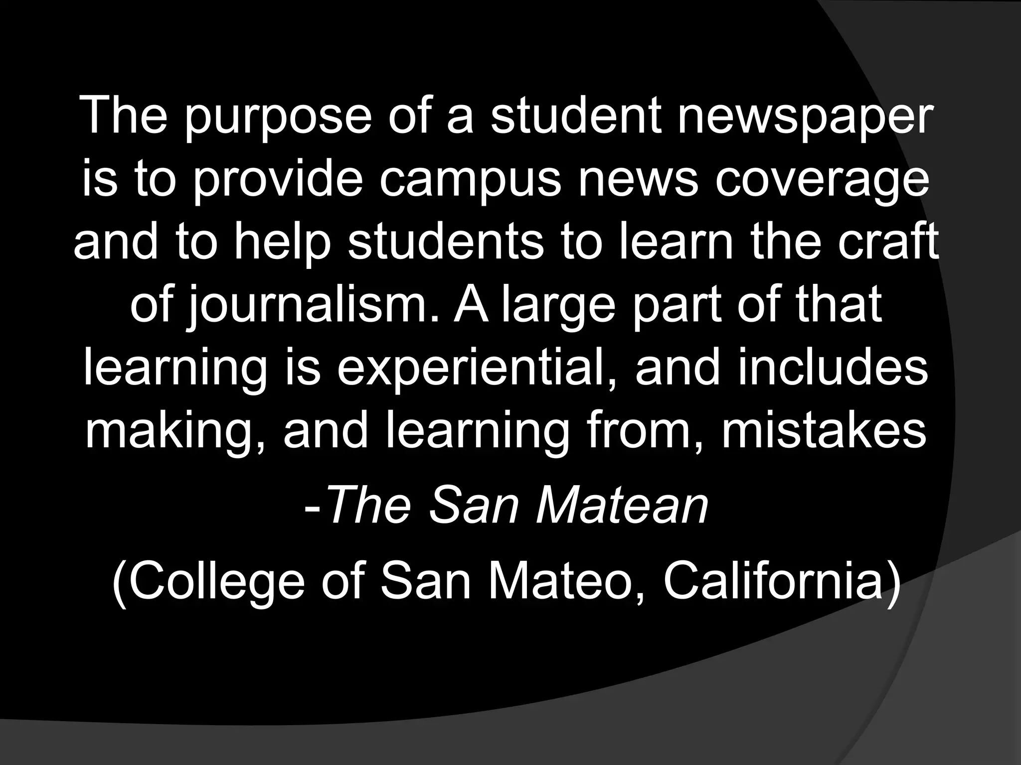
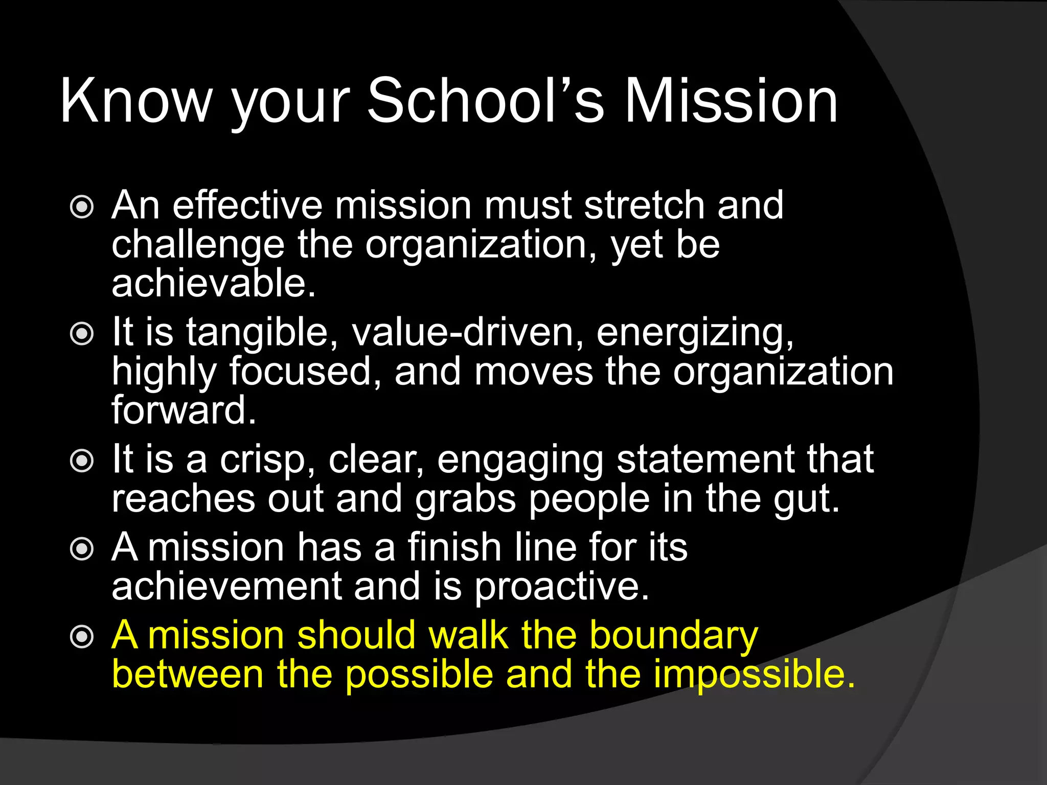
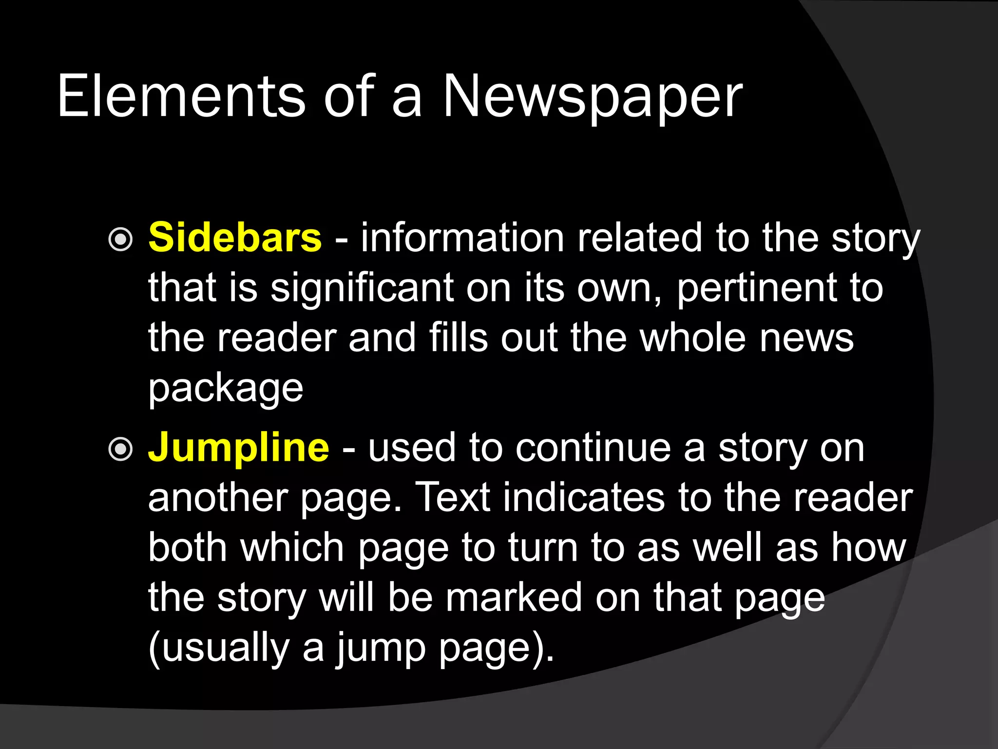
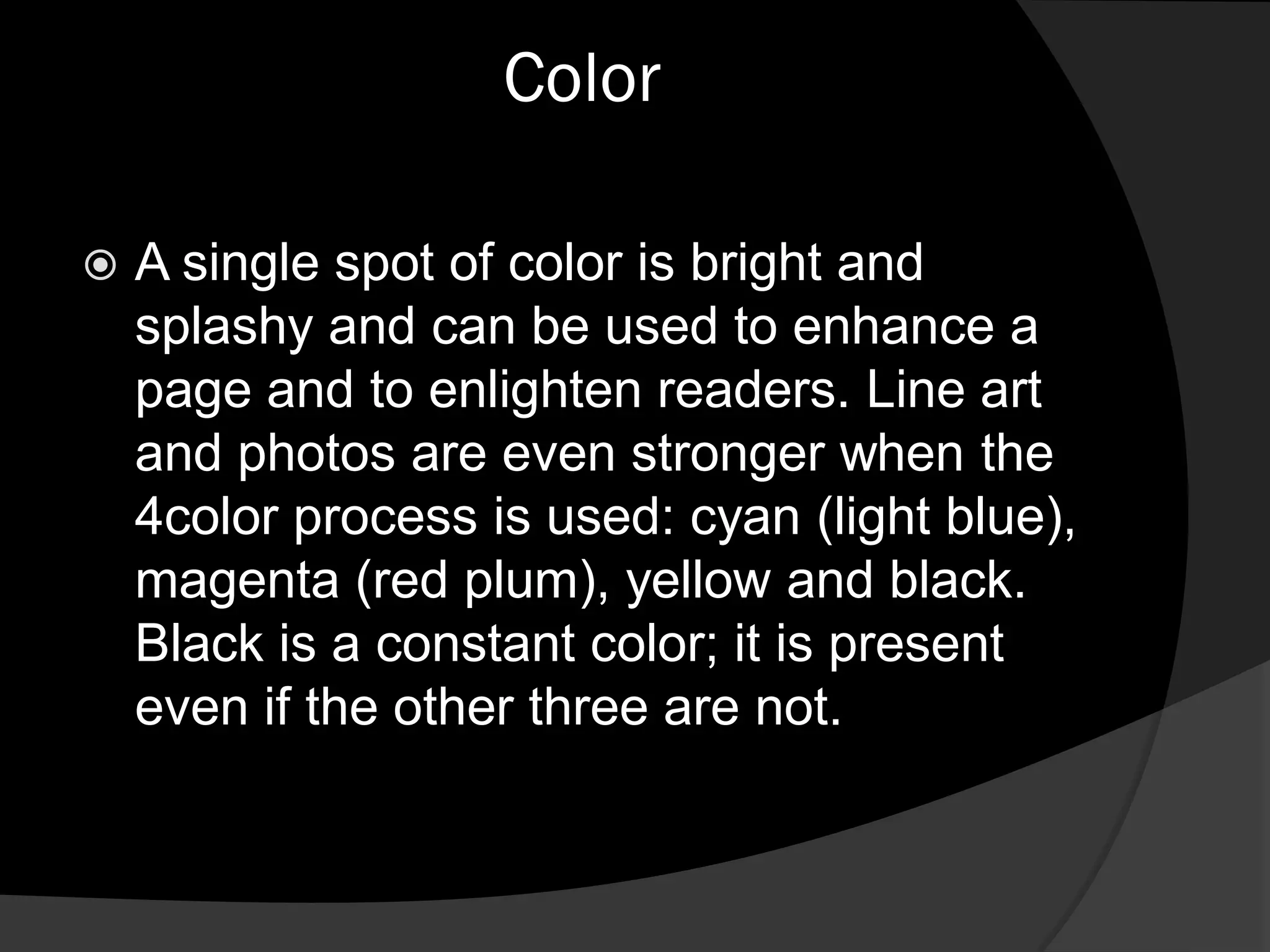
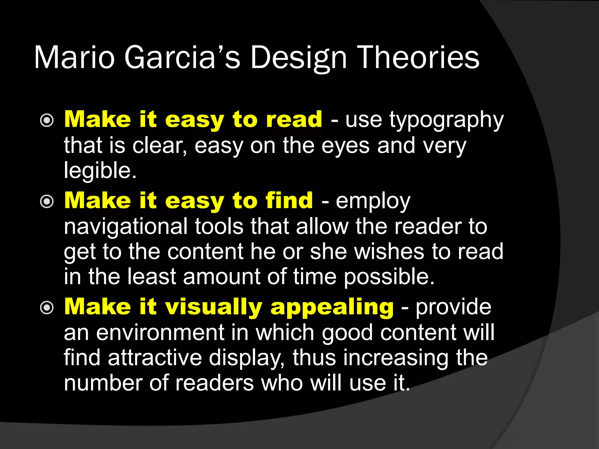
The document provides guidance on starting and operating a student newspaper. It discusses understanding the school's mission and values, the newspaper's purpose and target audience, conducting a SWOT analysis, determining budget and resources needed, and following a calendar of events. Tips are provided on design elements like headlines, photos, and infographics. The importance of knowing the school, audience, and purpose is emphasized for an effective student newspaper.
The document provides an overview of campus journalism, including definitions, functions, and best practices. It discusses what journalism is, the scope and functions of campus publications, and the roles and responsibilities of student journalists. It also outlines the key elements of writing news stories, editing, layout and design, and overall management of a campus publication. The goal is to inform students about the field of campus journalism and what it takes to produce an effective student newspaper.
This document contains examples of magazine covers and pages that demonstrate common forms and conventions used in magazine design. Key conventions discussed include mastheads, coverlines, images of artists/celebrities, consistent color schemes, and layout techniques to guide the reader's eye. Different designs are analyzed in terms of targeting specific social groups and magazines' intended audiences.
The document describes a student's plans to design the front cover and contents page for a school magazine. The student intends to plan ideas according to design appearance and finalize a professional-looking product. The magazine will be friendly for all ages and incorporate the school colors and logo. It will include information on upcoming events, competitions, student achievements and topics of interest to both students and parents. The student provides sketches of their planned front cover and contents page layouts. They include a student photo, relevant images and text with consideration of typography, color scheme and technical capabilities.
The document is a student's work on designing a school magazine. It includes research conducted on magazines, analysis of example magazines, and the design process. The student outlines their target audience, proposed title, main cover image of a student, additional images of the school and events, and typography considerations. Photoshop is used to design the magazine cover and contents page, with the student demonstrating learning how to use various tools to edit and combine images. The process involved research, analysis, a proposal, draft design, and reflection on skills learned in using the software.
This document outlines the process taken to design a school magazine cover and content page. It includes research on magazine design conventions, primary research through a student survey, rough planning, and a photoshoot. Secondary research covered terminology like mastheads, cover lines, and puffs. The survey informed design choices like appealing to upper secondary students and featuring school life articles. A flat plan organized the layout before production in CAD.
The document discusses the process of creating a school magazine, including researching other magazines, surveying students, and producing a cover and index page in Photoshop. It provides details on elements of an effective magazine cover like the masthead, main image, strap line, teaser stories and typography. It also includes a student's school magazine proposal form, sketches of the cover and contents page, demand surveys, and explanations of how images were edited in Photoshop.
- The document describes a task to produce a cover and contents page for a school magazine. It involved researching existing school magazine designs, surveying students about desired content, and creating the cover and contents page using Photoshop.
- Details are provided about design elements of effective magazine covers, including using inviting images of students, attention-grabbing headlines, and clear identification of the target audience and price in the masthead.
- An example student proposal and preliminary sketches are shown for creating the school magazine cover and contents page in Photoshop, with consideration for the target audience, images, layout, and technical requirements.
As unit g321 research and planning workbook joshua dukeJoshuaDuke77
This document provides a summary of key magazine conventions and forms that are important for media research and planning. It discusses elements like the masthead, skyline, anchorage text, price and issue details, puffs, barcodes, and coverlines. It also examines how magazines can use, develop, or challenge conventions related to things like title placement, color schemes, straplines, and proportions. Additionally, it analyzes how magazines represent and appeal to different social groups based on attributes like age, gender, race, sexuality, education, occupation, and income. Finally, it briefly discusses magazine institutions and distribution technologies and processes.
Here are some notes on the process of creating the front cover and contents page for the school magazine:
- Took several photos around the school to have options for images to include. Wanted shots that reflected different aspects of school life.
- Selected a close-up photo of a student working individually at a computer for the front cover main image, as this aligned with the target audience of current students.
- Laid out the text in Photoshop, experimenting with font styles, sizes and colors to achieve a clean, easy-to-read design. Placed cover lines above and below the main image to draw the eye.
- Included the magazine title, issue details and school logo/mast
Here are some notes on the process of creating the front cover and contents page for the school magazine:
- Took several photos around the school to have options for images to include. Wanted shots that reflected different aspects of school life.
- Selected a close-up photo of a student working individually at a computer for the front cover main image, as this aligned with the target audience of current students.
- Laid out the text in Photoshop, experimenting with font styles, sizes and colors to achieve a clean, readable design while drawing attention to key elements like the title and cover lines.
- For the contents page, chose two additional photos that related to subheadings - one of a group study session
1. The document describes the features used in the student's magazine project that emulate real magazines, including cover lines, fonts, dates, barcodes, mastheads, limited images, and single-subject focus.
2. Details are provided about the contents page, including three images, color scheme continuity, editor's note, and text boxes.
3. For the double-page spread, features like varied font size, page numbers, column structure, and quote box are used to emulate real magazines.
The document summarizes the process of designing a magazine cover and contents page for a college publication. It describes the layout elements including a bold title, focal image of a smiling model, surrounding descriptive text, and barcode in the corner. It then discusses planning the inside contents page with headings, page numbers, and magazine logo. Finally, it reflects on using InDesign software to produce the pages and publishing the preliminary task online.
This project taught the student many valuable skills. They learned about teamwork, planning, research, communication and photography. A questionnaire was used to determine the target audience and their preferences. Based on the results, the magazine was designed to appeal to youth aged 15-19 with a focus on music. It will be distributed through both digital means like apps and a website, as well as print through a partnership. The student improved their skills in software like Photoshop and used various technologies throughout the process.
The document describes a school magazine project where students were tasked with creating a front cover and contents page for a school magazine. They conducted audience research to determine what content would appeal to students and parents. They analyzed existing school magazines to identify good and bad design elements. The student then sketches out their magazine cover which features a close-up photo of a student, the title "Priory Zone", and stories about upcoming school events and the head boy's blog. The contents page lists various article topics centered around music, sport, and school news.
This student created a 14-page music magazine as a school project. Through conducting research and a questionnaire, they aimed to make the magazine appealing to its target audience of 15-19 year olds across various demographics. The student learned key skills in planning, teamwork, photography, design and integrating various technologies to produce the magazine. This included using software like Photoshop and PowerPoint, hardware like cameras, and online tools like Designmatic and Google Forms. The magazine was designed to both entertain readers and raise awareness of issues in the music industry.
The document outlines plans for designing the front cover and contents page of a school magazine. It will include edited photos of peers, relevant school information, and a red and black color scheme. The design of the front and contents pages will be similar, with consistent font usage. Research found that students, parents, and teachers would expect to see student achievements, sports, results, facilities, and current school affairs featured. Sketches provided show ideas for layouts of the front cover, featuring a main student photo, cover lines, and consistent typography and color scheme. The contents page sketch uses opacity and layout consistency to list article topics.
The document outlines plans for designing the front cover and contents page of a school magazine. It will include photos of students edited and placed with school information and a red and black color scheme. The front cover and contents page designs will be similar, with consistent fonts. Audience research found that students and parents most want to see student achievements, sports, results, facilities, and current school affairs. Sketches provided show ideas for layouts of the front cover with a student photo and headlines, and contents page listing stories.
AS Media Unit G321 Presentation - First DraftJRSBRILL-Media
This document contains information about planning and designing a magazine. It discusses magazine conventions such as mastheads, coverlines, and main images. It also discusses representing different social groups through magazine design and using technology in magazine production. Examples of current magazine distributors and the occupational social groups that different magazines may appeal to are provided. The document also analyzes sample magazine covers and discusses how they use, develop, and challenge conventions in their design.
This magazine cover targets parents of school-aged children. It uses bright colors like red and green along with a lot of white to create a clean, positive aesthetic. The only text is the lowercase word "parent" in the main coverline, clearly indicating the intended audience. The large, happy image of a smiling child in a white hat and top further appeals to parents by representing the clean, happy environment of the school. Overall the cover designs aims to inform and appeal to parents by depicting the school and its magazine positively.
Eliza Chapman-Smith has been tasked with creating the front and contents pages of a school magazine. She plans to use the school's colors of red, black, and white to create a simple yet modern design. Her goal is to have consistent branding to make the magazine look more professional. To ensure an authentic product, she will research other school magazines and conduct audience research to understand what readers expect to see.
The document provides details for designing the front cover and contents page of a school magazine. It includes suggestions for the target audience, possible magazine titles, main images to include on the front cover, cover lines, additional images and text, typography, background design, and technical considerations. Sketches are provided of potential front cover and contents page layouts that include a student photo, school logo, and relevant text and images.
This document discusses how newspapers can be used to enhance language skills for students learning English. It provides examples of classroom activities using the newspaper that target different skills such as reading, writing, speaking, vocabulary development, and critical thinking. Some of the suggested activities include having students find nouns, write stories based on photos, write display ads, and write summaries of news articles. The goal is for students to engage with authentic English language materials in an interactive way to improve their language skills.
The document provides instructions for producing the front cover and contents page of a school/college magazine. It discusses including a medium close-up photograph of a student plus appropriately laid-out text and masthead on the front cover. It also mentions producing a mock-up of the contents page layout. The target audience for the magazine is discussed as mainly being 16-18 year olds concerned with school, social life, and work. Several topic ideas are outlined for features in the magazine, such as driving lessons, university information, general news, and fashion tips.
Finished as unit g321 research and planning workbook jamie bidiki.pptjxmsandwich
The document discusses various conventions and elements used in magazine design including:
- Mastheads, coverlines, and images that identify the main topics and attract readers' attention.
- Elements like puffs, barcodes, and pricing that provide additional contextual information.
- How conventions can be developed, challenged, or adapted to create different stylistic effects.
- Target audiences are defined by attributes like age, gender, social class, and personal preferences.
- The roles of institutions in a magazine's production, distribution, and marketing.
- Physical technologies used in photography, printing, and digital design/distribution of magazines.
The student is creating a magazine for their school as a coursework project. They intend to make the magazine formal to provide inspiration and useful information to students. It will have a grey, red, and black theme to clearly represent the school. The magazine will include both images and words to appeal to different types of readers. The student conducted market research with 20 classmates about what they would like to see in a school magazine. Based on the feedback, the student decided to create a special edition focused on the school's sports day that also includes information about other recent events.
The document describes a student's plans to create the front and contents pages of a school magazine. The student intends to use red, black, and white colors to create a simple yet modern design. They plan to conduct research on other school magazines and audience research to inform their design choices. The front page will feature a photo of two students in an art classroom as the main image with headlines and article descriptions. The contents page will list article titles and page numbers in a consistent layout with the magazine logo and a photo of the headteacher.
This document provides guidance on writing feature stories in journalism. It discusses the differences between hard news, which reports events factually, and soft news or features, which aim to humanize stories and add context. It then outlines various types of features, such as personality profiles, human interest stories, backgrounders, and trend stories. The document also provides tips for planning, reporting, drafting, revising, and structuring effective feature stories.
Here are some notes on the process of creating the front cover and contents page for the school magazine:
- Took several photos around the school to have options for images to include. Wanted shots that reflected different aspects of school life.
- Selected a close-up photo of a student working individually at a computer for the front cover main image, as this aligned with the target audience of current students.
- Laid out the text in Photoshop, experimenting with font styles, sizes and colors to achieve a clean, easy-to-read design. Placed cover lines above and below the main image to draw the eye.
- Included the magazine title, issue details and school logo/mast
Here are some notes on the process of creating the front cover and contents page for the school magazine:
- Took several photos around the school to have options for images to include. Wanted shots that reflected different aspects of school life.
- Selected a close-up photo of a student working individually at a computer for the front cover main image, as this aligned with the target audience of current students.
- Laid out the text in Photoshop, experimenting with font styles, sizes and colors to achieve a clean, readable design while drawing attention to key elements like the title and cover lines.
- For the contents page, chose two additional photos that related to subheadings - one of a group study session
1. The document describes the features used in the student's magazine project that emulate real magazines, including cover lines, fonts, dates, barcodes, mastheads, limited images, and single-subject focus.
2. Details are provided about the contents page, including three images, color scheme continuity, editor's note, and text boxes.
3. For the double-page spread, features like varied font size, page numbers, column structure, and quote box are used to emulate real magazines.
The document summarizes the process of designing a magazine cover and contents page for a college publication. It describes the layout elements including a bold title, focal image of a smiling model, surrounding descriptive text, and barcode in the corner. It then discusses planning the inside contents page with headings, page numbers, and magazine logo. Finally, it reflects on using InDesign software to produce the pages and publishing the preliminary task online.
This project taught the student many valuable skills. They learned about teamwork, planning, research, communication and photography. A questionnaire was used to determine the target audience and their preferences. Based on the results, the magazine was designed to appeal to youth aged 15-19 with a focus on music. It will be distributed through both digital means like apps and a website, as well as print through a partnership. The student improved their skills in software like Photoshop and used various technologies throughout the process.
The document describes a school magazine project where students were tasked with creating a front cover and contents page for a school magazine. They conducted audience research to determine what content would appeal to students and parents. They analyzed existing school magazines to identify good and bad design elements. The student then sketches out their magazine cover which features a close-up photo of a student, the title "Priory Zone", and stories about upcoming school events and the head boy's blog. The contents page lists various article topics centered around music, sport, and school news.
This student created a 14-page music magazine as a school project. Through conducting research and a questionnaire, they aimed to make the magazine appealing to its target audience of 15-19 year olds across various demographics. The student learned key skills in planning, teamwork, photography, design and integrating various technologies to produce the magazine. This included using software like Photoshop and PowerPoint, hardware like cameras, and online tools like Designmatic and Google Forms. The magazine was designed to both entertain readers and raise awareness of issues in the music industry.
The document outlines plans for designing the front cover and contents page of a school magazine. It will include edited photos of peers, relevant school information, and a red and black color scheme. The design of the front and contents pages will be similar, with consistent font usage. Research found that students, parents, and teachers would expect to see student achievements, sports, results, facilities, and current school affairs featured. Sketches provided show ideas for layouts of the front cover, featuring a main student photo, cover lines, and consistent typography and color scheme. The contents page sketch uses opacity and layout consistency to list article topics.
The document outlines plans for designing the front cover and contents page of a school magazine. It will include photos of students edited and placed with school information and a red and black color scheme. The front cover and contents page designs will be similar, with consistent fonts. Audience research found that students and parents most want to see student achievements, sports, results, facilities, and current school affairs. Sketches provided show ideas for layouts of the front cover with a student photo and headlines, and contents page listing stories.
AS Media Unit G321 Presentation - First DraftJRSBRILL-Media
This document contains information about planning and designing a magazine. It discusses magazine conventions such as mastheads, coverlines, and main images. It also discusses representing different social groups through magazine design and using technology in magazine production. Examples of current magazine distributors and the occupational social groups that different magazines may appeal to are provided. The document also analyzes sample magazine covers and discusses how they use, develop, and challenge conventions in their design.
This magazine cover targets parents of school-aged children. It uses bright colors like red and green along with a lot of white to create a clean, positive aesthetic. The only text is the lowercase word "parent" in the main coverline, clearly indicating the intended audience. The large, happy image of a smiling child in a white hat and top further appeals to parents by representing the clean, happy environment of the school. Overall the cover designs aims to inform and appeal to parents by depicting the school and its magazine positively.
Eliza Chapman-Smith has been tasked with creating the front and contents pages of a school magazine. She plans to use the school's colors of red, black, and white to create a simple yet modern design. Her goal is to have consistent branding to make the magazine look more professional. To ensure an authentic product, she will research other school magazines and conduct audience research to understand what readers expect to see.
The document provides details for designing the front cover and contents page of a school magazine. It includes suggestions for the target audience, possible magazine titles, main images to include on the front cover, cover lines, additional images and text, typography, background design, and technical considerations. Sketches are provided of potential front cover and contents page layouts that include a student photo, school logo, and relevant text and images.
This document discusses how newspapers can be used to enhance language skills for students learning English. It provides examples of classroom activities using the newspaper that target different skills such as reading, writing, speaking, vocabulary development, and critical thinking. Some of the suggested activities include having students find nouns, write stories based on photos, write display ads, and write summaries of news articles. The goal is for students to engage with authentic English language materials in an interactive way to improve their language skills.
The document provides instructions for producing the front cover and contents page of a school/college magazine. It discusses including a medium close-up photograph of a student plus appropriately laid-out text and masthead on the front cover. It also mentions producing a mock-up of the contents page layout. The target audience for the magazine is discussed as mainly being 16-18 year olds concerned with school, social life, and work. Several topic ideas are outlined for features in the magazine, such as driving lessons, university information, general news, and fashion tips.
Finished as unit g321 research and planning workbook jamie bidiki.pptjxmsandwich
The document discusses various conventions and elements used in magazine design including:
- Mastheads, coverlines, and images that identify the main topics and attract readers' attention.
- Elements like puffs, barcodes, and pricing that provide additional contextual information.
- How conventions can be developed, challenged, or adapted to create different stylistic effects.
- Target audiences are defined by attributes like age, gender, social class, and personal preferences.
- The roles of institutions in a magazine's production, distribution, and marketing.
- Physical technologies used in photography, printing, and digital design/distribution of magazines.
The student is creating a magazine for their school as a coursework project. They intend to make the magazine formal to provide inspiration and useful information to students. It will have a grey, red, and black theme to clearly represent the school. The magazine will include both images and words to appeal to different types of readers. The student conducted market research with 20 classmates about what they would like to see in a school magazine. Based on the feedback, the student decided to create a special edition focused on the school's sports day that also includes information about other recent events.
The document describes a student's plans to create the front and contents pages of a school magazine. The student intends to use red, black, and white colors to create a simple yet modern design. They plan to conduct research on other school magazines and audience research to inform their design choices. The front page will feature a photo of two students in an art classroom as the main image with headlines and article descriptions. The contents page will list article titles and page numbers in a consistent layout with the magazine logo and a photo of the headteacher.
This document provides guidance on writing feature stories in journalism. It discusses the differences between hard news, which reports events factually, and soft news or features, which aim to humanize stories and add context. It then outlines various types of features, such as personality profiles, human interest stories, backgrounders, and trend stories. The document also provides tips for planning, reporting, drafting, revising, and structuring effective feature stories.
Similar to Layout-and-Design-for-Schoolpaper-2015.pdf (20)
Fonts play a crucial role in both User Interface (UI) and User Experience (UX) design. They affect readability, accessibility, aesthetics, and overall user perception.
Technoblade The Legacy of a Minecraft Legend.Techno Merch
Technoblade, born Alex on June 1, 1999, was a legendary Minecraft YouTuber known for his sharp wit and exceptional PvP skills. Starting his channel in 2013, he gained nearly 11 million subscribers. His private battle with metastatic sarcoma ended in June 2022, but his enduring legacy continues to inspire millions.
EASY TUTORIAL OF HOW TO USE CAPCUT BY: FEBLESS HERNANEFebless Hernane
CapCut is an easy-to-use video editing app perfect for beginners. To start, download and open CapCut on your phone. Tap "New Project" and select the videos or photos you want to edit. You can trim clips by dragging the edges, add text by tapping "Text," and include music by selecting "Audio." Enhance your video with filters and effects from the "Effects" menu. When you're happy with your video, tap the export button to save and share it. CapCut makes video editing simple and fun for everyone!
Visual Style and Aesthetics: Basics of Visual Design
Visual Design for Enterprise Applications
Range of Visual Styles.
Mobile Interfaces:
Challenges and Opportunities of Mobile Design
Approach to Mobile Design
Patterns
Architectural and constructions management experience since 2003 including 18 years located in UAE.
Coordinate and oversee all technical activities relating to architectural and construction projects,
including directing the design team, reviewing drafts and computer models, and approving design
changes.
Organize and typically develop, and review building plans, ensuring that a project meets all safety and
environmental standards.
Prepare feasibility studies, construction contracts, and tender documents with specifications and
tender analyses.
Consulting with clients, work on formulating equipment and labor cost estimates, ensuring a project
meets environmental, safety, structural, zoning, and aesthetic standards.
Monitoring the progress of a project to assess whether or not it is in compliance with building plans
and project deadlines.
Attention to detail, exceptional time management, and strong problem-solving and communication
skills are required for this role.
Connect Conference 2022: Passive House - Economic and Environmental Solution...TE Studio
Passive House: The Economic and Environmental Solution for Sustainable Real Estate. Lecture by Tim Eian of TE Studio Passive House Design in November 2022 in Minneapolis.
- The Built Environment
- Let's imagine the perfect building
- The Passive House standard
- Why Passive House targets
- Clean Energy Plans?!
- How does Passive House compare and fit in?
- The business case for Passive House real estate
- Tools to quantify the value of Passive House
- What can I do?
- Resources
PDF SubmissionDigital Marketing Institute in NoidaPoojaSaini954651
https://www.safalta.com/online-digital-marketing/advance-digital-marketing-training-in-noidaTop Digital Marketing Institute in Noida: Boost Your Career Fast
[3:29 am, 30/05/2024] +91 83818 43552: Safalta Digital Marketing Institute in Noida also provides advanced classes for individuals seeking to develop their expertise and skills in this field. These classes, led by industry experts with vast experience, focus on specific aspects of digital marketing such as advanced SEO strategies, sophisticated content creation techniques, and data-driven analytics.
Maximize Your Content with Beautiful Assets : Content & Asset for Landing Page pmgdscunsri
Figma is a cloud-based design tool widely used by designers for prototyping, UI/UX design, and real-time collaboration. With features such as precision pen tools, grid system, and reusable components, Figma makes it easy for teams to work together on design projects. Its flexibility and accessibility make Figma a top choice in the digital age.
ARENA - Young adults in the workplace (Knight Moves).pdfKnight Moves
Presentations of Bavo Raeymaekers (Project lead youth unemployment at the City of Antwerp), Suzan Martens (Service designer at Knight Moves) and Adriaan De Keersmaeker (Community manager at Talk to C)
during the 'Arena • Young adults in the workplace' conference hosted by Knight Moves.
2. The purpose of a student newspaper
is to provide campus news coverage
and to help students to learn the craft
of journalism. A large part of that
learning is experiential, and includes
making, and learning from, mistakes
-The San Matean
(College of San Mateo, California)
3. Where do I start?
Know your School’s Mission and Vision
Know your Newspaper’s purpose
Know your target audience
Know your SWOT
Know what you need
Know your budget and how to obtain it
Know DepEd’s, your school’s and
community’s calendar of activities
4. Know your School’s Mission
An effective mission must stretch and
challenge the organization, yet be
achievable.
It is tangible, value-driven, energizing,
highly focused, and moves the organization
forward.
It is a crisp, clear, engaging statement that
reaches out and grabs people in the gut.
A mission has a finish line for its
achievement and is proactive.
A mission should walk the boundary
between the possible and the impossible.
5. Know your School’s Vision
A shared vision is a specific description
of what it will be like when the mission is
achieved.
A vision is a mental image.
It must be written in practical, concrete
terms that everyone can understand and
see in the same way.
6. Know your School’s Values
Values and beliefs are the core of who
you are, what you do, and how you think
and feel.
Values and beliefs reflect what is
important to you
They describe what you think about
school and how you think it should
operate.
7. What is your Paper’s Purpose
It is the voice of your Students,
Teachers, Faculty, your School, your
Community, your Baranggay
Record keeping of your School’s and
Community’s achievements, events and
activities
Recruitment, Training ground and talent
development and management for
NSPC contestants
8. Know your Target Audience
Students, Faculty and Parents
Community
Barangay Officials
School Board
DSPC Judges
RSPC and NSPC judges who are
professional writers and journalists
10. Know what you Need
Office
Computers
Storage
Camera/s
WiFi
Printer
White Board
Books, Magazines and Newspapers
A Functioning Editorial Team
11. Know your Budget
How much is your budget
Do not be afraid to dream big
Get support from your barangay, town or city
Get corporate support and sponsorships
Make your paper, a money generating office
You can get advertisements, but how?
If your students are skilled, who’s stopping
them from making profit (layout, photography
and writing)
12. Know your Calendar of Activities
Use a Whiteboard to schedule and mark
all of your events and activities
School
Community
Barangay
Mark all your events for photo and story
coverage
Task students to get involved
Collect, tag and rank photos and stories
for future use
13. Additional, on photos
Rather using photos taken from the
internet, find a way to shoot, get and
store stock and file photos from your
students, school and community
Making or shooting Stock photos can be
a way to train students and generate
money
15. Elements of a Newspaper
Masthead- Details of the publisher, place
of publication, editorial staff and
information about the newspaper,
generally placed on the editorial page.
Flag- The printed title (i.e., name and logo)
of a newspaper at the top of the front
page.
Folio- Newspaper name, date and page
number that appear at the top of each
page.
16. Elements of a Newspaper
Fold – name used to literally mean the line
caused by where a printed newspaper was
folded over. Above the fold is generally
used to refer to the top half of the page of
broadsheet newspapers.
Dateline - the words at the beginning of a
news article that tell when and where the
story was written.
17. Elements of a Newspaper
White space - Areas of a page free of any type
or artwork.
News article - a story about an event that has
just taken place.
Feature article - a detailed report on a person,
an issue, or an event
Headlines - brief description of the story
Banner - a headline stretching across the top of
a page.
Photographs - the main illustration of the news
Cutlines - tells the reader what is going on in the
photo, the names of persons in the frame and the
photographers name
18. Elements of a Newspaper
Subhead - an additional summary printed
beneath the headline in smaller, but still
large font as a way of both clarifying the
headline and as a way of leading the
reader into the story.
Byline - beneath the subhead (if there is
one) is usually the byline that lists the
name of the writer or organization that
prepared the story.
19. Elements of a Newspaper
Sidebars - information related to the story
that is significant on its own, pertinent to
the reader and fills out the whole news
package
Jumpline - used to continue a story on
another page. Text indicates to the reader
both which page to turn to as well as how
the story will be marked on that page
(usually a jump page).
20. Elements of a Newspaper
Pullquotes - interesting quotes from the story
that can be understood without reading the
story, but make the reader want to
Mugshots - tightly cropped photos of a
person's head that are used to identify the
main players in the article
Breakout boxes - similar to sidebars but
contain information from the story that calls
the reader to action, such as the time and
location of an event being reported on
21. Elements of a Newspaper
Infographics - An infographic (short for
information graphic) is a type of picture that
blends data with design, helping individuals
and organizations concisely communicate
messages to their audience
Skybox - Teasers that run above the flag on
Page One. If they're boxed (with art), they're
called skyboxes or boxcars; if they use only a
line of type, they're called skylines.
Package - A bundle of related stories and
photos
22. Color
A single spot of color is bright and
splashy and can be used to enhance a
page and to enlighten readers. Line art
and photos are even stronger when the
4color process is used: cyan (light blue),
magenta (red plum), yellow and black.
Black is a constant color; it is present
even if the other three are not.
23. A newspaper is not an advertising circular, a
cereal box or a comic book.
Loud, comic book color does not lend
credibility to the editorial product. For this
reason, try to use full color with carefully
selected screens to produce a subtle palette
of distinctive, not raucous, color.
Four-color should be used in the paper as a
partner in the communication of news.
24. Different colors evoke different
emotions--red is active, yellow allows
the most light to the eye, and blue is
most calming. Red and yellow expand
on the page; blue contracts. So, for
excitement, use red or yellow; for
informational graphics, blue is more
respectable.
25. Color is--after all--only one element in
design. If a photo does not render a
strong and positive image in black and
white, it will not do so in 4-color. In such
a situation, it would be better to
substitute an illustration or something
else in spot color or black and white that
does work.
26. ⚫ Yellow
– happy, caution, joy
⚫ Brown
– warm, fall, dirt, earth
⚫ Green
– go, on, safe, envy, lush,
pastoral
⚫ Purple
– royal, sophisticated, Barney
Color Meanings: Contextually Specific
Red
aggression, love
hot, warning, stop, radiation
Pink
female, cute, cotton candy
Orange
warm, autumn, Halloween
Blue
cold, off
30. Mario Garcia’s Design Theories
Make it easy to read - use typography
that is clear, easy on the eyes and very
legible.
Make it easy to find - employ
navigational tools that allow the reader to
get to the content he or she wishes to read
in the least amount of time possible.
Make it visually appealing - provide
an environment in which good content will
find attractive display, thus increasing the
number of readers who will use it.
31. A well-designed paper must have:
Newsy and appealing front pages.
At least three powerful stories (high on
emotion, low on baggage).
At least one wonderful photo that conveys
it all in ten seconds.
A list of what I must know I’ll find in the
paper today.
A very short list of what I should know if I
have an extra five minutes.
Something to make me feel good about
me.
32. 10 Tips for Better Design & Layout
Create hierarchy: Readers see at a
glance what are the most important
stories on the page. Centerpieces
anchor each page.
33. 10 Tips for Better Design & Layout
Create a Center of Visual Impact
(CVI): More than 80 percent of readers
climb into the page through the lead
image. Each page must have dominant
art. Almost all pages will have lead art
from the lead story or the centerpiece.
CVI determines the news value of the
page. If it is soft on page 1A, the entire
page will scream "soft news" to readers.
34. 10 Tips for Better Design & Layout
Organize: Because readers are in a
hurry, information on the page must be
organized to avoid confusion. Make sure
the design helps to highlight the
questions readers will have about this
information.
35. 10 Tips for Better Design & Layout
Contrast: Successful pages will have
vertical and horizontal elements. There
will be dominant and secondary
elements. There will be lead and
dominant headlines and secondary
heads.
36. 10 Tips for Better Design & Layout
Color: Color should be used to inform,
not as window dressing. Best use of
color is in photos and graphics. Color
also helps move the reader around a
package. Designers should have logic
for use of color. Remember to use
restraint.
37. 10 Tips for Better Design & Layout
Typography: The more type faces
used, the more disorganized it is to
readers. Editors are encouraged to
spend more time on what headlines say
than trying to decide what typeface to
use.
38. 10 Tips for Better Design & Layout
Surprise the reader: In every issue we
should give readers a surprise a head,
photo, story, page design or graphic that
is so outstanding that they would pass it
along for another person to read. Design
can enhance that surprise. The secret:
make it special.
39. 10 Tips for Better Design & Layout
Break the rules: Guidelines are made
to be broken, but only for a valid reason.
If the rules are constantly broken,
consistency goes out the window. That
ruins the impact of a visual surprise
because there is no benchmark to
compare the surprise to for readers.
Page designers are encouraged to take
risks with the basics. Don't be so
predictable as to be boring.
40. 10 Tips for Better Design & Layout
Consistency: Keep things in the same
place each day so busy readers don't
spend too much time hunting for
information rather than reading.
41. 10 Tips for Better Design & Layout
Make it fun: Seek the opinion of other
staffers and don't have a thin skin.
Simple yet dynamic design should
result. Content is the most important
part of page design. Remember the goal
with design is to get readers into the
body and rest of the contents.
42. How to Design Good Pages
RANK YOUR STORIES - Before you
touch pencil to paper or hand to mouse,
rank your stories. You must know what
the stories are about and evaluate their
news value. Don't be lazy; read them.
Once you have ranked them, generally
place them in descending order on the
page according to their importance.
Story placement is a nonverbal cue that
indicates their importance to readers.
43. How to Design Good Pages
BUILD YOUR PAGE AROUND ART -
When you design, start with the art and
build your page around it. Pages are
built around photographs and graphics.
Your design options often will become
clear once you place photographs and
graphics, especially if they go with
stories.
44. How to Design Good Pages
HAVE ONE DOMINANT ELEMENT,
usually a photo with a story. You must give
the reader a reason to stop and look at the
page. Often the dominant element is a story
with a photo, but it can have more photos,
quotes and graphics to provide the reader
with more points of entry onto the page.
Your central package must dominate the
page so that the reader's eye is drawn to it.
45. How to Design Good Pages
If you only have one photo, PLAY IT BIG.
Eye-Trac research shows most readers
enter a page by looking at photos. If you
have only one photo, make it big enough to
catch the reader's attention. Photos can be
smaller if you have more of them.
If you have an open page, the dominant
photo generally should be: At least 3
columns if it is vertical. At least 4 columns if
it is horizontal.
46. How to Design Good Pages
VARIATIONS - Vary the sizes and
shapes of the photos and graphics to
add variety and visual appeal to the
page. Photos that have similar shapes
and sizes are dull, giving the reader little
reason to sample them. If they are
nearly the same, none stands out. Avoid
square photographs.
47. How to Design Good Pages
USE A MIXTURE OF VERTICAL AND
HORIZONTAL ELEMENTS to add
variety to the page and to move the
reader's eyes around it. Cross the page
at least once with type. Don't leave
vertical gutters that run all the way down
the page and divide it visually. Avoid
stacking, or pancaking, stories on top of
one other. None of them will stand out.
48. How to Design Good Pages
USE PHOTOS AND OTHER GRAPHIC
ELEMENTS to break up the gray and to
avoid tombstoning headlines. Secondary
photos and graphics are wonderful ways
to break up headlines and to add life to
the bottom of your pages. This is
especially true with jumps. Make your
art work for you.
49. How to Design Good Pages
Honor the hierarchy of type. Generally,
headlines should decrease in size as you
go down the page because the stories are
less important. Use three-line headlines
above two-line headlines.
The main exception to type hierarchy is the
headline at the bottom of an open page on
an anchor story, which gives the reader a
reason to look at the story. You need a
bigger headline to attract a reader to the
bottom of the page In most cases, use a
48-point headline for an anchor.
50. How to Design Good Pages
Use screens and color to add variety to
your pages. Use screens more when
you have only one piece of art,
especially on the bottom part of the back
page. Keep screens small to increase
their legibility. Color is more effective
when used sparingly.
51. SND Tips for Better Design
These tips for dynamic design come from
judges in the Society for News Design's
1998 awards competition.
Allow content to drive design:
Structure and format are wonderful, but
only so long as they allow the ability to
react to the unexpected. The judges
demanded flexibility in the winning
designs.
52. SND Tips for Better Design
Think like, not for the reader: Superficial,
institution coverage presented without a
sense of context was frowned upon. The
winning papers dealt with relevant
issues to the reader. The winners told
the readers what they wanted to know.
53. SND Tips for Better Design
Reflect the community being served:
The judges noted the lack of diversity on
both the visuals and written content on
the front pages of many of the papers in
the competition. The winners were seen
as inclusive of all demographic
segments of the communities. "The
world is far more diverse than the
average white male," one judge noted.
54. SND Tips for Better Design
Develop a visual personality: Reflect the
community that is being served. The
judges decried the sameness that
permeates North American newspapers.
They noted, however, this did not begin
or end with the inclusion of an icon of
the community (building, animal, etc.)
which was seen as a fad to be avoided.
55. SND Tips for Better Design
Give the same care and attention to
words as design: The judges found that
headlines and captions in many of the
entries were "dull ... boring ... lifeless"
representing a handoff effect where they
become lost in the production process
on the copy desk. Headlines and
captions should say something, and not
be left to the end of the process.
56. SND Tips for Better Design
Package information in a lively manner:
The winning entries reflected the
"urgency ... vitality of daily life."
57. SND Tips for Better Design
Keep it simple: Avoid the fads that
interfere with the ability to communicate
effectively with the reader. The judges
suggested understanding that working
with every tool available (color, graphics,
photographs, typography, etc.) did not
require all of them to be used at once.
58. SND Tips for Better Design
Treat typography with respect:
Remember the basics ... type is not, and
never was, intended to be elastic.
59. SND Tips for Better Design
Take care with the details: Remember
that no matter how good the design,
poor production values can destroy it.
60. SND Tips for Better Design
Surprise the reader and have fun: Every
day's paper should contain a surprise for
the readers... something that should
stop them and make them take notice.
61. “If you can design a newspaper
that’s inviting, informative and easy
to read, you can successfully
compete with all those TVs, CDs,
computers and magazines. You can
keep a noble old institution – the
newspaper – alive for another day.”
– Tim Harrower, Newspaper Designer
62. Tim Harrower’s Rules of thumb
All stories should be shaped like rectangles
Everything should be modular
Avoid placing any graphic element in the middle of
a leg of type
Avoid placing art at the bottom of a leg of type
Text that wraps below a photo should be at least
1 inch deep
Every page should have a dominant piece of art
A well designed page is generally at least 1/3 art
63. Tim Harrower’s Rules of thumb
Avoid boxing stories (putting articles in a box
or frame) just to keep headlines from butting
Only box stories if they are special or
different
The optimum depth for legs of text is 2-10
inches
Use italics, boldface, reverse and special
effects in SMALL doses
Type smaller than 8 point is difficult to read
64. Tim Harrower’s Rules of thumb
Every story needs a headline
Headlines should get smaller as you move
down the page
5-10 words are optimum for most headlines
Don’t butt headlines (placing them right next
to one another)
When in doubt, run one big photo instead of
two smaller photos
When using two or more photos, make one
dominant
65. Tim Harrower’s Rules of thumb
Try to vary the shapes and sizes of all photos.
When cutlines run beside photos, they should be at
least 6 picas wide
When cutlines run below the photo, square them
off evenly and make sure they do not extend
beyond either edge of the photo
Run at least 4 inches of a story before you jump it
Jump at least 6 inches of a story
Jump stories once and only once
Whenever possible jump all stories to the same
place
67. Widows and Orphans
Widow - A widow is a word or line of text
that is forced to go on alone and start its
own column or page.
Orphan - An orphan is a single word at the
bottom of a paragraph that gets left behind
68. Some techniques for eliminating
widows include:
Forcing a page break early, producing a shorter page;
Adjusting the leading, the space between lines of text
(although such carding or feathering is usually frowned
upon)
Adjusting the spacing between words to produce 'tighter'
or 'looser' paragraphs
Adjusting the hyphenation of words or characters within
the paragraph
Adjusting the page's margins
Subtle scaling of the page, though too much non-uniform
scaling can visibly distort the letters
Rewriting a portion of the paragraph
Reduce the tracking of the words
Adding a pull quote to the text (more common for
magazines)
Adding a figure to the text, or resizing an existing figure.
69. Hypens, En-Dash, Em-Dashes
Hyphens (-) are used to connect compound
words to form an adjective like “snow-
covered” or divide a word that breaks from the
end of a line to the next.
En-dash (–) is longer than a hyphen (-) but
shorter than an em-dash (—), and is used to
indicate range by spanning time or quantities.
Em-dashes (—) are used to break a thought—
they’re the longest of the three dashes. Or they
are used—with an opening and ending dash
like this—to add a thought in the middle of a
sentence. If you want to set a thought apart
and bring attention to it, use an em-dash.
70. INFORMATIONAL GRAPHICS
Informational graphics--which can be
charts, maps, graphs, illustrations, and
photos--are used in TPC page design to
explain the story through a visual image.
5/9/2023 Sanjay Ranade, HoD, DCJ, UoM
70
71. Infographics are most effectively used at
papers where the news reporters are
continually anticipating, preparing and
collecting--when not in a crisis situation--
information that will be essential but
unavailable when they are working
against a deadline.
5/9/2023 Sanjay Ranade, HoD, DCJ, UoM
71
72. Informational graphics should never be
used only as an alternative to a photo or
illustration, or as something thrown in to
break up an otherwise gray page.
Effective informational graphics (also
called "factgraphics" or "infographs")
require the same degree of accuracy as
the stories that they accompany.
5/9/2023 Sanjay Ranade, HoD, DCJ, UoM
72
73. The infograph should truly reflect the news, and
its content should be available for quick retrieval
just moments after a news story breaks. For this
to occur, an art staff--or perhaps "infographers"-
-must keep a constantly updated and cataloged
library of source materials that should include
advertising logos, brochures, building diagrams,
charts, clip art, copyright-free and original
graphics, floor plans, maps, page layouts from
other newspapers, pamphlets, photos,
postcards, reference books and statistical data.
5/9/2023 Sanjay Ranade, HoD, DCJ, UoM
73