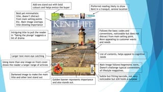
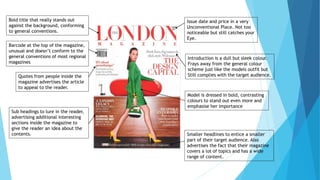
This document analyzes the codes and conventions used in magazine front covers. It discusses several magazine covers, noting elements like titles, images, color schemes, and layouts. Common conventions like barcodes and issue numbers are mentioned. Unconventional elements are also analyzed, like an unusual barcode placement. The target audience and aesthetics are considered. Inspiration is drawn from minimalist designs and template-like layouts that feature subheadings. Sticking to conventions is advised, unless a brand is very well-established.