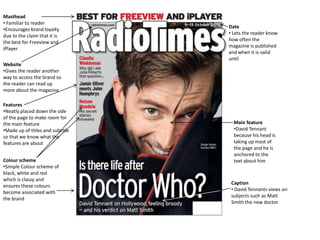
1. Masthead
• Familiar to reader
Date
•Encourages brand loyalty
• Lets the reader know
due to the claim that it is
how often the
the best for Freeview and
magazine is published
iPlayer
and when it is valid
until
Website
•Gives the reader another
way to access the brand so
the reader can read up
more about the magazine
Features
•Neatly placed down the side
of the page to make room for
the main feature Main feature
•Made up of titles and subtitles •David Tennant
so that we know what the because his head is
features are about taking up most of
the page and he is
anchored to the
Colour scheme text about him
•Simple Colour scheme of
black, white and red
which is classy and
Caption
ensures these colours
• David Tennants views on
become associated with
subjects such as Matt
the brand
Smith the new doctor
2. Masthead Date
• Recognisable • Lets the audience know
•Lets the reader how often the magazine is
know whats in the published, in this case
magazine once every two weeks
•Visible from a
distance
Main feature
Colour scheme • Tanya off Eastenders is
• Bright vibrant the main feature because
colours used to she is taking up most of
attract the young the space on the front
audience that this cover and we know who
magazine is aimed at she is because the text is
anchored to her
Features Captions
•Placed around the • Gives more
side of the front cover information about
to make room for the the Eastenders
main story storyline which is the
•Made up of titles and magazines main
subtitles so that we feature
know what the
features are about
3. Main feature
• Rihanna is clearly the main feature Date
because she is the only person on • Lets the reader know
the front cover and the text how old the magazine
mentioning her is the biggest and and its stories are
anchored on her
• The fact that one of her eyes is
hidden suggests that she is hiding
something and will encourage
people to read the magazine
Website
• Gives the reader
Features
another way to access
• Neatly positioned on
the brand which can
the cover to make room
enable them to find out
for the main feature
more information
•Made up of titles and
subtitles so that we know
what the features are
about
Colour scheme
• Simple but effective
contrasting colour Captions
scheme of black and • Gives a brief insight into
white helps the brand what is being discussed in
become recognisable due the Rihanna feature
to the simplicity and
classiness of it all
4. Masthead
•Visible and Recognisable from a
Date
distance
• Lets the reader know how
•Encourages brand loyalty due to
often the magazine is
the claim of it being the best
published and when it is
magazine for Sky and Virgin
valid until
Features Website
• Placed neatly down the side of • Gives the reader more than
the cover to make room for the one way to access the brand
main feature so makes the brand more
•Made up of titles and subtitles so interactive
that we know what the features
are about
Main Feature
• David Mitchell and Robert Webb Colour scheme
are clearly the main features due • Simple Colour scheme of
to them taking up the most red, white, yellow and black is
amount of room on the page and classy and helps these colours
the text is largest and anchored to become associated with TV
on them. They look confused and and Satellite magazine
are wearing contrasting clothes
but the fact that they are standing
close shows that they are friends
Caption
• Gives more information about
the main feature, in this case an
interview with David Mitchell
and Robert Webb about Peep
Show
5. Flat plan for TV Magazine
This is the original flat plan for my
TV magazine. My magazine will be
classy and similar to TV and
Satellite magazine
6. Final Front Cover
This is the final front cover for my TV
magazine. I have tried to include features, text
and images similar to those seen on
magazines such as Radio Times and TV and
Satellite week