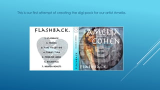
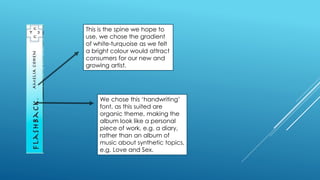
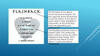
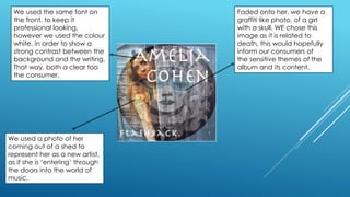
2. This is our first attempt of creating the digi-pack for our artist Amelia.
3. This is the spine we hope to
use, we chose the gradient
of white-turquoise as we felt
a bright colour would attract
consumers for our new and
growing artist.
We chose this ‘handwriting’
font, as this suited are
organic theme, making the
album look like a personal
piece of work, e.g. a diary,
rather than an album of
music about synthetic topics,
e.g. Love and Sex.
4. On the back of our album
cover we have a song list, this
has used the same handwriting
to suit the theme of the album,
and make it more desirable to
consumers, as the matching
fonts are appealing and
professional.
The background photo shows a
broken heart. This symbol has
been used to convey our artists
feelings of heart break. This is
suited as the theme for the
album, is dark and almost
depressing.
5. We used the same font on
the front, to keep it
professional looking,
however we used the colour
white, in order to show a
strong contrast between the
background and the writing.
That way, both a clear too
the consumer.
We used a photo of her
coming out of a shed to
represent her as a new artist,
as if she is ‘entering’ through
the doors into the world of
music.
Faded onto her, we have a
graffiti like photo, of a girl
with a skull. WE chose this
image as it is related to
death, this would hopefully
inform our consumers of
the sensitive themes of the
album and its content.