
Recommended
More Related Content
What's hot
What's hot (20)
Similar to Digipak Analysis: Ellie Goulding - Halcyon
Similar to Digipak Analysis: Ellie Goulding - Halcyon (20)
Recently uploaded
Recently uploaded (20)
Digipak Analysis: Ellie Goulding - Halcyon
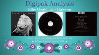
- 1. Digipak Analysis Genre: Dream pop, Alternative dance, Indie pop Release Date: 5th October 2012 Ellie Goulding – Halcyon
- 2. Analysis The true purpose of a digipak is to sell and promote an artist or band’s music. Furthermore, the digipak contains a variety of element such as a tracklist, an album title, the artist’s name, artwork/photography, a lyrics booklet etc. The album is also created with the intention of making the CD eye-catching, to attract an audience, to promote the artist’s work as well as star image.
- 3. Font & Colours When you look at the digipak, the audience can see that the artist’s name ‘Ellie Goulding’ and album title ‘Halcyon’ are displayed in a light pink, sans serif font. The use of pink tones against the dark, contrasting background allows the artist’s name and album title to pop out of the page. This draws the audience’s attention whilst informing them of the album title and that it is in fact Ellie Goulding. The colour pink symbolises tenderness as well as romance. This could imply the charming vibe throughout the album whilst reflecting a feminine atmosphere as Ellie Goulding is a female. The background is presented in dark, grey tones which is done with the intention of drawing the audience’s attention towards Ellie Goulding herself. Furthermore, the use of the dark tones within the front cover of the digipak suggest elegance as well as mystery. This interests the audience and draws them in as the element of mystery encourages them to listen to the album and discover Ellie Goulding’ new music.
- 4. Layout The front cover is portrayed in a simplistic style alongside minimal text with the intention of drawing the audience’s attention to Ellie Goulding and her star image. The album title and artist's name have been positioned in the very top and very bottom portion of the front cover with the intention of informing the audience as well as drawing their attention to the titles and thus promoting the album. Elie Goulding is presented in a close-up shot in the centre of the front cover. This draws the audience’s attention towards herself and promotes her star image as the audience gazes at the front panel. The word ‘Halcyon’ denotes a period of time in the past which was pleasingly happy and peaceful. This could suggest that the mood of the album is calm and pleasant which encourages the audience to feel positive about her work and therefore purchase the album.
- 5. Appearance Ellie Goulding is wearing dark clothes in order to avoid distracting the audience away from her which further promotes her star image. She wears minimal make-up, an almost bare face and radiant complexion which is aided with her clean eyeliner which could hint that Ellie Goulding is young and that this is an early stage within her career. Looking at the front panel, the audience can see Ellie Goulding ‘whipping’ her hair. This portrays her femininity and promotes her album whistling aiding the album with an urban edge.
- 6. Colours & Layout The CD is portrayed in a solid black block of colour. Due to the use of dark colour, this connects the CD with the album and enables the audience to associated the front panel, the CD and the back panel as one. The small hints of pink throughout the digipak were used to compliment the front cover, back cover as well as the CD which draws the audience’s attention. The record label logo is placed at the bottom of the CD in order to avoid distracting the audience away from the main focus – the artist’s name and the album title. However, the copyright information can be seen lining the edge of the CD with the intention of adding an edgy feel to the CD in order to, once again, avoid diverting the audience’s attention away from the main focus.
- 7. Layout On the back cover, the most significant element of the digipak is the tracklist. This is because the tracklist reflects the mood of the album whilst informing the audience as to what they should expect to hear. Informative text such as copyright information, website and record label are situated at the bottom of the back cover. This has been done intentionally so that the text informs the audience but doesn’t distract them from the main focus point – the tracklist.
- 8. Font & Colours The black and pink theme continues to the spine and back cover of the digipak, this enables the audience to interlink the different panels together as they would associate the spine and back panel with the front cover. Once again, a hint of pink has been incorporated within the titles of the tracklist in order to compliment the overall theme of the digipak. The theme of the album title and artist’s name is consistent throughout the front cover and spine of the digipak. This connects the spine as well as the front and back panel together. The contrast between the back background (which is black) and the text (which is pink) draws the audience’s attention towards the main focus – the tracklist.