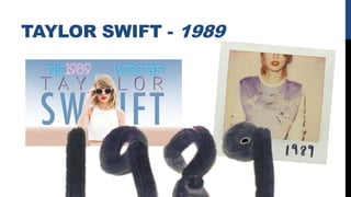
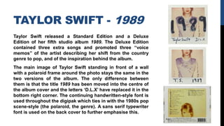
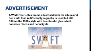
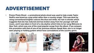
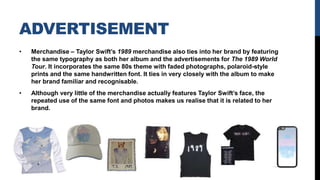
BRANDING
AND BRAND
IMAGE
WHAT IS A BRAND?
Branding is the process of creating a unique
image for a product that makes it both
recognisable and memorable for a consumer;
by making a product recognisable and
memorable, it makes the product stand out in
the market so that it can attract and retain loyal
customers. This is achieved through
advertisements that use consistent themes.
In the music industry, bands and artists are seen as
products that have to be sold to consumers. Therefore,
marketing campaigns create a certain unique image of
the artist’s music, look and personality. This brand
image must be successful and must appeal to the
audience, which makes brand image crucial to the
selling of the music.
TAYLOR SWIFT - 1989
TAYLOR SWIFT - 1989
Taylor Swift released a Standard Edition and a Deluxe
Edition of her fifth studio album 1989. The Deluxe Edition
contained three extra songs and promoted three “voice
memos” of the artist describing her shift from the country
genre to pop, and of the inspiration behind the album.
The main image of Taylor Swift standing in front of a wall
with a polaroid frame around the photo stays the same in the
two versions of the album. The only difference between
them is that the title 1989 has been moved into the centre of
the album cover and the letters ‘D.L.X’ have replaced it in the
bottom right corner. The continuing handwritten-style font is
used throughout the digipak which ties in with the 1980s pop
scene-style (the polaroid, the genre). A sans serif typewriter
font is used on the back cover to further emphasise this.
ADVERTISEMENT
• A World Tour – this promo advertised both the album and
her world tour. A different typography is used but still
follows the 1980s style with its colourful glow which
connotes discos and neon lights.
ADVERTISEMENT
• Promo Photo Shoot – a promotional photo shoot was used to help create Taylor
Swift’s new brand as a pop artist rather than a country singer. This was done by
using conventional brighter colours like blue and white, her hair is shorter which
suggests that she has matured and has broken away from her younger self and
music, and it was taken in front of a city skyline which links to her song Welcome to
New York, which was one of the most popular songs from the album. If we compare
this promotion with that of one of her previous albums Speak Now, she is no longer
seen playing or holding guitars which have connotations of the country genre.
ADVERTISEMENT
• Merchandise – Taylor Swift’s 1989 merchandise also ties into her brand by featuring
the same typography as both her album and the advertisements for The 1989 World
Tour. It incorporates the same 80s theme with faded photographs, polaroid-style
prints and the same handwritten font. It ties in very closely with the album to make
her brand familiar and recognisable.
• Although very little of the merchandise actually features Taylor Swift’s face, the
repeated use of the same font and photos makes us realise that it is related to her
brand.
IN CONCLUSION
We can infer from analysing Taylor Swift’s 1989 album that
the repetition of typography and photographs is key to the
promotion of an album. As a consumer, we are almost forced
to recognise the artist’s shift towards the pop genre rather
than country which is shown through juxtaposing fonts and
images that are used in her previous albums like Red and
Speak Now. The light colours that are used in her
advertisements are also very effective because they reflect
the mixed gender target audience of Swift’s brand. Her
branding is also quite stereotypical (bright colours, focus on
the artist) so it portrays to us that she is now a pop artist.

Branding and Brand Image

  • 1.
  • 2.
    WHAT IS ABRAND? Branding is the process of creating a unique image for a product that makes it both recognisable and memorable for a consumer; by making a product recognisable and memorable, it makes the product stand out in the market so that it can attract and retain loyal customers. This is achieved through advertisements that use consistent themes. In the music industry, bands and artists are seen as products that have to be sold to consumers. Therefore, marketing campaigns create a certain unique image of the artist’s music, look and personality. This brand image must be successful and must appeal to the audience, which makes brand image crucial to the selling of the music.
  • 3.
  • 4.
    TAYLOR SWIFT -1989 Taylor Swift released a Standard Edition and a Deluxe Edition of her fifth studio album 1989. The Deluxe Edition contained three extra songs and promoted three “voice memos” of the artist describing her shift from the country genre to pop, and of the inspiration behind the album. The main image of Taylor Swift standing in front of a wall with a polaroid frame around the photo stays the same in the two versions of the album. The only difference between them is that the title 1989 has been moved into the centre of the album cover and the letters ‘D.L.X’ have replaced it in the bottom right corner. The continuing handwritten-style font is used throughout the digipak which ties in with the 1980s pop scene-style (the polaroid, the genre). A sans serif typewriter font is used on the back cover to further emphasise this.
  • 5.
    ADVERTISEMENT • A WorldTour – this promo advertised both the album and her world tour. A different typography is used but still follows the 1980s style with its colourful glow which connotes discos and neon lights.
  • 6.
    ADVERTISEMENT • Promo PhotoShoot – a promotional photo shoot was used to help create Taylor Swift’s new brand as a pop artist rather than a country singer. This was done by using conventional brighter colours like blue and white, her hair is shorter which suggests that she has matured and has broken away from her younger self and music, and it was taken in front of a city skyline which links to her song Welcome to New York, which was one of the most popular songs from the album. If we compare this promotion with that of one of her previous albums Speak Now, she is no longer seen playing or holding guitars which have connotations of the country genre.
  • 7.
    ADVERTISEMENT • Merchandise –Taylor Swift’s 1989 merchandise also ties into her brand by featuring the same typography as both her album and the advertisements for The 1989 World Tour. It incorporates the same 80s theme with faded photographs, polaroid-style prints and the same handwritten font. It ties in very closely with the album to make her brand familiar and recognisable. • Although very little of the merchandise actually features Taylor Swift’s face, the repeated use of the same font and photos makes us realise that it is related to her brand.
  • 8.
    IN CONCLUSION We caninfer from analysing Taylor Swift’s 1989 album that the repetition of typography and photographs is key to the promotion of an album. As a consumer, we are almost forced to recognise the artist’s shift towards the pop genre rather than country which is shown through juxtaposing fonts and images that are used in her previous albums like Red and Speak Now. The light colours that are used in her advertisements are also very effective because they reflect the mixed gender target audience of Swift’s brand. Her branding is also quite stereotypical (bright colours, focus on the artist) so it portrays to us that she is now a pop artist.