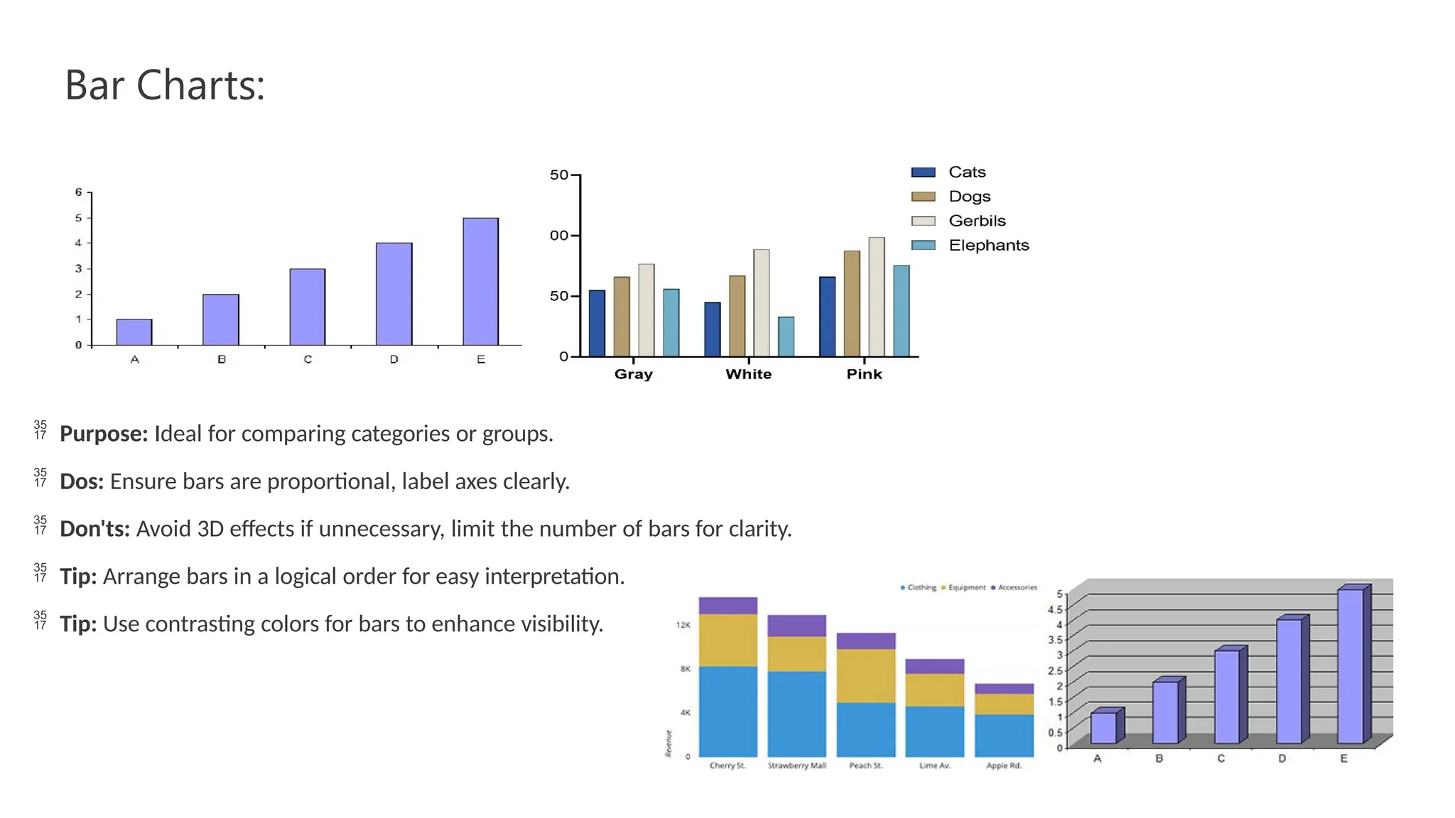
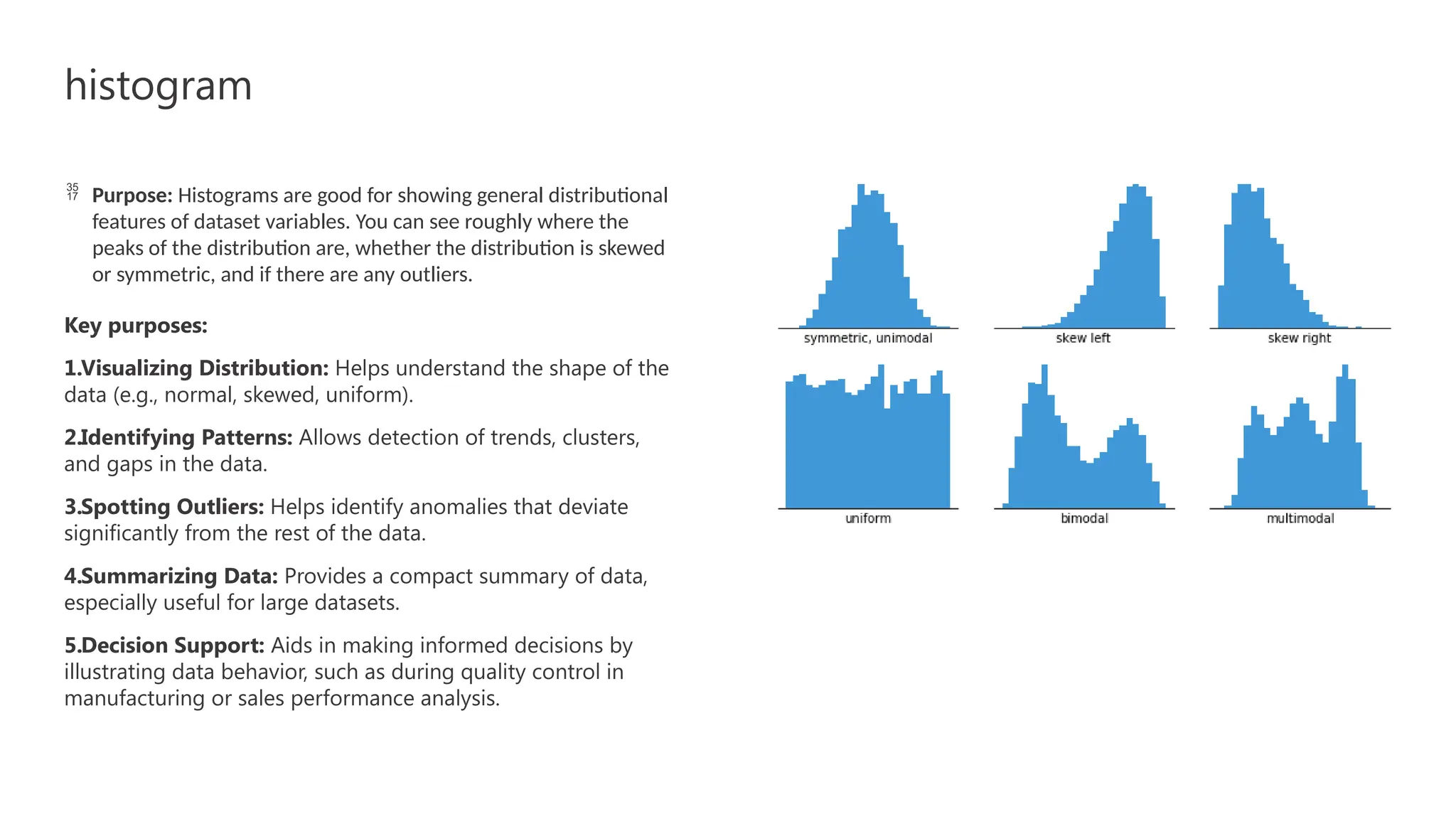
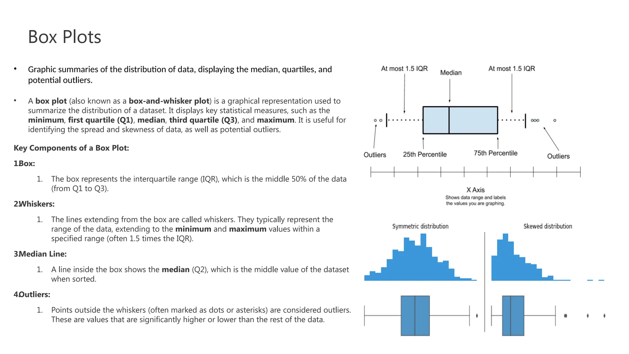
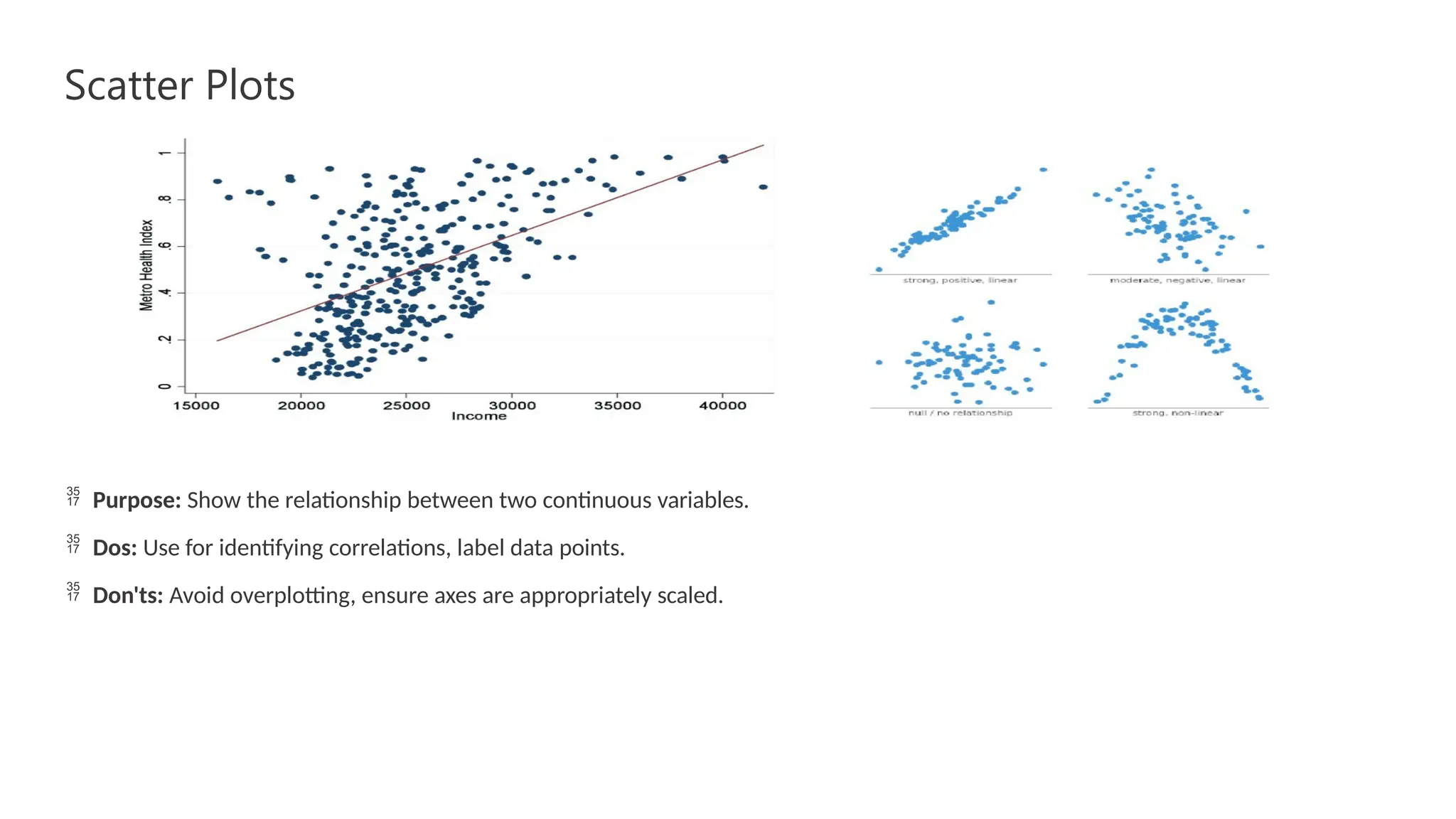
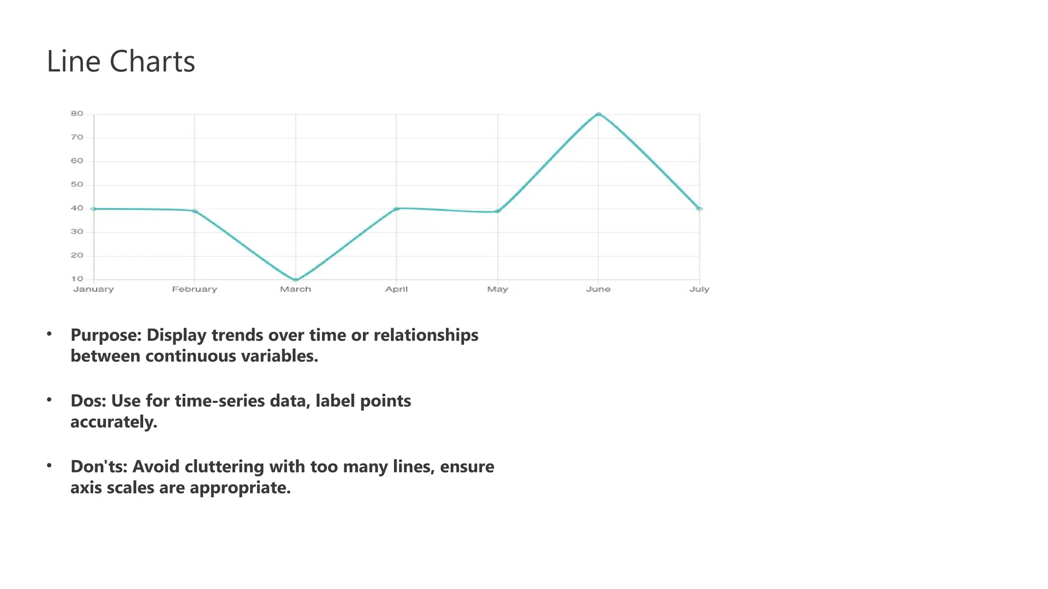
Data Visualization Fundamentals
Different Types of Visualization
Presenter BY : Yassen Mohamed Hadhoud
Bar Charts:
 Purpose: Ideal for comparing categories or groups.
 Dos: Ensure bars are proportional, label axes clearly.
 Don'ts: Avoid 3D effects if unnecessary, limit the number of bars for clarity.
 Tip: Arrange bars in a logical order for easy interpretation.
 Tip: Use contrasting colors for bars to enhance visibility.
histogram
 Purpose: Histograms are good for showing general distributional
features of dataset variables. You can see roughly where the
peaks of the distribution are, whether the distribution is skewed
or symmetric, and if there are any outliers.
Key purposes:
1.Visualizing Distribution: Helps understand the shape of the
data (e.g., normal, skewed, uniform).
2.Identifying Patterns: Allows detection of trends, clusters,
and gaps in the data.
3.Spotting Outliers: Helps identify anomalies that deviate
significantly from the rest of the data.
4.Summarizing Data: Provides a compact summary of data,
especially useful for large datasets.
5.Decision Support: Aids in making informed decisions by
illustrating data behavior, such as during quality control in
manufacturing or sales performance analysis.
Box Plots
• Graphic summaries of the distribution of data, displaying the median, quartiles, and
potential outliers.
• A box plot (also known as a box-and-whisker plot) is a graphical representation used to
summarize the distribution of a dataset. It displays key statistical measures, such as the
minimum, first quartile (Q1), median, third quartile (Q3), and maximum. It is useful for
identifying the spread and skewness of data, as well as potential outliers.
Key Components of a Box Plot:
1.
Box:
1. The box represents the interquartile range (IQR), which is the middle 50% of the data
(from Q1 to Q3).
2.
Whiskers:
1. The lines extending from the box are called whiskers. They typically represent the
range of the data, extending to the minimum and maximum values within a
specified range (often 1.5 times the IQR).
3.
Median Line:
1. A line inside the box shows the median (Q2), which is the middle value of the dataset
when sorted.
4.
Outliers:
1. Points outside the whiskers (often marked as dots or asterisks) are considered outliers.
These are values that are significantly higher or lower than the rest of the data.
Scatter Plots
 Purpose: Show the relationship between two continuous variables.
 Dos: Use for identifying correlations, label data points.
 Don'ts: Avoid overplotting, ensure axes are appropriately scaled.
Line Charts
• Purpose: Display trends over time or relationships
between continuous variables.
• Dos: Use for time-series data, label points
accurately.
• Don'ts: Avoid cluttering with too many lines, ensure
axis scales are appropriate.

Data Visualization Fundamentals power.pptx

  • 1.
    Data Visualization Fundamentals DifferentTypes of Visualization Presenter BY : Yassen Mohamed Hadhoud
  • 2.
    Bar Charts:  Purpose:Ideal for comparing categories or groups.  Dos: Ensure bars are proportional, label axes clearly.  Don'ts: Avoid 3D effects if unnecessary, limit the number of bars for clarity.  Tip: Arrange bars in a logical order for easy interpretation.  Tip: Use contrasting colors for bars to enhance visibility.
  • 3.
    histogram  Purpose: Histogramsare good for showing general distributional features of dataset variables. You can see roughly where the peaks of the distribution are, whether the distribution is skewed or symmetric, and if there are any outliers. Key purposes: 1.Visualizing Distribution: Helps understand the shape of the data (e.g., normal, skewed, uniform). 2.Identifying Patterns: Allows detection of trends, clusters, and gaps in the data. 3.Spotting Outliers: Helps identify anomalies that deviate significantly from the rest of the data. 4.Summarizing Data: Provides a compact summary of data, especially useful for large datasets. 5.Decision Support: Aids in making informed decisions by illustrating data behavior, such as during quality control in manufacturing or sales performance analysis.
  • 4.
    Box Plots • Graphicsummaries of the distribution of data, displaying the median, quartiles, and potential outliers. • A box plot (also known as a box-and-whisker plot) is a graphical representation used to summarize the distribution of a dataset. It displays key statistical measures, such as the minimum, first quartile (Q1), median, third quartile (Q3), and maximum. It is useful for identifying the spread and skewness of data, as well as potential outliers. Key Components of a Box Plot: 1. Box: 1. The box represents the interquartile range (IQR), which is the middle 50% of the data (from Q1 to Q3). 2. Whiskers: 1. The lines extending from the box are called whiskers. They typically represent the range of the data, extending to the minimum and maximum values within a specified range (often 1.5 times the IQR). 3. Median Line: 1. A line inside the box shows the median (Q2), which is the middle value of the dataset when sorted. 4. Outliers: 1. Points outside the whiskers (often marked as dots or asterisks) are considered outliers. These are values that are significantly higher or lower than the rest of the data.
  • 5.
    Scatter Plots  Purpose:Show the relationship between two continuous variables.  Dos: Use for identifying correlations, label data points.  Don'ts: Avoid overplotting, ensure axes are appropriately scaled.
  • 6.
    Line Charts • Purpose:Display trends over time or relationships between continuous variables. • Dos: Use for time-series data, label points accurately. • Don'ts: Avoid cluttering with too many lines, ensure axis scales are appropriate.