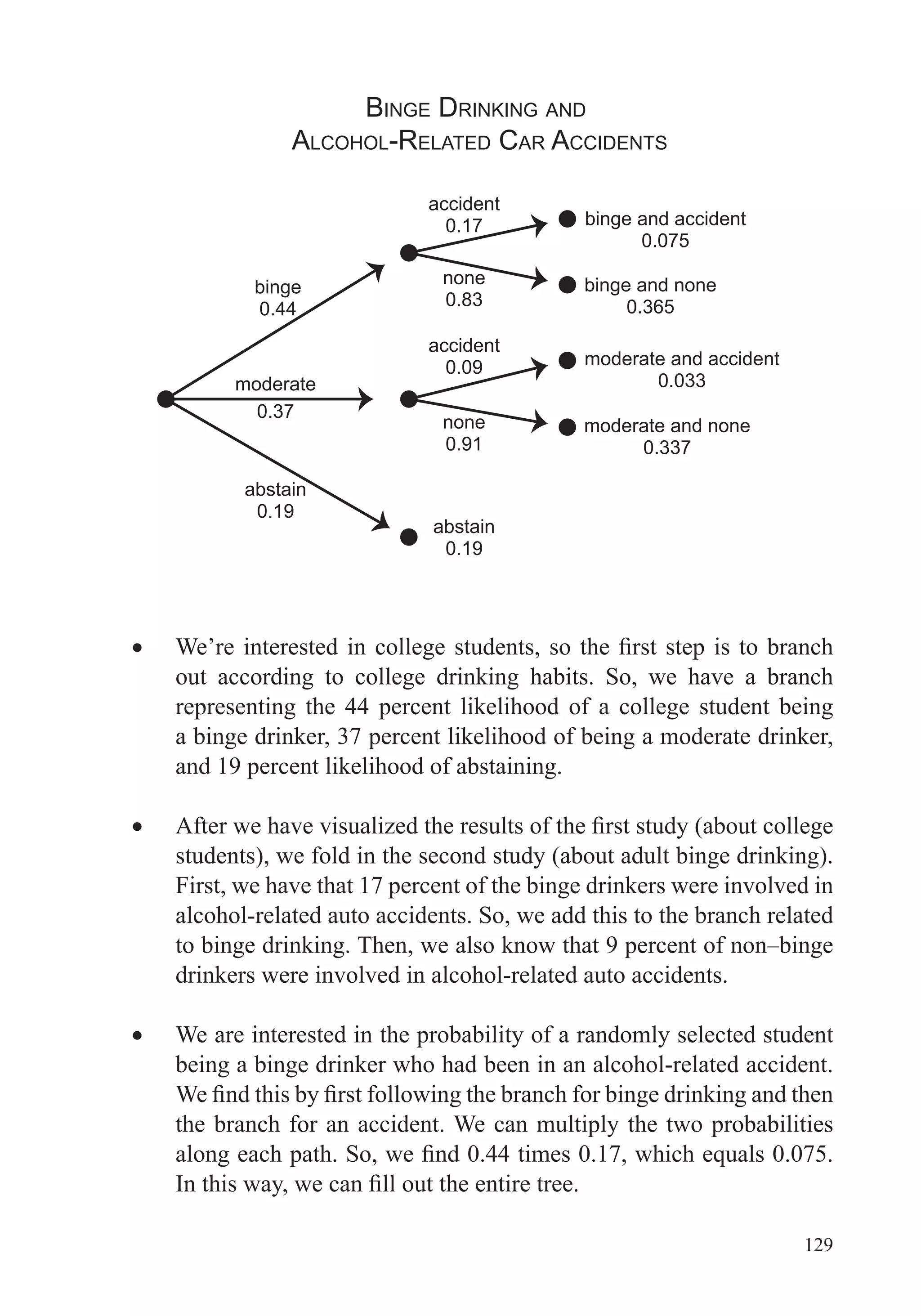
Download to read offline


This document provides an overview of the scope and topics that will be covered in the course "Big Data: How Data Analytics Is Transforming the World". The course will demonstrate how various organizations are using new types of data and analytical tools to improve operations. It will cover important data analysis tools and techniques, including graphing data, data preparation, regression, anomaly detection, simulation, clustering, and network analysis. A variety of case studies will illustrate how these different methods have been applied successfully. The goal is to help learners understand the data analysis process and choose appropriate tools to analyze data sets of interest.


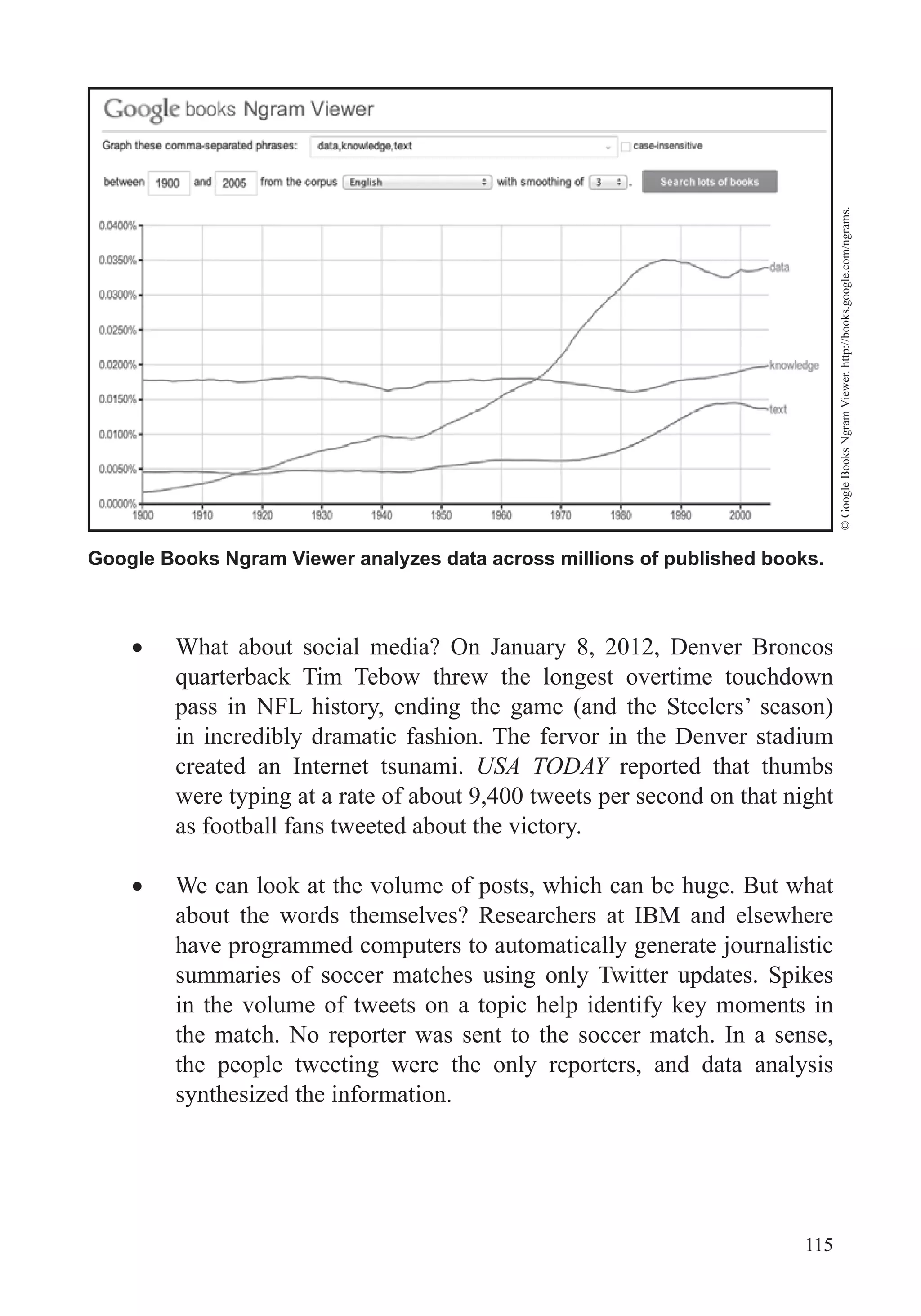
![[(Pst)2 + i c3] mra](https://cdn.slidesharecdn.com/ss_thumbnails/pst2ic3-mra-130306114211-phpapp02-thumbnail.jpg?width=640&height=640&fit=bounds)


![Big Data [sorry] & Data Science: What Does a Data Scientist Do?](https://cdn.slidesharecdn.com/ss_thumbnails/dslatcloudmsevent20130125-130126065651-phpapp01-thumbnail.jpg?width=640&height=640&fit=bounds)