Download to read offline


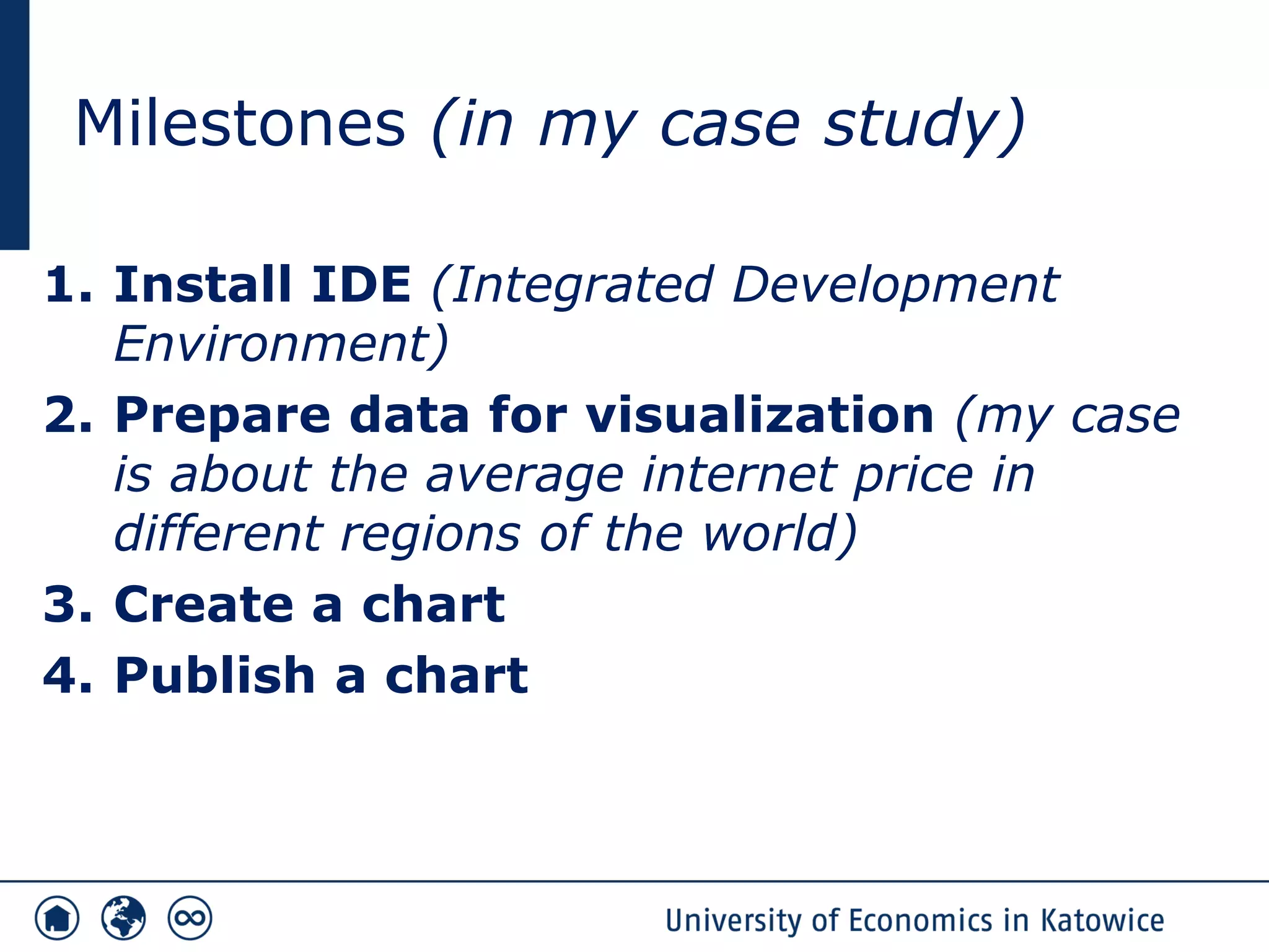
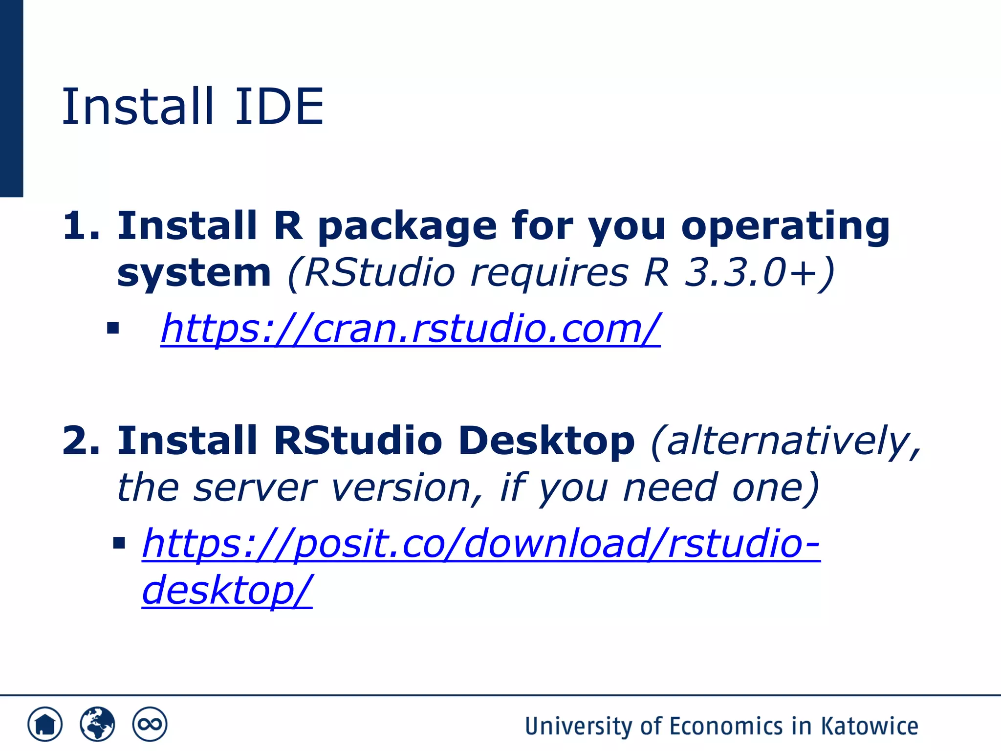
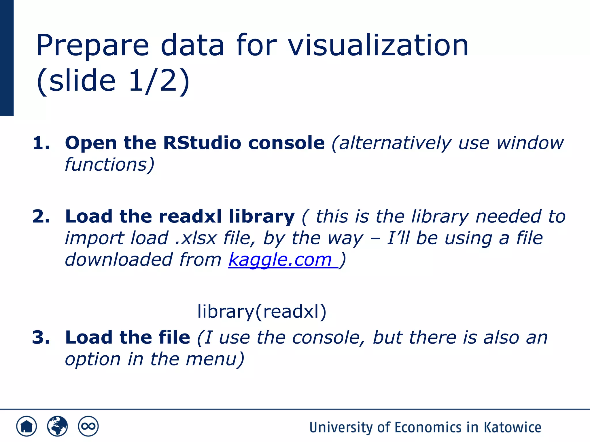
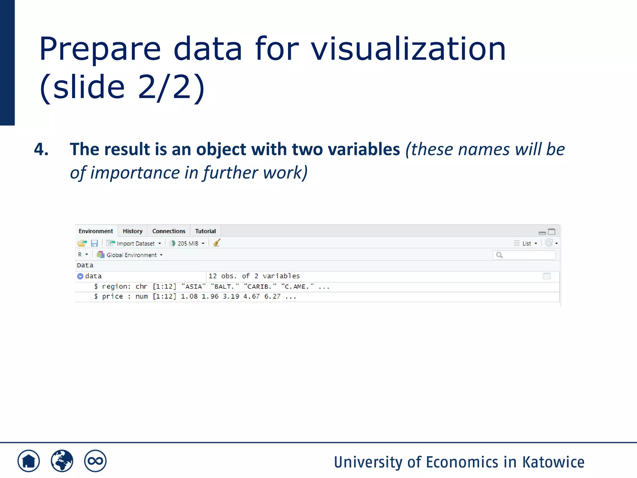
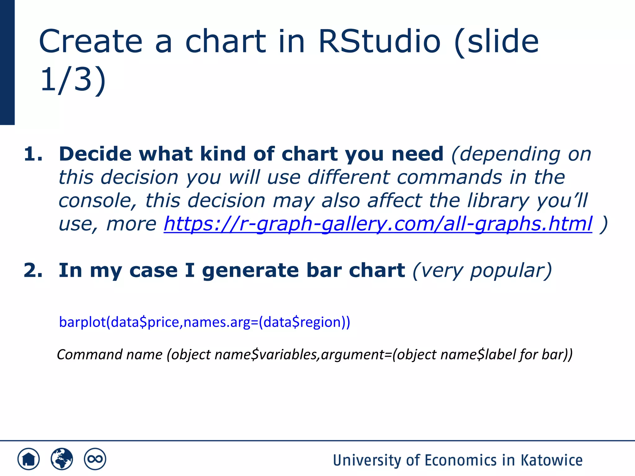
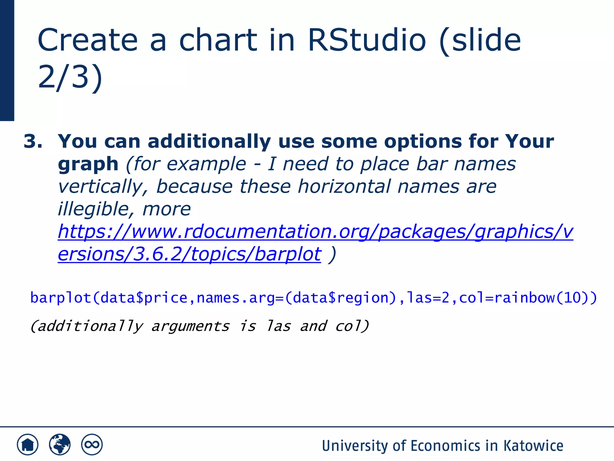
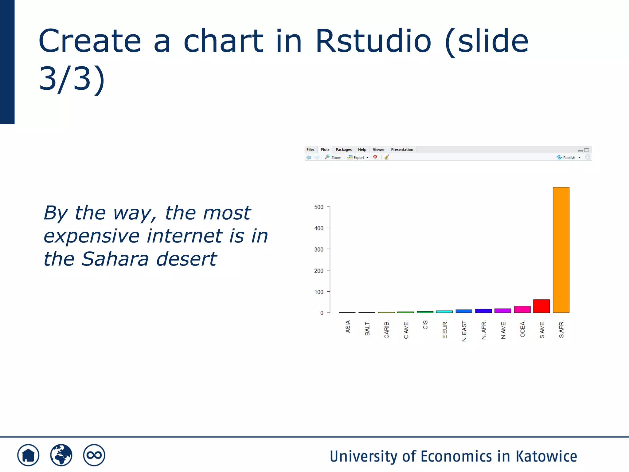
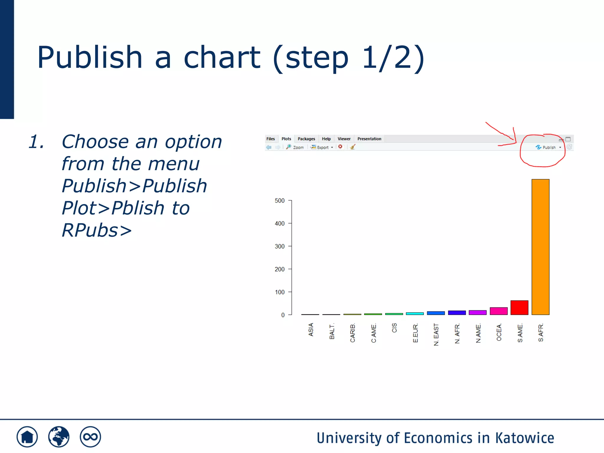
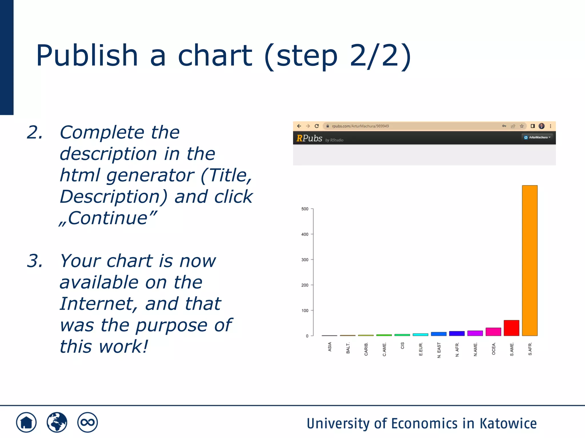


1. The document discusses visualizing analytical data on the web using R and RStudio. It outlines the steps to install RStudio, prepare data for visualization from a .xlsx file, create bar charts in RStudio showing internet prices by region, and publish the charts online using RPubs. 2. Key steps include loading the readxl library to import excel data, using barplot commands to generate charts specifying variables for prices and regions, and publishing charts to RPubs by selecting from the publish menu. 3. The example chart shows internet prices are highest in the Sahara desert region.