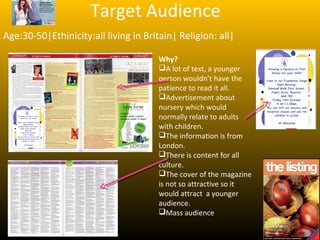
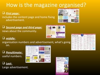
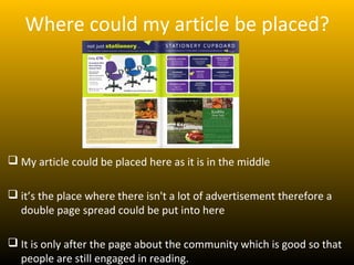
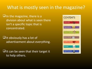
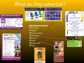
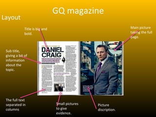
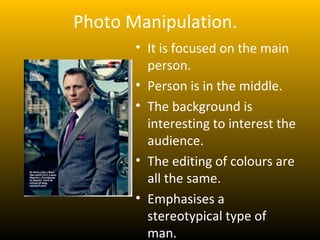
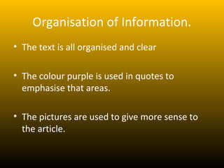
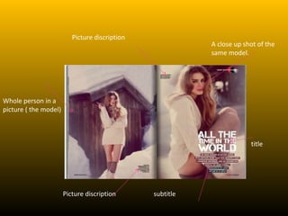
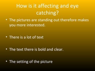
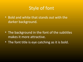
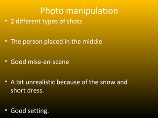
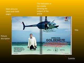
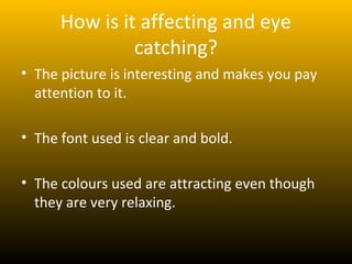
Assignment 6

   By Luara
The listing magazine
        What kind of things are in the newspaper?
          Community

          Organisation

          Home & Gardens

          Eat & Drinks

          Health & Beauty

          Business

          Useful numbers
Target Audience
Age:30-50|Ethinicity:all living in Britain| Religion: all|

                                       Why?
                                       A lot of text, a younger
                                       person wouldn’t have the
                                       patience to read it all.
                                       Advertisement about
                                       nursery which would
                                       normally relate to adults
                                       with children.
                                       The information is from
                                       London.
                                       There is content for all
                                       culture.
                                       The cover of the magazine
                                       is not so attractive so it
                                       would attract a younger
                                       audience.
                                       Mass audience
How is the magazine organised?
 First page:
includes the content page and home fixing
   advertisement.

 Second page and third page:
news about the community.

 middle:
organisation numbers and advertisement, what's going
   on.

 Penultimate:
useful numbers.

 Last:
Large advertisement.
Where could my article be placed?


 My article could be placed here as it is in the middle

 it’s the place where there isn't a lot of advertisement therefore a
  double page spread could be put into here

 It is only after the page about the community which is good so that
  people are still engaged in reading.
What is mostly seen in the magazine?
 In the magazine, there is a
  division about what is seen there
  isn't a specific topic that is
  concentrated.

 It obviously has a lot of
  advertisement about everything.

 It can be seen that their target it
  to help others.
How can my documentary fit into this?
As the magazine is concentrated in helping people
 this could help someone figure out if they are going
 through the gender dysphonia problem.

My documentary would send out information
 which is clearly throughout the whole magazine.

As there isn't a specific topic in the magazine it
 shows its opened for everyone and it has a open
 mind, therefore it would be good to place my
 documentary there as there wont be a lot of
 discrimination.
What do they advertise?


      Advertisement about:
      Furniture
      Health
      Home caring
      schooling
      Beauty
      Food
      Restaurant.
      Party
Where can this magazine be found?
Where is it available?     Price?   Procedures.
                          £30+VAT    call number
Online                             placed on the
Post                               website.
Local Households.
Facebook
Twitter
LinkedIn


£900 to have a double
a double page spread in
The magazine.
Time out magazine
   What kind of things are in the magazine?
   Tickets and offers.
    Restaurants Bars & pubs
   Hotels & Around town
   Museums & Theatre attractions
   Music & Art advices & Books poetry
   Clubs
   Sport & fitness
   Shopping
   Properties
   Competitions
   Dating
Target Audience.
AGE: 18-25| REGION: LONDON| NATIONALITY:
BRITISH/IRISH/SPANISH/ITALIAN/PORTUGUESE ETC. INTEREST:
MUSIC AND NIGHT LIFE.

WHY?
Advertise about gigs in London.( young people go to gigs.)

All nationalities as London is a multi cultural place where
people from all over the world come, therefore it is target at a
mass audience.
How is the magazine organised?
1st Page:
Weekend in London and pictures and some asverts.
Next pages:
Some double page spreads. ( my work would fit here)
After:
Possible places to go in London
Information about Art, music and shopping.
Last page:
TV shows for the whole week.
Where is it available?
• Train stations
• Museums
• Galleries
• By post
Price:
Free
Cost for double page spread:
£8,400
Stage 2.
GQ magazine
Layout
              Title is big and                                   Main picture
              bold.                                              taking the full
                                                                 page.


 Sub title,
 giving a bit of
 information
 about the
 topic.


 The full text
 separated in                    Small pictures   Picture
 columns                         to give          discription.
                                 evidence.
How is it affecting and eye
              catching?
• The title is bright and bold
• The picture takes the whole page therefore
  brings much more attention.
• The colours used
• The positioning of the pictures
• It is clear therefore doesn’t make you
  confused.
Style of font.
     • The font is black.

     • The font colours are all
       matching to the rest of
       the article including the
       picture.

     • The font is in bold .
Photo Manipulation.
       • It is focused on the main
         person.
       • Person is in the middle.
       • The background is
         interesting to interest the
         audience.
       • The editing of colours are
         all the same.
       • Emphasises a
         stereotypical type of
         man.
Organisation of Information.
• The text is all organised and clear

• The colour purple is used in quotes to
  emphasise that areas.

• The pictures are used to give more sense to
  the article.
Picture discription
                                                           A close up shot of the
                                                           same model.


Whole person in a
picture ( the model)


                                                                        title


                       Picture discription      subtitle
How is it affecting and eye
               catching?
• The pictures are standing out therefore makes
  you more interested.

• There is a lot of text

• The text there is bold and clear.

• The setting of the picture
Style of font
• Bold and white that stands out with the
  darker background.

• The background in the font of the subtitles
  makes it more attractive.
• The font title is eye catching as it is bold.
Photo manipulation
• 2 different types of shots

• The person placed in the middle

• Good mise-en-scene

• A bit unrealistic because of the snow and
  short dress.

• Good setting.
Organisation of information.
• First you see the pictures
• Than the title
• Than the subtitles
The helicopter in
                        the middle
      Main pictures     showing the
      takes over both   subject of the
      pages.            article


                                                   Title

Picture
discription


                                            Subtitle
How is it affecting and eye
               catching?
• The picture is interesting and makes you pay
  attention to it.

• The font used is clear and bold.

• The colours used are attracting even though
  they are very relaxing.
Style of font.
• Big and bold

• Clear

• The same font used in every adverts

• Separated.
Photo Manipulation
• Interesting because of the man in the water
  and also because of the helicopter.

• Unrealistic

• Showing anger but with a calm background
Organisation of information
• 1st you see the man in white

• Then you read the title

• Then you pay attention to the helicopter

• Than you read the subtitle.

• Organised.

Assignment 6

  • 1.
    Assignment 6 By Luara
  • 2.
    The listing magazine What kind of things are in the newspaper?  Community  Organisation  Home & Gardens  Eat & Drinks  Health & Beauty  Business  Useful numbers
  • 3.
    Target Audience Age:30-50|Ethinicity:all livingin Britain| Religion: all| Why? A lot of text, a younger person wouldn’t have the patience to read it all. Advertisement about nursery which would normally relate to adults with children. The information is from London. There is content for all culture. The cover of the magazine is not so attractive so it would attract a younger audience. Mass audience
  • 4.
    How is themagazine organised?  First page: includes the content page and home fixing advertisement.  Second page and third page: news about the community.  middle: organisation numbers and advertisement, what's going on.  Penultimate: useful numbers.  Last: Large advertisement.
  • 5.
    Where could myarticle be placed?  My article could be placed here as it is in the middle  it’s the place where there isn't a lot of advertisement therefore a double page spread could be put into here  It is only after the page about the community which is good so that people are still engaged in reading.
  • 6.
    What is mostlyseen in the magazine?  In the magazine, there is a division about what is seen there isn't a specific topic that is concentrated.  It obviously has a lot of advertisement about everything.  It can be seen that their target it to help others.
  • 7.
    How can mydocumentary fit into this? As the magazine is concentrated in helping people this could help someone figure out if they are going through the gender dysphonia problem. My documentary would send out information which is clearly throughout the whole magazine. As there isn't a specific topic in the magazine it shows its opened for everyone and it has a open mind, therefore it would be good to place my documentary there as there wont be a lot of discrimination.
  • 8.
    What do theyadvertise? Advertisement about: Furniture Health Home caring schooling Beauty Food Restaurant. Party
  • 9.
    Where can thismagazine be found? Where is it available? Price? Procedures. £30+VAT call number Online placed on the Post website. Local Households. Facebook Twitter LinkedIn £900 to have a double a double page spread in The magazine.
  • 10.
    Time out magazine What kind of things are in the magazine? Tickets and offers.  Restaurants Bars & pubs Hotels & Around town Museums & Theatre attractions Music & Art advices & Books poetry Clubs Sport & fitness Shopping Properties Competitions Dating
  • 11.
    Target Audience. AGE: 18-25|REGION: LONDON| NATIONALITY: BRITISH/IRISH/SPANISH/ITALIAN/PORTUGUESE ETC. INTEREST: MUSIC AND NIGHT LIFE. WHY? Advertise about gigs in London.( young people go to gigs.) All nationalities as London is a multi cultural place where people from all over the world come, therefore it is target at a mass audience.
  • 12.
    How is themagazine organised? 1st Page: Weekend in London and pictures and some asverts. Next pages: Some double page spreads. ( my work would fit here) After: Possible places to go in London Information about Art, music and shopping. Last page: TV shows for the whole week.
  • 13.
    Where is itavailable? • Train stations • Museums • Galleries • By post Price: Free Cost for double page spread: £8,400
  • 14.
  • 15.
    GQ magazine Layout Title is big and Main picture bold. taking the full page. Sub title, giving a bit of information about the topic. The full text separated in Small pictures Picture columns to give discription. evidence.
  • 16.
    How is itaffecting and eye catching? • The title is bright and bold • The picture takes the whole page therefore brings much more attention. • The colours used • The positioning of the pictures • It is clear therefore doesn’t make you confused.
  • 17.
    Style of font. • The font is black. • The font colours are all matching to the rest of the article including the picture. • The font is in bold .
  • 18.
    Photo Manipulation. • It is focused on the main person. • Person is in the middle. • The background is interesting to interest the audience. • The editing of colours are all the same. • Emphasises a stereotypical type of man.
  • 19.
    Organisation of Information. •The text is all organised and clear • The colour purple is used in quotes to emphasise that areas. • The pictures are used to give more sense to the article.
  • 20.
    Picture discription A close up shot of the same model. Whole person in a picture ( the model) title Picture discription subtitle
  • 21.
    How is itaffecting and eye catching? • The pictures are standing out therefore makes you more interested. • There is a lot of text • The text there is bold and clear. • The setting of the picture
  • 22.
    Style of font •Bold and white that stands out with the darker background. • The background in the font of the subtitles makes it more attractive. • The font title is eye catching as it is bold.
  • 23.
    Photo manipulation • 2different types of shots • The person placed in the middle • Good mise-en-scene • A bit unrealistic because of the snow and short dress. • Good setting.
  • 24.
    Organisation of information. •First you see the pictures • Than the title • Than the subtitles
  • 25.
    The helicopter in the middle Main pictures showing the takes over both subject of the pages. article Title Picture discription Subtitle
  • 26.
    How is itaffecting and eye catching? • The picture is interesting and makes you pay attention to it. • The font used is clear and bold. • The colours used are attracting even though they are very relaxing.
  • 27.
    Style of font. •Big and bold • Clear • The same font used in every adverts • Separated.
  • 28.
    Photo Manipulation • Interestingbecause of the man in the water and also because of the helicopter. • Unrealistic • Showing anger but with a calm background
  • 29.
    Organisation of information •1st you see the man in white • Then you read the title • Then you pay attention to the helicopter • Than you read the subtitle. • Organised.