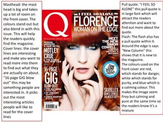
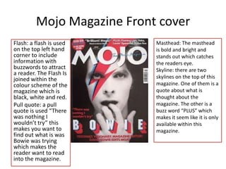
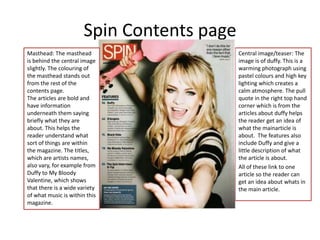
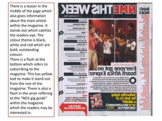
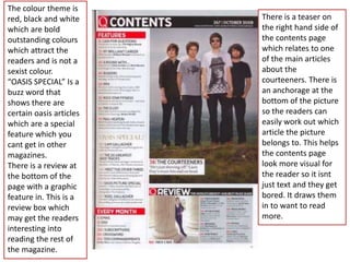
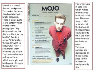
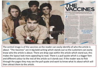
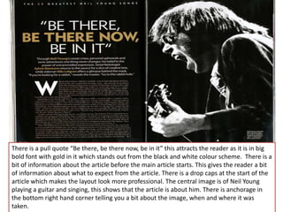
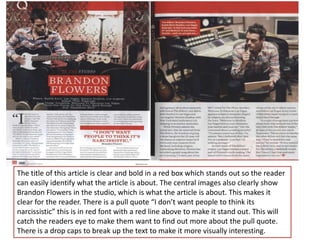
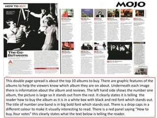
Analysis of alternative indie
     genre magazines
Teasers: “ARE YOU BEING
Buzz words: this has                                          CYPERSTALKED?” and
been used to catch the                                        “WHAT MAKES U2
audiences eye to                                              RUN?”. These are here to
believe this magazine                                         tease the audience
offers more than what                                         about what type of
other magazines offer.                                        articles are within the
They have done this by                                        magazine to get them to
using “special” and                                           read them
making it a different                                         Centre image: this
colour to stand out                                           indicates that the main
from the magazine.                                            article is about them
Masthead: the                                                 (U2) which also has a
masthead is “Spin”                                            teaser next to it about
which is short and                                            the article. The image
catchy. The masthead                                          will interest the audience
is within a red box                                           more so they know the
which makes it stand                                          main story is about
out more to the                                               them. The picture is a
readers. Red being                                            dark image which makes
angry, danger and                                             them stand out from the
fearful makes it catch                                        magazine and black
your attention more                                           connotes
and wonder what is                                            dark/gloomy/scary which
inside.                                                       could give information
                         These elements target their          about the article.
                         audience as it gives them an
                         insider of what is within the
                         magazine so they can choose
                         whether it appeals to them or not.
Centre image: the centre
image is a black and white         Buzz words: “Free”
theme, which helps the text        posters are within the
stand out more. Due to the         magazine, this shows that
text being red this connotes       they are offering more
danger and anger which could       than other magazines.
be included within the quote       Pull quotes: “What would
“id lick him from head to toe”.    I do if I met lennon? Id lick
The bright red text is the         him from head to toe” this
names of the bands which can       makes the reader more
help the audience quickly find     involved within the
out what sort of bands the         magazine and gets the
magazine is including to help      more interesting in the
them realise if it is appealing    article due to the strange
to their genre of music.           quote.
                                   Skyline: This shows the
Masthead: The masthead is          audience that it is big
bright red and stands out from     news for the magazine,
the rest of the writing. It is a   and trying to get the
bold big font so it makes it       audience involved with
easier to point out from other     gigs/festivals which they
magazines.                         may have no heard of
                                   before.
Rocksound Magazine Front Cover
Masthead: the masthead       Flash: a flash is used “WIN VIP
is the main thing that       TICKETS” this stands out from
draws your eye to the        the rest of the magazine and
magazine. Due to the
magazine being colourful
                             shows that there are
this helps the picture       competition the readers may
stand out as it is dark      be interested in. In the Bottom
colours (nearly black and    right corner there is also some
white). The colours are      teasers showing that there are
purple, yellow and blue      free posters inside the
which are bright and         magazine which will also help
using bold fonts. The
“DEFTONES”is in white
                             the readers see what music is
which is the main article    within the magazine. The
which relates to the         Cover lines stand out and let
picture. Having this cover   the readers know what sort of
line in a different colour   articles are within the
stands out and helps the     magazine to see if they are
readers work out what        interested or not.
the main article is about
so they have an idea
about what is in the
magazine.
Masthead: the mast        Pull quote: “I FEEL SO
head is big and takes     ALONE” this pull quote is
up a lot of room on       in large font which will
the front cover. The      attract the readers
colours stand out but     attention and want to
also blend in with this   find out more about the
issue. This will help     quote.
                          Flash: The flash also has
the readers quickly
                          a pull quote within it.
find the magazine.
                          Around the edge is says
Cover lines: the cover    “New Column” this
lines are interesting     shows that it is new to
and make you want to      the magazine.
read more into them       The colours used on the
to find out what they     front cover are red,
are actually on about.    which stands for danger,
“16 page GIG blow         white which stands for
out” this may be          purity, and blue which is
something people are      a calming colour. This
interested in. It picks   makes the image seem
out the most              firey but calming and
interesting articles      pure at the same time so
people will like to       the readers know it’s a
read for the cover        mixture
lines
Mojo Magazine Front cover
Flash: a flash is used      Masthead: The masthead
on the top left hand        is bold and bright and
corner to include           stands out which catches
information with            the readers eye.
buzzwords to attract        Skyline: there are two
a reader. The Flash Is
joined within the           skylines on the top of this
colour scheme of the        magazine. One of them is a
magazine which is           quote about what is
black, white and red.       thought about the
Pull quote: a pull          magazine. The other is a
quote is used “There        buzz word “PLUS” which
was nothing I               makes it seem like it is only
wouldn’t try” this          available within this
makes you want to           magazine.
find out what is was
Bowie was trying
which makes the
reader want to read
into the magazine.
Spin Contents page
Masthead: The masthead                      Central image/teaser: The
is behind the central image                 image is of duffy. This is a
slightly. The colouring of                  warming photograph using
the masthead stands out                     pastel colours and high key
from the rest of the                        lighting which creates a
contents page.                              calm atmosphere. The pull
The articles are bold and                   quote in the right top hand
have information                            corner which is from the
underneath them saying                      articles about duffy helps
briefly what they are                       the reader get an idea of
about. This helps the                       what the mainarticle is
reader understand what                      about. The features also
sort of things are within                   include Duffy and give a
the magazine. The titles,                   little description of what
which are artists names,                    the article is about.
also vary, for example from                 All of these link to one
Duffy to My Bloody                          article so the reader can
Valentine, which shows                      get an idea about whats in
that there is a wide variety                the main article.
of what music is within this
magazine.
There is a teaser in the
middle of the page which
also gives information
about the main article
within the magazine. It
stands out which catches
the readers eye. The
colour theme is black,
white and red which are
bold, outstanding
colours.
There is a flash at the
bottom which refers to
subscribing to the
magazine. This has yellow
text to make it stand out
from the rest of the
magazine. There is also a
flash in the arror reffering
to the “NO1 gig guide”
within the magazine
which the readers may be
interested in.
The colour theme is
red, black and white     There is a teaser on
which are bold           the right hand side of
outstanding colours      the contents page
which attract the        which relates to one
readers and is not a     of the main articles
sexist colour.           about the
“OASIS SPECIAL” Is a     courteeners. There is
buzz word that           an anchorage at the
shows there are          bottom of the picture
certain oasis articles   so the readers can
which are a special      easily work out which
feature which you        article the picture
cant get in other        belongs to. This helps
magazines.               the contents page
There is a review at     look more visual for
the bottom of the        the reader so it isnt
page with a graphic      just text and they get
feature in. This is a    bored. It draws them
review box which         in to want to read
may get the readers      more.
interesting into
reading the rest of
the magazine.
The articles are
Mojo has a pastel
                           in bold font
themed background.
                           which makes
This makes the teaser
                           them easy to
stand out due to its
                           read and stand
bright colouring.
                           out. The cover
There is a pull quote
                           story is titled
at the bottom which
                           separately at
relates to the
                           the bottom so
photograph. “My
                           the reader can
doctors tell me that
                           easily identify
this is brilliant for my
                           what the main
health”. Due to it
                           cover line was
saying “this” makes
                           on the front
the reader want to
                           cover.
know what “this” is
                           The issue
so it makes them
                           number and
read into the article.
                           date is also on
The colour scheme is
                           the contents
yellow and black
                           page so the
which are bright and
                           reader can
bold colours to catch
                           easily identify
the readers eye.
                           this.
The central image is of the vaccines so the reader can easily identify of who the article is
about. “The Vaccines” are in big bold writing which stands out so the customers can easily
know who the article is about. There are drop caps within the article which stand out, this
makes the layout look more appealing to read. There is a pull quote which is a bigger font
and different colour to the rest of the article so it stands out. If the reader was to flick
through the pages they may see the pull quote and want to know what its about which will
then attract them to the article.
There is a pull quote “Be there, be there now, be in it” this attracts the reader as it is in big
bold font with gold in it which stands out from the black and white colour scheme. There is a
bit of information about the article before the main article starts. This gives the reader a bit
of information about what to expect from the article. There is a drop caps at the start of the
article which makes the layout look more professional. The central image is of Neil Young
playing a guitar and singing, this shows that the article is about him. There is anchorage in
the bottom right hand corner telling you a bit about the image, when and where it was
taken.
The title of this article is clear and bold in a red box which stands out so the reader
can easily identify what the article is about. The central images also clearly show
Brandon Flowers in the studio, which is what the article is about. This makes it
clear for the reader. There is a pull quote “I don’t want people to think its
narcissistic” this is in red font with a red line above to make it stand out. This will
catch the readers eye to make them want to find out more about the pull quote.
There is a drop caps to break up the text to make it more visually interesting.
This double page spread is about the top 10 albums to buy. There are graphic features of the
albums to help the viewers know which album they are on about. Underneath each image
there is information about the album and reviews. The left hand side shows the number one
album, the picture is large so it stands out from the rest. It clearly states it is telling the
reader how to buy the album as it is in a white box with black and red font which stands out.
The title of number one band is in big bold font which stands out. There is a drop caps in a
different colour to make it visually interesting to read. There is a red panel saying “How to
buy..Your votes” this clearly states what the text below is telling the reader.

Front cover contents and double page

  • 1.
    Analysis of alternativeindie genre magazines
  • 2.
    Teasers: “ARE YOUBEING Buzz words: this has CYPERSTALKED?” and been used to catch the “WHAT MAKES U2 audiences eye to RUN?”. These are here to believe this magazine tease the audience offers more than what about what type of other magazines offer. articles are within the They have done this by magazine to get them to using “special” and read them making it a different Centre image: this colour to stand out indicates that the main from the magazine. article is about them Masthead: the (U2) which also has a masthead is “Spin” teaser next to it about which is short and the article. The image catchy. The masthead will interest the audience is within a red box more so they know the which makes it stand main story is about out more to the them. The picture is a readers. Red being dark image which makes angry, danger and them stand out from the fearful makes it catch magazine and black your attention more connotes and wonder what is dark/gloomy/scary which inside. could give information These elements target their about the article. audience as it gives them an insider of what is within the magazine so they can choose whether it appeals to them or not.
  • 3.
    Centre image: thecentre image is a black and white Buzz words: “Free” theme, which helps the text posters are within the stand out more. Due to the magazine, this shows that text being red this connotes they are offering more danger and anger which could than other magazines. be included within the quote Pull quotes: “What would “id lick him from head to toe”. I do if I met lennon? Id lick The bright red text is the him from head to toe” this names of the bands which can makes the reader more help the audience quickly find involved within the out what sort of bands the magazine and gets the magazine is including to help more interesting in the them realise if it is appealing article due to the strange to their genre of music. quote. Skyline: This shows the Masthead: The masthead is audience that it is big bright red and stands out from news for the magazine, the rest of the writing. It is a and trying to get the bold big font so it makes it audience involved with easier to point out from other gigs/festivals which they magazines. may have no heard of before.
  • 4.
    Rocksound Magazine FrontCover Masthead: the masthead Flash: a flash is used “WIN VIP is the main thing that TICKETS” this stands out from draws your eye to the the rest of the magazine and magazine. Due to the magazine being colourful shows that there are this helps the picture competition the readers may stand out as it is dark be interested in. In the Bottom colours (nearly black and right corner there is also some white). The colours are teasers showing that there are purple, yellow and blue free posters inside the which are bright and magazine which will also help using bold fonts. The “DEFTONES”is in white the readers see what music is which is the main article within the magazine. The which relates to the Cover lines stand out and let picture. Having this cover the readers know what sort of line in a different colour articles are within the stands out and helps the magazine to see if they are readers work out what interested or not. the main article is about so they have an idea about what is in the magazine.
  • 5.
    Masthead: the mast Pull quote: “I FEEL SO head is big and takes ALONE” this pull quote is up a lot of room on in large font which will the front cover. The attract the readers colours stand out but attention and want to also blend in with this find out more about the issue. This will help quote. Flash: The flash also has the readers quickly a pull quote within it. find the magazine. Around the edge is says Cover lines: the cover “New Column” this lines are interesting shows that it is new to and make you want to the magazine. read more into them The colours used on the to find out what they front cover are red, are actually on about. which stands for danger, “16 page GIG blow white which stands for out” this may be purity, and blue which is something people are a calming colour. This interested in. It picks makes the image seem out the most firey but calming and interesting articles pure at the same time so people will like to the readers know it’s a read for the cover mixture lines
  • 6.
    Mojo Magazine Frontcover Flash: a flash is used Masthead: The masthead on the top left hand is bold and bright and corner to include stands out which catches information with the readers eye. buzzwords to attract Skyline: there are two a reader. The Flash Is joined within the skylines on the top of this colour scheme of the magazine. One of them is a magazine which is quote about what is black, white and red. thought about the Pull quote: a pull magazine. The other is a quote is used “There buzz word “PLUS” which was nothing I makes it seem like it is only wouldn’t try” this available within this makes you want to magazine. find out what is was Bowie was trying which makes the reader want to read into the magazine.
  • 7.
    Spin Contents page Masthead:The masthead Central image/teaser: The is behind the central image image is of duffy. This is a slightly. The colouring of warming photograph using the masthead stands out pastel colours and high key from the rest of the lighting which creates a contents page. calm atmosphere. The pull The articles are bold and quote in the right top hand have information corner which is from the underneath them saying articles about duffy helps briefly what they are the reader get an idea of about. This helps the what the mainarticle is reader understand what about. The features also sort of things are within include Duffy and give a the magazine. The titles, little description of what which are artists names, the article is about. also vary, for example from All of these link to one Duffy to My Bloody article so the reader can Valentine, which shows get an idea about whats in that there is a wide variety the main article. of what music is within this magazine.
  • 8.
    There is ateaser in the middle of the page which also gives information about the main article within the magazine. It stands out which catches the readers eye. The colour theme is black, white and red which are bold, outstanding colours. There is a flash at the bottom which refers to subscribing to the magazine. This has yellow text to make it stand out from the rest of the magazine. There is also a flash in the arror reffering to the “NO1 gig guide” within the magazine which the readers may be interested in.
  • 9.
    The colour themeis red, black and white There is a teaser on which are bold the right hand side of outstanding colours the contents page which attract the which relates to one readers and is not a of the main articles sexist colour. about the “OASIS SPECIAL” Is a courteeners. There is buzz word that an anchorage at the shows there are bottom of the picture certain oasis articles so the readers can which are a special easily work out which feature which you article the picture cant get in other belongs to. This helps magazines. the contents page There is a review at look more visual for the bottom of the the reader so it isnt page with a graphic just text and they get feature in. This is a bored. It draws them review box which in to want to read may get the readers more. interesting into reading the rest of the magazine.
  • 10.
    The articles are Mojohas a pastel in bold font themed background. which makes This makes the teaser them easy to stand out due to its read and stand bright colouring. out. The cover There is a pull quote story is titled at the bottom which separately at relates to the the bottom so photograph. “My the reader can doctors tell me that easily identify this is brilliant for my what the main health”. Due to it cover line was saying “this” makes on the front the reader want to cover. know what “this” is The issue so it makes them number and read into the article. date is also on The colour scheme is the contents yellow and black page so the which are bright and reader can bold colours to catch easily identify the readers eye. this.
  • 11.
    The central imageis of the vaccines so the reader can easily identify of who the article is about. “The Vaccines” are in big bold writing which stands out so the customers can easily know who the article is about. There are drop caps within the article which stand out, this makes the layout look more appealing to read. There is a pull quote which is a bigger font and different colour to the rest of the article so it stands out. If the reader was to flick through the pages they may see the pull quote and want to know what its about which will then attract them to the article.
  • 12.
    There is apull quote “Be there, be there now, be in it” this attracts the reader as it is in big bold font with gold in it which stands out from the black and white colour scheme. There is a bit of information about the article before the main article starts. This gives the reader a bit of information about what to expect from the article. There is a drop caps at the start of the article which makes the layout look more professional. The central image is of Neil Young playing a guitar and singing, this shows that the article is about him. There is anchorage in the bottom right hand corner telling you a bit about the image, when and where it was taken.
  • 13.
    The title ofthis article is clear and bold in a red box which stands out so the reader can easily identify what the article is about. The central images also clearly show Brandon Flowers in the studio, which is what the article is about. This makes it clear for the reader. There is a pull quote “I don’t want people to think its narcissistic” this is in red font with a red line above to make it stand out. This will catch the readers eye to make them want to find out more about the pull quote. There is a drop caps to break up the text to make it more visually interesting.
  • 14.
    This double pagespread is about the top 10 albums to buy. There are graphic features of the albums to help the viewers know which album they are on about. Underneath each image there is information about the album and reviews. The left hand side shows the number one album, the picture is large so it stands out from the rest. It clearly states it is telling the reader how to buy the album as it is in a white box with black and red font which stands out. The title of number one band is in big bold font which stands out. There is a drop caps in a different colour to make it visually interesting to read. There is a red panel saying “How to buy..Your votes” this clearly states what the text below is telling the reader.