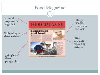
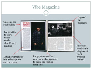
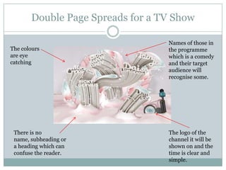
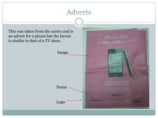
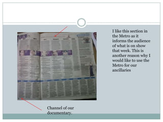
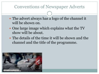
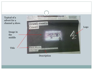
Ancillaries

SHAHNA PINNOCK
Double Page Spread

 If we were to put our double page spread in women's
  magazines such as Now, Look or Closer we would get 2
  sides of a A4 piece of paper which would make an A3.
 With some double page spreads one side has an article
  explaining a topic while the other side has a picture.
 As our documentary will be on either Channel 4 or BBC3
  we will need bright images, a large picture of food and
  our logo.
 There must be no offensive language or images as anyone
  can pick up the magazine even though the target
  audience is people who are 18 and upwards.
Examples of Double Page Spreads
                            (NME)

Large quote which draws              The costume of the celebrity
the attention of the reader          contrasts the colour of the
and also substitutes as the          article
heading.


Recognition of the
journalist who wrote
the article


 4 brief paragraphs
 on the subject.                      Subheading is easy to read
                                      and highlights important
                                      things such as Lily Allen.
Vibe Magazine
Recognition of photographer and             Unlike Lily Allen’s
journalist. Also subheading is              spread there are
short and straight to the point.            many images and
                                            one large one
                                            making it more eye
                                            catching. One is in
                                            colour.


                                                   Name of the
                                                   magazine


There are several paragraphs as it is an
interview however this may get boring for    Long quote.
the reader.
Food Magazine

Name of
magazine in                        2 large
large font                         images
                                   relating to
                                   the topic
Subheading is
short and clear
                                  Small
                                  subheading
                                  explaining
                                  pictures


3 simple and
short
paragraphs.
Vibe Magazine

                                                Logo of
                                                the
Quote as the                                    magazine
subheading


Large letter
to show
where
reader
should start
reading                                        Photos of
                                               musician in
                                               his place of
                                               work
Long paragraphs as    Large picture with a     creating
it is a description   contrasting background   realism
and interview         to make the writing
                      seem less.
Differences and Similarities

 There are many similarities and differences in the
  examples of double page spreads I have used
 Some use several images while others use one.
 Some have longer paragraphs as they contain short
  interviews.
Double Page Spreads for a TV Show

                                  Names of those in
The colours                       the programme
are eye                           which is a comedy
catching                          and their target
                                  audience will
                                  recognise some.


 There is no                      The logo of the
 name, subheading or              channel it will be
 a heading which can              shown on and the
 confuse the reader.              time is clear and
                                  simple.
Conventions of a double page spread

 Usually have large images which takes up a page and is
    relevant to the topic.
   a heading.
   A sentence to tell us what the article is about.
   Sometimes the first letter of the sentence is big to show
    the reader where to start reading.
   Quotes
   They usually have sub headings and a written article in
    columns.
   The journalists name is written usually at the bottom of
    the page and sometimes at the top.
   Smaller images also relating to topic
Appealing to Target Audience

 Our target audience is people from the age of 16 and
  onwards.
 Mostly women but we will design our double page
  spread for men too.
 We will have a small written description of our
  documentary and several images to appeal to our
  audience.
 Putting our double page spreads in magazines like
  Now, Closer and (Men’s Weekly or Fitness) allows us
  to reach a wide audience and these magazines have
  health sections.
What has inspired me from double page spreads

 I have been inspired by many of the pictures which
  are large and draw attention to the subject.
 I also like the journalist or designer recognition
 The organisation of information is good as it is short,
  easy to find and does not reveal too much
  information.
Newspaper I want to advertise in
 I have done research and considered putting
  my documentary in newspapers like The Sun
  which target both male and female and cost
  less than 50p.
 I have decided to advertise my documentary
  in the Metro, my reasons for choosing this one
  is because of their target audience which is
  similar to mine, it is free so everyone is able to
  get one and also their advertisements contain
  TV shows from a variety of Channels.
Adverts

This was taken from the metro and is
an advert for a phone but the layout
is similar to that of a TV show.

                           Image


                          Name


                          Logo
I like this section in
                 the Metro as it
                 informs the audience
                 of what is on show
                 that week. This is
                 another reason why I
                 would like to use the
                 Metro for our
                 ancillaries


Channel of our
documentary.
Cost and Size of adverts

 There is a process of making a newspaper so
    advertising costs quite a bit of money.
   Newspapers generally generate 70%-80% of
    revenue from advertisement.
   You have to think of the cost for printing and
    distribution.
   The internet has an increasing rate of
    advertisements and on every website there is
    some kind of advert whether its for a TV show or
    product.
   In the Metro the size of the advert is usually a
    page, so it is important to consider how much
    information you want on it.
Conventions of Newspaper Adverts

 The advert always has a logo of the channel it
  will be shown on.
 One large image which explains what the TV
  show will be about.
 The details of the time it will be shown and the
  channel and the title of the programme.
Typical of a
advert for a
channel 4 show.
                                Logo

   Image in
   the
   middle


     Title


                  Description
Appealing to Target Audience
 I will make my advert eye catching with a large image of
  food.
 The channel it will be shown on will also appeal to my
  target audience.
 As we are targeting mostly females, the use of colours and
  images of women will appeal to them as they will be able to
  relate more. However we may use a man also which can
  attract both men and women.
 As food is something everyone eats it may catch attention
  as many people are interested in what they eat due to how
  media portrays certain foods.
 As fast food is more popular instead of using an image of a
  salad we could use either chips or burgers.
Inspirations

 For my advert I would like to have a large image taking up
  the whole page as this will catch attention and then
  medium sized titles.
 I would also like the logo of the TV channel to be large so
  our target audience remembers which channel and what
  time to watch it.
 Colours are appealing so therefore I would like to use a
  variety.

Ancillaries

  • 1.
  • 2.
    Double Page Spread If we were to put our double page spread in women's magazines such as Now, Look or Closer we would get 2 sides of a A4 piece of paper which would make an A3.  With some double page spreads one side has an article explaining a topic while the other side has a picture.  As our documentary will be on either Channel 4 or BBC3 we will need bright images, a large picture of food and our logo.  There must be no offensive language or images as anyone can pick up the magazine even though the target audience is people who are 18 and upwards.
  • 3.
    Examples of DoublePage Spreads (NME) Large quote which draws The costume of the celebrity the attention of the reader contrasts the colour of the and also substitutes as the article heading. Recognition of the journalist who wrote the article 4 brief paragraphs on the subject. Subheading is easy to read and highlights important things such as Lily Allen.
  • 4.
    Vibe Magazine Recognition ofphotographer and Unlike Lily Allen’s journalist. Also subheading is spread there are short and straight to the point. many images and one large one making it more eye catching. One is in colour. Name of the magazine There are several paragraphs as it is an interview however this may get boring for Long quote. the reader.
  • 5.
    Food Magazine Name of magazinein 2 large large font images relating to the topic Subheading is short and clear Small subheading explaining pictures 3 simple and short paragraphs.
  • 6.
    Vibe Magazine Logo of the Quote as the magazine subheading Large letter to show where reader should start reading Photos of musician in his place of work Long paragraphs as Large picture with a creating it is a description contrasting background realism and interview to make the writing seem less.
  • 7.
    Differences and Similarities There are many similarities and differences in the examples of double page spreads I have used  Some use several images while others use one.  Some have longer paragraphs as they contain short interviews.
  • 8.
    Double Page Spreadsfor a TV Show Names of those in The colours the programme are eye which is a comedy catching and their target audience will recognise some. There is no The logo of the name, subheading or channel it will be a heading which can shown on and the confuse the reader. time is clear and simple.
  • 9.
    Conventions of adouble page spread  Usually have large images which takes up a page and is relevant to the topic.  a heading.  A sentence to tell us what the article is about.  Sometimes the first letter of the sentence is big to show the reader where to start reading.  Quotes  They usually have sub headings and a written article in columns.  The journalists name is written usually at the bottom of the page and sometimes at the top.  Smaller images also relating to topic
  • 10.
    Appealing to TargetAudience  Our target audience is people from the age of 16 and onwards.  Mostly women but we will design our double page spread for men too.  We will have a small written description of our documentary and several images to appeal to our audience.  Putting our double page spreads in magazines like Now, Closer and (Men’s Weekly or Fitness) allows us to reach a wide audience and these magazines have health sections.
  • 11.
    What has inspiredme from double page spreads  I have been inspired by many of the pictures which are large and draw attention to the subject.  I also like the journalist or designer recognition  The organisation of information is good as it is short, easy to find and does not reveal too much information.
  • 12.
    Newspaper I wantto advertise in  I have done research and considered putting my documentary in newspapers like The Sun which target both male and female and cost less than 50p.  I have decided to advertise my documentary in the Metro, my reasons for choosing this one is because of their target audience which is similar to mine, it is free so everyone is able to get one and also their advertisements contain TV shows from a variety of Channels.
  • 13.
    Adverts This was takenfrom the metro and is an advert for a phone but the layout is similar to that of a TV show. Image Name Logo
  • 14.
    I like thissection in the Metro as it informs the audience of what is on show that week. This is another reason why I would like to use the Metro for our ancillaries Channel of our documentary.
  • 15.
    Cost and Sizeof adverts  There is a process of making a newspaper so advertising costs quite a bit of money.  Newspapers generally generate 70%-80% of revenue from advertisement.  You have to think of the cost for printing and distribution.  The internet has an increasing rate of advertisements and on every website there is some kind of advert whether its for a TV show or product.  In the Metro the size of the advert is usually a page, so it is important to consider how much information you want on it.
  • 16.
    Conventions of NewspaperAdverts  The advert always has a logo of the channel it will be shown on.  One large image which explains what the TV show will be about.  The details of the time it will be shown and the channel and the title of the programme.
  • 17.
    Typical of a advertfor a channel 4 show. Logo Image in the middle Title Description
  • 18.
    Appealing to TargetAudience  I will make my advert eye catching with a large image of food.  The channel it will be shown on will also appeal to my target audience.  As we are targeting mostly females, the use of colours and images of women will appeal to them as they will be able to relate more. However we may use a man also which can attract both men and women.  As food is something everyone eats it may catch attention as many people are interested in what they eat due to how media portrays certain foods.  As fast food is more popular instead of using an image of a salad we could use either chips or burgers.
  • 19.
    Inspirations  For myadvert I would like to have a large image taking up the whole page as this will catch attention and then medium sized titles.  I would also like the logo of the TV channel to be large so our target audience remembers which channel and what time to watch it.  Colours are appealing so therefore I would like to use a variety.