Download to read offline

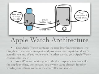


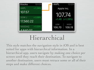
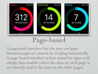


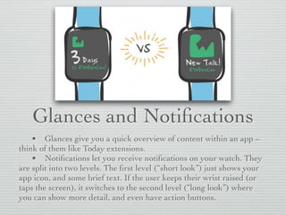


The document discusses the architecture and interface design of Apple Watch apps, highlighting the distinction between the watch and iPhone's roles, with the watch handling the user interface and the iPhone managing the app logic. It covers various navigation styles, user interactions, glances, notifications, and modal sheets, providing guidelines for effective layout, color usage, typography, and UI elements. Additionally, it emphasizes the use of groups for layout management and the importance of accessibility considerations in design.