APCHS Logo Competition

    Student Submissions
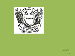
FINALIST
       AA
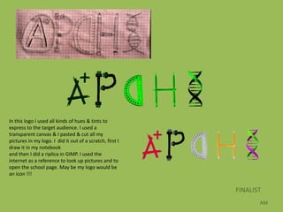
In this logo I used all kinds of hues & tints to
express to the target audience. I used a
transparent canvas & I pasted & cut all my
pictures in my logo. I did it out of a scratch, first I
draw it in my notebook
and then I did a riplica in GIMP. I used the
internet as a reference to look up pictures and to
open the school page. May be my logo would be
an icon !!!


                                                          FINALIST
                                                                 AM
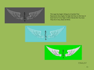
This Logo Has Eagle's Wings As A Symbol That
Represents How Eagles Fly High And How Us We Have A
Goal And Its To Go High In Other Words Rich You Goal.
They Are In Duo, Black & White.


                                         FINALIST
                                                        AS
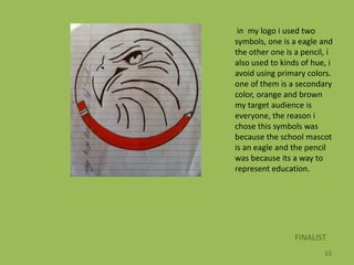
in my logo i used two
symbols, one is a eagle and
the other one is a pencil, i
also used to kinds of hue, i
avoid using primary colors.
one of them is a secondary
color, orange and brown
my target audience is
everyone, the reason i
chose this symbols was
because the school mascot
is an eagle and the pencil
was because its a way to
represent education.


                 FINALIST
                         ES
Art Teacher’s Honorable Mention
                             NG
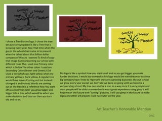
I chose a Tree For my logo. I chose the tree
because Arroyo paseo is like a Tree that is
Growing every year. Also That time when the
guy in the wheel chair came in to present
when he talked about that billion dollar
company of Watchs I wanted To kind of copy
that image but representing our school with
different Hues Tho.I used one Primary color
which is Yellow.The other colors I used are
Secondary Colors(Brown and Green).I Did
Used a tint which was light yellow when my        My logo is like a symbol How you start small and as you get bigger you make
primary yellow is Dark yellow. A regular tree     harder decisions. I would say somewhat My logo would be mainstream or so since
would have leaves Coming out but instead I        big company have Trees to represent they are a growing buissness like our school
changed it and instead Words are coming           we grow every year except we don’t die we keep on going until we become a
out of the tree.It is a reference how You start   very,very big school. My tree can also be a icon in a way since it is very simple and
off as a root then later you grow bigger and      most people will be able to remember.It was a great experience using gimp it will
bigger into a tree which would be when you        help me on the future with “tuning” pictures. I will use gimp in the future to make
make decisions and later on then you turn         logos and other art projects I will have later on the year.
old and so on.


                                                                                    Art Teacher’s Honorable Mention
                                                                                                                                     DNC
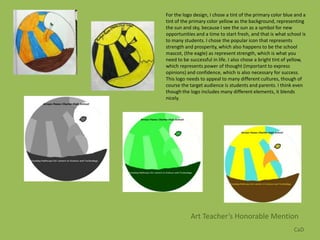
For the logo design, I chose a tint of the primary color blue and a
tint of the primary color yellow as the background, representing
the sun and sky, because I see the sun as a symbol for new
opportunities and a time to start fresh, and that is what school is
to many students. I chose the popular icon that represents
strength and prosperity, which also happens to be the school
mascot, (the eagle) as represent strength, which is what you
need to be successful in life. I also chose a bright tint of yellow,
which represents power of thought (important to express
opinions) and confidence, which is also necessary for success.
This logo needs to appeal to many different cultures, though of
course the target audience is students and parents. I think even
though the logo includes many different elements, it blends
nicely.


            Art Teacher’s Honorable Mention
                                                              CaD

Apchs logo competition finalists

  • 1.
    APCHS Logo Competition Student Submissions
  • 2.
  • 3.
    In this logoI used all kinds of hues & tints to express to the target audience. I used a transparent canvas & I pasted & cut all my pictures in my logo. I did it out of a scratch, first I draw it in my notebook and then I did a riplica in GIMP. I used the internet as a reference to look up pictures and to open the school page. May be my logo would be an icon !!! FINALIST AM
  • 4.
    This Logo HasEagle's Wings As A Symbol That Represents How Eagles Fly High And How Us We Have A Goal And Its To Go High In Other Words Rich You Goal. They Are In Duo, Black & White. FINALIST AS
  • 5.
    in my logoi used two symbols, one is a eagle and the other one is a pencil, i also used to kinds of hue, i avoid using primary colors. one of them is a secondary color, orange and brown my target audience is everyone, the reason i chose this symbols was because the school mascot is an eagle and the pencil was because its a way to represent education. FINALIST ES
  • 6.
  • 7.
    I chose aTree For my logo. I chose the tree because Arroyo paseo is like a Tree that is Growing every year. Also That time when the guy in the wheel chair came in to present when he talked about that billion dollar company of Watchs I wanted To kind of copy that image but representing our school with different Hues Tho.I used one Primary color which is Yellow.The other colors I used are Secondary Colors(Brown and Green).I Did Used a tint which was light yellow when my My logo is like a symbol How you start small and as you get bigger you make primary yellow is Dark yellow. A regular tree harder decisions. I would say somewhat My logo would be mainstream or so since would have leaves Coming out but instead I big company have Trees to represent they are a growing buissness like our school changed it and instead Words are coming we grow every year except we don’t die we keep on going until we become a out of the tree.It is a reference how You start very,very big school. My tree can also be a icon in a way since it is very simple and off as a root then later you grow bigger and most people will be able to remember.It was a great experience using gimp it will bigger into a tree which would be when you help me on the future with “tuning” pictures. I will use gimp in the future to make make decisions and later on then you turn logos and other art projects I will have later on the year. old and so on. Art Teacher’s Honorable Mention DNC
  • 8.
    For the logodesign, I chose a tint of the primary color blue and a tint of the primary color yellow as the background, representing the sun and sky, because I see the sun as a symbol for new opportunities and a time to start fresh, and that is what school is to many students. I chose the popular icon that represents strength and prosperity, which also happens to be the school mascot, (the eagle) as represent strength, which is what you need to be successful in life. I also chose a bright tint of yellow, which represents power of thought (important to express opinions) and confidence, which is also necessary for success. This logo needs to appeal to many different cultures, though of course the target audience is students and parents. I think even though the logo includes many different elements, it blends nicely. Art Teacher’s Honorable Mention CaD