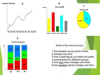
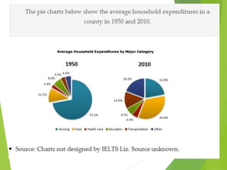
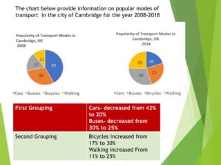
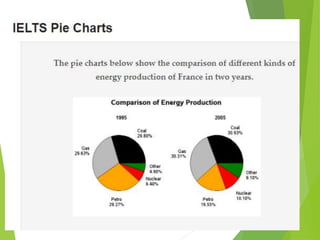
Starter
Prepare Your daily routine in a graphical representation
PIE CHART
Lesson objectives
Introduce the topic- interpretation of Pie Chart
Discuss ways of writing an introduction and overview for a pie chart.
Practice writing an introduction and overview
Introduction and Overview
55
20
15
10
Sales of cars in UAE in 2018
GMC
Benz
Toyota
Honda
This Pie chart shows the percentage of cars sold in UAE by different
companies during the year 2018-2019. Write an introduction and overview.
Day -2
 Lesson objectives
 Explain lexical and grammatical structure
 Discuss ways of grouping
 Practice grouping and constructing body paragraphs
Check your answers
Grouping
 The first grouping
 Choose 2-3 segments that account for higher percentages
of the first pie chart, and then write about how these
segments change from the first pie chart to the second pie
chart.
 The second grouping
 Choose 2-3 segments that account for lower percentages
of the first pie chart, and then write about how these
segments change from the first pie chart to the second pie
chart.
First grouping
Body Para 1
40% 13-25 years old
35% 26-35 years old.
75%= 3/4th – under
35years old
2nd Grouping
Body Para -2
15% - 36-45
10% 46-55
2% - over 55
25% - 1/4th above 36
40
35
15
8
2
Social media users
13-25
26-35
36-45
45-55
over 56
Sample
 The given pie chart provides information about the proportion of people
using digital networking according to age group for Jamestown for the
year 2018.
 Overall, the general trend of Jamestown’s social media users during
2018 was that the older a person was, the less likely they were to use
digital networking. Evidently, the younger population under the age of
35 contributed 3/4th of the social network users.
 In terms of the most significant feature of the chart, the largest
category of digital communicators was the group aged 13 to 25,
which accounted for 40% of the total users. In addition, the next
important segment of the population using social media, was those
aged between 26 and 35. This group’s contribution was slightly
lower at 35%. Moreover, added together, these two categories made
up more than half of all those who used social media platforms in 2018,
in Jamestown. They accounted for the vast majority of users, at 75%.
 In stark contrast, the category with the lowest percentage of users,
people older than 55, comprised a tiny 2% of all users. Furthermore,
those between 46 and 55 years of age contributed 10% and people aged
36 to 45 made up 18 per cent.
First Grouping Cars- decreased from 42%
to 20%
Buses- decreased from
30% to 25%
Second Grouping Bicycles increased from
17% to 30%
Walking increased From
11% to 25%
The chart below provide information on popular modes of
transport in the city of Cambridge for the year 2008-2018
sample
 The pie chart compares the popularity of various methods of
transportation used in Cambridge in 2008 and 2018
 Overall, after a decade, the general trend showed that Cambridge’s
population had moved away from using motorized vehicles, preferred
by the majority in 2008, to favouring walking and cycling, by 2018.
 In terms of vehicle transport, in 2008, cars were the most popular
choice, preferred by 42% of people. This was followed by bus usage at
30%. Moreover, 72% of people used either of these forms of
transportation. In contrast, over the next decade personal motor
vehicle use declined significantly and by 2018 it was the least popular
transport form. On the other hand, the popularity of buses dropped only
slightly by 5%.
 However, human propulsion, represented by the cycling
and pedestrian categories, was unpopular in 2008. Bicycle transport
was only chosen by 17% of people and travelling on foot was the least
popular choice at 11%. Nevertheless, by 2018, cycling and walking had
both experienced a 23% increase in popularity. Their use had more
than doubled in popularity.
 Tense?
 Past/Present/ Future
 The “past perfect” tense is used to describe how things had changed.
 Past perfect: subject + had + past participle + by + year
 Language ?
 Formal language
 Synonyms
 Linkers
 In contrast
 Although
 Whereas
 On the other hand
 Turning to another
 On one hand
 However
 Neverthless
 Proportion of or Percentage of / Fraction
 Expressing Percentage
 Accounted for----
 Made up -----
 Constituted-----
 Comprised-----
 Marked/sharp/notable- increase
 Fell sharply/ reaching low/ declined/ dipped/
 Insignificant/ little change
 The two pie charts illustrates the proportion of five
different types of energy production in France in 1995
and 2005.
 Overall, in both these years, the most source of
significant sources of energy were gas and coal, which
together accounted for over half the production of
energy, while nuclear and other kinds of energy sources
generated the least amount of energy in France. In all
types of energy production there was only minimal
change over the 10 year period.
Home work
 Prepare a demographic pie chart of UAE population.
Links for further practices
 https://ieltsliz.com/ielts-pie-chart-task-1-model-score-
9/
 https://www.ieltsbuddy.com/ielts-pie-chart.html

Analytical writing- Pie chart

  • 1.
    Starter Prepare Your dailyroutine in a graphical representation
  • 2.
    PIE CHART Lesson objectives Introducethe topic- interpretation of Pie Chart Discuss ways of writing an introduction and overview for a pie chart. Practice writing an introduction and overview
  • 4.
    Introduction and Overview 55 20 15 10 Salesof cars in UAE in 2018 GMC Benz Toyota Honda This Pie chart shows the percentage of cars sold in UAE by different companies during the year 2018-2019. Write an introduction and overview.
  • 6.
    Day -2  Lessonobjectives  Explain lexical and grammatical structure  Discuss ways of grouping  Practice grouping and constructing body paragraphs
  • 8.
  • 9.
    Grouping  The firstgrouping  Choose 2-3 segments that account for higher percentages of the first pie chart, and then write about how these segments change from the first pie chart to the second pie chart.  The second grouping  Choose 2-3 segments that account for lower percentages of the first pie chart, and then write about how these segments change from the first pie chart to the second pie chart.
  • 10.
    First grouping Body Para1 40% 13-25 years old 35% 26-35 years old. 75%= 3/4th – under 35years old 2nd Grouping Body Para -2 15% - 36-45 10% 46-55 2% - over 55 25% - 1/4th above 36 40 35 15 8 2 Social media users 13-25 26-35 36-45 45-55 over 56
  • 11.
    Sample  The givenpie chart provides information about the proportion of people using digital networking according to age group for Jamestown for the year 2018.  Overall, the general trend of Jamestown’s social media users during 2018 was that the older a person was, the less likely they were to use digital networking. Evidently, the younger population under the age of 35 contributed 3/4th of the social network users.  In terms of the most significant feature of the chart, the largest category of digital communicators was the group aged 13 to 25, which accounted for 40% of the total users. In addition, the next important segment of the population using social media, was those aged between 26 and 35. This group’s contribution was slightly lower at 35%. Moreover, added together, these two categories made up more than half of all those who used social media platforms in 2018, in Jamestown. They accounted for the vast majority of users, at 75%.  In stark contrast, the category with the lowest percentage of users, people older than 55, comprised a tiny 2% of all users. Furthermore, those between 46 and 55 years of age contributed 10% and people aged 36 to 45 made up 18 per cent.
  • 12.
    First Grouping Cars-decreased from 42% to 20% Buses- decreased from 30% to 25% Second Grouping Bicycles increased from 17% to 30% Walking increased From 11% to 25% The chart below provide information on popular modes of transport in the city of Cambridge for the year 2008-2018
  • 13.
    sample  The piechart compares the popularity of various methods of transportation used in Cambridge in 2008 and 2018  Overall, after a decade, the general trend showed that Cambridge’s population had moved away from using motorized vehicles, preferred by the majority in 2008, to favouring walking and cycling, by 2018.  In terms of vehicle transport, in 2008, cars were the most popular choice, preferred by 42% of people. This was followed by bus usage at 30%. Moreover, 72% of people used either of these forms of transportation. In contrast, over the next decade personal motor vehicle use declined significantly and by 2018 it was the least popular transport form. On the other hand, the popularity of buses dropped only slightly by 5%.  However, human propulsion, represented by the cycling and pedestrian categories, was unpopular in 2008. Bicycle transport was only chosen by 17% of people and travelling on foot was the least popular choice at 11%. Nevertheless, by 2018, cycling and walking had both experienced a 23% increase in popularity. Their use had more than doubled in popularity.
  • 14.
     Tense?  Past/Present/Future  The “past perfect” tense is used to describe how things had changed.  Past perfect: subject + had + past participle + by + year  Language ?  Formal language  Synonyms  Linkers  In contrast  Although  Whereas  On the other hand  Turning to another  On one hand  However  Neverthless  Proportion of or Percentage of / Fraction
  • 15.
     Expressing Percentage Accounted for----  Made up -----  Constituted-----  Comprised-----  Marked/sharp/notable- increase  Fell sharply/ reaching low/ declined/ dipped/  Insignificant/ little change
  • 19.
     The twopie charts illustrates the proportion of five different types of energy production in France in 1995 and 2005.  Overall, in both these years, the most source of significant sources of energy were gas and coal, which together accounted for over half the production of energy, while nuclear and other kinds of energy sources generated the least amount of energy in France. In all types of energy production there was only minimal change over the 10 year period.
  • 21.
    Home work  Preparea demographic pie chart of UAE population.
  • 22.
    Links for furtherpractices  https://ieltsliz.com/ielts-pie-chart-task-1-model-score- 9/  https://www.ieltsbuddy.com/ielts-pie-chart.html