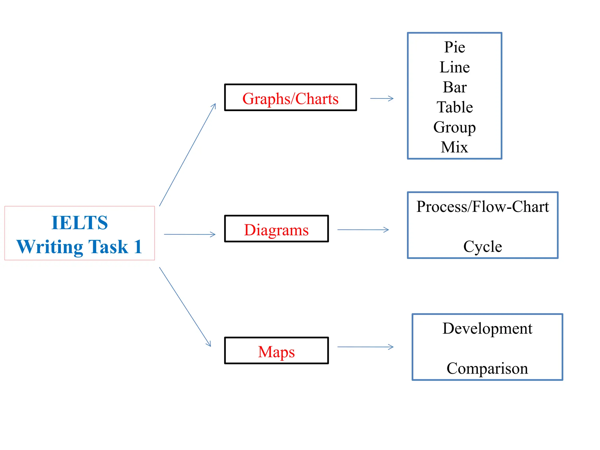
An Overview
Academic Writing
for IELTS
Slide 2 of 14 slides.
The Writing Section
The Writing is 60 minutes and there are 2 writing tasks.
Question paper. Official Answer sheet.
Task Time Number
of words
Example Task
1 20 150 Describe a graph or write a letter of complaint/apology.
2 40 250 Give an opinion on something or suggest a solution to a
problem.
IELTS
Writing Task 1
Graphs/Charts
Diagrams
Maps
Pie
Line
Bar
Table
Group
Mix
Process/Flow-Chart
Cycle
Development
Comparison
GRAPHS/CHARTS
In GROUPS
In
GROUPS
Multitypes/Mixed
MULTI types of Chart/graph
DIAGRAMS
Process/Flow-Chart
Cycle
MAPS
Academic Task 1
Pie Chart
Sales
white
red
blue
other
56,11%
28,05%
12,72%
3,12%
Look at this pie chart
Sales
white
red
blue
other
BAR CHART
Bar Graph
Introduction
The graph reveals/illustrates/etc …….
The number of people who visited the museum increased steadily/gradually
from 1990 to 2000, then dipped dramatically in 2005. since then, there was
a slight increased in number
Single and Multi
The chart below shows numbers of incidents and injuries
per 100 million passenger miles travelled (PMT)
by transportation type in 2002.
Paragraph Outline
Here's my advice for a 4-paragraph :
• Introduction:
Explain what the chart shows by paraphrasing the question.
• Overview:
Look for two main things - in this case, we could mention the highest item
and the fact that there were more incidents than injuries for all five
transport types. You don't need to mention any numbers at this point.
• Details/Body:
I'd probably group together the two highest items (demand response and
bus) in this paragraph. Remember that you can't talk about an increase or
decrease; you can only compare the numbers.
• Details/Body:
I'd group the three types of rail transport together for this paragraph.
Write some nice comparison sentences!
introduction
• The bar chart compares the number of
incidents and injuries for every 100 million
passenger miles travelled on five different
types of public transport in 2002.
overview
• It is clear that the most incidents and injuries
took place on demand-response vehicles. By
contrast, commuter rail services were
recorded as the lowest figures.
Body/details
• A total of 225 incidents and 173 injuries, per 100 million
passenger miles travelled, took place on demand-response
transport services. These figures were nearly three times as
high as those for the second highest category, bus services.
There were 76 incidents and 66 people were injured on buses.
• Rail services experienced fewer problems. The number of
incidents on light rail trains equalled the figure recorded for
buses, but there were significantly fewer injuries, at only 39.
Heavy rail services saw lower numbers of such events than light
rail services, but commuter rail passengers were even less likely
to experience problems. In fact, only 20 incidents and 17
injuries occurred on commuter trains.
Sales dropped dramatically in the first five years, but there was a recovery
towards the end of the decade
The data presented indicates that there was a drop of 10 % during
the first 6 months, but the rate rose slightly till the end of the year.
Introduction
The graph explains the fluctuation in the number
of people at a London underground station over
the course of a day
Sentence starter
Describing data
1. Rose from around 10
percent to 15 percent
2. Fell sharply to around 5
percent in both 1940 and
1945
3. Increased rapidly to a
peak of 20 percent
4. Fell dramatically to less
than 10 percent
5. Decreased steadily
to less than 10 percent
in 1955
6. Remained at this level
until 2000
Body #1
1. Fluctuated at around 12
percent from 1920 to 1940
2. Decreased dramatically
to under 5 percent in 1945
3. Increased rapidly to a peak
of about 15 percent in 1950
4. Fell gradually to about 12 percent in
the 1960s and around 7 or 8 percent
during the last 20 years of this period
Body #2
Adjectives and adverbs for speed of change:
3. How to Compare and Contrast
 Use conjunctions like: while/whilst/whereas/but
 Use linkers: however/in contrast by/by
comparison/meanwhile/on the other hand
For example:
Meanwhile, the US birth rate fluctuated at around 12
percent from 1920 to 1940.
Table
The table below gives information on consumer spending on
different items in five different countries in 2002.
Percentage of national consumer expenditure by category - 2002
Intro and overview
The table shows percentages of consumer
expenditure for three categories of products
and services in five countries in 2002.
It can be seen clearly that the largest proportion
of consumer spending in each country went on
food, drinks and tobacco. On the other hand,
the leisure/education category has the lowest
percentages in the table.
Body/detail
Out of the five countries, consumer spending on food, drinks and
tobacco was noticeably higher in Turkey, at 32.14%, and Ireland,
at nearly 29%. The proportion of spending on leisure and
education was also highest in Turkey, at 4.35%, while
expenditure on clothing and footwear was significantly higher in
Italy, at 9%, than in any of the other countries.
Sweden had the lowest percentages of national consumer
expenditure for food/drinks/tobacco and for clothing/footwear,
at nearly 16% and just over 5% respectively. Spain had slightly
higher figures for these categories, but the lowest figure for
leisure/education, at only 1.98%.
Mix/Combination Graphs
You should spend about 20 minutes on this task.
The graphs below shows the demand for electricity in England during typical days in
winter and summer. The pie chart shows how electricity is used in an average English
home.
Summarise the information by selecting and reporting the main features, and make
comparisons where relevant.
Write at least 150 words.
Writing Task 1
The first way
These graphs give information about how and what the English use their electricity (1)
during typical days in winter and summer.
In general, in winter, from 0 to 3, typical daily demand for electricity increases
sharply(about 32,000 to 40,000). Then, there is a rapid decline from 3 to 9 which hit the
lowest. However, it recovers from 9 to 12.From 12 to 16, it is stable. Followed by, (2) from
18 to 21, it growth (3) significantly. In 21, it reaches a peak. Finally, from 21to 24, it dropes
(4) enormously. In summer, from 0 to 9, typical daily demand for electricity drops sharply.
Then, from 9 to 12, it increases markedly (12,000 to 20,000 roughly).(5) Next by, (6) it is
stable from 15 to 21. At last, it drops steadly (7) from 21 to 24.
The pie chart indicates English people use the electricity. (8) Obviously, heating rooms,
heating water have the largest proportion, which constitute 52.5%,followed by ovens,
kettles, washing machines making up 17.5% and finally come lighting, TV, radio, vacuum,
cleaners, food mixes, electric tools have the same percentage. (9) And what is worth
mentioning is that heating rooms, heating water are the three times as many as ovens,
kettles, washing machines. (10)
Diagram
Diagram consists of
Process/flowchart Cycle
The skills that candidate
must have are as follow;
-Sequence
-Passive Voice
Process
It is less common in the
writing test, but sometimes
you will get an IELTS
process diagram to describe.
Outline :
1. Introduce the diagram
2. Give an overview
3. Give the detail
Life Cycle
The diagram shows the life cycle
of the honey bee.
This should follow the same format as
any task 1:
1. Introduce the diagram
2. Give an overview
3. Give the detail
Things to consider are :
How to summarise the diagram before
describing the stages in detail
Whether to use active or passive verb forms
Map
Map consists of
Comparison Development
The lexical resources
that candidate should
know are;
-Direction
-Comparison
Comparison Map
Go with the format:
1.Introduce the diagram
2. Give an overview
3. Give the detail
4. Give the detail
Development Map
Go with the format:
1.Introduce the diagram
2. Give an overview
3. Give the detail
4. Give the detail
Thank you/Mucho Gracias

IELTS Writing Guide Abn-wrtng Task 1-new.pptx

  • 1.
  • 2.
    Slide 2 of14 slides. The Writing Section The Writing is 60 minutes and there are 2 writing tasks. Question paper. Official Answer sheet. Task Time Number of words Example Task 1 20 150 Describe a graph or write a letter of complaint/apology. 2 40 250 Give an opinion on something or suggest a solution to a problem.
  • 4.
  • 5.
  • 7.
  • 8.
  • 10.
  • 11.
    MULTI types ofChart/graph
  • 12.
  • 13.
  • 14.
  • 15.
  • 20.
  • 25.
  • 26.
  • 33.
  • 36.
  • 39.
    Introduction The graph reveals/illustrates/etc……. The number of people who visited the museum increased steadily/gradually from 1990 to 2000, then dipped dramatically in 2005. since then, there was a slight increased in number
  • 40.
  • 41.
    The chart belowshows numbers of incidents and injuries per 100 million passenger miles travelled (PMT) by transportation type in 2002.
  • 42.
    Paragraph Outline Here's myadvice for a 4-paragraph : • Introduction: Explain what the chart shows by paraphrasing the question. • Overview: Look for two main things - in this case, we could mention the highest item and the fact that there were more incidents than injuries for all five transport types. You don't need to mention any numbers at this point. • Details/Body: I'd probably group together the two highest items (demand response and bus) in this paragraph. Remember that you can't talk about an increase or decrease; you can only compare the numbers. • Details/Body: I'd group the three types of rail transport together for this paragraph. Write some nice comparison sentences!
  • 43.
    introduction • The barchart compares the number of incidents and injuries for every 100 million passenger miles travelled on five different types of public transport in 2002.
  • 44.
    overview • It isclear that the most incidents and injuries took place on demand-response vehicles. By contrast, commuter rail services were recorded as the lowest figures.
  • 45.
    Body/details • A totalof 225 incidents and 173 injuries, per 100 million passenger miles travelled, took place on demand-response transport services. These figures were nearly three times as high as those for the second highest category, bus services. There were 76 incidents and 66 people were injured on buses. • Rail services experienced fewer problems. The number of incidents on light rail trains equalled the figure recorded for buses, but there were significantly fewer injuries, at only 39. Heavy rail services saw lower numbers of such events than light rail services, but commuter rail passengers were even less likely to experience problems. In fact, only 20 incidents and 17 injuries occurred on commuter trains.
  • 59.
    Sales dropped dramaticallyin the first five years, but there was a recovery towards the end of the decade
  • 60.
    The data presentedindicates that there was a drop of 10 % during the first 6 months, but the rate rose slightly till the end of the year.
  • 62.
    Introduction The graph explainsthe fluctuation in the number of people at a London underground station over the course of a day Sentence starter Describing data
  • 65.
    1. Rose fromaround 10 percent to 15 percent 2. Fell sharply to around 5 percent in both 1940 and 1945 3. Increased rapidly to a peak of 20 percent 4. Fell dramatically to less than 10 percent 5. Decreased steadily to less than 10 percent in 1955 6. Remained at this level until 2000 Body #1
  • 67.
    1. Fluctuated ataround 12 percent from 1920 to 1940 2. Decreased dramatically to under 5 percent in 1945 3. Increased rapidly to a peak of about 15 percent in 1950 4. Fell gradually to about 12 percent in the 1960s and around 7 or 8 percent during the last 20 years of this period Body #2
  • 69.
    Adjectives and adverbsfor speed of change:
  • 76.
    3. How toCompare and Contrast  Use conjunctions like: while/whilst/whereas/but  Use linkers: however/in contrast by/by comparison/meanwhile/on the other hand For example: Meanwhile, the US birth rate fluctuated at around 12 percent from 1920 to 1940.
  • 80.
  • 81.
    The table belowgives information on consumer spending on different items in five different countries in 2002. Percentage of national consumer expenditure by category - 2002
  • 82.
    Intro and overview Thetable shows percentages of consumer expenditure for three categories of products and services in five countries in 2002. It can be seen clearly that the largest proportion of consumer spending in each country went on food, drinks and tobacco. On the other hand, the leisure/education category has the lowest percentages in the table.
  • 83.
    Body/detail Out of thefive countries, consumer spending on food, drinks and tobacco was noticeably higher in Turkey, at 32.14%, and Ireland, at nearly 29%. The proportion of spending on leisure and education was also highest in Turkey, at 4.35%, while expenditure on clothing and footwear was significantly higher in Italy, at 9%, than in any of the other countries. Sweden had the lowest percentages of national consumer expenditure for food/drinks/tobacco and for clothing/footwear, at nearly 16% and just over 5% respectively. Spain had slightly higher figures for these categories, but the lowest figure for leisure/education, at only 1.98%.
  • 84.
  • 85.
    You should spendabout 20 minutes on this task. The graphs below shows the demand for electricity in England during typical days in winter and summer. The pie chart shows how electricity is used in an average English home. Summarise the information by selecting and reporting the main features, and make comparisons where relevant. Write at least 150 words. Writing Task 1
  • 87.
    The first way Thesegraphs give information about how and what the English use their electricity (1) during typical days in winter and summer. In general, in winter, from 0 to 3, typical daily demand for electricity increases sharply(about 32,000 to 40,000). Then, there is a rapid decline from 3 to 9 which hit the lowest. However, it recovers from 9 to 12.From 12 to 16, it is stable. Followed by, (2) from 18 to 21, it growth (3) significantly. In 21, it reaches a peak. Finally, from 21to 24, it dropes (4) enormously. In summer, from 0 to 9, typical daily demand for electricity drops sharply. Then, from 9 to 12, it increases markedly (12,000 to 20,000 roughly).(5) Next by, (6) it is stable from 15 to 21. At last, it drops steadly (7) from 21 to 24. The pie chart indicates English people use the electricity. (8) Obviously, heating rooms, heating water have the largest proportion, which constitute 52.5%,followed by ovens, kettles, washing machines making up 17.5% and finally come lighting, TV, radio, vacuum, cleaners, food mixes, electric tools have the same percentage. (9) And what is worth mentioning is that heating rooms, heating water are the three times as many as ovens, kettles, washing machines. (10)
  • 88.
  • 89.
  • 90.
    The skills thatcandidate must have are as follow; -Sequence -Passive Voice
  • 91.
    Process It is lesscommon in the writing test, but sometimes you will get an IELTS process diagram to describe. Outline : 1. Introduce the diagram 2. Give an overview 3. Give the detail
  • 93.
    Life Cycle The diagramshows the life cycle of the honey bee. This should follow the same format as any task 1: 1. Introduce the diagram 2. Give an overview 3. Give the detail Things to consider are : How to summarise the diagram before describing the stages in detail Whether to use active or passive verb forms
  • 94.
  • 95.
  • 98.
    The lexical resources thatcandidate should know are; -Direction -Comparison
  • 101.
    Comparison Map Go withthe format: 1.Introduce the diagram 2. Give an overview 3. Give the detail 4. Give the detail
  • 102.
    Development Map Go withthe format: 1.Introduce the diagram 2. Give an overview 3. Give the detail 4. Give the detail
  • 103.

Editor's Notes

  • #2 The writing section The writing is 60 minutes long and there are 2 writing tasks. Task 1 should take 20 minutes and will ask you to write 150 words. Examples of the tasks include describing a graph or writing a letter of complaint or apology. Task 2 should take 40 minutes and will ask you to write 250 words. Examples of the tasks include giving an opinion on something or suggesting a solution to a problem. You will be given a question paper and you should write your answers in the official answer sheet.