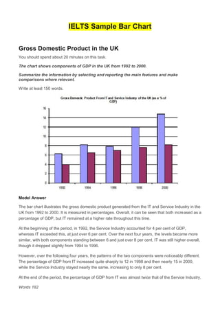
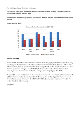
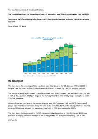
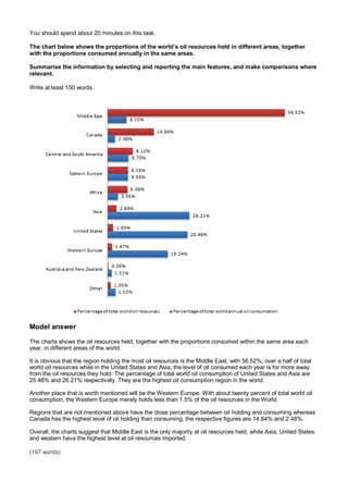
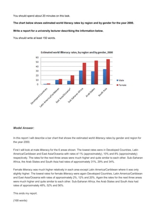
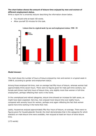
SlideShare a Scribd company logo
1 of 39
Download to read offline
IELTS Sample Bar Chart
Gross Domestic Product in the UK
You should spend about 20 minutes on this task.
The chart shows components of GDP in the UK from 1992 to 2000.
Summarize the information by selecting and reporting the main features and make
comparisons where relevant.
Write at least 150 words.
Model Answer
The bar chart illustrates the gross domestic product generated from the IT and Service Industry in the
UK from 1992 to 2000. It is measured in percentages. Overall, it can be seen that both increased as a
percentage of GDP, but IT remained at a higher rate throughout this time.
At the beginning of the period, in 1992, the Service Industry accounted for 4 per cent of GDP,
whereas IT exceeded this, at just over 6 per cent. Over the next four years, the levels became more
similar, with both components standing between 6 and just over 8 per cent. IT was still higher overall,
though it dropped slightly from 1994 to 1996.
However, over the following four years, the patterns of the two components were noticeably different.
The percentage of GDP from IT increased quite sharply to 12 in 1998 and then nearly 15 in 2000,
while the Service Industry stayed nearly the same, increasing to only 8 per cent.
At the end of the period, the percentage of GDP from IT was almost twice that of the Service Industry.
Words 182
You should spend about 20 minutes on this task.
The graph below shows female unemployment rates in each country of the United Kingdom in 2013 and
2014.
Summarise the information by selecting and reporting the main features, and make comparisons where
relevant.
Write at least 150 words.
Model answer
The bar chart shows the unemployment rates among women in the countries that make up the United Kingdom,
both in 2013 and in 2014. There has generally been a small decrease in female unemployment rates from 2013
to 2014, except in Scotland.
In 2013, 5.6% of women in Northern Ireland were unemployed. The only country with a smaller percentage of
women unemployed was Wales, with a rate of 5.4%. Both countries saw a decrease in the percentage of
unemployed women in 2014. In Northern Ireland, the percentage fell to 4.6% and in Wales it fell to 5%.
England had the greatest percentage of unemployed women in 2013, with 6.8%. However, this decreased by
0.3% in 2014. Lastly, Scotland was the only country which had an increasing percentage of unemployed
women. In 2013, it had 6.1% of women out of work. This increased to 6.7% in 2014, making it the country with
the highest female unemployment rate of the four countries.
(160 words)
You should spend about 20 minutes on this task.
The charts give information about two genres of TV programmes watched by men and women and four
different age groups in Australia.
Summarise the information by selecting and reporting the main features, and make comparisons where
relevant.
Write at least 150 words.
Model Answer.
The charts give information about the genres of TV programmes that Australian men and women and different
age groups watch. It is clear from the charts that women tend to watch more television than man overall,
although they watch slightly fewer game shows. The people who watch the mosttelevision are in the 45+ age
group.
Nearly 70% of women watch reality shows, which is almost twice as many as the percentage of men who
choose this genre of programme. Nevertheless, most age groups watch more reality shows than game shows
revealing that game shows are generally less popular than reality shows.
The percentage of people watching reality shows increases steadily from ages 16 to 45 with thelowest /
smallest percentage of viewers, at just over 50% of the age group 16-24 and the highest / biggest / largest /
greatest percentage, at 68% of the over-45s.
However, the pattern is different for game shows. The number of programmes watched by 25- to 44-year-olds
is significantly / considerably lower than the number watched by 16- to 24-year-olds and those over 45. Just
over 50% of 16- to 24-year-olds watch game shows, but this share is not ashigh as the share of people aged 45
and over watching game shows, at nearly 70%. Only 41% of 35- to 44-year-olds watch game shows, and the
share of 24- to 34-year-olds is slightly / even lower at 38%.
You should spend about 20 minutes on this task.
The bar chart below shows shares of expenditures for five major categories in the United States,
Canada, the United Kingdom, and Japan in the year 2009.
Write a report for a university lecturer describing the information below.
Write at least 150 words.
Model Answer:
The bar chart compares how consumers in the United States, Canada, the United Kingdom, and Japan
allocated different shares of total spending to categories such as food, housing, and transportation in 2009.
We can see that the United States had the highest housing expenditure share, 26% of total expenditures in
2009. The United Kingdom and Japan followed, with 24% and 22%, respectively. Canada had
the lowest housing share at 21%. Housing was the largest expenditure component in all
countries except Japan.
By contrast, Canada had the largest transportation share of all four countries at 20%. The United States and
the United Kingdom had the next-highest transportation shares, 17% and 15%, respectively. Japan had the
lowest, at 10%.
However, in Japan, consumers spent 23% of their total expenditures on food in 2009. The United Kingdom had
the second-highest share at 20%. Canada, with 15%, and the United States, with 14% had the lowest food
expenditure shares among the countries studied.
Overall, the data indicates that housing and health care shares of total expenditures were higherin the United
States than in Canada, the United Kingdom, and Japan in 2009, whereas Americans had the lowest clothing
share. Canada had the highest clothing and transportation shares, and Japan had the highest food
share, among the countries compared.
(214 words)
You should spend about 20 minutes on this task.
The chart below shows the percentage change in the share of international students among university
graduates in different Canadian provinces between 2001 and 2006.
Summarise the information by selecting and reporting the main features, and make comparisons where
relevant.
Write at least 150 words.
Model answer
The chart shows changes in the share of international students who graduated from universities in different
Canadian provinces over a period of 5 years.
In 2001, this share had a relatively narrow range, from 3% in Ontario to 7.0% in New Brunswick. Nova Scotia
had the second highest proportion at 6.5%. Five years later, the figures for most provinces had risen, with the
exception of Alberta. There, the figures fell by 1% to just over 4%.
By 2006, some parts of Canada experienced a considerable increase in their share of international graduates.
Growth in this share was especially strong in the case of New Brunswick, where the figures rose from 7% to
12%. The largest growth occurred in British Columbia, where it more than doubled to 11%.
Over this five-year period, changes in the proportion of international graduates have been very uneven across
the provinces of Canada. However, New Brunswick remained the province with the highest percentage overall.
(158 words)
You should spend about 20 minutes on this task.
The chart below gives information about the UK's ageing population in 1985 and makes predictions for
2035.
Summarise the information by selecting and reporting the main features, and make comparisons where
relevant.
Write at least 150 words.
Model answer
The graph shows how the size and distribution of the UK's ageing population is likely to change over a 50-year
period.
Overall, the proportions are predicted to increase in all UK countries. In 1985, 15 per cent of the UK population
was over 65, but by 2035, this will account for 23 per cent of the total population.
A closer look at the data reveals that the ageing population is expected to rise more in some parts of the UK
than in other. In 1985, Wales had the highest percentage of people aged 65 and over, at 16 per cent. The
second-largest group could be found in England and the third in Scotland. Northern Ireland had lowest
proportion, with 12 per cent aged 65 and over.
By 2035, Wales is still going to have by far the greatest percentage of over 65s, with figures likely to reach 26
per cent. However, the biggest increases in this age group, relative to the rest of the population, are predicted
to occur in Northern Ireland and Scotland. In Northern Ireland, for example, this figure will increase almost
double to 23 per cent.
(189 words)
You should spend about 20 minutes on this task.
The bar chart below gives information about the percentage of the population living in urban areas in
the world and in different continents.
Summarise the information by selecting and reporting the main features, and make comparisons where
relevant.
Write at least 150 words.
Model Answer:
The bar chart shows the urbanization percentage of the world in 1950 and compares this with the percentage in
2007 and the projected percentage for 2030.
Between 1950 and 2030, the proportion of the world's population residing in cities is expected todouble,
growing from 29% to 60%. However, this rate is less marked in some continents than others.
For example, 64% of the population of North America was urban in 1950, increasing to 79% by 2007. By
contrast, just 15% of the African population was urban in 1950, but this rose to 37% by 2007. This represents
one of the highest urbanization rates in the world, even though the percentage of Africans in urban areas is
still smaller than the world average.
It is also clear from the graph that, urbanization in Latin America is projected to be higher than Europe in
2030, in spite of being lower in 1950.
(151 words)
You should spend about 20 minutes on this task.
The chart below shows the percentage of male and female teachers in six different types of educational
setting in the UK in 2010.
Summarise the information by selecting and reporting the main features, and make comparisons where
relevant.
Write at least 150 words.
Model answer
The bar chart gives information about the gender of teachers in six types of educational institutions in the UK in
2010. It shows what percentage of teachers was male and what percentage was female.
Women dominated the teaching profession in primary education, but less so at lower and upper secondary
education. It was particularly true of nursery school, where the share of female teachers was above 95%.
Similarly one-sided was the situation in primary school, where over 90% of teachers were also female.
At secondary and upper secondary level this pattern was less pronounced, where there were nearly equal
proportions of male and female teachers. On the other hand, male teachers outnumbered female teachers in
high-level education, where the proportion of men was twice that for women.
Overall, the higher the level of education, the more male teachers dominated, and the reverse occurred with
respect to female teachers.
(150 words)
You should spend about 20 minutes on this task.
The bar chart below gives information about the number of students studying Computer Science at a
UK university between 2010 and 2012.
Summarise the information by selecting and reporting the main features, and make comparisons where
relevant.
Write at least 150 words.
Model answer
The bar chart illustrates the number of male and female students studying Computer Science at a UK university
over three years. It also indicates whether they were home or international students. Compared to the number
of home students, the number of international students was significantly smaller. Nevertheless, there was clear
statistical growth in the latter group from 2010-2012. Furthermore, the number of female home students
eventually overtook the number of males from the same group, reaching a high of 45 in 2012.
The year 2011 saw the most dramatic developments; the number of male home students fell from just below 40
to 24 and the number of females rose from 32 to 44. There was also significant growth in the number of male
students from overseas, climbing from 20 in 2010 to 39 in 2012. Overall, we can see an upward trend in the
number of students at the university.
(150 words)
You should spend about 20 minutes on this task.
The chart below shows the total number of minutes (in millions) of telephone calls in Finland, divided
into three categories, from 1995 – 2004.
Summarise the information by selecting and reporting the main features, and make comparisons where
relevant.
Write at least 150 words.
Model answer
The chart shows the time spent by Finland’s residents on different types of telephone calls between 1995 and
2004.
Local landline calls were the highest throughout the period, rising from 12000 million minutes in 1995 to just
under 17000 million in 2000. After peaking at 17000 million the following year, these calls had fallen back to the
1995 figure by 2004.
National and international landline calls grew steadily from 6000 million to 10500 million at the end of the period
in question, though the growth slowed over the last two years.
There was a dramatic increase in mobile calls from 250 to 9800 million minutes. This rise was particularly
noticeable between 2000 and 2004, during which time the use of mobile phones tripled.
To sum up, although local landline calls were still the most popular in 2004, the gap between the three
categories had narrowed considerately over the second half of the period in question.
(155 words)
You should spend about 20 minutes on this task.
The graph below shows the changes in maximum number of Asian elephants between 1994 and 2007.
Summarise the information by selecting and reporting the main features, and make comparisons where
relevant.
Write at least 150 words.
Model answer
The graph shows the estimated maximum population of elephants in a range of Asian countries in both 1997
and 2004.
In most of the countries included in the graph, the population fell. This was most noticeable in Malaysia and
Thailand, where the number of elephants was thought to be less than half the figure in 1997. In the former, the
number of elephants dropped as low as 1000. India remained the country with by far the largest elephant
population, but experienced a dramatic fall in numbers so that in 2004 there may have been as few as 7500.
Despite its size, China had a very small population of at most 500 elephants by 2004.
Although the trend was downwards overall, elephant populations were thought to have remained stable in Laos
and Vietnam at approximately 1200. The only country where elephants showed signs of recovering was
Cambodia, where numbers may have risen by up to 200.
(155 words)
You should spend about 20 minutes on this task.
The chart below shows the GDP growth per year for three countries between 2007 and 2010.
Summarise the information by selecting and reporting the main features, and make comparisons where
relevant.
Write at least 150 words.
Model answer
The chart shows the annual GDP growth for three countries from 2007 to 2010.
By the year 2007 the figure for Tunisia was by far the highest at close to 6.3% per annum. This figure is double
that of Ecuador and three times that of Japan on a global level.
However by 2008 this trend has changed considerably; the Japanese doubled their annual GDP over this
period and there was also an increase in the GDP of Ecuador, while Tunisia fell to 4.5% per year. In 2009 and
2010, the downward trend for Tunisia continued falling to a low of 3% at the end of this period.
For Ecuador, the GDP fell sharply to just under 1.5% in the year 2009 and rose only slightly in 2010 to 2.3%.
On the other hand, for Japan, the GDP figure rose significantly throughout this time and by the year 2010 had
more than matched the GDP figures for Tunisia of the year 2007.
(162 words)
You should spend about 20 minutes on this task.
The chart below shows the percentage of total US population aged 65 and over between 1900 and 2000.
Summarise the information by selecting and reporting the main features, and make comparisons where
relevant.
Write at least 150 words.
Model answer
The chart shows the percentage of total population aged 65 and over in the U.S. between 1900 and 2000. In
the year 1900 just over 4% of the population was aged over 65. However, by 1960 this figure had doubled.
The number of people aged between 75 and 84 remained fairly steady between 1900 and 1930, making up only
1-1.3% of the population. The figure began to rise more significantly in 1940 and by 1970 it had tripled to reach
3% of the population.
Although there was no change in the number of people aged 65 -74 between 1960 and 1970, the number of
people aged 75 and over increased during this time. By the year 2000, 12.4% of the US population had reached
the age of 65 or more, although this was slightly lower than in 1990 when it peaked at 12.6%.
The chart shows that today people in the U.S. can expect to live longer than in 1900. By the year 2000 more
than 12% of the population had managed to live to the age of 65 and over compared to only 4.1% in 1900.
(187 words)
You should spend about 20 minutes on this task.
The chart below shows male and female fitness membership between 1970 and 2000.
Summarise the information by selecting and reporting the main features, and make comparisons where
relevant.
Write at least 150 words.
Model answer
The chart shows male and female fitness membership over a thirty-year period. The vertical axis represents the
number of members. The horizontal axis represents the period from 1970 to 2000.
Overall, the chart indicates that there were greater fluctuations in fitness membership among men than among
women. The number of male members started the period at just over two thousand and reached highs of four
thousand in 1975 and five thousand around 1995. The lowest rates were in 1985 and more recently in 2000
when the rate dipped as low as one thousand.
Female fitness membership began lower at one thousand, doubled by 1975, and then fluctuated between two
and three thousand for the remainder of the period. When male rates were at their lowest, female rates were
higher. This was particularly true in 1985 when over three thousand women held fitness membership.
In brief, there were marked differences in rates of male and female fitness memberships in the period covered.
(161 words)
You should spend about 20 minutes on this task.
The chart below shows information about the challenges people face when they go to live in other
countries.
Summarise the information by selecting and reporting the main features, and make comparisons where
relevant.
Write at least 150 words.
Model answer
The chart shows the challenges people face when they settle in a new country and how the challenges vary
according to people’s ages.
The most challenging aspect for young people aged 18 to 34 is making new friends, a problem experienced by
46% of the people in this age group. However, only 36% of 35 - 54 year olds find it hard to make friends, while
even fewer people over 55 (23%) have this problem.
54% of the older age group finds learning the local language the biggest obstacle when settling. In comparison,
the youngest age group finds this easier, and the percentage of people who have problems learning the
language is much lower, at only 29%.
In contrast to their language-learning difficulties, only 22% of people in the oldest age group have trouble
finding accommodation. However, this is the second most significant problem for the other two age groups with
39% to 40% of the people in each group finding it hard.
In general, all age groups experience the same problems to some extent, but people over the age of 55
reported that they face markedly fewer challenges settling in a new country than their younger respondents.
(198 words)
You should spend about 20 minutes on this task.
The chart below shows the number of girls per 100 boys enrolled in different levels of school education.
Write a short report for a university lecturer describing the information shown below.
You should write at least 150 words.
Model answer
The chart shows the number of female students per 100 male students in primary, secondary and tertiary
education.
On Average, more boys than girls were enrolled in school both in 1990 and 1998 in all the countries, except in
tertiary education in developed countries. The number of girls per 100 boys was bigger in 1998 than in 1990 in
the two country groups and in all the educational stages.
Turning to the detail, there were more boys than girls in primary and secondary education. As can be seen,
developing countries saw a bigger discrepancy between the numbers of male and female students than
developed countries, with the number of girls per 100 boys at 83 in 1990 and 87 in 1998 in primary education.
However, in developed countries, the balance of the two was much closer to the ideal, particularly in secondary
education, with 98 girls per 100 boys in 1990 and 99 in 1998.
Regarding tertiary education, the balance was even worse than in any other levels of education in developing
countries with 66 girls enrolled for every 100 boys in 1990 and 75 in 1998. On the other hand, in developing
countries, the number of girls overtook that of boys at 105 per 100 boys in 1990 and 112 in 1998.
(213 words)
You should spend about 20 minutes on this task.
The chart below shows the proportions of the world’s oil resources held in different areas, together
with the proportions consumed annually in the same areas.
Summarise the information by selecting and reporting the main features, and make comparisons where
relevant.
Write at least 150 words.
Model answer
The charts shows the oil resources held, together with the proportions consumed within the same area each
year, in different areas of the world.
It is obvious that the region holding the most oil resources is the Middle East, with 56.52%, over a half of total
world oil resources while in the United States and Asia, the level of oil consumed each year is for more away
from the oil resources they hold. The percentage of total world oil consumption of United States and Asia are
25.48% and 26.21% respectively. They are the highest oil consumption region in the world.
Another place that is worth mentioned will be the Western Europe. With about twenty percent of total world oil
consumption, the Western Europe merely holds less than 1.5% of the oil resources in the World.
Regions that are not mentioned above have the close percentage between oil holding and consuming whereas
Canada has the highest level of oil holding than consuming, the respective figures are 14.84% and 2.48%.
Overall, the charts suggest that Middle East is the only majority at oil resources held, while Asia, United States
and western have the highest level at oil resources imported.
(197 words)
You should spend about 20 minutes on this task.
The chart shows student expenditure over a three-year period in the United Kingdom.
Summarise the information by selecting and reporting the main features, and make comparisons where
relevant.
Write at least 150 words.
Student expenditure (aged under 26 in higher education) United Kingdom*
Percentage of total expenditure
Model Answer:
The chart shows the changes which took place in student spending in the United Kingdom during/over the
three-year period from 1996 to 1999.
Students spent 3% less on accommodation, which fell from 23% to 20% of total expenditure, and there was a
2% decrease in spending on food, bills and household goods, which fell from 20% to 18%. At the same time
course expenditure went down by 3% from 10% to 7%. Children, who constituted 1% of students' expenditure
in 1996, are not represented in 1999.
On the other hand, there was a 5% growth in spending on entertainment, which stood at 26% of total
expenditure in 1996 but rose to 31% in 1999. Spending on other non-essential items and credit repayments
grew by 4% to make up 16% of total expenditure. Spending on essential travel went upby 3% while non-
essential travel underwent a 1% fall.
Overall, with the exception of expenditure on travel, the most significant general change was a shift
from/in spending on essential items to spending on non-essential items.
You should spend about 20 minutes on this task.
The graph below gives information about the preferred leisure activities of Australian children.
Write a report for a university lecturer describing the information shown.
You should write at least 150 words.
Model Answer:
The graph shows the preferred leisure sctivities of Australian children aged 5-14. As might be expected, it is
clear from the data that sedentary pursuits are far more popular nowadays than active ones.
Of the 10,000 children that were interviewed, all the boys and girls stated that they enjoyed watching TV or
videos in their spare time. In addition, the second most popular activity, attracting 80% of boys and 60% of girls,
was playing electronic or computer games. While girls rated activities such as art and craft highly – just under
60% stated that they enjoyed these in their spare time – only 35% of boys opted for creative pastimes. Bike
riding, on the other hand, was almost as popular as electronic games amongst boys and, perhaps surprisingly,
almost 60% of girls said that they enjoyed this too. Skateboarding was relatively less popular amongst both
boys and girls, although it still attracted 35% of boys and 25% of girls.
(157 words)
You should spend about 20 minutes on this task.
The bar chart below shows the results of a survey conducted by a personnel department at a major
company. The survey was carried out on two groups of workers: those aged from 18-30 and those aged
45-60, and shows factors affecting their work performance.
Write a report for a university lecturer describing the information shown below.
You should write at least 150 words.
Model Answer:
The bar chart indicates a survey on two different age groups on the factors contributing to make their
environment pleasant for working.
These factors are divided into external and internal factors. The internal factors are team spirit, competent boss,
respect from colleagues and job satisfaction. The external factors are chance for personal development, job
security, promotional prospects and money.
On the internal factors above 50% in both age groups agreed that team spirit, competent boss and job
satisfaction are essential to make their environment pleasant. Whereas on the external factors, there are
contrasting results. On the chance for personal development and promotional aspects, 80% to 90% of the
younger groups were in favor while only less than 50% of the older group thought so. A similar pattern is also
noted on job security. With regards to money, 69% to 70% on both age group said it is essential.
In conclusion, the internal factors have similar responses from the two age groups while they had dissimilar
responses on the external factors.
(170 words)
You should spend about 20 minutes on this task.
The chart below shows estimated world literacy rates by region and by gender for the year 2000.
Write a report for a university lecturer describing the information below.
You should write at least 150 words.
Model Answer:
In this report I will describe a bar chart that shows the estimated world illiteracy rates by gender and region for
the year 2000.
First I will look at male illiteracy for the 6 areas shown. The lowest rates were in Developed Countries, Latin
America/Caribbean and East Asia/Oceania with rates of 1% (approximately), 10% and 8% (approximately)
respectively. The rates for the next three areas were much higher and quite similar to each other. Sub-Saharan
Africa, the Arab States and South Asia had rates of approximately 31%, 29% and 34%.
Female illiteracy was much higher relatively in each area except Latin America/Caribbean where it was only
slightly higher. The lowest rates for female illiteracy were again Developed Countries, Latin America/Caribbean
and East Asia/Oceania with rates of approximately 2%, 12% and 20%. Again the rates for the next three areas
were much higher and quite similar to each other. Sub-Saharan Africa, the Arab States and South Asia had
rates of approximately 48%, 52% and 56%.
This ends my report.
(168 words)
You should spend about 20 minutes on this task.
The chart shows the number of mobile phones and landlines per 100 people in selected countries.
Write a report for a university lecturer describing the information given.
You should write at least 150 words.
Model Answer:
The graph shows the number of mobile phones and landlines per 100 users, for selected countries.
Overall, most of the countries included in the graph have more mobile phones subscribers than
landlines.
Most European countries have high mobile phone use. The biggest users of mobile phones are the
Italians, with 88 cell phones per 100 people. For example, Italy has twice as many mobile phones as
landlines, with 88 mobiles per hundred people compared to 45 for landlines. Mobile phone use is low
in Canada, with fewer than 40 phones per 100 people. Denmark is also unusual because it has
slightly more landlines than mobile phones.
However, in some countries, the number of landlines is higher than the number of mobile phones.
One example is the USA, where the number of mobiles, at 50 per 100 people, is much lower than the
number of landlines, at almost 70 per hundred. A similar pattern can be seen in Canada. The highest
number of landlines in the graph is in Denmark, with about 90 per 100 people. In contrast, the lowest
figures for fixed lines are in Italy and the UK.
In conclusion, it seems that mobile phone use is higher in Europe than in North America.
(205 words)
You should spend about 20 minutes on this task.
The chart below shows the figures for imprisonment in five countries between 1930 and 1980.
Write a report for a university, lecturer describing the information shown below.
You should write at least 150 words.
Model Answer:
The table shows that the figures for imprisonment in the five countries mentioned indicate no overall pattern of
increase or decrease. In fact there is considerable fluctuation from country to country.
In Great Britain the numbers in prison have increased steadily from 30 000 in 1930 to 80,000 in 1980. On the
other hand in Australia, and particularly in New Zealand the numbers fell markedly from 1930 to 1940. Since
then they have increased gradually, apart from in 1980 when the numbers in prison in New Zealand fell by
about 30,000 from the 1970 total. Canada is the only country in which the numbers in prison have decreased
over the period 1930 to 1980, although there have been fluctuations in this trend. The figures for the United
States indicate the greatest number of prisoners compared to the other four countries but population size needs
to be taken into account in this analysis. The prison population in the United States increased rapidly from 1970
to 1980 and this must be a worrying trend.
(172 words)
You should spend about 20 minutes on this task.
The chart below shows the employment rates across 6 countries in 1995 and 2005.
Summarize the information by choosing and describe the main idea, and make
comparisons where appropriate.
You should write at least 150 words.
Model Answer:
The graph shows changes in employment rates in six countries between 1995 and 2005, for men
and women. Overall more and more people of working age are employed, and there have been
significant improvements for women, although they leg behind men in entering the workforce.
The most obvious trend in the graph is that women have lower employment rates in most of the
countries in the graph. For example, in Australia in 1995, 57 percent of men could find work or
retain a job, but only 27 percent of women. The difference was even bigger in New Zealand, with
60 percent of women. Even in Switzerland and Iceland, alightly more men than women were in
the job market.
The second biggest trend in the graph is the improvement in employment between 1995 and
2005. In all countries shown, figures for both men and women improved. The biggest change was
in the United Kingdom, from 55 percent of men in 1995 to 73 percent over the ten years period.
Furthermore, the increases in employment rates for women were much higher in New Zealand.
The percentage of working women jumped from 25 percent to 42 percent, and in the United
States from 45 percent to 61 percent over the decade.
In conclusion, all the countries in the graph showed at least a 12 percent increase in employment
rates of both men and women over the ten yeares. While men had relatively higher employment
rate throughout the period, more and more women appear to be entering the labour market.
(256 words)
The graph shows Internet Usage in Taiwan by Age Group, 1998-2000.
Summarise the information by selecting and reporting the main features, and make comparisons
where relevant.
 You should write at least 150 words.
 You should spend about 20 minutes on this task.
Model Answer:
The graph shows changes in the age profile of Internet users in Taiwan between 1998 and 2000.
The main users of the Internet in Taiwan are young adults between 16 and 30 years old. In
1998, they accounted for more than half of all users. In 1999 the number dropped slightly to
45%, but even in 2000 they were the biggest group.
The second biggest group of users is aged between 31 and 50. They made up 41% in 1998,
falling slightly to 37% in 2000. When combined with the 16-30 age group, over 94% of users in
1998 were between 16 and 50.
However this number is dropping steadily as more children and older users log on. In 1999, the
number of children online quadrupled from 2% to 8%, and it continued to increase in 2000.
There were similar increases for older users, rising from 4% in 1998 to 10% in 2000.
In summary, while adults between 16 and 50 still represent the great majority of Internet users
in Taiwan, their share is declining as more children and older users join the web.
(184 words)
The graph shows estimated oil production capacity for several Gulf countries between
1990 and 2010.
Summarise the information by selecting and reporting the main features, and make comparisons
where relevant.
 You should write at least 150 words.
 You should spend about 20 minutes on this task.
Model Answer:
The graph shows Oil Production Capacity in millions of barrels per day for selected Gulf countries.
There are several features in this graph.
The most significant feature is that oil production will increase sharply in almost all the countries
shown. Kuwait and Iraq are both expected to double their output between 1990 and 2010, with
Kuwait's production rising from 1.8 million barrels per day (bpd) in 1990 to 3.8 in 2010. Iran will
also increase its output by a slightly smaller amount. After remaining steady at 2.5 million bpd
from 1990 to 2000, the UAE's output is expected to approach 4.0 million bpd in 2010. Only
Qatar's production is predicted to fall, back to 0.8 million bpd after a slight rise in 2000.
However, the greatest increase will be from Saudi Arabia. In 1990, its output capacity at 8.5
million bpd exceeded the combined production of Iran, Iraq and Kuwait. This lead is expected to
continue with a 75% increase in production to 14.5 million bpd 2010.
In summary, while most of the countries are expected to show increases, Saudi Arabia will
maintain and strengthen its position as the major producer.
(191 words)
The chart below shows information about Heart Attacks by Age and Gender in USA.
Summarise the information by selecting and reporting the main features, and make comparisons
where relevant.
 You should write at least 150 words.
 You should spend about 20 minutes on this task.
Model Answer:
The graph shows how age and gender influence the frequency of heart attacks in the US.
Less than 6% of all heart attacks occur in the 29-44 age group. The number of women who suffer
heart attacks in this group is negligible - only 3000 per year, compared to 123,000 men.
However the proportion of men and women with heart attacks rises dramatically between 45 and
64, with over half a million per year. Over 420,000 men a year in this age group have heart attacks.
The incidence amongst women increases - women have one heart attack for every three men in this
age group.
Over the age of 65, the number of men suffering heart attacks only increases slightly. However there
is a huge increase in the number of women with heart attacks - they comprise over 40% of all
victims.
In conclusion, men are more likely to be the victims of heart attacks at all ages, but women are
increasingly likely over the age of 65.
(168 words)
The chart below shows the amount spent on six consumer goods in four European
countries.
Write a report for a university lecturer describing the information shown below.
 You should write at least 150 words.
 You should spend about 20 minutes on this task.
Model Answer:
The chart shows that Britain, among the four European countries listed, has spent most heavily
on the range of consumer goods included. In every case, British spending is considerably higher
than that of other countries; only in the case of tennis racquets does another country, Italy,
come close.
In contrast, Germany is generally the lowest spender. This Is most evident in photographic film,
where Germany spends much less than Britain. Germany only spends more than another
country, France, in two cases; tennis racquets and perfumes.
Meanwhile, France and Italy generally maintain middle positions, averaging approximately similar
spending overall. Specifically, France spends more on CDs and photographic film but less on
tennis racquets than Italy does. Italys spending on personal stereos is only marginally greater
than that of France, while spending on toys is equal between the two.
It is clear from the data given that there are some significant differences in spending habits
within Europe.
(155 words)
Write a report describing the information in the graph below.
 You should write at least 150 words.
 You should spend about 20 minutes on this task.
Model Answer:
The chart shows striking changes in the fertility rate of women in six Gulf countries – Saudi
Arabia, the UAE, Oman, Qatar, Kuwait and Bahrain between 1990 and 2000.
In the ten year period, there was a decline in the number of births per woman in all countries.
The biggest declines were in two countries which had low fertility rates at the start of the decade,
Bahrain and the UAE.
Fertility rates vary greatly between the six countries. Oman and Saudi Arabia had the highest
rates, with over seven births per woman in 1990. This compared with around 4 births per woman
in Bahrain and the UAE, and just 3.75 in Kuwait
By 2000, the rate had fallen below three births per woman in Kuwait, Bahrain and the UAE, with
a drop of over 25% in a decade in the UAE. However, in Saudi Arabia and Oman, the rates fell by
just 20%, from 7.0 to 5.5.
In summary, there were major decreases in birth rates in all countries, but some countries in the
region have double the fertility rate of others.
(181 words)
Write a report for a university lecturer describing the information below.
 You should write at least 150 words.
 You should spend about 20 minutes on this task.
Model Answer:
The graph shows weekly expenditure on fast food in Britain by food and income group. There are
two main trends. First, the expenditure is directly related to income. Secondly, there are
differences in the types of fast food eaten by each group.
The amount of money spent on fast food is related to income. People in the high-income group
spent the most - over 85 pence per person per week. People in the low-income group spent the
least - less than half of what the high-income earners spent.
The type of fast food eaten also depends on the group. High-income earners spent 3 times more
on hamburgers than people in the low-income group. Pizza was generally the least favorite food.
Fish and chips was the most popular food with the low-income group but consumption was fairly
similar among all groups.
(140 words)
The graph below shows the different modes of transport used to travel to and from
work in one European city in 1960, 1980 and 2000.
Write a report for a university lecturer describing the information below.
 You should write at least 150 words.
 You should spend about 20 minutes on this task.
Model Answer:
The graph shows the changing patterns in commuting by train, car, tube or bus for commuters in
London in the years 1960, 1980 and 2000.
The number of people using trains at first rose from just under 20% in 1960 to about 26% in
1980, but then fell back to about 23% in 2000.
Use of the tube has been relatively stable, falling from around 27% of commuters in 1960 to
22% in 1980, but climbing back to reach 25% by 2000.
On the other hand, the use of cars increased steadily from just over 5% in 1960 to 23% in 1980,
reaching almost 40% by 2000, whereas the popularity of buses has declined since 1960, falling
from just under 35% in 1960 to 27% in 1980 and only 15% in 2000.
The graph indicates the growing use of cars for commuting to work between 1960 - 2000, and
the corresponding decline in the popularity of buses from being the most popular mode of
transport in 1960 to the least popular in 2000.
(173 words)
Write a report describing the information in the graph below.
 You should write at least 150 words.
 You should spend about 20 minutes on this task.
Model Answer:
The chart shows striking differences in the level of computer and Internet penetration in the Arab
world.
The UAE and Kuwait are by far the most computerized countries, with Lebanon a distant third.
The UAE has over 150 computers for every 1000 inhabitants, compared to Kuwait's 130 and
Lebanon's 60. In contrast, countries such as Egypt, Morocco and Syria have less than 20
computers per 1000 inhabitants.
There are also great differences in Internet use and availability. The UAE has by far the highest
proportion of users, with more than one-third of its population using the Internet. Kuwait and
Lebanon are second and third again, with 100 users per thousand in Kuwait and 80 in Lebanon.
In some countries the number using the Internet is negligible: Saudi Arabia has less than 20
users per thousand, and there are fewer than 5 users per thousand in Syria.
One unusual feature of the graph is that Internet use does not seem to be directly related to the
number of computers. In several countries (the UAE, Lebanon, Jordan and Oman), there are
more Internet users per thousand people than computers. However, in other countries, such as
Kuwait, Saudi Arabia and Syria, the number of Internet users is lower than the number of
computers.
In summary, there are major differences between computer use and Internet use in the Arab
world, but the UAE clearly leads the area in both number of computers and number of internet
users per capita.
(245 words)
The chart below shows the amount of leisure time enjoyed by men and women of
different employment status.
Write a report for a university lecturer describing the information shown below.
 You should write at least 150 words.
 Allow yourself 20 minutes for this task.
Model Answer:
The chart shows the number of hours of leisure enjoyed by men and women in a typical week in
1998-9, according to gender and employment status.
Among those employed full-time, men on average had fifty hours of leisure, whereas women had
approximately thirty-seven hours. There were no figures given for male part-time workers, but
female part-timers had forty hours of leisure time, only slightly more than women in full-time
employment, perhaps reflecting their work in the home.
In the unemployed and retired categories, leisure time showed an increase for both sexes, as
might have been expected. Here too, men enjoyed more leisure time over eighty hours,
compared with seventy hours for women, perhaps once again reflecting the fact that women
spend more time working in the home than men.
Lastly, housewives enjoyed approximately fifty-four hours of leisure, on average. There were no
figures given for househusbands! Overall, the chart demonstrates that in the categories for which
statistics on male leisure time were available, men enjoyed at least ten hours of extra leisure
time.
(173 words)
The diagram below shows the average hours of unpaid work per week done by people
in different categories. (Unpaid work refers to such activities as childcare in the home,
housework and gardening.)
Describe the information presented below, comparing results for men and women in the
categories shown. Suggest reasons for what you see.
 You should write at least 150 words.
 You should spend about 20 minutes on this task.
Model Answer:
The diagram reveals that the number of hours per week spent in unpaid work is unequally
distributed between men and women.
In households where there are no children, women are reported to work some 30 hours per week
in such tasks as housework and gardening. Men's contribution to these unpaid jobs averages a
considerably lower 18 hours.
When children enter the household, however, the inequality becomes even more pronounced. In
families of 1 - 2 children, men maintain approximately the same number of hours of unpaid work
as in childless households, but the number of hours women work in the home rises to 52 per
week, much of it, on doubt, due to childcare responsibilities.
Interestingly, when there are three or more children in the household, men are found to work
even fewer hours around the house than before the appearance of the third child. Whereas
women's unpaid hours rise to approximately 56 per week, the corresponding figure for men, 16,
actually represents a decrease.
The data suggest that the increased presence of women in the paid work force has yet to lead to
an increased role for men in the home.
(192 words)
You should spend about 20 minutes on this task.
The chart below gives information about Someland's main exports in 2005, 2015, and future projections
for 2025.
Summarise the information by selecting and reporting the main features, and make comparisons where
relevant.
Write at least 150 words.
Model answer
This bar chart illustrates the performance of Someland's primary exports in 2005 and 2015. It also indicates
future projections for 2025. According to the data, it seems likely that international tourism will become the
dominant industry, although dairy exports will remain strong. In 2005, we can see that tourism was the greatest
exports earner of the three industries, with revenue standing at just over $6 billion.
This figure has increased slightly, so that now, in 2015, it has reached almost $7 billion. It is estimated that
international tourism will continue to grow, so that by 2025, it will be earning around $8 billion for the country. In
2000, dairy exports were worth around $5 billion, but since then there has been a dramatic increase, and sales
for this year are approximately $8 billion. Experts are predicting that exports in this area may fall slightly, so a
figure of $7.5 billion is expected for 2025. Meat products are the third key industry in Someland, but sales have
dropped since 2000 and now stand at $3.5 billion. It is expected that sales will continue to decrease in the
future.
(187 words)
You should spend about 20 minutes on this task.
The chart below gives information about the most common sports played in New Zealand in 2002.
Summarise the information by selecting and reporting the main features, and make comparisons where
relevant.
Write at least 150 words.
Model answer
The bar graph provides information about the most Common sports played in New Zealand in 2002. It gives
figures for both boys and girls and clearly shows that their participation in sports is fairly equal. However, their
sporting preferences tend to be different.
According to the graph, the most popular sport among girls is netball, with participation rates reaching 25 per
cent. A similar percentage of boys prefer soccer, which is clearly their favourite sport. Ten per cent of boys also
enjoy playing cricket but hardly any girls take part in this game. While swimming is popular among both boys
and girls, fewer boys participate in this sport - about 13 per cent compared to approximately 22 per cent of girls.
Other sports such as tennis, basketball and martial arts have lower levels of popularity, and a significant
percentage of boys and girls say they enjoy sports not referred to on the chart.
(153 words)
You should spend about 20 minutes on this task.
The chart below gives information about science qualifications held by people in two countries.
Summarise the information by selecting and reporting the main features, and make comparisons where
relevant.
Write at least 150 words.
Model answer
The bar chart illustrates the percentage of people who hold a science qualification in Singapore and Malaysia. A
prominent feature is that a significantly low percentage of people hold science qualifications, that is Master’s
and Bachelor’s degrees in science from university level studies in both countries. Less than 5% of people hold a
qualification in science at Master’s degree level in both Singapore and Malaysia.
There is a significant difference in the percentage of people holding science qualifications at Bachelor level
between the two countries; while this number is 20% in Singapore, in Malaysia it is a mere 10%. The
percentage of people with school leaving exams in science is slightly higher in Malaysia than in Singapore. 35%
of people in Malaysia have a science qualification at this level, whereas the number in Singapore is 5% lower.
Finally, more than half the people in both countries hold no science qualification at all.
(152 words)
You should spend about 20 minutes on this task.
The bar chart below shows the percentage of students who passed their high school competency
exams, by subject and gender, during the period 2010-2011.
Summarise the information by selecting and reporting the main features, and make comparisons where
relevant.
Write at least 150 words.
Students passing high school competency exams, by subject and gender, 2010-2011
Model answer
The graph shows the percentages of boys and girls who were successful in their high school competency
exams in the period from 2010 to 2011, by subject.
Overall, students of both sexes did/performed best in Computer Science, Mathematics, and Foreign
Languages, including French, German and Spanish. Results for boys and girls were roughly
comparable/equivalent/equal/the same in Computer Science and Mathematics. In other subjects, however,
there were some significant differences.
Girls achieved by far their best results in Computer Science, with a pass rate of 56.3%, which was
considerably/much/around 14% higher than the boys. The difference was even greater/more marked in
Chemistry, where over/more than 16% more girls passed. The (only/one/single) subject where boys’ results
were better than girls was Geography where they achieved a pass rate of30.4%, which was 10% higher
than that/the figure/the percentage/the pass rate/the result for girls.
In general, we can (say/see)/the statistics show that during the period in question girls performed better in
most subjects in the competency exams than boys.
You should spend about 20 minutes on this task.
The chart below shows the number of travellers using three major airports in New York City between
1995 and 2000.
Summarise the information by selecting and reporting the main features, and make comparisons where
relevant.
Write at least 150 words.
Model answer
The bar chart gives information about how many people visited New York City through three major airports,
over a six-year period between 1995 and 2000.
Overall, it can be seen that over the period, there was a fluctuant trend in the number of passengers who
travelled via John F. Kennedy airport, while the other two airports saw an upward trend. Another interesting
point is that LaGuardia airport was the most popular at the end.
Looking at the detail, the number of travellers at John F. Kennedy airport started at 26m in 1995, and then
increased remarkably to reach the highest point of 47m in 1997. In 1999, the figure dipped to 32m. At the last
year, there was a slight growth to 44m. On the other hand, LaGuardia began at 35m in 1995, after that it rose
remarkably for the next three years, at 46m. In 2000, LaGuardia hit the peak point at 68m travellers.
However, if we look at Newark airport, it started at the lowest point of 16m passengers in the first year. After this
point, the trend increased significantly to 42m in 1998. In the last two years it remained stable at 42m travellers.
(197 words)

More Related Content

What's hot

Writing task 2 band 8 9
Writing task 2 band 8   9Writing task 2 band 8   9
Writing task 2 band 8 9Linh Pham
 
Skimming and scanning skills
Skimming and scanning skillsSkimming and scanning skills
Skimming and scanning skillsuribeanne2
 
10 IELTS Academic 1 Answers / essays.
10 IELTS Academic 1 Answers / essays. 10 IELTS Academic 1 Answers / essays.
10 IELTS Academic 1 Answers / essays. Ben Worthington
 
Paraphrasing for IELTS - writing task 1
Paraphrasing for IELTS - writing task 1Paraphrasing for IELTS - writing task 1
Paraphrasing for IELTS - writing task 1David Wills
 
Memorandums and letters powerpoint
Memorandums and letters powerpointMemorandums and letters powerpoint
Memorandums and letters powerpointTammy Carter
 
IELTS Writing Task 1 Academic sample answers
IELTS Writing Task 1 Academic sample answersIELTS Writing Task 1 Academic sample answers
IELTS Writing Task 1 Academic sample answersBen Worthington
 
Ielts writing task 1 - chart sample 27
Ielts writing task 1 - chart sample 27Ielts writing task 1 - chart sample 27
Ielts writing task 1 - chart sample 27ieltsboxcom
 
IELTS ACADEMIC TASK 1: How to describe a pie chart
IELTS ACADEMIC TASK 1: How to describe a pie chartIELTS ACADEMIC TASK 1: How to describe a pie chart
IELTS ACADEMIC TASK 1: How to describe a pie chartBen Worthington
 
Ielts writing task 1 chart
Ielts writing task 1 chartIelts writing task 1 chart
Ielts writing task 1 chartAshak Hossan
 
5 Easy Ways to Improve Cohesion in IELTS Writing Task 2
5 Easy Ways to Improve Cohesion in IELTS Writing Task 2 5 Easy Ways to Improve Cohesion in IELTS Writing Task 2
5 Easy Ways to Improve Cohesion in IELTS Writing Task 2 Ben Worthington
 
IELTS Writing Task 01.pptx
IELTS Writing Task 01.pptxIELTS Writing Task 01.pptx
IELTS Writing Task 01.pptxraihan shakil
 
Writing process ppt and assignment
Writing process ppt and assignmentWriting process ppt and assignment
Writing process ppt and assignmentJonathan_Aaron_Go
 
Scanning and skimming
Scanning and skimmingScanning and skimming
Scanning and skimmingNMKJ
 
WHAT IS THE DIFFERENCE BETWEEN IELTS, TOEFL
WHAT IS THE DIFFERENCE BETWEEN IELTS, TOEFL WHAT IS THE DIFFERENCE BETWEEN IELTS, TOEFL
WHAT IS THE DIFFERENCE BETWEEN IELTS, TOEFL Global Opportunities
 
IELTS ACADEMIC TASK 1: How to describe a line graph
IELTS ACADEMIC TASK 1: How to describe a line graphIELTS ACADEMIC TASK 1: How to describe a line graph
IELTS ACADEMIC TASK 1: How to describe a line graphBen Worthington
 
Skimming and Scanning a key Reading Comprehension Skill
Skimming and Scanning a key Reading Comprehension SkillSkimming and Scanning a key Reading Comprehension Skill
Skimming and Scanning a key Reading Comprehension SkillCarrie Leggatt
 

What's hot (20)

ielts.ppt
ielts.pptielts.ppt
ielts.ppt
 
Writing task 2 band 8 9
Writing task 2 band 8   9Writing task 2 band 8   9
Writing task 2 band 8 9
 
Skimming and scanning skills
Skimming and scanning skillsSkimming and scanning skills
Skimming and scanning skills
 
10 IELTS Academic 1 Answers / essays.
10 IELTS Academic 1 Answers / essays. 10 IELTS Academic 1 Answers / essays.
10 IELTS Academic 1 Answers / essays.
 
Paraphrasing for IELTS - writing task 1
Paraphrasing for IELTS - writing task 1Paraphrasing for IELTS - writing task 1
Paraphrasing for IELTS - writing task 1
 
Memorandums and letters powerpoint
Memorandums and letters powerpointMemorandums and letters powerpoint
Memorandums and letters powerpoint
 
Line graph
Line graphLine graph
Line graph
 
IELTS Writing Task 1 Academic sample answers
IELTS Writing Task 1 Academic sample answersIELTS Writing Task 1 Academic sample answers
IELTS Writing Task 1 Academic sample answers
 
Ielts writing task 1 - chart sample 27
Ielts writing task 1 - chart sample 27Ielts writing task 1 - chart sample 27
Ielts writing task 1 - chart sample 27
 
Skimming & Scanning
Skimming & ScanningSkimming & Scanning
Skimming & Scanning
 
IELTS ACADEMIC TASK 1: How to describe a pie chart
IELTS ACADEMIC TASK 1: How to describe a pie chartIELTS ACADEMIC TASK 1: How to describe a pie chart
IELTS ACADEMIC TASK 1: How to describe a pie chart
 
Ielts writing task 1 chart
Ielts writing task 1 chartIelts writing task 1 chart
Ielts writing task 1 chart
 
5 Easy Ways to Improve Cohesion in IELTS Writing Task 2
5 Easy Ways to Improve Cohesion in IELTS Writing Task 2 5 Easy Ways to Improve Cohesion in IELTS Writing Task 2
5 Easy Ways to Improve Cohesion in IELTS Writing Task 2
 
IELTS Writing Task 01.pptx
IELTS Writing Task 01.pptxIELTS Writing Task 01.pptx
IELTS Writing Task 01.pptx
 
Writing process ppt and assignment
Writing process ppt and assignmentWriting process ppt and assignment
Writing process ppt and assignment
 
Scanning and skimming
Scanning and skimmingScanning and skimming
Scanning and skimming
 
WHAT IS THE DIFFERENCE BETWEEN IELTS, TOEFL
WHAT IS THE DIFFERENCE BETWEEN IELTS, TOEFL WHAT IS THE DIFFERENCE BETWEEN IELTS, TOEFL
WHAT IS THE DIFFERENCE BETWEEN IELTS, TOEFL
 
Paraphrasing
ParaphrasingParaphrasing
Paraphrasing
 
IELTS ACADEMIC TASK 1: How to describe a line graph
IELTS ACADEMIC TASK 1: How to describe a line graphIELTS ACADEMIC TASK 1: How to describe a line graph
IELTS ACADEMIC TASK 1: How to describe a line graph
 
Skimming and Scanning a key Reading Comprehension Skill
Skimming and Scanning a key Reading Comprehension SkillSkimming and Scanning a key Reading Comprehension Skill
Skimming and Scanning a key Reading Comprehension Skill
 

Similar to Bar Chart Samples.pdf

Simon's task 1 samples
Simon's task 1 samplesSimon's task 1 samples
Simon's task 1 samplesKhoa Đăng
 
GCSE Decision Making
GCSE Decision MakingGCSE Decision Making
GCSE Decision MakingMr Cornish
 
IELTS Writing Task 1 - Describing Numbers in Task 1
IELTS Writing Task 1 - Describing Numbers in Task 1IELTS Writing Task 1 - Describing Numbers in Task 1
IELTS Writing Task 1 - Describing Numbers in Task 1IELTSBackup
 
2022 Pop pyramid .pptx
2022 Pop pyramid .pptx2022 Pop pyramid .pptx
2022 Pop pyramid .pptxRobMarchetto1
 
How long before we see life expectancy falling in some areas?
How long before we see life expectancy falling in some areas?How long before we see life expectancy falling in some areas?
How long before we see life expectancy falling in some areas?Danny Dorling
 
Mercer Capital's Value Focus: Laboratory Services | Mid-Year 2016
Mercer Capital's Value Focus: Laboratory Services | Mid-Year 2016Mercer Capital's Value Focus: Laboratory Services | Mid-Year 2016
Mercer Capital's Value Focus: Laboratory Services | Mid-Year 2016Mercer Capital
 
Relative income poverty statistics: headline figures, financial year ending 2019
Relative income poverty statistics: headline figures, financial year ending 2019Relative income poverty statistics: headline figures, financial year ending 2019
Relative income poverty statistics: headline figures, financial year ending 2019Statistics for Wales @ Welsh Government
 
Data Visualization: WOMEN TOWARDS GROWTH - IRELAND'S IMPACT
Data Visualization: WOMEN TOWARDS GROWTH - IRELAND'S IMPACTData Visualization: WOMEN TOWARDS GROWTH - IRELAND'S IMPACT
Data Visualization: WOMEN TOWARDS GROWTH - IRELAND'S IMPACTSindhujanDhayalan
 
Relative income poverty statistics: headline figures, financial year ending 2018
Relative income poverty statistics: headline figures, financial year ending 2018Relative income poverty statistics: headline figures, financial year ending 2018
Relative income poverty statistics: headline figures, financial year ending 2018Statistics for Wales @ Welsh Government
 
2013 - Charting international labor comparisons
2013 - Charting international labor comparisons2013 - Charting international labor comparisons
2013 - Charting international labor comparisonsRichard Han
 
Sample study area report 1.5 mi. radius, US census data, demographics, commer...
Sample study area report 1.5 mi. radius, US census data, demographics, commer...Sample study area report 1.5 mi. radius, US census data, demographics, commer...
Sample study area report 1.5 mi. radius, US census data, demographics, commer...dbpdata
 
Dublin Demographics 2013
Dublin Demographics 2013Dublin Demographics 2013
Dublin Demographics 2013Jamie Cudden
 
0921 105版人口推估報告 英文版
0921 105版人口推估報告 英文版0921 105版人口推估報告 英文版
0921 105版人口推估報告 英文版Maulik Patel
 

Similar to Bar Chart Samples.pdf (20)

Simon's task 1 samples
Simon's task 1 samplesSimon's task 1 samples
Simon's task 1 samples
 
GCSE Decision Making
GCSE Decision MakingGCSE Decision Making
GCSE Decision Making
 
Population Structures
Population StructuresPopulation Structures
Population Structures
 
IELTS Writing Task 1 - Describing Numbers in Task 1
IELTS Writing Task 1 - Describing Numbers in Task 1IELTS Writing Task 1 - Describing Numbers in Task 1
IELTS Writing Task 1 - Describing Numbers in Task 1
 
SociologyExchange.co.uk Shared Resource
SociologyExchange.co.uk Shared ResourceSociologyExchange.co.uk Shared Resource
SociologyExchange.co.uk Shared Resource
 
Poverty statistics - Headline figures
Poverty statistics - Headline figuresPoverty statistics - Headline figures
Poverty statistics - Headline figures
 
Exam questions 1
Exam questions 1Exam questions 1
Exam questions 1
 
2022 Pop pyramid .pptx
2022 Pop pyramid .pptx2022 Pop pyramid .pptx
2022 Pop pyramid .pptx
 
How long before we see life expectancy falling in some areas?
How long before we see life expectancy falling in some areas?How long before we see life expectancy falling in some areas?
How long before we see life expectancy falling in some areas?
 
Mercer Capital's Value Focus: Laboratory Services | Mid-Year 2016
Mercer Capital's Value Focus: Laboratory Services | Mid-Year 2016Mercer Capital's Value Focus: Laboratory Services | Mid-Year 2016
Mercer Capital's Value Focus: Laboratory Services | Mid-Year 2016
 
Relative income poverty statistics: headline figures, financial year ending 2019
Relative income poverty statistics: headline figures, financial year ending 2019Relative income poverty statistics: headline figures, financial year ending 2019
Relative income poverty statistics: headline figures, financial year ending 2019
 
Data Visualization: WOMEN TOWARDS GROWTH - IRELAND'S IMPACT
Data Visualization: WOMEN TOWARDS GROWTH - IRELAND'S IMPACTData Visualization: WOMEN TOWARDS GROWTH - IRELAND'S IMPACT
Data Visualization: WOMEN TOWARDS GROWTH - IRELAND'S IMPACT
 
Relative income poverty statistics: headline figures, financial year ending 2018
Relative income poverty statistics: headline figures, financial year ending 2018Relative income poverty statistics: headline figures, financial year ending 2018
Relative income poverty statistics: headline figures, financial year ending 2018
 
Well-being of Wales, 2018
Well-being of Wales, 2018Well-being of Wales, 2018
Well-being of Wales, 2018
 
2013 - Charting international labor comparisons
2013 - Charting international labor comparisons2013 - Charting international labor comparisons
2013 - Charting international labor comparisons
 
Australia demo
Australia demoAustralia demo
Australia demo
 
Sample study area report 1.5 mi. radius, US census data, demographics, commer...
Sample study area report 1.5 mi. radius, US census data, demographics, commer...Sample study area report 1.5 mi. radius, US census data, demographics, commer...
Sample study area report 1.5 mi. radius, US census data, demographics, commer...
 
SociologyExchange.co.uk Shared Resource
SociologyExchange.co.uk Shared ResourceSociologyExchange.co.uk Shared Resource
SociologyExchange.co.uk Shared Resource
 
Dublin Demographics 2013
Dublin Demographics 2013Dublin Demographics 2013
Dublin Demographics 2013
 
0921 105版人口推估報告 英文版
0921 105版人口推估報告 英文版0921 105版人口推估報告 英文版
0921 105版人口推估報告 英文版
 

More from Zoay7I6

Samples Analysis.pptx
Samples Analysis.pptxSamples Analysis.pptx
Samples Analysis.pptxZoay7I6
 
Ex. 1 (Populations in 2007).pdf
Ex. 1 (Populations in 2007).pdfEx. 1 (Populations in 2007).pdf
Ex. 1 (Populations in 2007).pdfZoay7I6
 
gele.pdf
gele.pdfgele.pdf
gele.pdfZoay7I6
 
Presentation2022 gka.pptx
Presentation2022 gka.pptxPresentation2022 gka.pptx
Presentation2022 gka.pptxZoay7I6
 
1200 commonly used words in IELTS Listening.pdf
1200 commonly used words in IELTS Listening.pdf1200 commonly used words in IELTS Listening.pdf
1200 commonly used words in IELTS Listening.pdfZoay7I6
 
Commonly Confused Words.pdf
Commonly Confused Words.pdfCommonly Confused Words.pdf
Commonly Confused Words.pdfZoay7I6
 

More from Zoay7I6 (6)

Samples Analysis.pptx
Samples Analysis.pptxSamples Analysis.pptx
Samples Analysis.pptx
 
Ex. 1 (Populations in 2007).pdf
Ex. 1 (Populations in 2007).pdfEx. 1 (Populations in 2007).pdf
Ex. 1 (Populations in 2007).pdf
 
gele.pdf
gele.pdfgele.pdf
gele.pdf
 
Presentation2022 gka.pptx
Presentation2022 gka.pptxPresentation2022 gka.pptx
Presentation2022 gka.pptx
 
1200 commonly used words in IELTS Listening.pdf
1200 commonly used words in IELTS Listening.pdf1200 commonly used words in IELTS Listening.pdf
1200 commonly used words in IELTS Listening.pdf
 
Commonly Confused Words.pdf
Commonly Confused Words.pdfCommonly Confused Words.pdf
Commonly Confused Words.pdf
 

Recently uploaded

Software Engineering Methodologies (overview)
Software Engineering Methodologies (overview)Software Engineering Methodologies (overview)
Software Engineering Methodologies (overview)eniolaolutunde
 
Solving Puzzles Benefits Everyone (English).pptx
Solving Puzzles Benefits Everyone (English).pptxSolving Puzzles Benefits Everyone (English).pptx
Solving Puzzles Benefits Everyone (English).pptxOH TEIK BIN
 
Separation of Lanthanides/ Lanthanides and Actinides
Separation of Lanthanides/ Lanthanides and ActinidesSeparation of Lanthanides/ Lanthanides and Actinides
Separation of Lanthanides/ Lanthanides and ActinidesFatimaKhan178732
 
Presiding Officer Training module 2024 lok sabha elections
Presiding Officer Training module 2024 lok sabha electionsPresiding Officer Training module 2024 lok sabha elections
Presiding Officer Training module 2024 lok sabha electionsanshu789521
 
Concept of Vouching. B.Com(Hons) /B.Compdf
Concept of Vouching. B.Com(Hons) /B.CompdfConcept of Vouching. B.Com(Hons) /B.Compdf
Concept of Vouching. B.Com(Hons) /B.CompdfUmakantAnnand
 
“Oh GOSH! Reflecting on Hackteria's Collaborative Practices in a Global Do-It...
“Oh GOSH! Reflecting on Hackteria's Collaborative Practices in a Global Do-It...“Oh GOSH! Reflecting on Hackteria's Collaborative Practices in a Global Do-It...
“Oh GOSH! Reflecting on Hackteria's Collaborative Practices in a Global Do-It...Marc Dusseiller Dusjagr
 
The basics of sentences session 2pptx copy.pptx
The basics of sentences session 2pptx copy.pptxThe basics of sentences session 2pptx copy.pptx
The basics of sentences session 2pptx copy.pptxheathfieldcps1
 
Science 7 - LAND and SEA BREEZE and its Characteristics
Science 7 - LAND and SEA BREEZE and its CharacteristicsScience 7 - LAND and SEA BREEZE and its Characteristics
Science 7 - LAND and SEA BREEZE and its CharacteristicsKarinaGenton
 
Kisan Call Centre - To harness potential of ICT in Agriculture by answer farm...
Kisan Call Centre - To harness potential of ICT in Agriculture by answer farm...Kisan Call Centre - To harness potential of ICT in Agriculture by answer farm...
Kisan Call Centre - To harness potential of ICT in Agriculture by answer farm...Krashi Coaching
 
Presentation by Andreas Schleicher Tackling the School Absenteeism Crisis 30 ...
Presentation by Andreas Schleicher Tackling the School Absenteeism Crisis 30 ...Presentation by Andreas Schleicher Tackling the School Absenteeism Crisis 30 ...
Presentation by Andreas Schleicher Tackling the School Absenteeism Crisis 30 ...EduSkills OECD
 
Introduction to AI in Higher Education_draft.pptx
Introduction to AI in Higher Education_draft.pptxIntroduction to AI in Higher Education_draft.pptx
Introduction to AI in Higher Education_draft.pptxpboyjonauth
 
Incoming and Outgoing Shipments in 1 STEP Using Odoo 17
Incoming and Outgoing Shipments in 1 STEP Using Odoo 17Incoming and Outgoing Shipments in 1 STEP Using Odoo 17
Incoming and Outgoing Shipments in 1 STEP Using Odoo 17Celine George
 
BASLIQ CURRENT LOOKBOOK LOOKBOOK(1) (1).pdf
BASLIQ CURRENT LOOKBOOK  LOOKBOOK(1) (1).pdfBASLIQ CURRENT LOOKBOOK  LOOKBOOK(1) (1).pdf
BASLIQ CURRENT LOOKBOOK LOOKBOOK(1) (1).pdfSoniaTolstoy
 
Paris 2024 Olympic Geographies - an activity
Paris 2024 Olympic Geographies - an activityParis 2024 Olympic Geographies - an activity
Paris 2024 Olympic Geographies - an activityGeoBlogs
 
Introduction to ArtificiaI Intelligence in Higher Education
Introduction to ArtificiaI Intelligence in Higher EducationIntroduction to ArtificiaI Intelligence in Higher Education
Introduction to ArtificiaI Intelligence in Higher Educationpboyjonauth
 
APM Welcome, APM North West Network Conference, Synergies Across Sectors
APM Welcome, APM North West Network Conference, Synergies Across SectorsAPM Welcome, APM North West Network Conference, Synergies Across Sectors
APM Welcome, APM North West Network Conference, Synergies Across SectorsAssociation for Project Management
 
POINT- BIOCHEMISTRY SEM 2 ENZYMES UNIT 5.pptx
POINT- BIOCHEMISTRY SEM 2 ENZYMES UNIT 5.pptxPOINT- BIOCHEMISTRY SEM 2 ENZYMES UNIT 5.pptx
POINT- BIOCHEMISTRY SEM 2 ENZYMES UNIT 5.pptxSayali Powar
 
Crayon Activity Handout For the Crayon A
Crayon Activity Handout For the Crayon ACrayon Activity Handout For the Crayon A
Crayon Activity Handout For the Crayon AUnboundStockton
 
Sanyam Choudhary Chemistry practical.pdf
Sanyam Choudhary Chemistry practical.pdfSanyam Choudhary Chemistry practical.pdf
Sanyam Choudhary Chemistry practical.pdfsanyamsingh5019
 

Recently uploaded (20)

Software Engineering Methodologies (overview)
Software Engineering Methodologies (overview)Software Engineering Methodologies (overview)
Software Engineering Methodologies (overview)
 
Solving Puzzles Benefits Everyone (English).pptx
Solving Puzzles Benefits Everyone (English).pptxSolving Puzzles Benefits Everyone (English).pptx
Solving Puzzles Benefits Everyone (English).pptx
 
Separation of Lanthanides/ Lanthanides and Actinides
Separation of Lanthanides/ Lanthanides and ActinidesSeparation of Lanthanides/ Lanthanides and Actinides
Separation of Lanthanides/ Lanthanides and Actinides
 
Presiding Officer Training module 2024 lok sabha elections
Presiding Officer Training module 2024 lok sabha electionsPresiding Officer Training module 2024 lok sabha elections
Presiding Officer Training module 2024 lok sabha elections
 
Concept of Vouching. B.Com(Hons) /B.Compdf
Concept of Vouching. B.Com(Hons) /B.CompdfConcept of Vouching. B.Com(Hons) /B.Compdf
Concept of Vouching. B.Com(Hons) /B.Compdf
 
“Oh GOSH! Reflecting on Hackteria's Collaborative Practices in a Global Do-It...
“Oh GOSH! Reflecting on Hackteria's Collaborative Practices in a Global Do-It...“Oh GOSH! Reflecting on Hackteria's Collaborative Practices in a Global Do-It...
“Oh GOSH! Reflecting on Hackteria's Collaborative Practices in a Global Do-It...
 
The basics of sentences session 2pptx copy.pptx
The basics of sentences session 2pptx copy.pptxThe basics of sentences session 2pptx copy.pptx
The basics of sentences session 2pptx copy.pptx
 
Science 7 - LAND and SEA BREEZE and its Characteristics
Science 7 - LAND and SEA BREEZE and its CharacteristicsScience 7 - LAND and SEA BREEZE and its Characteristics
Science 7 - LAND and SEA BREEZE and its Characteristics
 
Kisan Call Centre - To harness potential of ICT in Agriculture by answer farm...
Kisan Call Centre - To harness potential of ICT in Agriculture by answer farm...Kisan Call Centre - To harness potential of ICT in Agriculture by answer farm...
Kisan Call Centre - To harness potential of ICT in Agriculture by answer farm...
 
Presentation by Andreas Schleicher Tackling the School Absenteeism Crisis 30 ...
Presentation by Andreas Schleicher Tackling the School Absenteeism Crisis 30 ...Presentation by Andreas Schleicher Tackling the School Absenteeism Crisis 30 ...
Presentation by Andreas Schleicher Tackling the School Absenteeism Crisis 30 ...
 
Introduction to AI in Higher Education_draft.pptx
Introduction to AI in Higher Education_draft.pptxIntroduction to AI in Higher Education_draft.pptx
Introduction to AI in Higher Education_draft.pptx
 
Incoming and Outgoing Shipments in 1 STEP Using Odoo 17
Incoming and Outgoing Shipments in 1 STEP Using Odoo 17Incoming and Outgoing Shipments in 1 STEP Using Odoo 17
Incoming and Outgoing Shipments in 1 STEP Using Odoo 17
 
Model Call Girl in Tilak Nagar Delhi reach out to us at 🔝9953056974🔝
Model Call Girl in Tilak Nagar Delhi reach out to us at 🔝9953056974🔝Model Call Girl in Tilak Nagar Delhi reach out to us at 🔝9953056974🔝
Model Call Girl in Tilak Nagar Delhi reach out to us at 🔝9953056974🔝
 
BASLIQ CURRENT LOOKBOOK LOOKBOOK(1) (1).pdf
BASLIQ CURRENT LOOKBOOK  LOOKBOOK(1) (1).pdfBASLIQ CURRENT LOOKBOOK  LOOKBOOK(1) (1).pdf
BASLIQ CURRENT LOOKBOOK LOOKBOOK(1) (1).pdf
 
Paris 2024 Olympic Geographies - an activity
Paris 2024 Olympic Geographies - an activityParis 2024 Olympic Geographies - an activity
Paris 2024 Olympic Geographies - an activity
 
Introduction to ArtificiaI Intelligence in Higher Education
Introduction to ArtificiaI Intelligence in Higher EducationIntroduction to ArtificiaI Intelligence in Higher Education
Introduction to ArtificiaI Intelligence in Higher Education
 
APM Welcome, APM North West Network Conference, Synergies Across Sectors
APM Welcome, APM North West Network Conference, Synergies Across SectorsAPM Welcome, APM North West Network Conference, Synergies Across Sectors
APM Welcome, APM North West Network Conference, Synergies Across Sectors
 
POINT- BIOCHEMISTRY SEM 2 ENZYMES UNIT 5.pptx
POINT- BIOCHEMISTRY SEM 2 ENZYMES UNIT 5.pptxPOINT- BIOCHEMISTRY SEM 2 ENZYMES UNIT 5.pptx
POINT- BIOCHEMISTRY SEM 2 ENZYMES UNIT 5.pptx
 
Crayon Activity Handout For the Crayon A
Crayon Activity Handout For the Crayon ACrayon Activity Handout For the Crayon A
Crayon Activity Handout For the Crayon A
 
Sanyam Choudhary Chemistry practical.pdf
Sanyam Choudhary Chemistry practical.pdfSanyam Choudhary Chemistry practical.pdf
Sanyam Choudhary Chemistry practical.pdf
 

Bar Chart Samples.pdf

  • 1. IELTS Sample Bar Chart Gross Domestic Product in the UK You should spend about 20 minutes on this task. The chart shows components of GDP in the UK from 1992 to 2000. Summarize the information by selecting and reporting the main features and make comparisons where relevant. Write at least 150 words. Model Answer The bar chart illustrates the gross domestic product generated from the IT and Service Industry in the UK from 1992 to 2000. It is measured in percentages. Overall, it can be seen that both increased as a percentage of GDP, but IT remained at a higher rate throughout this time. At the beginning of the period, in 1992, the Service Industry accounted for 4 per cent of GDP, whereas IT exceeded this, at just over 6 per cent. Over the next four years, the levels became more similar, with both components standing between 6 and just over 8 per cent. IT was still higher overall, though it dropped slightly from 1994 to 1996. However, over the following four years, the patterns of the two components were noticeably different. The percentage of GDP from IT increased quite sharply to 12 in 1998 and then nearly 15 in 2000, while the Service Industry stayed nearly the same, increasing to only 8 per cent. At the end of the period, the percentage of GDP from IT was almost twice that of the Service Industry. Words 182
  • 2. You should spend about 20 minutes on this task. The graph below shows female unemployment rates in each country of the United Kingdom in 2013 and 2014. Summarise the information by selecting and reporting the main features, and make comparisons where relevant. Write at least 150 words. Model answer The bar chart shows the unemployment rates among women in the countries that make up the United Kingdom, both in 2013 and in 2014. There has generally been a small decrease in female unemployment rates from 2013 to 2014, except in Scotland. In 2013, 5.6% of women in Northern Ireland were unemployed. The only country with a smaller percentage of women unemployed was Wales, with a rate of 5.4%. Both countries saw a decrease in the percentage of unemployed women in 2014. In Northern Ireland, the percentage fell to 4.6% and in Wales it fell to 5%. England had the greatest percentage of unemployed women in 2013, with 6.8%. However, this decreased by 0.3% in 2014. Lastly, Scotland was the only country which had an increasing percentage of unemployed women. In 2013, it had 6.1% of women out of work. This increased to 6.7% in 2014, making it the country with the highest female unemployment rate of the four countries. (160 words)
  • 3. You should spend about 20 minutes on this task. The charts give information about two genres of TV programmes watched by men and women and four different age groups in Australia. Summarise the information by selecting and reporting the main features, and make comparisons where relevant. Write at least 150 words. Model Answer. The charts give information about the genres of TV programmes that Australian men and women and different age groups watch. It is clear from the charts that women tend to watch more television than man overall, although they watch slightly fewer game shows. The people who watch the mosttelevision are in the 45+ age group. Nearly 70% of women watch reality shows, which is almost twice as many as the percentage of men who choose this genre of programme. Nevertheless, most age groups watch more reality shows than game shows revealing that game shows are generally less popular than reality shows. The percentage of people watching reality shows increases steadily from ages 16 to 45 with thelowest / smallest percentage of viewers, at just over 50% of the age group 16-24 and the highest / biggest / largest / greatest percentage, at 68% of the over-45s. However, the pattern is different for game shows. The number of programmes watched by 25- to 44-year-olds is significantly / considerably lower than the number watched by 16- to 24-year-olds and those over 45. Just over 50% of 16- to 24-year-olds watch game shows, but this share is not ashigh as the share of people aged 45 and over watching game shows, at nearly 70%. Only 41% of 35- to 44-year-olds watch game shows, and the share of 24- to 34-year-olds is slightly / even lower at 38%.
  • 4. You should spend about 20 minutes on this task. The bar chart below shows shares of expenditures for five major categories in the United States, Canada, the United Kingdom, and Japan in the year 2009. Write a report for a university lecturer describing the information below. Write at least 150 words. Model Answer: The bar chart compares how consumers in the United States, Canada, the United Kingdom, and Japan allocated different shares of total spending to categories such as food, housing, and transportation in 2009. We can see that the United States had the highest housing expenditure share, 26% of total expenditures in 2009. The United Kingdom and Japan followed, with 24% and 22%, respectively. Canada had the lowest housing share at 21%. Housing was the largest expenditure component in all countries except Japan. By contrast, Canada had the largest transportation share of all four countries at 20%. The United States and the United Kingdom had the next-highest transportation shares, 17% and 15%, respectively. Japan had the lowest, at 10%. However, in Japan, consumers spent 23% of their total expenditures on food in 2009. The United Kingdom had the second-highest share at 20%. Canada, with 15%, and the United States, with 14% had the lowest food expenditure shares among the countries studied. Overall, the data indicates that housing and health care shares of total expenditures were higherin the United States than in Canada, the United Kingdom, and Japan in 2009, whereas Americans had the lowest clothing share. Canada had the highest clothing and transportation shares, and Japan had the highest food share, among the countries compared. (214 words)
  • 5. You should spend about 20 minutes on this task. The chart below shows the percentage change in the share of international students among university graduates in different Canadian provinces between 2001 and 2006. Summarise the information by selecting and reporting the main features, and make comparisons where relevant. Write at least 150 words. Model answer The chart shows changes in the share of international students who graduated from universities in different Canadian provinces over a period of 5 years. In 2001, this share had a relatively narrow range, from 3% in Ontario to 7.0% in New Brunswick. Nova Scotia had the second highest proportion at 6.5%. Five years later, the figures for most provinces had risen, with the exception of Alberta. There, the figures fell by 1% to just over 4%. By 2006, some parts of Canada experienced a considerable increase in their share of international graduates. Growth in this share was especially strong in the case of New Brunswick, where the figures rose from 7% to 12%. The largest growth occurred in British Columbia, where it more than doubled to 11%. Over this five-year period, changes in the proportion of international graduates have been very uneven across the provinces of Canada. However, New Brunswick remained the province with the highest percentage overall. (158 words)
  • 6. You should spend about 20 minutes on this task. The chart below gives information about the UK's ageing population in 1985 and makes predictions for 2035. Summarise the information by selecting and reporting the main features, and make comparisons where relevant. Write at least 150 words. Model answer The graph shows how the size and distribution of the UK's ageing population is likely to change over a 50-year period. Overall, the proportions are predicted to increase in all UK countries. In 1985, 15 per cent of the UK population was over 65, but by 2035, this will account for 23 per cent of the total population. A closer look at the data reveals that the ageing population is expected to rise more in some parts of the UK than in other. In 1985, Wales had the highest percentage of people aged 65 and over, at 16 per cent. The second-largest group could be found in England and the third in Scotland. Northern Ireland had lowest proportion, with 12 per cent aged 65 and over. By 2035, Wales is still going to have by far the greatest percentage of over 65s, with figures likely to reach 26 per cent. However, the biggest increases in this age group, relative to the rest of the population, are predicted to occur in Northern Ireland and Scotland. In Northern Ireland, for example, this figure will increase almost double to 23 per cent. (189 words)
  • 7. You should spend about 20 minutes on this task. The bar chart below gives information about the percentage of the population living in urban areas in the world and in different continents. Summarise the information by selecting and reporting the main features, and make comparisons where relevant. Write at least 150 words. Model Answer: The bar chart shows the urbanization percentage of the world in 1950 and compares this with the percentage in 2007 and the projected percentage for 2030. Between 1950 and 2030, the proportion of the world's population residing in cities is expected todouble, growing from 29% to 60%. However, this rate is less marked in some continents than others. For example, 64% of the population of North America was urban in 1950, increasing to 79% by 2007. By contrast, just 15% of the African population was urban in 1950, but this rose to 37% by 2007. This represents one of the highest urbanization rates in the world, even though the percentage of Africans in urban areas is still smaller than the world average. It is also clear from the graph that, urbanization in Latin America is projected to be higher than Europe in 2030, in spite of being lower in 1950. (151 words)
  • 8. You should spend about 20 minutes on this task. The chart below shows the percentage of male and female teachers in six different types of educational setting in the UK in 2010. Summarise the information by selecting and reporting the main features, and make comparisons where relevant. Write at least 150 words. Model answer The bar chart gives information about the gender of teachers in six types of educational institutions in the UK in 2010. It shows what percentage of teachers was male and what percentage was female. Women dominated the teaching profession in primary education, but less so at lower and upper secondary education. It was particularly true of nursery school, where the share of female teachers was above 95%. Similarly one-sided was the situation in primary school, where over 90% of teachers were also female. At secondary and upper secondary level this pattern was less pronounced, where there were nearly equal proportions of male and female teachers. On the other hand, male teachers outnumbered female teachers in high-level education, where the proportion of men was twice that for women. Overall, the higher the level of education, the more male teachers dominated, and the reverse occurred with respect to female teachers. (150 words)
  • 9. You should spend about 20 minutes on this task. The bar chart below gives information about the number of students studying Computer Science at a UK university between 2010 and 2012. Summarise the information by selecting and reporting the main features, and make comparisons where relevant. Write at least 150 words. Model answer The bar chart illustrates the number of male and female students studying Computer Science at a UK university over three years. It also indicates whether they were home or international students. Compared to the number of home students, the number of international students was significantly smaller. Nevertheless, there was clear statistical growth in the latter group from 2010-2012. Furthermore, the number of female home students eventually overtook the number of males from the same group, reaching a high of 45 in 2012. The year 2011 saw the most dramatic developments; the number of male home students fell from just below 40 to 24 and the number of females rose from 32 to 44. There was also significant growth in the number of male students from overseas, climbing from 20 in 2010 to 39 in 2012. Overall, we can see an upward trend in the number of students at the university. (150 words)
  • 10. You should spend about 20 minutes on this task. The chart below shows the total number of minutes (in millions) of telephone calls in Finland, divided into three categories, from 1995 – 2004. Summarise the information by selecting and reporting the main features, and make comparisons where relevant. Write at least 150 words. Model answer The chart shows the time spent by Finland’s residents on different types of telephone calls between 1995 and 2004. Local landline calls were the highest throughout the period, rising from 12000 million minutes in 1995 to just under 17000 million in 2000. After peaking at 17000 million the following year, these calls had fallen back to the 1995 figure by 2004. National and international landline calls grew steadily from 6000 million to 10500 million at the end of the period in question, though the growth slowed over the last two years. There was a dramatic increase in mobile calls from 250 to 9800 million minutes. This rise was particularly noticeable between 2000 and 2004, during which time the use of mobile phones tripled. To sum up, although local landline calls were still the most popular in 2004, the gap between the three categories had narrowed considerately over the second half of the period in question. (155 words)
  • 11. You should spend about 20 minutes on this task. The graph below shows the changes in maximum number of Asian elephants between 1994 and 2007. Summarise the information by selecting and reporting the main features, and make comparisons where relevant. Write at least 150 words. Model answer The graph shows the estimated maximum population of elephants in a range of Asian countries in both 1997 and 2004. In most of the countries included in the graph, the population fell. This was most noticeable in Malaysia and Thailand, where the number of elephants was thought to be less than half the figure in 1997. In the former, the number of elephants dropped as low as 1000. India remained the country with by far the largest elephant population, but experienced a dramatic fall in numbers so that in 2004 there may have been as few as 7500. Despite its size, China had a very small population of at most 500 elephants by 2004. Although the trend was downwards overall, elephant populations were thought to have remained stable in Laos and Vietnam at approximately 1200. The only country where elephants showed signs of recovering was Cambodia, where numbers may have risen by up to 200. (155 words)
  • 12. You should spend about 20 minutes on this task. The chart below shows the GDP growth per year for three countries between 2007 and 2010. Summarise the information by selecting and reporting the main features, and make comparisons where relevant. Write at least 150 words. Model answer The chart shows the annual GDP growth for three countries from 2007 to 2010. By the year 2007 the figure for Tunisia was by far the highest at close to 6.3% per annum. This figure is double that of Ecuador and three times that of Japan on a global level. However by 2008 this trend has changed considerably; the Japanese doubled their annual GDP over this period and there was also an increase in the GDP of Ecuador, while Tunisia fell to 4.5% per year. In 2009 and 2010, the downward trend for Tunisia continued falling to a low of 3% at the end of this period. For Ecuador, the GDP fell sharply to just under 1.5% in the year 2009 and rose only slightly in 2010 to 2.3%. On the other hand, for Japan, the GDP figure rose significantly throughout this time and by the year 2010 had more than matched the GDP figures for Tunisia of the year 2007. (162 words)
  • 13. You should spend about 20 minutes on this task. The chart below shows the percentage of total US population aged 65 and over between 1900 and 2000. Summarise the information by selecting and reporting the main features, and make comparisons where relevant. Write at least 150 words. Model answer The chart shows the percentage of total population aged 65 and over in the U.S. between 1900 and 2000. In the year 1900 just over 4% of the population was aged over 65. However, by 1960 this figure had doubled. The number of people aged between 75 and 84 remained fairly steady between 1900 and 1930, making up only 1-1.3% of the population. The figure began to rise more significantly in 1940 and by 1970 it had tripled to reach 3% of the population. Although there was no change in the number of people aged 65 -74 between 1960 and 1970, the number of people aged 75 and over increased during this time. By the year 2000, 12.4% of the US population had reached the age of 65 or more, although this was slightly lower than in 1990 when it peaked at 12.6%. The chart shows that today people in the U.S. can expect to live longer than in 1900. By the year 2000 more than 12% of the population had managed to live to the age of 65 and over compared to only 4.1% in 1900. (187 words)
  • 14. You should spend about 20 minutes on this task. The chart below shows male and female fitness membership between 1970 and 2000. Summarise the information by selecting and reporting the main features, and make comparisons where relevant. Write at least 150 words. Model answer The chart shows male and female fitness membership over a thirty-year period. The vertical axis represents the number of members. The horizontal axis represents the period from 1970 to 2000. Overall, the chart indicates that there were greater fluctuations in fitness membership among men than among women. The number of male members started the period at just over two thousand and reached highs of four thousand in 1975 and five thousand around 1995. The lowest rates were in 1985 and more recently in 2000 when the rate dipped as low as one thousand. Female fitness membership began lower at one thousand, doubled by 1975, and then fluctuated between two and three thousand for the remainder of the period. When male rates were at their lowest, female rates were higher. This was particularly true in 1985 when over three thousand women held fitness membership. In brief, there were marked differences in rates of male and female fitness memberships in the period covered. (161 words)
  • 15. You should spend about 20 minutes on this task. The chart below shows information about the challenges people face when they go to live in other countries. Summarise the information by selecting and reporting the main features, and make comparisons where relevant. Write at least 150 words. Model answer The chart shows the challenges people face when they settle in a new country and how the challenges vary according to people’s ages. The most challenging aspect for young people aged 18 to 34 is making new friends, a problem experienced by 46% of the people in this age group. However, only 36% of 35 - 54 year olds find it hard to make friends, while even fewer people over 55 (23%) have this problem. 54% of the older age group finds learning the local language the biggest obstacle when settling. In comparison, the youngest age group finds this easier, and the percentage of people who have problems learning the language is much lower, at only 29%. In contrast to their language-learning difficulties, only 22% of people in the oldest age group have trouble finding accommodation. However, this is the second most significant problem for the other two age groups with 39% to 40% of the people in each group finding it hard. In general, all age groups experience the same problems to some extent, but people over the age of 55 reported that they face markedly fewer challenges settling in a new country than their younger respondents. (198 words)
  • 16. You should spend about 20 minutes on this task. The chart below shows the number of girls per 100 boys enrolled in different levels of school education. Write a short report for a university lecturer describing the information shown below. You should write at least 150 words. Model answer The chart shows the number of female students per 100 male students in primary, secondary and tertiary education. On Average, more boys than girls were enrolled in school both in 1990 and 1998 in all the countries, except in tertiary education in developed countries. The number of girls per 100 boys was bigger in 1998 than in 1990 in the two country groups and in all the educational stages. Turning to the detail, there were more boys than girls in primary and secondary education. As can be seen, developing countries saw a bigger discrepancy between the numbers of male and female students than developed countries, with the number of girls per 100 boys at 83 in 1990 and 87 in 1998 in primary education. However, in developed countries, the balance of the two was much closer to the ideal, particularly in secondary education, with 98 girls per 100 boys in 1990 and 99 in 1998. Regarding tertiary education, the balance was even worse than in any other levels of education in developing countries with 66 girls enrolled for every 100 boys in 1990 and 75 in 1998. On the other hand, in developing countries, the number of girls overtook that of boys at 105 per 100 boys in 1990 and 112 in 1998. (213 words)
  • 17. You should spend about 20 minutes on this task. The chart below shows the proportions of the world’s oil resources held in different areas, together with the proportions consumed annually in the same areas. Summarise the information by selecting and reporting the main features, and make comparisons where relevant. Write at least 150 words. Model answer The charts shows the oil resources held, together with the proportions consumed within the same area each year, in different areas of the world. It is obvious that the region holding the most oil resources is the Middle East, with 56.52%, over a half of total world oil resources while in the United States and Asia, the level of oil consumed each year is for more away from the oil resources they hold. The percentage of total world oil consumption of United States and Asia are 25.48% and 26.21% respectively. They are the highest oil consumption region in the world. Another place that is worth mentioned will be the Western Europe. With about twenty percent of total world oil consumption, the Western Europe merely holds less than 1.5% of the oil resources in the World. Regions that are not mentioned above have the close percentage between oil holding and consuming whereas Canada has the highest level of oil holding than consuming, the respective figures are 14.84% and 2.48%. Overall, the charts suggest that Middle East is the only majority at oil resources held, while Asia, United States and western have the highest level at oil resources imported. (197 words)
  • 18. You should spend about 20 minutes on this task. The chart shows student expenditure over a three-year period in the United Kingdom. Summarise the information by selecting and reporting the main features, and make comparisons where relevant. Write at least 150 words. Student expenditure (aged under 26 in higher education) United Kingdom* Percentage of total expenditure Model Answer: The chart shows the changes which took place in student spending in the United Kingdom during/over the three-year period from 1996 to 1999. Students spent 3% less on accommodation, which fell from 23% to 20% of total expenditure, and there was a 2% decrease in spending on food, bills and household goods, which fell from 20% to 18%. At the same time course expenditure went down by 3% from 10% to 7%. Children, who constituted 1% of students' expenditure in 1996, are not represented in 1999. On the other hand, there was a 5% growth in spending on entertainment, which stood at 26% of total expenditure in 1996 but rose to 31% in 1999. Spending on other non-essential items and credit repayments grew by 4% to make up 16% of total expenditure. Spending on essential travel went upby 3% while non- essential travel underwent a 1% fall. Overall, with the exception of expenditure on travel, the most significant general change was a shift from/in spending on essential items to spending on non-essential items.
  • 19. You should spend about 20 minutes on this task. The graph below gives information about the preferred leisure activities of Australian children. Write a report for a university lecturer describing the information shown. You should write at least 150 words. Model Answer: The graph shows the preferred leisure sctivities of Australian children aged 5-14. As might be expected, it is clear from the data that sedentary pursuits are far more popular nowadays than active ones. Of the 10,000 children that were interviewed, all the boys and girls stated that they enjoyed watching TV or videos in their spare time. In addition, the second most popular activity, attracting 80% of boys and 60% of girls, was playing electronic or computer games. While girls rated activities such as art and craft highly – just under 60% stated that they enjoyed these in their spare time – only 35% of boys opted for creative pastimes. Bike riding, on the other hand, was almost as popular as electronic games amongst boys and, perhaps surprisingly, almost 60% of girls said that they enjoyed this too. Skateboarding was relatively less popular amongst both boys and girls, although it still attracted 35% of boys and 25% of girls. (157 words)
  • 20. You should spend about 20 minutes on this task. The bar chart below shows the results of a survey conducted by a personnel department at a major company. The survey was carried out on two groups of workers: those aged from 18-30 and those aged 45-60, and shows factors affecting their work performance. Write a report for a university lecturer describing the information shown below. You should write at least 150 words. Model Answer: The bar chart indicates a survey on two different age groups on the factors contributing to make their environment pleasant for working. These factors are divided into external and internal factors. The internal factors are team spirit, competent boss, respect from colleagues and job satisfaction. The external factors are chance for personal development, job security, promotional prospects and money. On the internal factors above 50% in both age groups agreed that team spirit, competent boss and job satisfaction are essential to make their environment pleasant. Whereas on the external factors, there are contrasting results. On the chance for personal development and promotional aspects, 80% to 90% of the younger groups were in favor while only less than 50% of the older group thought so. A similar pattern is also noted on job security. With regards to money, 69% to 70% on both age group said it is essential. In conclusion, the internal factors have similar responses from the two age groups while they had dissimilar responses on the external factors. (170 words)
  • 21. You should spend about 20 minutes on this task. The chart below shows estimated world literacy rates by region and by gender for the year 2000. Write a report for a university lecturer describing the information below. You should write at least 150 words. Model Answer: In this report I will describe a bar chart that shows the estimated world illiteracy rates by gender and region for the year 2000. First I will look at male illiteracy for the 6 areas shown. The lowest rates were in Developed Countries, Latin America/Caribbean and East Asia/Oceania with rates of 1% (approximately), 10% and 8% (approximately) respectively. The rates for the next three areas were much higher and quite similar to each other. Sub-Saharan Africa, the Arab States and South Asia had rates of approximately 31%, 29% and 34%. Female illiteracy was much higher relatively in each area except Latin America/Caribbean where it was only slightly higher. The lowest rates for female illiteracy were again Developed Countries, Latin America/Caribbean and East Asia/Oceania with rates of approximately 2%, 12% and 20%. Again the rates for the next three areas were much higher and quite similar to each other. Sub-Saharan Africa, the Arab States and South Asia had rates of approximately 48%, 52% and 56%. This ends my report. (168 words)
  • 22. You should spend about 20 minutes on this task. The chart shows the number of mobile phones and landlines per 100 people in selected countries. Write a report for a university lecturer describing the information given. You should write at least 150 words. Model Answer: The graph shows the number of mobile phones and landlines per 100 users, for selected countries. Overall, most of the countries included in the graph have more mobile phones subscribers than landlines. Most European countries have high mobile phone use. The biggest users of mobile phones are the Italians, with 88 cell phones per 100 people. For example, Italy has twice as many mobile phones as landlines, with 88 mobiles per hundred people compared to 45 for landlines. Mobile phone use is low in Canada, with fewer than 40 phones per 100 people. Denmark is also unusual because it has slightly more landlines than mobile phones. However, in some countries, the number of landlines is higher than the number of mobile phones. One example is the USA, where the number of mobiles, at 50 per 100 people, is much lower than the number of landlines, at almost 70 per hundred. A similar pattern can be seen in Canada. The highest number of landlines in the graph is in Denmark, with about 90 per 100 people. In contrast, the lowest figures for fixed lines are in Italy and the UK. In conclusion, it seems that mobile phone use is higher in Europe than in North America. (205 words)
  • 23. You should spend about 20 minutes on this task. The chart below shows the figures for imprisonment in five countries between 1930 and 1980. Write a report for a university, lecturer describing the information shown below. You should write at least 150 words. Model Answer: The table shows that the figures for imprisonment in the five countries mentioned indicate no overall pattern of increase or decrease. In fact there is considerable fluctuation from country to country. In Great Britain the numbers in prison have increased steadily from 30 000 in 1930 to 80,000 in 1980. On the other hand in Australia, and particularly in New Zealand the numbers fell markedly from 1930 to 1940. Since then they have increased gradually, apart from in 1980 when the numbers in prison in New Zealand fell by about 30,000 from the 1970 total. Canada is the only country in which the numbers in prison have decreased over the period 1930 to 1980, although there have been fluctuations in this trend. The figures for the United States indicate the greatest number of prisoners compared to the other four countries but population size needs to be taken into account in this analysis. The prison population in the United States increased rapidly from 1970 to 1980 and this must be a worrying trend. (172 words)
  • 24. You should spend about 20 minutes on this task. The chart below shows the employment rates across 6 countries in 1995 and 2005. Summarize the information by choosing and describe the main idea, and make comparisons where appropriate. You should write at least 150 words. Model Answer: The graph shows changes in employment rates in six countries between 1995 and 2005, for men and women. Overall more and more people of working age are employed, and there have been significant improvements for women, although they leg behind men in entering the workforce. The most obvious trend in the graph is that women have lower employment rates in most of the countries in the graph. For example, in Australia in 1995, 57 percent of men could find work or retain a job, but only 27 percent of women. The difference was even bigger in New Zealand, with 60 percent of women. Even in Switzerland and Iceland, alightly more men than women were in the job market. The second biggest trend in the graph is the improvement in employment between 1995 and 2005. In all countries shown, figures for both men and women improved. The biggest change was in the United Kingdom, from 55 percent of men in 1995 to 73 percent over the ten years period. Furthermore, the increases in employment rates for women were much higher in New Zealand. The percentage of working women jumped from 25 percent to 42 percent, and in the United States from 45 percent to 61 percent over the decade. In conclusion, all the countries in the graph showed at least a 12 percent increase in employment rates of both men and women over the ten yeares. While men had relatively higher employment rate throughout the period, more and more women appear to be entering the labour market. (256 words)
  • 25. The graph shows Internet Usage in Taiwan by Age Group, 1998-2000. Summarise the information by selecting and reporting the main features, and make comparisons where relevant.  You should write at least 150 words.  You should spend about 20 minutes on this task. Model Answer: The graph shows changes in the age profile of Internet users in Taiwan between 1998 and 2000. The main users of the Internet in Taiwan are young adults between 16 and 30 years old. In 1998, they accounted for more than half of all users. In 1999 the number dropped slightly to 45%, but even in 2000 they were the biggest group. The second biggest group of users is aged between 31 and 50. They made up 41% in 1998, falling slightly to 37% in 2000. When combined with the 16-30 age group, over 94% of users in 1998 were between 16 and 50. However this number is dropping steadily as more children and older users log on. In 1999, the number of children online quadrupled from 2% to 8%, and it continued to increase in 2000. There were similar increases for older users, rising from 4% in 1998 to 10% in 2000. In summary, while adults between 16 and 50 still represent the great majority of Internet users in Taiwan, their share is declining as more children and older users join the web. (184 words)
  • 26. The graph shows estimated oil production capacity for several Gulf countries between 1990 and 2010. Summarise the information by selecting and reporting the main features, and make comparisons where relevant.  You should write at least 150 words.  You should spend about 20 minutes on this task. Model Answer: The graph shows Oil Production Capacity in millions of barrels per day for selected Gulf countries. There are several features in this graph. The most significant feature is that oil production will increase sharply in almost all the countries shown. Kuwait and Iraq are both expected to double their output between 1990 and 2010, with Kuwait's production rising from 1.8 million barrels per day (bpd) in 1990 to 3.8 in 2010. Iran will also increase its output by a slightly smaller amount. After remaining steady at 2.5 million bpd from 1990 to 2000, the UAE's output is expected to approach 4.0 million bpd in 2010. Only Qatar's production is predicted to fall, back to 0.8 million bpd after a slight rise in 2000. However, the greatest increase will be from Saudi Arabia. In 1990, its output capacity at 8.5 million bpd exceeded the combined production of Iran, Iraq and Kuwait. This lead is expected to continue with a 75% increase in production to 14.5 million bpd 2010. In summary, while most of the countries are expected to show increases, Saudi Arabia will maintain and strengthen its position as the major producer. (191 words)
  • 27. The chart below shows information about Heart Attacks by Age and Gender in USA. Summarise the information by selecting and reporting the main features, and make comparisons where relevant.  You should write at least 150 words.  You should spend about 20 minutes on this task. Model Answer: The graph shows how age and gender influence the frequency of heart attacks in the US. Less than 6% of all heart attacks occur in the 29-44 age group. The number of women who suffer heart attacks in this group is negligible - only 3000 per year, compared to 123,000 men. However the proportion of men and women with heart attacks rises dramatically between 45 and 64, with over half a million per year. Over 420,000 men a year in this age group have heart attacks. The incidence amongst women increases - women have one heart attack for every three men in this age group. Over the age of 65, the number of men suffering heart attacks only increases slightly. However there is a huge increase in the number of women with heart attacks - they comprise over 40% of all victims. In conclusion, men are more likely to be the victims of heart attacks at all ages, but women are increasingly likely over the age of 65. (168 words)
  • 28. The chart below shows the amount spent on six consumer goods in four European countries. Write a report for a university lecturer describing the information shown below.  You should write at least 150 words.  You should spend about 20 minutes on this task. Model Answer: The chart shows that Britain, among the four European countries listed, has spent most heavily on the range of consumer goods included. In every case, British spending is considerably higher than that of other countries; only in the case of tennis racquets does another country, Italy, come close. In contrast, Germany is generally the lowest spender. This Is most evident in photographic film, where Germany spends much less than Britain. Germany only spends more than another country, France, in two cases; tennis racquets and perfumes. Meanwhile, France and Italy generally maintain middle positions, averaging approximately similar spending overall. Specifically, France spends more on CDs and photographic film but less on tennis racquets than Italy does. Italys spending on personal stereos is only marginally greater than that of France, while spending on toys is equal between the two. It is clear from the data given that there are some significant differences in spending habits within Europe. (155 words)
  • 29. Write a report describing the information in the graph below.  You should write at least 150 words.  You should spend about 20 minutes on this task. Model Answer: The chart shows striking changes in the fertility rate of women in six Gulf countries – Saudi Arabia, the UAE, Oman, Qatar, Kuwait and Bahrain between 1990 and 2000. In the ten year period, there was a decline in the number of births per woman in all countries. The biggest declines were in two countries which had low fertility rates at the start of the decade, Bahrain and the UAE. Fertility rates vary greatly between the six countries. Oman and Saudi Arabia had the highest rates, with over seven births per woman in 1990. This compared with around 4 births per woman in Bahrain and the UAE, and just 3.75 in Kuwait By 2000, the rate had fallen below three births per woman in Kuwait, Bahrain and the UAE, with a drop of over 25% in a decade in the UAE. However, in Saudi Arabia and Oman, the rates fell by just 20%, from 7.0 to 5.5. In summary, there were major decreases in birth rates in all countries, but some countries in the region have double the fertility rate of others. (181 words)
  • 30. Write a report for a university lecturer describing the information below.  You should write at least 150 words.  You should spend about 20 minutes on this task. Model Answer: The graph shows weekly expenditure on fast food in Britain by food and income group. There are two main trends. First, the expenditure is directly related to income. Secondly, there are differences in the types of fast food eaten by each group. The amount of money spent on fast food is related to income. People in the high-income group spent the most - over 85 pence per person per week. People in the low-income group spent the least - less than half of what the high-income earners spent. The type of fast food eaten also depends on the group. High-income earners spent 3 times more on hamburgers than people in the low-income group. Pizza was generally the least favorite food. Fish and chips was the most popular food with the low-income group but consumption was fairly similar among all groups. (140 words)
  • 31. The graph below shows the different modes of transport used to travel to and from work in one European city in 1960, 1980 and 2000. Write a report for a university lecturer describing the information below.  You should write at least 150 words.  You should spend about 20 minutes on this task. Model Answer: The graph shows the changing patterns in commuting by train, car, tube or bus for commuters in London in the years 1960, 1980 and 2000. The number of people using trains at first rose from just under 20% in 1960 to about 26% in 1980, but then fell back to about 23% in 2000. Use of the tube has been relatively stable, falling from around 27% of commuters in 1960 to 22% in 1980, but climbing back to reach 25% by 2000. On the other hand, the use of cars increased steadily from just over 5% in 1960 to 23% in 1980, reaching almost 40% by 2000, whereas the popularity of buses has declined since 1960, falling from just under 35% in 1960 to 27% in 1980 and only 15% in 2000. The graph indicates the growing use of cars for commuting to work between 1960 - 2000, and the corresponding decline in the popularity of buses from being the most popular mode of transport in 1960 to the least popular in 2000. (173 words)
  • 32. Write a report describing the information in the graph below.  You should write at least 150 words.  You should spend about 20 minutes on this task. Model Answer: The chart shows striking differences in the level of computer and Internet penetration in the Arab world. The UAE and Kuwait are by far the most computerized countries, with Lebanon a distant third. The UAE has over 150 computers for every 1000 inhabitants, compared to Kuwait's 130 and Lebanon's 60. In contrast, countries such as Egypt, Morocco and Syria have less than 20 computers per 1000 inhabitants. There are also great differences in Internet use and availability. The UAE has by far the highest proportion of users, with more than one-third of its population using the Internet. Kuwait and Lebanon are second and third again, with 100 users per thousand in Kuwait and 80 in Lebanon. In some countries the number using the Internet is negligible: Saudi Arabia has less than 20 users per thousand, and there are fewer than 5 users per thousand in Syria. One unusual feature of the graph is that Internet use does not seem to be directly related to the number of computers. In several countries (the UAE, Lebanon, Jordan and Oman), there are more Internet users per thousand people than computers. However, in other countries, such as Kuwait, Saudi Arabia and Syria, the number of Internet users is lower than the number of computers. In summary, there are major differences between computer use and Internet use in the Arab world, but the UAE clearly leads the area in both number of computers and number of internet users per capita. (245 words)
  • 33. The chart below shows the amount of leisure time enjoyed by men and women of different employment status. Write a report for a university lecturer describing the information shown below.  You should write at least 150 words.  Allow yourself 20 minutes for this task. Model Answer: The chart shows the number of hours of leisure enjoyed by men and women in a typical week in 1998-9, according to gender and employment status. Among those employed full-time, men on average had fifty hours of leisure, whereas women had approximately thirty-seven hours. There were no figures given for male part-time workers, but female part-timers had forty hours of leisure time, only slightly more than women in full-time employment, perhaps reflecting their work in the home. In the unemployed and retired categories, leisure time showed an increase for both sexes, as might have been expected. Here too, men enjoyed more leisure time over eighty hours, compared with seventy hours for women, perhaps once again reflecting the fact that women spend more time working in the home than men. Lastly, housewives enjoyed approximately fifty-four hours of leisure, on average. There were no figures given for househusbands! Overall, the chart demonstrates that in the categories for which statistics on male leisure time were available, men enjoyed at least ten hours of extra leisure time. (173 words)
  • 34. The diagram below shows the average hours of unpaid work per week done by people in different categories. (Unpaid work refers to such activities as childcare in the home, housework and gardening.) Describe the information presented below, comparing results for men and women in the categories shown. Suggest reasons for what you see.  You should write at least 150 words.  You should spend about 20 minutes on this task. Model Answer: The diagram reveals that the number of hours per week spent in unpaid work is unequally distributed between men and women. In households where there are no children, women are reported to work some 30 hours per week in such tasks as housework and gardening. Men's contribution to these unpaid jobs averages a considerably lower 18 hours. When children enter the household, however, the inequality becomes even more pronounced. In families of 1 - 2 children, men maintain approximately the same number of hours of unpaid work as in childless households, but the number of hours women work in the home rises to 52 per week, much of it, on doubt, due to childcare responsibilities. Interestingly, when there are three or more children in the household, men are found to work even fewer hours around the house than before the appearance of the third child. Whereas women's unpaid hours rise to approximately 56 per week, the corresponding figure for men, 16, actually represents a decrease. The data suggest that the increased presence of women in the paid work force has yet to lead to an increased role for men in the home. (192 words)
  • 35. You should spend about 20 minutes on this task. The chart below gives information about Someland's main exports in 2005, 2015, and future projections for 2025. Summarise the information by selecting and reporting the main features, and make comparisons where relevant. Write at least 150 words. Model answer This bar chart illustrates the performance of Someland's primary exports in 2005 and 2015. It also indicates future projections for 2025. According to the data, it seems likely that international tourism will become the dominant industry, although dairy exports will remain strong. In 2005, we can see that tourism was the greatest exports earner of the three industries, with revenue standing at just over $6 billion. This figure has increased slightly, so that now, in 2015, it has reached almost $7 billion. It is estimated that international tourism will continue to grow, so that by 2025, it will be earning around $8 billion for the country. In 2000, dairy exports were worth around $5 billion, but since then there has been a dramatic increase, and sales for this year are approximately $8 billion. Experts are predicting that exports in this area may fall slightly, so a figure of $7.5 billion is expected for 2025. Meat products are the third key industry in Someland, but sales have dropped since 2000 and now stand at $3.5 billion. It is expected that sales will continue to decrease in the future. (187 words)
  • 36. You should spend about 20 minutes on this task. The chart below gives information about the most common sports played in New Zealand in 2002. Summarise the information by selecting and reporting the main features, and make comparisons where relevant. Write at least 150 words. Model answer The bar graph provides information about the most Common sports played in New Zealand in 2002. It gives figures for both boys and girls and clearly shows that their participation in sports is fairly equal. However, their sporting preferences tend to be different. According to the graph, the most popular sport among girls is netball, with participation rates reaching 25 per cent. A similar percentage of boys prefer soccer, which is clearly their favourite sport. Ten per cent of boys also enjoy playing cricket but hardly any girls take part in this game. While swimming is popular among both boys and girls, fewer boys participate in this sport - about 13 per cent compared to approximately 22 per cent of girls. Other sports such as tennis, basketball and martial arts have lower levels of popularity, and a significant percentage of boys and girls say they enjoy sports not referred to on the chart. (153 words)
  • 37. You should spend about 20 minutes on this task. The chart below gives information about science qualifications held by people in two countries. Summarise the information by selecting and reporting the main features, and make comparisons where relevant. Write at least 150 words. Model answer The bar chart illustrates the percentage of people who hold a science qualification in Singapore and Malaysia. A prominent feature is that a significantly low percentage of people hold science qualifications, that is Master’s and Bachelor’s degrees in science from university level studies in both countries. Less than 5% of people hold a qualification in science at Master’s degree level in both Singapore and Malaysia. There is a significant difference in the percentage of people holding science qualifications at Bachelor level between the two countries; while this number is 20% in Singapore, in Malaysia it is a mere 10%. The percentage of people with school leaving exams in science is slightly higher in Malaysia than in Singapore. 35% of people in Malaysia have a science qualification at this level, whereas the number in Singapore is 5% lower. Finally, more than half the people in both countries hold no science qualification at all. (152 words)
  • 38. You should spend about 20 minutes on this task. The bar chart below shows the percentage of students who passed their high school competency exams, by subject and gender, during the period 2010-2011. Summarise the information by selecting and reporting the main features, and make comparisons where relevant. Write at least 150 words. Students passing high school competency exams, by subject and gender, 2010-2011 Model answer The graph shows the percentages of boys and girls who were successful in their high school competency exams in the period from 2010 to 2011, by subject. Overall, students of both sexes did/performed best in Computer Science, Mathematics, and Foreign Languages, including French, German and Spanish. Results for boys and girls were roughly comparable/equivalent/equal/the same in Computer Science and Mathematics. In other subjects, however, there were some significant differences. Girls achieved by far their best results in Computer Science, with a pass rate of 56.3%, which was considerably/much/around 14% higher than the boys. The difference was even greater/more marked in Chemistry, where over/more than 16% more girls passed. The (only/one/single) subject where boys’ results were better than girls was Geography where they achieved a pass rate of30.4%, which was 10% higher than that/the figure/the percentage/the pass rate/the result for girls. In general, we can (say/see)/the statistics show that during the period in question girls performed better in most subjects in the competency exams than boys.
  • 39. You should spend about 20 minutes on this task. The chart below shows the number of travellers using three major airports in New York City between 1995 and 2000. Summarise the information by selecting and reporting the main features, and make comparisons where relevant. Write at least 150 words. Model answer The bar chart gives information about how many people visited New York City through three major airports, over a six-year period between 1995 and 2000. Overall, it can be seen that over the period, there was a fluctuant trend in the number of passengers who travelled via John F. Kennedy airport, while the other two airports saw an upward trend. Another interesting point is that LaGuardia airport was the most popular at the end. Looking at the detail, the number of travellers at John F. Kennedy airport started at 26m in 1995, and then increased remarkably to reach the highest point of 47m in 1997. In 1999, the figure dipped to 32m. At the last year, there was a slight growth to 44m. On the other hand, LaGuardia began at 35m in 1995, after that it rose remarkably for the next three years, at 46m. In 2000, LaGuardia hit the peak point at 68m travellers. However, if we look at Newark airport, it started at the lowest point of 16m passengers in the first year. After this point, the trend increased significantly to 42m in 1998. In the last two years it remained stable at 42m travellers. (197 words)