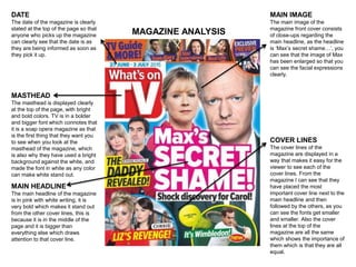
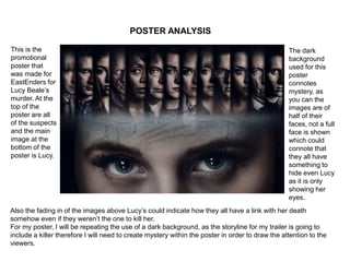
Magazine & Poster Analysis
Ancillary Task
MAGAZINE ANALYSIS
DATE
The date of the magazine is clearly
stated at the top of the page so that
anyone who picks up the magazine
can clearly see that the date is as
they are being informed as soon as
they pick it up.
MASTHEAD
The masthead is displayed clearly
at the top of the page, with bright
and bold colors. TV is in a bolder
and bigger font which connotes that
it is a soap opera magazine as that
is the first thing that they want you
to see when you look at the
masthead of the magazine, which
is also why they have used a bright
background against the white, and
made the font in white as any color
can make white stand out.
MAIN HEADLINE
The main headline of the magazine
is in pink with white writing, it is
very bold which makes it stand out
from the other cover lines, this is
because it is in the middle of the
page and it is bigger than
everything else which draws
attention to that cover line.
MAIN IMAGE
The main image of the
magazine front cover consists
of close-ups regarding the
main headline, as the headline
is ‘Max’s secret shame…’, you
can see that the image of Max
has been enlarged so that you
can see the facial expressions
clearly.
COVER LINES
The cover lines of the
magazine are displayed in a
way that makes it easy for the
viewer to see each of the
cover lines. From the
magazine I can see that they
have placed the most
important cover line next to the
main headline and then
followed by the others, as you
can see the fonts get smaller
and smaller. Also the cover
lines at the top of the
magazine are all the same
which shows the importance of
them which is that they are all
equal.
ANALYSIS
• For my magazine, I will be repeating many of the codes and conventions that are
shown in real magazines (Steve Neale), so that I can be able to target the right
audience.
• For example the magazine has the main images enlarged, therefore for my magazine
I will make sure that my main headline and images are in clear sight so that it is the
first thing people see when they pick up my soap opera magazine.
• On many soap opera magazines the cover lines are placed either at the bottom of the
magazine, or at the top of the magazine, so that they are easy to read. I will repeat
(Steve Neale) this on to my magazine, as it is a simple layout that isn’t too
overcrowding, this way it is easy to see where you may need to move images of fonts
out of the way so that there isn’t too much going on, on the page.
• The colour scheme of the magazine is very eye catching as bright colours have been
used in order to attract people from a far so that they can buy the magazine. Using
bright colours against white and black make them stand out. For example the main
headline is in pink and white therefore, for my magazine I will be repeating (Steve
Neale) the colour scheme of this soap opera magazine so that it can attract the right
audience that I am trying to appeal to.
POSTER ANALYSIS
This is the
promotional
poster that
was made for
EastEnders for
Lucy Beale’s
murder. At the
top of the
poster are all
of the suspects
and the main
image at the
bottom of the
poster is Lucy.
Also the fading in of the images above Lucy’s could indicate how they all have a link with her death
somehow even if they weren’t the one to kill her.
For my poster, I will be repeating the use of a dark background, as the storyline for my trailer is going to
include a killer therefore I will need to create mystery within the poster in order to draw the attention to the
viewers.
The dark
background
used for this
poster
connotes
mystery, as
you can the
images are of
half of their
faces, not a full
face is shown
which could
connote that
they all have
something to
hide even Lucy
as it is only
showing her
eyes.

Analysis

  • 1.
    Magazine & PosterAnalysis Ancillary Task
  • 2.
    MAGAZINE ANALYSIS DATE The dateof the magazine is clearly stated at the top of the page so that anyone who picks up the magazine can clearly see that the date is as they are being informed as soon as they pick it up. MASTHEAD The masthead is displayed clearly at the top of the page, with bright and bold colors. TV is in a bolder and bigger font which connotes that it is a soap opera magazine as that is the first thing that they want you to see when you look at the masthead of the magazine, which is also why they have used a bright background against the white, and made the font in white as any color can make white stand out. MAIN HEADLINE The main headline of the magazine is in pink with white writing, it is very bold which makes it stand out from the other cover lines, this is because it is in the middle of the page and it is bigger than everything else which draws attention to that cover line. MAIN IMAGE The main image of the magazine front cover consists of close-ups regarding the main headline, as the headline is ‘Max’s secret shame…’, you can see that the image of Max has been enlarged so that you can see the facial expressions clearly. COVER LINES The cover lines of the magazine are displayed in a way that makes it easy for the viewer to see each of the cover lines. From the magazine I can see that they have placed the most important cover line next to the main headline and then followed by the others, as you can see the fonts get smaller and smaller. Also the cover lines at the top of the magazine are all the same which shows the importance of them which is that they are all equal.
  • 3.
    ANALYSIS • For mymagazine, I will be repeating many of the codes and conventions that are shown in real magazines (Steve Neale), so that I can be able to target the right audience. • For example the magazine has the main images enlarged, therefore for my magazine I will make sure that my main headline and images are in clear sight so that it is the first thing people see when they pick up my soap opera magazine. • On many soap opera magazines the cover lines are placed either at the bottom of the magazine, or at the top of the magazine, so that they are easy to read. I will repeat (Steve Neale) this on to my magazine, as it is a simple layout that isn’t too overcrowding, this way it is easy to see where you may need to move images of fonts out of the way so that there isn’t too much going on, on the page. • The colour scheme of the magazine is very eye catching as bright colours have been used in order to attract people from a far so that they can buy the magazine. Using bright colours against white and black make them stand out. For example the main headline is in pink and white therefore, for my magazine I will be repeating (Steve Neale) the colour scheme of this soap opera magazine so that it can attract the right audience that I am trying to appeal to.
  • 4.
    POSTER ANALYSIS This isthe promotional poster that was made for EastEnders for Lucy Beale’s murder. At the top of the poster are all of the suspects and the main image at the bottom of the poster is Lucy. Also the fading in of the images above Lucy’s could indicate how they all have a link with her death somehow even if they weren’t the one to kill her. For my poster, I will be repeating the use of a dark background, as the storyline for my trailer is going to include a killer therefore I will need to create mystery within the poster in order to draw the attention to the viewers. The dark background used for this poster connotes mystery, as you can the images are of half of their faces, not a full face is shown which could connote that they all have something to hide even Lucy as it is only showing her eyes.