Download to read offline

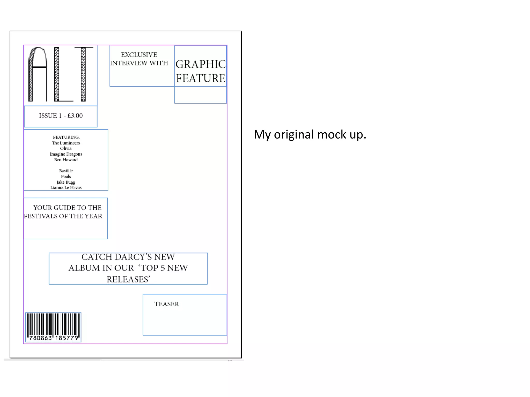
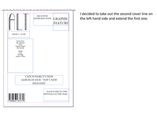
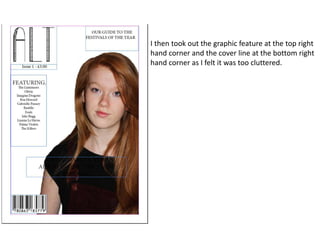
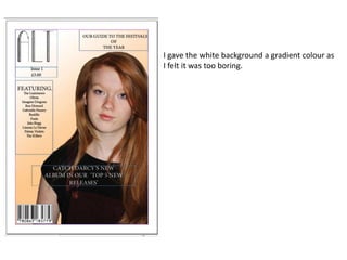
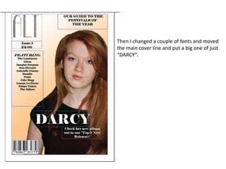
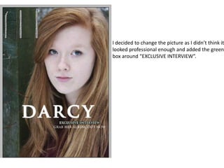
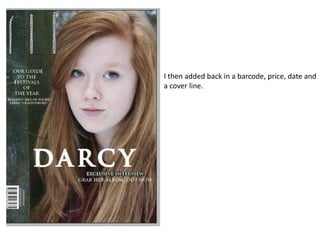
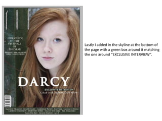
The document describes revisions made to a mock magazine cover design. The designer removed some cover lines and graphic elements to reduce clutter. They then added gradients and changed fonts. The main cover line and picture were moved and replaced to look more professional. Additional elements like a barcode, price and date were included to complete the redesign.


