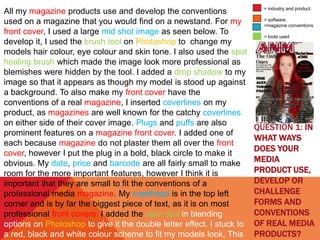
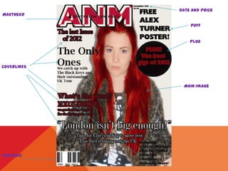
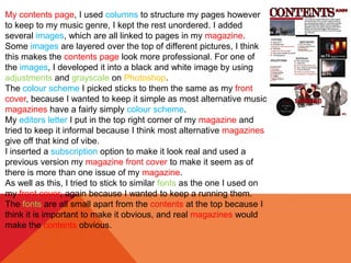
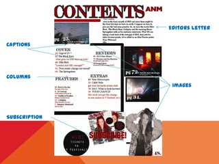
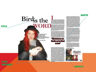
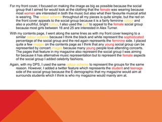
The document discusses the ways in which the media product, a magazine, uses and develops conventions of real magazines. It describes including common magazine elements such as a cover image, coverlines, masthead, date/price, and barcode. The contents page includes columns and images. The double page spread features the main image, title, and article. Throughout the magazine, the same color scheme, fonts, and layout are used to maintain consistency. The target audience is described as females aged 16-25 interested in alternative music. Features and images aim to attract this audience. The magazine would likely be distributed in shops, at concerts, and as an online publication.
2. QUESTION 1: IN
WHAT WAYS
DOES YOUR
MEDIA
PRODUCT USE,
DEVELOP OR
CHALLENGE
FORMS AND
CONVENTIONS
OF REAL MEDIA
PRODUCTS?
All my magazine products use and develop the conventions
used on a magazine that you would find on a newstand. For my
front cover, I used a large mid shot image as seen below. To
develop it, I used the brush tool on Photoshop to change my
models hair colour, eye colour and skin tone. I also used the spot
healing brush which made the image look more professional as
blemishes were hidden by the tool. I added a drop shadow to my
image so that it appears as though my model is stood up against
a background. To also make my front cover have the
conventions of a real magazine, I inserted coverlines on my
product, as magazines are well known for the catchy coverlines
on either side of their cover image. Plugs and puffs are also
prominent features on a magazine front cover. I added one of
each because magazine do not plaster them all over the front
cover, however I put the plug in a bold, black circle to make it
obvious. My date, price and barcode are all fairly small to make
room for the more important features, however I think it is
important that they are small to fit the conventions of a
professional media magazine. My masthead is in the top left
corner and is by far the biggest piece of text, as it is on most
professional front covers. I added the satin tool in blending
options on Photoshop to give it the double letter effect. I stuck to
a red, black and white colour scheme to fit my models look, This
= industry and product
= software
=magazine conventions
= tools used
4. My contents page, I used columns to structure my pages however
to keep to my music genre, I kept the rest unordered. I added
several images, which are all linked to pages in my magazine.
Some images are layered over the top of different pictures, I think
this makes the contents page look more professional. For one of
the images, I developed it into a black and white image by using
adjustments and grayscale on Photoshop.
The colour scheme I picked sticks to them the same as my front
cover, because I wanted to keep it simple as most alternative music
magazines have a fairly simply colour scheme.
My editors letter I put in the top right corner of my magazine and
tried to keep it informal because I think most alternative magazines
give off that kind of vibe.
I inserted a subscription option to make it look real and used a
previous version my magazine front cover to make it seem as of
there is more than one issue of my magazine.
As well as this, I tried to stick to similar fonts as the one I used on
my front cover, again because I wanted to keep a running them.
The fonts are all small apart from the contents at the top because I
think it is important to make it obvious, and real magazines would
make the contents obvious.
6. For my DPS I put the main image on the left hand page because
I wanted to have who the article was written about large and
central on one page and have the article on the other page. I
changed the hair colour, eye colour and skin tone on Photoshop
again, the same as I did on my front cover.
I stuck to the same red, white and black colour scheme
as I did on the last two pieces of my work and kept the font fairly
simple and made the title of the article bold and large. I also
added a quote in in a larger font because most professional
articles have this. I gave the article a small font and put it in two
central columns to keep the article ordered.
To make it more individual, I added a twitter feature in
the bottom right corner.
The page numbers I chose are a interesting font but
also small so that the numbers do not distract from the article
pages. I made the DPS on InDesign, however the images and
the quote were made using Photoshop because it was easier to
change the hair colour etcetera.
8. 2. HOW DOES
YOUR MEDIA
PRODUCT
REPRESENT
PARTICULAR
SOCIAL
GROUPS?
= SOCIAL GROUP
I aimed for mainly women, however it would also be acceptable for men between
the ages of 16 and 25. So, I tried make my magazine suitable for both
genders and age groups. Because they are older than younger teens and
possibly more sophisticated, I made the colour scheme and layout more
sophisticated.
I used a female for my images because I think it appeals to both genders. I also
aged my model at 17 because I think it is an age that both the younger and
older of the age range will be interested in. I tried to keep my models poses
fun, but natural to catch the eye and to link it in with the music genre I chose.
I also used a lot of colourful, concert images because young people spend a
lot of time at gigs nowadays.
I chose colours that were simple but also had a vibrancy, because I wanted to still
have a sophistication about the magazine but there still be an eye catching,
youthfulness side to the magazine, linking again to my age range.
I added features such as the possibility to win ticket to V festival and plugs like
the best gigs of 2012., this was to keep my social group interested. I also
added the feature of a free Alex Turner poster. This would mainly appeal to
the women of my social group, however it may also appeal to some men.
The article could be read by anyone in the social group I have targeted. This is
because it is written very informally and is not focused on a particular gender,
although I think it is more likely to be read by the more mature of the social
group I have targeted. This could discount, some of those who are not as
mature, but considering my music genre, I think most of the social group I
have chosen would have a certain sophistication.
=
FEATURES
9. For my front cover, I focused on making the image as big as possible because the social
group that I aimed for would look at the clothing that the female was wearing because
most women are interested in both the music but also what their favourite musical artist
is wearing. The colour scheme throughout all my pieces is quite simple, but the red on
the front cover appeals to the social group because it is a fairly feminine colour and
also a youthful, bright colour. I also used the puff to appeal to the female social group
because most girls between 16 and 25 are interested in Alex Turner.
With my contents page, I went along the same lines as with my front cover keeping to a
similar colour scheme because I think the black and white represent the sophisticated
percentage of the social group and the red again represents the feminine side. I placed
quite a few images on the contents page as I think that any young social group can be
represented by concert images because many young people love attending concerts.
The pages that feature in my magazine also represent the social group I was aiming
for because it has alternative music representation but to represent the female aspects
of the social group I added celebrity fashions.
Again, with my DPS, I used the same colour scheme to represent the groups for the same
reason. However, I added a twitter feature which represents the student and teenage
side of the social group because the E demographic that my magazine would aim at
surrounds students which I think is who my magazine would mainly aim at.
10. 3.WHAT KIND
OF MEDIA
INSTITUTION
MIGHT
DISTRIBUTE
YOUR MEDIA
PRODUCT AND
WHY?
The 3 main institutions that would distribute my magazine are likely to be shops,
gigs and webzines.
I think that shops would distribute my magazine mainly because that is where
most magazines are sold and because it is on permanent view to the public
who can purchase the magazine whenever they want. I think also because
it is a music magazine it can only be found in a minority of places, one of
these being a local shop. because of this I think my magazine would be
distributed at this institution.
Secondly, I think my magazine would be distributed at an institution such as a
gig or music festival because that is where music is played, and where
better place to sell a music genre magazine, than somewhere that plays
music? It is more likely to be distributed at a gig or festival that plays the
type of music genre that my magazine focuses on. Because my music
genre is alternative, I think it would be sold at festivals such as V festival
and obviously would be sold at gigs of alternative music bands
Finally, my magazine could be distributed as a webzine. As the age range I
targeted my magazine at is very in touch with technology, I think it would be
appropriate to distribute my magazine as an online magazine. Many more
features can also be accessed via a webzine so it would make more room
for videos and a more interactive way of reading the magazine.
These 3 institutions are where I think my magazine would be distributed.
= institution
11. 4. WHO
WOULD BE
THE
AUDIENCE
FOR YOUR
MEDIA
PRODUCT?
The audience for my magazine was mainly females between 16 and 25, this was
because it is the easiest age range to focus on because my peers were
between these ages and being 16 at the time, I knew what kind of magazine
girls my age looked for.
Through the magazine making process, my audience didn’t change, it is possible
that my magazine could also be targeted at males between the same ages as
well, however I still think that the target audience is more female than male
and so no my target audience hardly changed at all.
It was fairly easy for me to aim towards my target audience because, as I
mentioned, I was 16 when I began making the magazine and so I knew what
girls in my target audience would look for when choosing a magazine . As I
am also into the alternative genre of music, I knew what my magazine would
look like and what people who also liked this type of music would look for in a
magazine. Although, it was difficult to determine how to word the article,
coverlines and editors letter because I didn’t want it to be extremely formal
but neither informal so It was difficult to find the perfect balance to hit the
youthfulness sophistication of my target audience.
I would say that my choice is based on personal influence because my peers
were around the target audience age range I chose and also as most of my
friends and I listen to the same genre of music, and read the same type of
music magazine, so it was fairly easy to work out that I wanted a target
audience similar to me and my peers.
= target audience
12. 5. HOW DID YOU
ATTRACT/ADDRESS
YOUR AUDIENCE?
As my audience was mainly female, I tried to design my magazine how a
female between the ages of 16 and 25 who prefers alternative music
would want the magazine they are buying to look.
For the images, I used bright and eye catching concert images that would
appeal to the alternative nature of my audience, but I also used images
of my model. The model is wearing quite quirky and fashionable
clothing which again would appeal to women because of the fashion
side.
I used a fairly simple colour scheme of black, white and red. However, I
think the red again appeals more to a female because it red is more of
a feminine colour. Also, red is often seen in music magazines, so I
thought it was important to go with a colour seen in many music
magazines.
I also put in some features such as horoscopes which women are more
likely to look at because I think women are more concerned with future
predictions concerning money, love etc. I also added the best gigs of
2012 which would attract the audience because it is a music
magazine after all and many people love to read about gigs that they
may have been to.
The article would attract my audience because although it looks at the
music side of the persons career, it also looks briefly into the artists
personally life. It is also written in an informal format which appeals to
the younger portion of my magazines audience.
The price of my magazine is £2.99 which is a reasonable price and
attracts the audience because it is affordable and as my magazine is
= audience
= features
13. The genre of music of my magazine is alternative/indie which is usually not a
popular music genre for women. However, recently it has become more popular
with females and so I think now it is an appropriate music genre that will attract
the audience I have chosen.
14. AUDIENCE MEMBER PROFILE:
Name: Danielle Friel
Age:17
Why would you buy my
magazine?: Because it’s new, it’s
different but it still has the
conventional things that you
would expect from a magazine.
What attracted you to my
magazine?: The front cover
because it was really eye
catching.
Where would you expect to see
it?: Supermarkets, newsagents,
newstands and possibly concerts.
Would you pay £2.99 for this
magazine?: Definitely, it’s my kind