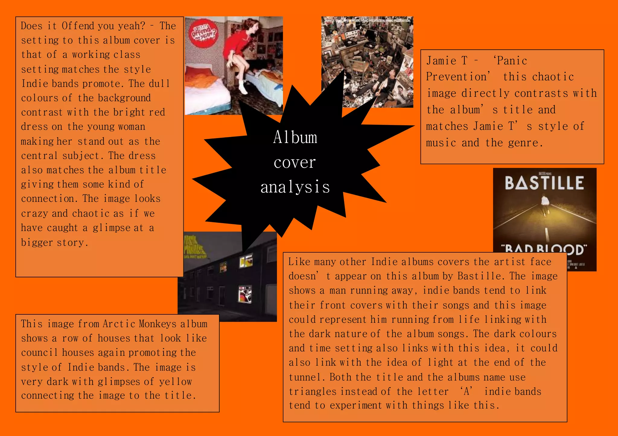
Album
cover
analysis
Jamie T – ‘Panic
Prevention’ this chaotic
image directly contrasts with
the album’s title and
matches Jamie T’s style of
music and the genre.
Does it Offend you yeah? – The
setting to this album cover is
that of a working class
setting matches the style
Indie bands promote. The dull
colours of the background
contrast with the bright red
dress on the young woman
making her stand out as the
central subject. The dress
also matches the album title
giving them some kind of
connection. The image looks
crazy and chaotic as if we
have caught a glimpse at a
bigger story.
This image from Arctic Monkeys album
shows a row of houses that look like
council houses again promoting the
style of Indie bands. The image is
very dark with glimpses of yellow
connecting the image to the title.
Like many other Indie albums covers the artist face
doesn’t appear on this album by Bastille. The image
shows a man running away, indie bands tend to link
their front covers with their songs and this image
could represent him running from life linking with
the dark nature of the album songs. The dark colours
and time setting also links with this idea, it could
also link with the idea of light at the end of the
tunnel. Both the title and the albums name use
triangles instead of the letter ‘A’ indie bands
tend to experiment with things like this.

Album cover analysis

  • 1.
    Album cover analysis Jamie T –‘Panic Prevention’ this chaotic image directly contrasts with the album’s title and matches Jamie T’s style of music and the genre. Does it Offend you yeah? – The setting to this album cover is that of a working class setting matches the style Indie bands promote. The dull colours of the background contrast with the bright red dress on the young woman making her stand out as the central subject. The dress also matches the album title giving them some kind of connection. The image looks crazy and chaotic as if we have caught a glimpse at a bigger story. This image from Arctic Monkeys album shows a row of houses that look like council houses again promoting the style of Indie bands. The image is very dark with glimpses of yellow connecting the image to the title. Like many other Indie albums covers the artist face doesn’t appear on this album by Bastille. The image shows a man running away, indie bands tend to link their front covers with their songs and this image could represent him running from life linking with the dark nature of the album songs. The dark colours and time setting also links with this idea, it could also link with the idea of light at the end of the tunnel. Both the title and the albums name use triangles instead of the letter ‘A’ indie bands tend to experiment with things like this.