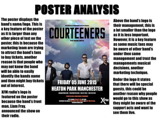
1. The poster displays the
band’s name/logo. This is
a key feature of the poster
as it is larger than any
other piece of text on the
poster, this is because the
marketing team are trying
to attract the band’s fans
to buy tickets, another
reason is that people who
may not know the band
will be able to easily
identify the bands name
and then might buy tickets
out of interest.
Above the band’s logo is
their management, this is
a lot smaller than the logo
as it is less important.
However, it is a key feature
as some music fans may
be aware of other band’s
under then same
management and trust the
managements musical
decisions, another
marketing technique.
XFM radio’s logo is
featured on the poster
because the band’s front
man, Liam Fray,
announced the show on
their radio.
Under the logo it states
that there will be special
guests, this could be
another reason why people
would go to this show as
they might be aware of the
support acts and want to
see them live.
2. The second largest piece
of text on the poster is
the date and location of
the show. This is a key
piece of information
which needs to stand out
to the audience so they
are able to easily
remember it. This is the
same with the location
as this information will
be required if someone
buys a ticket.
The next piece of
information this poster
gives the audience is the
websites and numbers of
the places that are going to
sell their tickets, this is
important as fans will need
to know where to buy
tickets from.
In a different colour the
time and date of ticket
sale is displayed on the
poster, the colour
difference may be an
indication that it is an
important feature. The
date and time of ticket
sales is needed to inform
fans when tickets are
available to buy.
At the bottom of the poster
there is some information
about the bands latest album,
concrete love, it states the
chart position the album
achieved and the singles
released from it. This is also
used to attract people to
come to the show, fans who
have bought the album will
be able to identify the singles
released and other people
may be attracted by the chart
position the album achieved.
3. The background of the
poster is basically the
same as the band’s
album cover for
concrete love. The only
difference is that they
have decided to use a
psychedelic theme
behind the bands logo;
this may interest
people to look at the
poster as it is colourful
and bright which
would attract people’s
attention.
At the very bottom of the
poster the band’s
website is shown, this is
important because fans
can go and get further
information if they are
unsure of anything on
the poster. It also allows
people who haven’t
heard of the band to find
out some more
information about the
band. The Courteeners
website also features
links to iTunes where
people can purchase
their album.