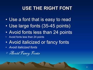
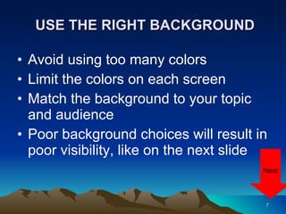
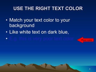
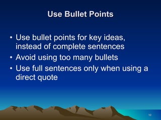
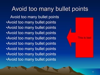
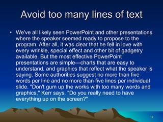
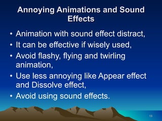
MISTAKES IN POWERPOINT PRESENTATIONS By Ham Diyon With modifications by Mrs. Stroop
Have you experienced this… You walk into the SmartBoard room, They turn off the light, The teacher clicks on the mouse again and again and again and again, Guess what happens next…
After five minutes or so…
PowerPoint Do’s and Don’ts
KNOW YOUR TOPIC Use note cards Talk to your audience Don’t read word by word Be confident.
USE THE RIGHT FONT Use a font that is easy to read Use large fonts (35-45 points) Avoid fonts less than 24 points Avoid fonts less than 24 points Avoid italicized or fancy fonts Avoid italicized fonts Avoid Fancy Fonts
USE THE RIGHT BACKGROUND Avoid using too many colors Limit the colors on each screen Match the background to your topic and audience Poor background choices will result in poor visibility, like on the next slide Next
This is poor background Too dark Text should be light, Wrong choice for PowerPoint background, Avoid this combination.
USE THE RIGHT TEXT COLOR  Match your text color to your background Like white text on dark blue, E.g. this is very poor text color Poor color
Use Bullet Points Use bullet points for key ideas, instead of complete sentences Avoid using too many bullets Use full sentences only when using a direct quote
Avoid too many bullet points Avoid too many bullet points Avoid too many bullet points Avoid too many bullet points Avoid too many bullet points Avoid too many bullet points Avoid too many bullet points Avoid too many bullet points Avoid too many bullet points Avoid too many bullet points This is bad
Avoid too many lines of text We've all likely seen PowerPoint and other presentations where the speaker seemed ready to propose to the program. After all, it was clear that he fell in love with every wrinkle, special effect and other bit of gadgetry available. But the most effective PowerPoint presentations are simple—charts that are easy to understand, and graphics that reflect what the speaker is saying. Some authorities suggest no more than five words per line and no more than five lines per individual slide. "Don't gum up the works with too many words and graphics," Kerr says. "Do you really need to have everything up on the screen?"
Annoying Animations and Sound Effects Animation with sound effect distract, It can be effective if wisely used, Avoid flashy, flying and twirling animation, Use less annoying like Appear effect and Dissolve effect, Avoid using sound effects.
Annoying animation and sound effect
Enlarged Pictures from the Website stretch Stretch up
Spelling and Grammar Check Use Spell Check and Editing Tools Remember some words can’t be checked, like proper names Edit, review, and rehearse before presenting
Remember to Cite Sources Used Cite on the slide or prepare a “resources used” slide at the end of your presentation. Sources Used … Microsoft PowerPoint Do’s and Don’ts  http://www.microsoft.com/business/en-us/resources/technology/business-software/powerpoint-tips.aspx?fbid=jRUvGcVu_hU
Remember Your Audience Take full control of your audience Talk to your audience, don’t read to them You should be the main attraction not the PowerPoint Speak to your audience not the screen Control your voice.
Photos and Clip Art Sources tryshakespeare.com http://office.microsoft.com/en-us/images/ eventiq.com libertarianrock.com ellay2013.wordpress.com
Now You Try It—Remember What You Learned Your assignment is to make a two slide practice PowerPoint. Your first slide is your title slide.  It should have a title for your presentation (Practice Presentation, or be more creative) and your name, grade, and today’s date.
Now You Try It—Remember What You Learned Your second slide should include a graphic (picture or clip art) and some text explaining why you chose that graphic. Once your presentation is complete email your presentation to me through TeacherWeb.com

8th grade ppt dos and donts

  • 1.
    MISTAKES IN POWERPOINTPRESENTATIONS By Ham Diyon With modifications by Mrs. Stroop
  • 2.
    Have you experiencedthis… You walk into the SmartBoard room, They turn off the light, The teacher clicks on the mouse again and again and again and again, Guess what happens next…
  • 3.
  • 4.
  • 5.
    KNOW YOUR TOPICUse note cards Talk to your audience Don’t read word by word Be confident.
  • 6.
    USE THE RIGHTFONT Use a font that is easy to read Use large fonts (35-45 points) Avoid fonts less than 24 points Avoid fonts less than 24 points Avoid italicized or fancy fonts Avoid italicized fonts Avoid Fancy Fonts
  • 7.
    USE THE RIGHTBACKGROUND Avoid using too many colors Limit the colors on each screen Match the background to your topic and audience Poor background choices will result in poor visibility, like on the next slide Next
  • 8.
    This is poorbackground Too dark Text should be light, Wrong choice for PowerPoint background, Avoid this combination.
  • 9.
    USE THE RIGHTTEXT COLOR Match your text color to your background Like white text on dark blue, E.g. this is very poor text color Poor color
  • 10.
    Use Bullet PointsUse bullet points for key ideas, instead of complete sentences Avoid using too many bullets Use full sentences only when using a direct quote
  • 11.
    Avoid too manybullet points Avoid too many bullet points Avoid too many bullet points Avoid too many bullet points Avoid too many bullet points Avoid too many bullet points Avoid too many bullet points Avoid too many bullet points Avoid too many bullet points Avoid too many bullet points This is bad
  • 12.
    Avoid too manylines of text We've all likely seen PowerPoint and other presentations where the speaker seemed ready to propose to the program. After all, it was clear that he fell in love with every wrinkle, special effect and other bit of gadgetry available. But the most effective PowerPoint presentations are simple—charts that are easy to understand, and graphics that reflect what the speaker is saying. Some authorities suggest no more than five words per line and no more than five lines per individual slide. "Don't gum up the works with too many words and graphics," Kerr says. "Do you really need to have everything up on the screen?"
  • 13.
    Annoying Animations andSound Effects Animation with sound effect distract, It can be effective if wisely used, Avoid flashy, flying and twirling animation, Use less annoying like Appear effect and Dissolve effect, Avoid using sound effects.
  • 14.
  • 15.
    Enlarged Pictures fromthe Website stretch Stretch up
  • 16.
    Spelling and GrammarCheck Use Spell Check and Editing Tools Remember some words can’t be checked, like proper names Edit, review, and rehearse before presenting
  • 17.
    Remember to CiteSources Used Cite on the slide or prepare a “resources used” slide at the end of your presentation. Sources Used … Microsoft PowerPoint Do’s and Don’ts http://www.microsoft.com/business/en-us/resources/technology/business-software/powerpoint-tips.aspx?fbid=jRUvGcVu_hU
  • 18.
    Remember Your AudienceTake full control of your audience Talk to your audience, don’t read to them You should be the main attraction not the PowerPoint Speak to your audience not the screen Control your voice.
  • 19.
    Photos and ClipArt Sources tryshakespeare.com http://office.microsoft.com/en-us/images/ eventiq.com libertarianrock.com ellay2013.wordpress.com
  • 20.
    Now You TryIt—Remember What You Learned Your assignment is to make a two slide practice PowerPoint. Your first slide is your title slide. It should have a title for your presentation (Practice Presentation, or be more creative) and your name, grade, and today’s date.
  • 21.
    Now You TryIt—Remember What You Learned Your second slide should include a graphic (picture or clip art) and some text explaining why you chose that graphic. Once your presentation is complete email your presentation to me through TeacherWeb.com