Production Reflection
Your Name
Process
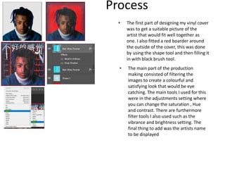
• The first part of designing my vinyl cover
was to get a suitable picture of the
artist that would fit well together as
one. I also fitted a red boarder around
the outside of the cover, this was done
by using the shape tool and then filling it
in with black brush tool.
• The main part of the production
making consisted of filtering the
images to create a colourful and
satisfying look that would be eye
catching. The main tools I used for this
were in the adjustments setting where
you can change the saturation , Hue
and contrast. There are furthermore
filter tools I also used such as the
vibrance and brightness setting. The
final thing to add was the artists name
to be displayed
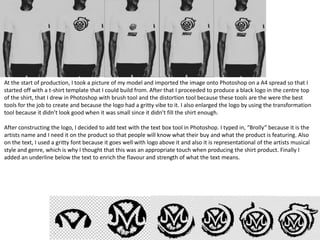
At the start of production, I took a picture of my model and imported the image onto Photoshop on a A4 spread so that I
started off with a t-shirt template that I could build from. After that I proceeded to produce a black logo in the centre top
of the shirt, that I drew in Photoshop with brush tool and the distortion tool because these tools are the were the best
tools for the job to create and because the logo had a gritty vibe to it. I also enlarged the logo by using the transformation
tool because it didn’t look good when it was small since it didn’t fill the shirt enough.
After constructing the logo, I decided to add text with the text box tool in Photoshop. I typed in, “Brolly” because it is the
artists name and I need it on the product so that people will know what their buy and what the product is featuring. Also
on the text, I used a gritty font because it goes well with logo above it and also it is representational of the artists musical
style and genre, which is why I thought that this was an appropriate touch when producing the shirt product. Finally I
added an underline below the text to enrich the flavour and strength of what the text means.

6. production reflection 3

  • 1.
  • 2.
    Process • The firstpart of designing my vinyl cover was to get a suitable picture of the artist that would fit well together as one. I also fitted a red boarder around the outside of the cover, this was done by using the shape tool and then filling it in with black brush tool. • The main part of the production making consisted of filtering the images to create a colourful and satisfying look that would be eye catching. The main tools I used for this were in the adjustments setting where you can change the saturation , Hue and contrast. There are furthermore filter tools I also used such as the vibrance and brightness setting. The final thing to add was the artists name to be displayed
  • 3.
    At the startof production, I took a picture of my model and imported the image onto Photoshop on a A4 spread so that I started off with a t-shirt template that I could build from. After that I proceeded to produce a black logo in the centre top of the shirt, that I drew in Photoshop with brush tool and the distortion tool because these tools are the were the best tools for the job to create and because the logo had a gritty vibe to it. I also enlarged the logo by using the transformation tool because it didn’t look good when it was small since it didn’t fill the shirt enough. After constructing the logo, I decided to add text with the text box tool in Photoshop. I typed in, “Brolly” because it is the artists name and I need it on the product so that people will know what their buy and what the product is featuring. Also on the text, I used a gritty font because it goes well with logo above it and also it is representational of the artists musical style and genre, which is why I thought that this was an appropriate touch when producing the shirt product. Finally I added an underline below the text to enrich the flavour and strength of what the text means.

Editor's Notes

  • #3 Discuss the tools and processes used in your production. Log your thoughts and feelings about your work.