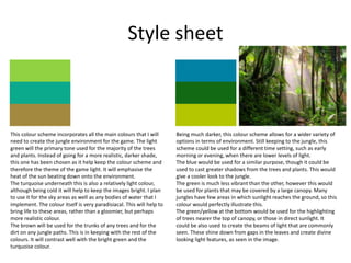
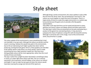
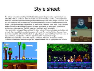
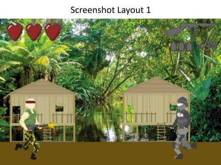
Pre-Production
Style sheet
This colour scheme incorporates all the main colours that I will
need to create the jungle environment for the game. The light
green will the primary tone used for the majority of the trees
and plants. Instead of going for a more realistic, darker shade,
this one has been chosen as it help keep the colour scheme and
therefore the theme of the game light. It will emphasise the
heat of the sun beating down onto the environment.
The turquoise underneath this is also a relatively light colour,
although being cold it will help to keep the images bright. I plan
to use it for the sky areas as well as any bodies of water that I
implement. The colour itself is very paradisiacal. This will help to
bring life to these areas, rather than a gloomier, but perhaps
more realistic colour.
The brown will be used for the trunks of any trees and for the
dirt on any jungle paths. This is in keeping with the rest of the
colours. It will contrast well with the bright green and the
turquoise colour.
Being much darker, this colour scheme allows for a wider variety of
options in terms of environment. Still keeping to the jungle, this
scheme could be used for a different time setting, such as early
morning or evening, when there are lower levels of light.
The blue would be used for a similar purpose, though it could be
used to cast greater shadows from the trees and plants. This would
give a cooler look to the jungle.
The green is much less vibrant than the other, however this would
be used for plants that may be covered by a large canopy. Many
jungles have few areas in which sunlight reaches the ground, so this
colour would perfectly illustrate this.
The green/yellow at the bottom would be used for the highlighting
of trees nearer the top of canopy, or those in direct sunlight. It
could be also used to create the beams of light that are commonly
seen. These shine down from gaps in the leaves and create divine
looking light features, as seen in the image.
Style sheet
The colour palette of this environment is more something that I tried
not resemble in my own work. Although the colours are perfect and the
result is stunning, I believe this would only work in this environment,
due to the art style being much higher quality than what I will be
producing. Coming from the game ‘Arma 3’, these graphics are intended
to be realistic which is why there is so much variety. I wish to make
something that has a high resolution myself, but I feel that more
distinguishable colours will be more appropriate, rather than this much
variety of tones and shades.
The way in which the sunlight has been illustrated is something to keep
in mind, as in lower light these colours will alter. The sun is directly
overhead in the screenshot, around midday, so the colours are vibrant
and bright. If I was to make my own game at dusk, the colours would
have been nearing the orange and red end of the spectrum.
Although being a similar environment, this colour palette is quite unlike
the one from the ‘Arma’ level. This one being from ‘Just Cause 2’, the
colours are much brighter to match the tone of the game. There is a
large variety of tones to create the jungle environment in a realistic way
but purely because the game aims to provide a life-like graphic
representation.
They differ in the way that Arma can be muted and dormant in areas,
whereas Just Cause’s colours are always vibrant and often quite harsh.
The ideal way in which they are presented can be quite overpowering, a
product of the game’s fun and exciting theme. It may also be to
juxtapose the chaos of explosion and gunfire with the beautiful scenery.
Although it cannot be seen in this image, much of the environment
varies, but primarily it is jungle.
Style sheet
The style of artwork is something that I had tried to create in the production experiments. It was
difficult to settle on a set scale of the characters and environment as I wanted a balance between
detail and simplicity. I needed something that could be recognisable as the thing it was meant to be
but also something that could be drawn multiple times without too much time being spent. In the
images I have gathered these elements can be seen. In the screenshot from ‘Sonic’ I have captured
a level of detail that would be preferable to recreate. Shading can be seen clearly as well as the
environment and characters. The HUD is also at a level that I feel is acceptable.
I also feel that the art style of ‘Papers, Please’ is at the balance. The characters are detailed but not
so much that it would be impossible to create a walk-cycle. The way in which the characters have
been drawn is a little different to how I will do it, but the scale is correct. The environment is also at
a plausible level, provided that I did some repetition within my own level design.
Below this is a screenshot I found that depicts a number of characters. These show smaller
characters than those in the other images, but the environment is to an appropriate level of detail.
Screenshot Layout 1
Sound Effects/Dialogue
Sound Effect How You Could Make It
Footsteps Walking on different surfaces
Jumping (impact) Landing on different surfaces
Shouting/yelling Vocals
Gunfire Sourced from internet
Ambient jungle sounds Birdsong, insects, running water, rain
Effects (lives) Created with BeepBox
Music
Band Name Track Name Link
I have decided I will write my own music for my game using programs such as
BeepBox and GarageBand.
Contingency Planning
Potential Issue Solution
Lost or corrupted files Create multiple versions and save them to
multiple places/devices
Health and Safety
Potential Issue How will the issue be
avoided?
RSI Regular stretching of limbs
Eye strain Taking breaks away from the screen

6. Pre production

  • 1.
  • 2.
    Style sheet This colourscheme incorporates all the main colours that I will need to create the jungle environment for the game. The light green will the primary tone used for the majority of the trees and plants. Instead of going for a more realistic, darker shade, this one has been chosen as it help keep the colour scheme and therefore the theme of the game light. It will emphasise the heat of the sun beating down onto the environment. The turquoise underneath this is also a relatively light colour, although being cold it will help to keep the images bright. I plan to use it for the sky areas as well as any bodies of water that I implement. The colour itself is very paradisiacal. This will help to bring life to these areas, rather than a gloomier, but perhaps more realistic colour. The brown will be used for the trunks of any trees and for the dirt on any jungle paths. This is in keeping with the rest of the colours. It will contrast well with the bright green and the turquoise colour. Being much darker, this colour scheme allows for a wider variety of options in terms of environment. Still keeping to the jungle, this scheme could be used for a different time setting, such as early morning or evening, when there are lower levels of light. The blue would be used for a similar purpose, though it could be used to cast greater shadows from the trees and plants. This would give a cooler look to the jungle. The green is much less vibrant than the other, however this would be used for plants that may be covered by a large canopy. Many jungles have few areas in which sunlight reaches the ground, so this colour would perfectly illustrate this. The green/yellow at the bottom would be used for the highlighting of trees nearer the top of canopy, or those in direct sunlight. It could be also used to create the beams of light that are commonly seen. These shine down from gaps in the leaves and create divine looking light features, as seen in the image.
  • 3.
    Style sheet The colourpalette of this environment is more something that I tried not resemble in my own work. Although the colours are perfect and the result is stunning, I believe this would only work in this environment, due to the art style being much higher quality than what I will be producing. Coming from the game ‘Arma 3’, these graphics are intended to be realistic which is why there is so much variety. I wish to make something that has a high resolution myself, but I feel that more distinguishable colours will be more appropriate, rather than this much variety of tones and shades. The way in which the sunlight has been illustrated is something to keep in mind, as in lower light these colours will alter. The sun is directly overhead in the screenshot, around midday, so the colours are vibrant and bright. If I was to make my own game at dusk, the colours would have been nearing the orange and red end of the spectrum. Although being a similar environment, this colour palette is quite unlike the one from the ‘Arma’ level. This one being from ‘Just Cause 2’, the colours are much brighter to match the tone of the game. There is a large variety of tones to create the jungle environment in a realistic way but purely because the game aims to provide a life-like graphic representation. They differ in the way that Arma can be muted and dormant in areas, whereas Just Cause’s colours are always vibrant and often quite harsh. The ideal way in which they are presented can be quite overpowering, a product of the game’s fun and exciting theme. It may also be to juxtapose the chaos of explosion and gunfire with the beautiful scenery. Although it cannot be seen in this image, much of the environment varies, but primarily it is jungle.
  • 4.
    Style sheet The styleof artwork is something that I had tried to create in the production experiments. It was difficult to settle on a set scale of the characters and environment as I wanted a balance between detail and simplicity. I needed something that could be recognisable as the thing it was meant to be but also something that could be drawn multiple times without too much time being spent. In the images I have gathered these elements can be seen. In the screenshot from ‘Sonic’ I have captured a level of detail that would be preferable to recreate. Shading can be seen clearly as well as the environment and characters. The HUD is also at a level that I feel is acceptable. I also feel that the art style of ‘Papers, Please’ is at the balance. The characters are detailed but not so much that it would be impossible to create a walk-cycle. The way in which the characters have been drawn is a little different to how I will do it, but the scale is correct. The environment is also at a plausible level, provided that I did some repetition within my own level design. Below this is a screenshot I found that depicts a number of characters. These show smaller characters than those in the other images, but the environment is to an appropriate level of detail.
  • 5.
  • 6.
    Sound Effects/Dialogue Sound EffectHow You Could Make It Footsteps Walking on different surfaces Jumping (impact) Landing on different surfaces Shouting/yelling Vocals Gunfire Sourced from internet Ambient jungle sounds Birdsong, insects, running water, rain Effects (lives) Created with BeepBox
  • 7.
    Music Band Name TrackName Link I have decided I will write my own music for my game using programs such as BeepBox and GarageBand.
  • 8.
    Contingency Planning Potential IssueSolution Lost or corrupted files Create multiple versions and save them to multiple places/devices
  • 9.
    Health and Safety PotentialIssue How will the issue be avoided? RSI Regular stretching of limbs Eye strain Taking breaks away from the screen

Editor's Notes

  • #3 Explore colours and pixel art styles similar to what you want to produce. Discuss these elements in relation to why you chose them and where you may use them in your project. Go over as many pages as you need to.
  • #4 Explore colours and pixel art styles similar to what you want to produce. Discuss these elements in relation to why you chose them and where you may use them in your project. Go over as many pages as you need to.
  • #5 Explore colours and pixel art styles similar to what you want to produce. Discuss these elements in relation to why you chose them and where you may use them in your project. Go over as many pages as you need to.
  • #6 Mock up of a potential design using the colours and sourced images. Alter this slide to make it appropriate for your planned product types. Use the content established in your style sheet to do this.
  • #7 What sound effects might you need for your animated screenshot? How could you make them?
  • #8 What music could you use?