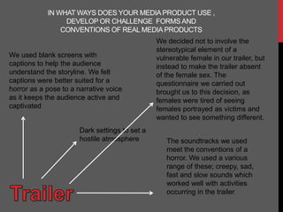
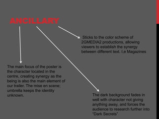
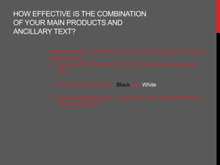
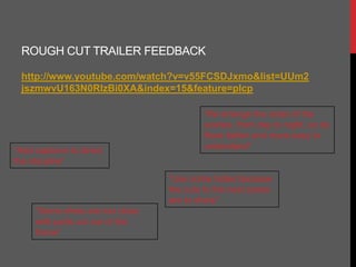
EVALUATION
IN WHAT WAYS DOES YOUR MEDIA PRODUCT USE ,
                 DEVELOP OR CHALLENGE FORMS AND
                CONVENTIONS OF REAL MEDIA PRODUCTS
                                                We decided not to involve the
                                                stereotypical element of a
We used blank screens with                      vulnerable female in our trailer, but
captions to help the audience                   instead to make the trailer absent
understand the storyline. We felt               of the female sex. The
captions were better suited for a               questionnaire we carried out
horror as a pose to a narrative voice           brought us to this decision, as
as it keeps the audience active and             females were tired of seeing
captivated                                      females portrayed as victims and
                                                wanted to see something different.
                       Dark settings to set a
                       hostile atmosphere          The soundtracks we used
                                                   meet the conventions of a
                                                   horror. We used a various
                                                   range of these; creepy, sad,
                                                   fast and slow sounds which
                                                   worked well with activities
                                                   occurring in the trailer
Introduces and allows the
audience to get to no the faces
behind 2GMEDIA2


Keeping our audience
updated was very
important to us as we
believe                           Is our foundation, its here
communication is the              were 2gmedia2 kept our
key. This also tells our          audience up to date with our
audience that what                latest activities.
they say matters,
building a strong
relationship and
creates a successful
production as were
catering to there
requests.
ANCILLARY
                                     Sticks to the color scheme of
                                    2GMEDIA2 productions, allowing
                                    viewers to establish the synergy
                                    between different text. I,e Magazines


The main focus of the poster is
the character located in the
centre, creating synergy as the
being is also the main element of
our trailer. The mise en scene;
umbrella keeps the identity
unknown.                                  The dark background fades in
                                          well with character not giving
                                          anything away, and forces the
                                          audience to research further into
                                          “Dark Secrets”
HOW EFFECTIVE IS THE COMBINATION
OF YOUR MAIN PRODUCTS AND
ANCILLARY TEXT?

        We feel it was very effective as it was well thought out. What we
        kept constant:
        • The font (COPPERPLATE GOTHIC BOLD) with blood red
          color

        • The color scheme; Red, Black and White

        • The supernatural figure, as the main form of identification for
          “DARK SECRETS”
WHAT WE LEARNT FROM
OUR AUDIENCE
FEEDBACK


http://2gmedia2.wordpress.com/2011/10/06/live-audience-
feedback/
ROUGH CUT TRAILER FEEDBACK

 http://www.youtube.com/watch?v=v55FCSDJxmo&list=UUm2
 jszmwvU163N0RIzBi0XA&index=15&feature=plcp

                                         “Re arrange the order of the
                                         scenes, from day to night, so its
                                         flows better and more easy to
“Add captions to direct                  understand”
the storyline”
                                 “Use some fades because
                                 the cuts to the next scene
                                 are to sharp”
     “Some shots are too close
     with parts cut out of the
     frame”
TECHNOLOGY
                     USED


                         For viewers to watch our
                         trailer
HD Camera to
capture our shots
in high definition

evaluation

  • 1.
  • 2.
    IN WHAT WAYSDOES YOUR MEDIA PRODUCT USE , DEVELOP OR CHALLENGE FORMS AND CONVENTIONS OF REAL MEDIA PRODUCTS We decided not to involve the stereotypical element of a We used blank screens with vulnerable female in our trailer, but captions to help the audience instead to make the trailer absent understand the storyline. We felt of the female sex. The captions were better suited for a questionnaire we carried out horror as a pose to a narrative voice brought us to this decision, as as it keeps the audience active and females were tired of seeing captivated females portrayed as victims and wanted to see something different. Dark settings to set a hostile atmosphere The soundtracks we used meet the conventions of a horror. We used a various range of these; creepy, sad, fast and slow sounds which worked well with activities occurring in the trailer
  • 3.
    Introduces and allowsthe audience to get to no the faces behind 2GMEDIA2 Keeping our audience updated was very important to us as we believe Is our foundation, its here communication is the were 2gmedia2 kept our key. This also tells our audience up to date with our audience that what latest activities. they say matters, building a strong relationship and creates a successful production as were catering to there requests.
  • 4.
    ANCILLARY Sticks to the color scheme of 2GMEDIA2 productions, allowing viewers to establish the synergy between different text. I,e Magazines The main focus of the poster is the character located in the centre, creating synergy as the being is also the main element of our trailer. The mise en scene; umbrella keeps the identity unknown. The dark background fades in well with character not giving anything away, and forces the audience to research further into “Dark Secrets”
  • 5.
    HOW EFFECTIVE ISTHE COMBINATION OF YOUR MAIN PRODUCTS AND ANCILLARY TEXT? We feel it was very effective as it was well thought out. What we kept constant: • The font (COPPERPLATE GOTHIC BOLD) with blood red color • The color scheme; Red, Black and White • The supernatural figure, as the main form of identification for “DARK SECRETS”
  • 6.
    WHAT WE LEARNTFROM OUR AUDIENCE FEEDBACK http://2gmedia2.wordpress.com/2011/10/06/live-audience- feedback/
  • 7.
    ROUGH CUT TRAILERFEEDBACK http://www.youtube.com/watch?v=v55FCSDJxmo&list=UUm2 jszmwvU163N0RIzBi0XA&index=15&feature=plcp “Re arrange the order of the scenes, from day to night, so its flows better and more easy to “Add captions to direct understand” the storyline” “Use some fades because the cuts to the next scene are to sharp” “Some shots are too close with parts cut out of the frame”
  • 8.
    TECHNOLOGY USED For viewers to watch our trailer HD Camera to capture our shots in high definition