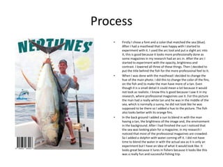
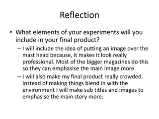
Joshua Palmer experimented with design elements for a magazine masthead and photo. He added an arc to the masthead to make it look more professional. He adjusted the hue, brightness, and contrast of the main photo to make the man and fish look more realistic in their environment. In the background, he added a sun and dolphin to make the scene more crowded and interesting, mimicking professional magazines. For the final product, he will include placing an image over the masthead to emphasize it, and make the overall design more crowded with subtitles and images to highlight the main story.