
Recommended
More Related Content
What's hot
What's hot (20)
Viewers also liked
Viewers also liked (17)
Similar to 3 Horror Magazine
Similar to 3 Horror Magazine (20)
Recently uploaded
Recently uploaded (20)
3 Horror Magazine
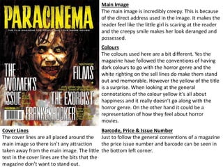
- 1. Main Image The main image is incredibly creepy. This is because of the direct address used in the image. It makes the reader feel like the little girl is scaring at the reader and the creepy smile makes her look deranged and possessed. Colours The colours used here are a bit different. Yes the magazine have followed the conventions of having dark colours to go with the horror genre and the white righting on the sell lines do make them stand out and memorable. However the yellow of the title is a surprise. When looking at the general connotations of the colour yellow it’s all about happiness and it really doesn’t go along with the horror genre. On the other hand it could be a representation of how they feel about horror movies. Cover Lines The cover lines are all placed around the main image so there isn’t any attraction taken away from the main image. The little text in the cover lines are the bits that the magazine don’t want to stand out. Barcode, Price & Issue Number Just to follow the general conventions of a magazine the price issue number and barcode can be seen in the bottom left corner.
- 2. Barcode, Price & Issue Number Just to follow the general conventions of a magazine the price issue number and barcode can be seen in the bottom left corner. Cover Lines The cover lines are all placed at the side of the main image. Going from the rule of thirds the sell lines should be the first thing that the reader sees. The magazine obviously wanted to have this effect because it does take attention away from the main image. Colours The colours used here are a bit different. Yes the magazine have followed the conventions of having dark colours to go with the horror genre and the white righting on the sell lines do make them stand out and memorable. The red writing also follows the horror genre with it’s conventions of danger but again like the other magazine contains the colours yellow. One can only assume it’s a reflection on how the magazine feels about horror films. Main Image The main image is incredibly creepy. This is because of the direct address used in the image. It makes the reader feel like the person in the image is starring at them and the teeth just make them like out right disgusting.
- 3. Barcode, Price & Issue Number The issue number can be seen in tiny writing above the tittle. This is so it doesn’t take any attention away from the title. The barcode cant be seen and it’s probably on the back of the magazine. This is so no space or attention is taken away from the main image. Cover Lines The cover lines are placed at the top of the magazine. This is quite usually but when looking at the magazine they are concealed and take not attention away from the main image. Colours The colours used here followed the horror genre, the dark colours used and the connotation of the red used really supports this magazine in looking like a horror magazine. The white of the sell lines makes them stand out to the reader. Main Image The main image is incredibly creepy. This is because of the direct address used in the image. It makes the reader feel like the person the image is starring at them. The eyes here are also very creepy because the head it facing you but the eyes cant really be seen.