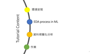
About me
• Education
•NCU (MIS)、NCCU (CS)
• Work Experience
• Telecom big data Innovation
• AI projects
• Retail marketing technology
• User Group
• TW Spark User Group
• TW Hadoop User Group
• Taiwan Data Engineer Association Director
• Research
• Big Data/ ML/ AIOT/ AI Columnist
2
EDA process
• 當我們拿到資料集,如何進行下一步?EDA 就是第一步
• EDA 有助於我們了解資料樣貌
• 為建模制定假設
• 檢查數據品質,必要時進行處理與清洗
• EDA 有助於事後模型預測
8
EDA is an approach to analyzing datasets to summarize their main characteristics,
often with visual methods (wikipedia)
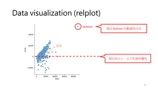
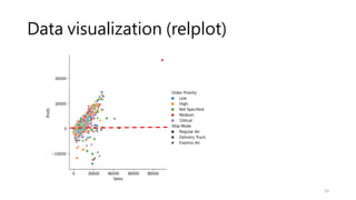
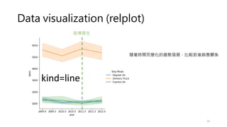
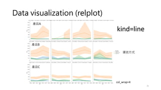
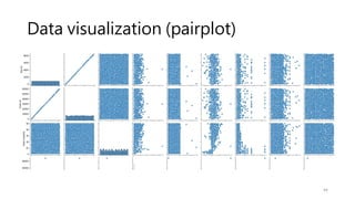
Data visualization (relplot)
•Visualizing statistical relationships
• Statistical analysis is a process of understanding how variables in a dataset
relate to each other and how those relationships depend on other variables.
• Visualization can be a core component of this process because, when data are
visualized properly, the human visual system can see trends and patterns that
indicate a relationship.
17
參考: https://www.cntofu.com/book/172/docs/10.md
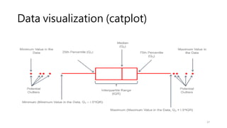
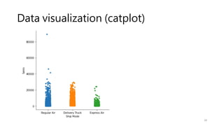
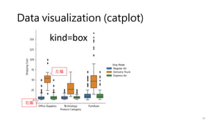
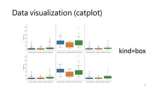
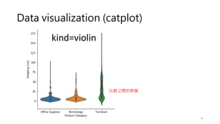
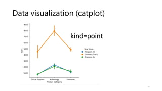
Data visualization (catplot)
•How to use different visual representations to show the relationship
between multiple variables in a dataset.
• We focused on cases where the main relationship was between two
numerical variables. If one of the main variables is categorical
(divided into discrete groups) it may be helpful to use a more
specialized approach to visualization
26
參考: https://www.cntofu.com/book/172/docs/13.md
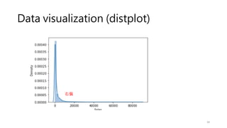
Data visualization (displot)
•What range do the observations cover?
• What is their central tendency?
• Are they heavily skewed in one direction?
• Is there evidence for bimodality (雙峰)?
• Are there significant outliers?
38
參考: https://www.cntofu.com/book/172/docs/24.md
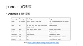
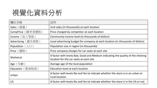
視覺化資料分析
欄位名稱 說明
Sales(銷量) Unitsales (in thousands) at each location
CompPrice(競爭者價格) Price charged by competitor at each location
Income(收入等級) Community income level (in thousands of dollars)
Advertising(廣告預算) Local advertising budget for company at each location (in thousands of dollars)
Population(人口) Population size in region (in thousands)
Price(價格) Price company charges for car seats at each site
ShelveLoc
A factor with levels Bad, Good and Medium indicating the quality of the shelving
location for the car seats at each site
Age(年齡) Average age of the local population
Education(教育程度) Education level at each location
Urban
A factor with levels No and Yes to indicate whether the store is in an urban or
rural location
US A factor with levels No and Yes to indicate whether the store is in the US or not
47
Story telling
• BerkleyAdvanced media institute workshop
• https://multimedia.journalism.berkeley.edu/workshops/online-data-
visualization-course/?gclid=Cj0KCQjwgYSTBhDKARIsAB8Kuks_9PQM0cWr-
XnWkcUHht7PGMRLLLkS4iNkBvwfoqa_maZ8ZXXJXdMaAg1mEALw_wcB
• A good example for data storytelling
• https://blog.presentation-company.com/data-visualization-vs.-data-
storytelling-whats-the-difference
55


![[系列活動] 給工程師的統計學及資料分析 123](https://cdn.slidesharecdn.com/ss_thumbnails/0114lckungtdsaprerequisite-170110090917-thumbnail.jpg?width=640&height=640&fit=bounds)

![[系列活動] 手把手教你R語言資料分析實務](https://cdn.slidesharecdn.com/ss_thumbnails/stepbystepr20170114-170113030702-thumbnail.jpg?width=640&height=640&fit=bounds)

![[DSC 2016] 系列活動:許懷中 / R 語言資料探勘實務](https://cdn.slidesharecdn.com/ss_thumbnails/rdatamining-161030010840-thumbnail.jpg?width=640&height=640&fit=bounds)