EDA Visualization
Orozco Hsu
2024-03-20
1
About me
• Education
• NCU (MIS)、NCCU (CS)
• Experiences
• Telecom big data Innovation
• Retail Media Network (RMN)
• Customer Data Platform (CDP)
• Know-your-customer (KYC)
• Digital Transformation
• Research
• Data Ops (ML Ops)
• Business Data Analysis, AI
2
Tutorial
Content
3
Story telling and visualization
Exploration Data Analysis and Visualization
Home work
What is data visualization?
Code
• Download materials:
• https://drive.google.com/drive/folders/1ibppjANnGy2RYe5CW805MwHrprm2
nu5f?usp=sharing
4
學習 Python 的建議書籍
• 史上最強Python入門邁向頂尖高手之路王者歸來
5
https://www.books.com.tw/products/0010976050?sloc=main
Python 視覺化套件
6
https://jovian.com/aakashns/python-matplotlib-data-visualization
Get ready to your Orange 3
• Open source machine learning and data visualization
• Version: 3.36.2
• https://orangedatamining.com/
7
Story telling With Data (SWD)
• Always remember Data Comparison!
• Focus on simplicity and ease of interpretation
• The takeaways!
8
https://www.storytellingwithdata.com
From touchdowns to takeaways
9
Sorting categories
10
A vertical bar chart can be a better choice if data is ordinal
Allow the labels to be written in a single,
easily readable line
11
Rainbow palette, overly distracting!
• If the goal is to observe the「fluctuation of commercials across
categories over the five years」, we could better achieve that by
iterating to a different graph type.
• On the other hand, if we’re meant simply to compare the overall
category trends,「toning down the color」usage might be beneficial.
12
Color in only the year with the highest
number of commercials in each category
13
This results in a visually chaotic!
2023
2022
Over-Time
The Over-Time means the Line-Graph
14
An overly complex visualization with numerous overlapping data series
In order of total number of commercials
across all five years of data
15
Bar charts instead of line graphs, we can
intentionally emphasize that aspect of our data
16
The number of commercial advertisers in each category, in each year, is a countable
The area graph small multiple chart
17
A visualization of this on social media.
It maintains visual interest while facilitating more straightforward
comparisons across categories over several years.
A combination of line graphs with descriptive
captions to convey these insights more clearly
18
A combination of line graphs with descriptive
captions to convey these insights more clearly
19
A combination of line graphs with descriptive
captions to convey these insights more clearly
20
Conclusion
• There is no singularly correct approach to data visualization.
• The key is to consider the audience's needs, the context of the
presentation, and the intended message.
• Visualizing data is as much an art as it is a science, requiring
experimentation, iteration, and feedback, rather than adherence to a
strict set of rules.
•All about communications!
21
https://www.storytellingwithdata.com/blog
What is data visualization?
• Data visualization is the graphical representation of information and
data.
• By using visual elements like charts, graphs, and maps.
• A way to see and understand trends, outliers, and patterns in data.
22
What is data visualization?
23
https://www.tableau.com/learn/articles/data-visualization#advantages-disadvantages
24
The Pyramid of Data Needs (and why it matters for your career) | by Hugh Williams | Medium
25
The Pyramid of Data Needs (and why it matters for your career) | by Hugh Williams | Medium
Static chart
• There are generally THREE STEPS in drawing a chart:
• Observing the data, determine the relationship, and select the chart.
• What type of data it is, and what content you want to express.
• Category
• Numeric
• Text
• Datetime
• After clarifying the content to be expressed, you can choose which chart to
use to express it.
26
Pie chart
• You must have some kind of whole
amount that is divided into a number
of distinct parts.
• Your primary objective in a pie chart
should be to compare each group’s
contribution to the whole.
27
Line chart
• Line charts provide the clearest
graphical representation of time-
related variables and are the
preferred mode for representing
trends or variables over time.
28
Histogram chart
• It is used to summarize discrete
or continuous data that are
measured on an interval scale.
• It is often used to illustrate the
major features of the distribution
of the data in a convenient form.
29
Bar chart
• It provides a way of showing
data values represented as
the comparison of multiple
data sets side by side.
30
Differences between histogram and bar chart
Comparison terms Bar chart Histogram
Usage
To compare different categories of
data.
To display the distribution of a variable.
Type of variable Categorical variables Numeric variables
Rendering
Each data point is rendered as a
separate bar.
The data points are grouped and
rendered based on the bin value.
The entire range of data values is
divided into a series of non-
overlapping intervals.
Space between bars Can have space. No space.
Reordering bars Can be reordered. Cannot be reordered.
31
Scatter Plot
• It uses dots to
represent values for
two different numeric
variables and observe
relationships between
variables.
32
Pearson Correlation
Box plot
• Q1: The first quartile (25%) position.
• Q3: The third quartile (75%) position.
• Interquartile range (IQR)
• Lower and upper 1.5*IQR whiskers:
These represent the limits and
boundaries for the outliers.
• Outliers: Defined as observations that
fall below Q1 − 1.5 IQR or above Q3 +
1.5 IQR.
33
Box plot
34
35
New workflow
36
Add some widgets file, and data table
37
Open Orange workflow
• Double click 01.ows
38
Modify your output file path
• Check each of
Python widget,
change the old
path to your
existing path.
39
Dataset description (titanic.csv)
• In total with 12 columns.
• A training dataset to
predict whether passengers
will survive in the Titanic
accident.
40
Data Summary
• Load titanic.csv
• Data description
• Look at Names, Types, Role,
Values in table.
• Change the configurations
of Columns.
41
Data Summary
• Missing values
• Using the Features
Statistics Widget
• How about those missing
ratios?
42
Remove columns (called data preprocessing)
• Using Select columns widget.
43
Impute columns (called data preprocessing)
• Using Impute columns widget.
• For Default Method
• For each column
44
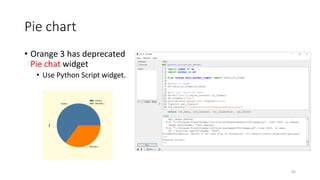
Pie chart
• Orange 3 has deprecated
Pie chat widget
• Use Python Script widget.
45
Line chart
• Using Line Plot widget.
• Typically, trend analysis
charts are presented
together with time-based
data.
46
Distribution chart
• Using distributions widget to
compare each variables.
47
Scatter plot
• Using scatter plot widget.
• It used to observe the degree
of correlation between
features
• positive correlation
• negative correlation
• noncorrelation
48
Box plot
• Using box plot widget.
• Comparing multiple
features with each other
49
Pivot Table
• Using pivot table widget.
• It summarizes the data
of a more extensive
table into a table of
statistics.
• The statistics can include
sums, averages, counts,
etc.
50
1. Show me top 10 data rows
• Hint: Use Data Sampler widget
51
2. Show me dataset info
• How many Rows?
• How many Features?
• All information like this!
52
3. Get a count of the number of survivors
53
4. Survival Conclusion
• For features, SEX, PCLASS, SIBSP,
PARCH, EMBARKED
• Women had a higher chance of survival
than men.
• First-class passengers had a higher
chance of survival.
• Passengers with siblings, spouses had a
higher chance of survival.
• Passengers with children and parents
had a higher chance of survival.
• Departing from the S terminal may
lead to lower cabin class and lower
chances of survival.
54
5. Show me sex survival rate
55
6. Look at survival rate by SEX and PCLASS
• Women in first class had a survival rate as high as 96.8%. In contrast,
men in economy class only had a 13.54% chance of survival
56
7. Look at survival rate by SEX, AGE and
PCLASS
• In the event of a disaster, women in
first class or business class have a 90%
chance of survival regardless of age.
• On the other hand, if a man is in
economy class and older than 18, the
chance of survival is only 13.36%.
• To summarize, in a disaster scenario,
girls and women have a higher chance
of survival compared to boys and men.
• Additionally, the higher the class (such
as first class), the higher the chances
of survival.
57
8. The price paid of each class
• Try to plot Pclass and Fare chart
to visualize data
• Every seat had someone board
for free, while others spent over
500 pounds for a first-class
ticket. It's quite an interesting
observation!
58
9. Visualizing data and express your thoughts
• Using today’s teaching knowledge and referencing
Story_telling_with_data.pdf, please visualize and analysis this data
(20240320_HW.csv) with the theme of sales.
• Based on your observations, explain the relationship between sales
and these variables.
59

資料視覺化_透過Orange3進行_無須寫程式直接使用_碩士學程_202403.pdf

  • 1.
  • 2.
    About me • Education •NCU (MIS)、NCCU (CS) • Experiences • Telecom big data Innovation • Retail Media Network (RMN) • Customer Data Platform (CDP) • Know-your-customer (KYC) • Digital Transformation • Research • Data Ops (ML Ops) • Business Data Analysis, AI 2
  • 3.
    Tutorial Content 3 Story telling andvisualization Exploration Data Analysis and Visualization Home work What is data visualization?
  • 4.
    Code • Download materials: •https://drive.google.com/drive/folders/1ibppjANnGy2RYe5CW805MwHrprm2 nu5f?usp=sharing 4
  • 5.
    學習 Python 的建議書籍 •史上最強Python入門邁向頂尖高手之路王者歸來 5 https://www.books.com.tw/products/0010976050?sloc=main
  • 6.
  • 7.
    Get ready toyour Orange 3 • Open source machine learning and data visualization • Version: 3.36.2 • https://orangedatamining.com/ 7
  • 8.
    Story telling WithData (SWD) • Always remember Data Comparison! • Focus on simplicity and ease of interpretation • The takeaways! 8 https://www.storytellingwithdata.com
  • 9.
    From touchdowns totakeaways 9
  • 10.
    Sorting categories 10 A verticalbar chart can be a better choice if data is ordinal
  • 11.
    Allow the labelsto be written in a single, easily readable line 11
  • 12.
    Rainbow palette, overlydistracting! • If the goal is to observe the「fluctuation of commercials across categories over the five years」, we could better achieve that by iterating to a different graph type. • On the other hand, if we’re meant simply to compare the overall category trends,「toning down the color」usage might be beneficial. 12
  • 13.
    Color in onlythe year with the highest number of commercials in each category 13 This results in a visually chaotic! 2023 2022 Over-Time
  • 14.
    The Over-Time meansthe Line-Graph 14 An overly complex visualization with numerous overlapping data series
  • 15.
    In order oftotal number of commercials across all five years of data 15
  • 16.
    Bar charts insteadof line graphs, we can intentionally emphasize that aspect of our data 16 The number of commercial advertisers in each category, in each year, is a countable
  • 17.
    The area graphsmall multiple chart 17 A visualization of this on social media. It maintains visual interest while facilitating more straightforward comparisons across categories over several years.
  • 18.
    A combination ofline graphs with descriptive captions to convey these insights more clearly 18
  • 19.
    A combination ofline graphs with descriptive captions to convey these insights more clearly 19
  • 20.
    A combination ofline graphs with descriptive captions to convey these insights more clearly 20
  • 21.
    Conclusion • There isno singularly correct approach to data visualization. • The key is to consider the audience's needs, the context of the presentation, and the intended message. • Visualizing data is as much an art as it is a science, requiring experimentation, iteration, and feedback, rather than adherence to a strict set of rules. •All about communications! 21 https://www.storytellingwithdata.com/blog
  • 22.
    What is datavisualization? • Data visualization is the graphical representation of information and data. • By using visual elements like charts, graphs, and maps. • A way to see and understand trends, outliers, and patterns in data. 22
  • 23.
    What is datavisualization? 23 https://www.tableau.com/learn/articles/data-visualization#advantages-disadvantages
  • 24.
    24 The Pyramid ofData Needs (and why it matters for your career) | by Hugh Williams | Medium
  • 25.
    25 The Pyramid ofData Needs (and why it matters for your career) | by Hugh Williams | Medium
  • 26.
    Static chart • Thereare generally THREE STEPS in drawing a chart: • Observing the data, determine the relationship, and select the chart. • What type of data it is, and what content you want to express. • Category • Numeric • Text • Datetime • After clarifying the content to be expressed, you can choose which chart to use to express it. 26
  • 27.
    Pie chart • Youmust have some kind of whole amount that is divided into a number of distinct parts. • Your primary objective in a pie chart should be to compare each group’s contribution to the whole. 27
  • 28.
    Line chart • Linecharts provide the clearest graphical representation of time- related variables and are the preferred mode for representing trends or variables over time. 28
  • 29.
    Histogram chart • Itis used to summarize discrete or continuous data that are measured on an interval scale. • It is often used to illustrate the major features of the distribution of the data in a convenient form. 29
  • 30.
    Bar chart • Itprovides a way of showing data values represented as the comparison of multiple data sets side by side. 30
  • 31.
    Differences between histogramand bar chart Comparison terms Bar chart Histogram Usage To compare different categories of data. To display the distribution of a variable. Type of variable Categorical variables Numeric variables Rendering Each data point is rendered as a separate bar. The data points are grouped and rendered based on the bin value. The entire range of data values is divided into a series of non- overlapping intervals. Space between bars Can have space. No space. Reordering bars Can be reordered. Cannot be reordered. 31
  • 32.
    Scatter Plot • Ituses dots to represent values for two different numeric variables and observe relationships between variables. 32 Pearson Correlation
  • 33.
    Box plot • Q1:The first quartile (25%) position. • Q3: The third quartile (75%) position. • Interquartile range (IQR) • Lower and upper 1.5*IQR whiskers: These represent the limits and boundaries for the outliers. • Outliers: Defined as observations that fall below Q1 − 1.5 IQR or above Q3 + 1.5 IQR. 33
  • 34.
  • 35.
  • 36.
  • 37.
    Add some widgetsfile, and data table 37
  • 38.
    Open Orange workflow •Double click 01.ows 38
  • 39.
    Modify your outputfile path • Check each of Python widget, change the old path to your existing path. 39
  • 40.
    Dataset description (titanic.csv) •In total with 12 columns. • A training dataset to predict whether passengers will survive in the Titanic accident. 40
  • 41.
    Data Summary • Loadtitanic.csv • Data description • Look at Names, Types, Role, Values in table. • Change the configurations of Columns. 41
  • 42.
    Data Summary • Missingvalues • Using the Features Statistics Widget • How about those missing ratios? 42
  • 43.
    Remove columns (calleddata preprocessing) • Using Select columns widget. 43
  • 44.
    Impute columns (calleddata preprocessing) • Using Impute columns widget. • For Default Method • For each column 44
  • 45.
    Pie chart • Orange3 has deprecated Pie chat widget • Use Python Script widget. 45
  • 46.
    Line chart • UsingLine Plot widget. • Typically, trend analysis charts are presented together with time-based data. 46
  • 47.
    Distribution chart • Usingdistributions widget to compare each variables. 47
  • 48.
    Scatter plot • Usingscatter plot widget. • It used to observe the degree of correlation between features • positive correlation • negative correlation • noncorrelation 48
  • 49.
    Box plot • Usingbox plot widget. • Comparing multiple features with each other 49
  • 50.
    Pivot Table • Usingpivot table widget. • It summarizes the data of a more extensive table into a table of statistics. • The statistics can include sums, averages, counts, etc. 50
  • 51.
    1. Show metop 10 data rows • Hint: Use Data Sampler widget 51
  • 52.
    2. Show medataset info • How many Rows? • How many Features? • All information like this! 52
  • 53.
    3. Get acount of the number of survivors 53
  • 54.
    4. Survival Conclusion •For features, SEX, PCLASS, SIBSP, PARCH, EMBARKED • Women had a higher chance of survival than men. • First-class passengers had a higher chance of survival. • Passengers with siblings, spouses had a higher chance of survival. • Passengers with children and parents had a higher chance of survival. • Departing from the S terminal may lead to lower cabin class and lower chances of survival. 54
  • 55.
    5. Show mesex survival rate 55
  • 56.
    6. Look atsurvival rate by SEX and PCLASS • Women in first class had a survival rate as high as 96.8%. In contrast, men in economy class only had a 13.54% chance of survival 56
  • 57.
    7. Look atsurvival rate by SEX, AGE and PCLASS • In the event of a disaster, women in first class or business class have a 90% chance of survival regardless of age. • On the other hand, if a man is in economy class and older than 18, the chance of survival is only 13.36%. • To summarize, in a disaster scenario, girls and women have a higher chance of survival compared to boys and men. • Additionally, the higher the class (such as first class), the higher the chances of survival. 57
  • 58.
    8. The pricepaid of each class • Try to plot Pclass and Fare chart to visualize data • Every seat had someone board for free, while others spent over 500 pounds for a first-class ticket. It's quite an interesting observation! 58
  • 59.
    9. Visualizing dataand express your thoughts • Using today’s teaching knowledge and referencing Story_telling_with_data.pdf, please visualize and analysis this data (20240320_HW.csv) with the theme of sales. • Based on your observations, explain the relationship between sales and these variables. 59