
More Related Content
What's hot
What's hot (18)
Viewers also liked
Similar to 20th Century and Modern Art
Similar to 20th Century and Modern Art (20)
Recently uploaded
Recently uploaded (18)
20th Century and Modern Art
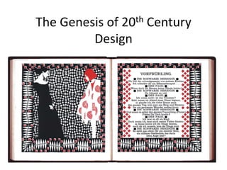
- 1. The Genesis of 20th Century Design
- 3. Aubrey Beardsley Jan Toorop
- 4. Margaret McDonald Margaret & Frances McDonald With Herbert McNair Charles Rennie Mackintosh
- 7. The Vienna Secession Gustav Klimt Koloman Moser
- 8. Vienna Secession & Typography
- 10. Peter Behrens
- 11. Dusseldorf School of Arts & Crafts
- 13. Peter Behrens
- 14. Concept of Total Design
- 18. London Underground Type Design by Edward Johnston
- 20. The Influence of Modern Art • Cubism • Futurism • Dada • Surrealism • Expressionism
- 21. Cubism Pablo Picasso, Nude, c. 1906–07Lege African mask
- 22. Analytical vs. Synthetic Cubism Juan Gris, Fruit Bowl, 1916Pablo Picasso, Man with Violin, 1911–12
- 23. Fernand Léger Fernand Léger, The City, 1919
- 26. Filippo Marinetti Guillaume Apollinaire
- 27. Fortunato Depero
- 28. Dada The Fountain, by Marcel Duchamp, 1917
- 30. Marcel Duchamp
- 32. Kurt Schwitters
- 33. John Heartfield & George Grosz
- 35. Surrealism Giorgio de Chirico Salvador Dali
- 36. Max Ernst
- 37. René Magritte
- 38. Salvador Dali
- 41. Fauves – Henri Matisse
- 42. Photography & The Modern Movement Francis Bruguière
- 43. Alvin Langdon Coburn, “The Octopus,” 1912
- 44. Man Ray, “Sleeping Woman,” 1929
- 45. Man Ray, “Gun with Alphabet Squares,” 1924 Man Ray, London Underground poster, 1932
Editor's Notes
- In the late 19th century and early 20th century, several designers, particularly in Scotland, Austria and Germany, broke with Art Nouveau and introduced a more rectilinear, geometric approach to design. Their concern for spatial relationships, inventive forms, functionality, and systems thinking laid the groundwork for 20th century design.
- The work of American architect Frank Lloyd Wright, who saw space as the essence of design, was an inspiration to European artists and designers who were moving away from the curvilinear art nouveau toward a rectilinear approach to spatial organization. Chapter one opening page spread for The House Beautiful, 1896–97. An underlying geometric structure imposed a strong order upon the intricacy of Wright’s textural design
- Another source of inspiration were the works of Aubrey Beardsley and Jan Toorop, which influenced a group of young students who collaborated at the Glasgow School of Art in the 1890’s: Charles Rennie Mackintosh, Herbert McNair, and sisters Margaret and Frances McDonald.
- “The Four” as they were called, innovated a geometric style that blended floral and curvilinear elements with a strong rectilinear structure. Their designs were also distinguished by symbolic imagery, stylized form, and bold simple lines that defined flat areas of color.
- Among those who drew inspiration from “The Four” were Jessie Marion King, whose stylized lettering and medieval-style fantasy illustration, with their romantic overtones, widely influenced fiction illustration throughout the 20th century.
- Talwin Morris , an Art Director at a Glasgow publishing firm, embraced the ideas of “The Four,” and applied the geometric spatial division and lyrical organic forms of the Glasgow group to mass communication. He also developed a system of standard formats for publication series that could be modified slightly to create distinctions.
- In Austria, the Vienna Secession, was formed by younger members of the Viennese Creative Artists’ Association, who resigned in protest when the organization refused to allow foreign artists to participate in their exhibitions. The Vienna Secession, led by painter Gustav Klimt, architects Joseph Maria Olbrich and Josef Hoffman, and artist-designer Koloman Moser, became another countermovement to Art Nouveau.
- The Vienna Secession’s love of sans serif lettering, ranging from flat, blocky slabs, to fluid calligraphic forms, can be seen in posters promoting their exhibitions, as well as in their publication Ver Sacrum, or Sacred Spring, published from 1898 to 1903.
- Koloman Moser and his fascination with geometry played a major role in defining the Secession’s approach to graphic design. His poster for the 13th Vienna Secession exhibition and Alfred Roller’s poster for the 14th exhibition, both from 1902, are outstanding examples of the geometric patterning and modular design construction that informed the design language of the mature phase of the Vienna Secession.
- German artist, architect and designer, Peter Behrens, whose advanced thinking about design influenced architecture, industrial design, and graphic design, set the stage for the future. He was an early advocate of sans-serif typography, and his booklet, “Celebration of Life and Art: A Consideration of the Theatre as the Highest Symbol of a Culture,” is believed to be the first to use sans-serif type as a running book text.
- In 1903, Behrens became the director of the Dusseldorf School of Arts and Crafts. The introductory course he developed there were precursors for the Bauhaus Preliminary Course, for which two of Behren’s apprentices, Walter Gropius and Mies van de Rohe, served as directors.
- In 1904, Dutch architect, J.L. Mathieu Lauweriks joined the Dusseldorf faculty and introduced an approach to teaching design based on geometric composition. A modular element, composed of a square, circumscribed around a circle was the basic building block for his compositions, in which the module could be subdivided and duplicated to create grids and geometric patterns, and to determine proportions, dimensions, and spatial divisions.
- Peter Behrens was influenced by Lauweriks’ theory, and applied it to his own work, which pushed 20th century design toward rational geometry as an underlying system for visual organization.
- When Peter Behrens was appointed Artistic Advisor to AEG, in 1907, he introduced the concept of total design to industry with the first comprehensive visual identification system that included graphic design, architecture, and product design. This trademark he created in 1907 was consistently applied to buildings, stationary, products, and graphics.
- Behren’s work furthered standardization in product design for machine manufacture. His work pointed toward a new design sensibility that would mature in the 1920’s.
- In 1916, Frank Pick of the Underground Electric Railways of London, as part of a poster campaign, commissioned Edward Johnston to design an exclusive, patented typeface. The result was a sans-serif with consistent stroke weight, whose proportions were based on classical Roman inscriptions.
- The identity project expanded to include signage, station architecture, product design and the design of the station platforms, trains and buses, and coach interiors. Through their commitment to design and their demonstration that design can make a positive contribution to the environment, the Underground became an international model for corporate design responsibility.
- Amid the social, political, cultural and economic turbulence of the early 20th century, visual art and design experienced a series of creative revolutions that brought the role of art and design in society, in addition to the long-held values and approaches to organizing space, into question. Several art movements arose, including Cubism, Futurism, Dada, Surrealism and Expressionism.
- Works by Spanish painter Pablo Picasso were the genesis of cubism. Picasso was influenced by ancient Iberian and African tribal art, as well as the work of French post-impressionist Paul Cézanne, who treated nature in terms of cylinder and cone.
- Two forms of cubism emerged: analytical cubism, represented by Picasso and George Braque, and synthetic cubism, represented by Juan Gris. In analytical cubism, the planes of the of the subject matter were analyzed, often from different vantage points, and assembled into a rhythmic composition of geometric planes. In synthetic cubism, the artist drew inverted forms based on past observations; these were signs, rather than representations of the subject matter.
- Cubism became a catalyst for experiments that pushed art and design toward geometric abstraction and new attitudes toward pictorial space, such as the work of Fernand Léger, whose subject matter was depicted with cylinders, spheres and cones.
- Léger’s letterforms in the book, “The End of the World, filmed by the Angel of Notre Dame,” pointed the way toward geometric letterforms. His flat planes of color, urban motifs, and the hard-edged precision of hit machine forms helped define the modern design sensibility after World War 1.
- The stirring “Manifesto of Futurism” by Italian poet, Filippo Marinetti, voiced enthusiasm for war, the machine age, speed and modern life.
- Marinetti and his followers used a painterly typographic design called “words in freedom,” which defied correct syntax and grammar, to express their emotionally charged poetry as works of visual art.
- Fortunato Depero applied Futurist philosophy to graphic design and advertising. In this New Futurist Theater Company poster, flat planes of vibrant color, diagonal composition, and angular repetitive forms produce kinetic energy.
- Futurism’s violent, revolutionary techniques were adopted by the Dadaists. Dada writers and artists sought absolute freedom from tradition and using shock, protest and nonsense, their work rebelled against the horrors of World War 1, the decadence of European society , blind faith in technological progress, and the inadequacy of religious and moral codes.
- The Dada movement’s guiding spirit was Tristan Tzara, a Paris-based, Romanian poet, and editor of the periodical DADA. Marcel Duchamp was the movement’s most prominent visual artist and it’s most articulate spokesperson.
- Duchamp shocked the public when he painted a moustache on a reproduction of the Mona Lisa, which was intended as an assault on tradition and a public that had lost the humanistic spirit of the Renaissance. His ready-made sculptures, such as a bicycle wheel mounted on a wooden stool, expressed the philosophy of absolute freedom in which the artist was entitled to individual decision and choice.
- Although the Dadaists claimed to be anti-art, several created meaningful visual art and graphic design, such as Raoul Hausmann and Hannah Höch, who worked in the medium of photomontage, the technique of manipulating found photographic images to create jarring juxtapositions and chance associations.
- Kurt Schwitters, of Hanover, Germany created a non-political offshoot of the Dada Movement that he named Merz, from the word Kommerz (commerce), found in one of his collages. His collages were strong design compositions based on nonsense, surprise, and chance, that were made by combining printed ephemera, rubbish, and found materials.
- In contrast to Schwitters, the Berlin Dadaists, John Heartfield and George Grosz created visual communication to raise public awareness and promote social change. In his powerful posters, book and magazine covers, political illustrations and cartoon, Heartfield used photomontage as an effective propaganda weapon aimed at the Weimar Republic and the growing Nazi Party. Grosz used satire and caricature to attack a corrupt society and advocate a classless social system.
- By the time the Dada movement ended in 1922, it had enriched the visual vocabulary started by futurism, furthered cubism’s concept of letterforms as concrete visual shapes, not just phonetic symbols, and released typographic design from the horizontal and vertical constraints imposed upon it by letterpress.
- While the Dada movement had been negative, destructive, and exhibitionist, Surrealism professed a poetic faith in man and his spirit. Led by Poet André Breton, writers experimented with stream-of-consciousness writing, or automatism, in search of truth in the world of intuition, dreams and the unconscious realm explored by Sigmund Freud. But, it was through the movement’s painters, such as Giorgio de Chirico, Max Ernst, René Magritte and Salvador Dali, that surrealism affected society and visual communications, especially photography and illustration.
- Max Ernst used a number of collage techniques that have been adopted in graphic communications: frottage, which used rubbings to compose directly on paper, and decalomania, Ernst’s process of transferring images from printed matter to a drawing or painting, and incorporating them in unexpected ways.
- Magritte’s images, in which space, color and perspective, and figures were rendered in a careful naturalism, but set in an illusionary dreamscape, also inspired visual communications.
- Dali influence graphic design in two ways: his deep perspectives inspired designers to bring depth to the flat printed page, and his approach to simultaneity has often been imitated in posters and editorial images.
- Expressionism is the tendency to depict subjective emotions and personal responses to subjects and events. It emerged as an organized movement in Germany, before World War I, and was represented by two groups: Die Brücke (The Bridge) and Der Blaue Reiter (The Blue Rider). Here, the figurative imagery in Käthe Kollwitz’s posters expresses with great emotional power, her concern for the poor.
- The paintings of Der Blaue Reiter founding member, Wassily Kandinsky convey emotions through form and color, without subject matter or literal symbols. Another founding member, Paul Klee, translated his subject matter into graphic signs and symbols. The color and form theories of Kandinsky and Klee became important foundations for design and design education though their teaching at the Bauhaus.
- In France, the Fauves (wild beasts) led by Henri Matisse, were more involved with color and structural relationships than expressions of spiritual crisis like the German expressionists. The visual language of Expressionism and the emphasis on social and political activism continue to influence graphic design to this day.
- The new visual language of the modern movements emphasized point, line, plane, shape, texture, and the relationship between these visual elements. Just as the new visual language had affected typography, it influenced photography. Francis Bruguière explored multiple exposure and the potential of light recorded on film as a medium for expression in his photographic abstractions.
- Alvin Langdon Coburn focused on pattern and structure in his vortographs, nonobjective photographic images, rather than depicting objects and things.
- Man Ray explored the creative potential of solarization and cameraless prints that he called rayographs.
- Man Ray applied surrealism to graphic design and photography assignments, such as his 1932 poster for the London Underground.
- The concepts, images, and methods of visual organization from cubism, futurism, Dada, Surrealism and expressionism have provided valuable insights and processes for graphic designers. The innovators of these movements continue to influence artists, designers and illustrators to this day.