
Recommended
More Related Content
What's hot
What's hot (20)
Similar to Postmodern Design
Similar to Postmodern Design (20)
More from Christopher Chuckry
Recently uploaded
Recently uploaded (20)
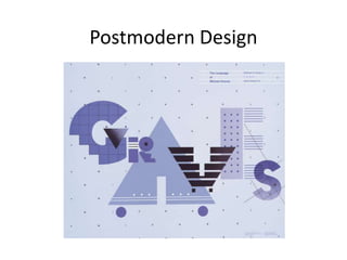
Postmodern Design
- 5. Early Swiss Postmodern Design Rosmarie Tissi Siegfried Odermatt Steff Geissbuhler
- 6. Rosmarie Tissi, direct mail folder for Anton Schöb printers, 1981 Rosmarie Tissi, Graphis cover, 1980 Rosmarie Tissi, poster for Anton Schöb printers, 1985
- 7. New-Wave Typography Wolfgang Weingart, experimental text setting, 1969
- 10. Wolfgang Weingart, exhibition poster, 1981 Wolfgang Weingart, exhibition poster, 1979
- 11. Wolfgang Weingart, exhibition poster, 1984.
- 12. Dan Friedman April Greiman Willi Kunz Kenneth Hiebert
- 13. Memphis & San Francisco Schools Michael Vanderbyl Michael Manwaring Michael Cronin
- 14. Retro & Vernacular Design Paula Scher, poster for CBS records, 1979 Paula Scher, Swatch Watch poster, 1985
- 15. Paula Scher, “Great Beginnings” spread for Koppel & Scher promotional booklet, 1984
- 16. Louise Fili, book cover for The Lover, 1985 Lorraine Louie, cover for the Quarterly, 1987 Carin Goldberg, book cover for The Sonnets of Orpheus, 1987
- 17. Daniel Pelavin, book cover for The Notebooks of Malte Laurids Brigge, 1985 Charles S. Anderson, label designs for Classico pasta sauce, 1985
- 18. Neville Brody
- 19. Neville Brody
- 20. Paula Scher, “Language Is a Deadly Weapon” graphic for MTV’s “Free Your Mind” campaign, 1994
Editor's Notes
- Within the context of design, the term postmodernism refers to a shift away from the objectivity of modern design toward a more subjective approach to designing. Postmodernism gained a strong foothold with designers who emerged in the 1970s. They turned away from the order and clarity of the International Typographic Style, which had been prevalent since the Bauhaus, and found inspiration in historical references, decoration, and the vernacular as they sought a broader range of design possibilities.
- During the 1960s, the terms supermannerism and supergraphics were used to describe work that broke with modern design. Supermannerism stems from the term mannerism, the stylish art of the 1500s that broke with the natural and harmonious beauty of the High Renaissance. Supermannerism was first used as a derogatory label by proponents of modern design in reference to the work of young architects who broke from modern design. Supergraphics describes the application of concrete graphic form to architecture, usually geometric shapes and letterforms that brought vitality and color to the built environment.
- Philadelphia-born Robert Venturi, the original and most controversial supermannerist, added large-scale lettering to his architectural vocabluary. He sees graphic communications and new technologies as important tools for architecture, as shown in his proposal for the Football Hall of Fame.
- Supermannerist architect Charles W. Moore called on graphic designer Barbara Stauffacher Solomon, who had studied graphic design at the Basel School of Design, to bring vitality and order through supergraphics to his 1966 project, Sea Ranch, a large condominium project in California. By 1970 supergraphics had caught on, and graphic design became more involved in environmental design.
- A shift away from modern design began in the 1960s when designers working within the International Typographic Style expanded its parameters as they experimented with a broader range of design possibilities to enhance communication and meaning. Among the pioneers who evolved the International Typographic Style in this way were Swiss designers Rosmarie Tissi, Siegfried Odermatt, and Steff Geissbuhler.
- Odermatt and Tissi frequently positioned text type on a background shape, which was defined by the depth of the text block and the lengths of the lines of type, as shown in the 1981 direct mail folder for Anton Schöb printers. Geissbuhler’s work during this period is represented by an engaging complexity; yet complexity is not an end in itself; rather, it is a dynamic visual language that communicates the concept of the message, as demonstrated in his 1965 Geigy brochure cover and 1974 “Blazer” financial services poster.
- During the 1970s, practitioners and teachers schooled in the International Typographic Style sought to reinvent typographic design, like Herbert Bayer, Jan Tschichold, and others had done in the 1920s. These new directions, inspired by the experimental work and teaching of Wolfgang Weingart, were labeled new-wave typography.
- Weingart began to challenge the objectivity, absolute order, and precision of the International Typographic Style, as well as the time-honored traditions of letterpress typography and the more recent traditions of photographic typography. Weingart questioned everything and broke all the rules. He infused feeling and humor into his work and encouraged his students to do the same.
- Weingart invented new typographic forms by combining characters in unexpected and whimsical ways—a colon turned on its side became an umlaut, a comma on its side became a u, a rotated lowercase m became an E, and a bullet over the vertical stroke of a lowercase n became an i-n ligature—or letters simply became concrete, abstract forms.
- By the mid-1970s, Weingart began to experiment with collage as a medium for visual communication and a method of combining image with typography. In the process he developed a new technique, which led to complex compositions created by sandwiching layers of film positives containing photographic images, type, and graphics cut from printer’s block-out film.
- This method enabled Weingart to compose complex visual information, unify typography and pictorial images, and juxtapose type and image with textures, which were often created by enlarging halftone dots or overlapping halftone screens to create moiré patterns.
- Dan Friedman, April Greiman, Willi Kunz, and Kenneth Hiebert, all of whom spent time at the Basel School and afterwards came to the United States to teach and practice, helped spread the new design sensibility. Although Weingart and others who pioneered new-wave typography rejected the notion of style, by the late 1970s and 1980s, their work was widely imitated.
- In the early 1980s in San Francisco, Michael Vanderbyl, Michael Manwaring, and Michael Cronin forged a postmodern design movement that positioned San Francisco as a creative center of design. Although the San Francisco designers share gestures, shapes, palettes, intuitive spatial arrangements, and assign symbolic roles to geometric elements, personal attitudes are evident in their work.
- Retro, which first emerged in New York in the 1980s and spread quickly throughout the world, was a movement based on historical revival, particularly a revival of modernist European design from the first half of the twentieth century. New York retro began with Paula Scher, Louise Fili, and Carin Goldberg. Scher’s 1979 poster for CBS Records was inspired by Russian constructivist and nineteenth-century wood type posters.
- Other retro influenced designers included Louise Fili, Carin Goldberg and Lorraine Louie.
- Along with Daniel Pelavin and Charles S. Anderson.
- Although it would be a misnomer to label English designer Neville Brody a retro designer who reinvented styles of the past, he did draw inspiration from the geometric forms of the Russian constructivist artists, as well as the Dada experimental attitudes and their rejection of the doctrines of the ruling establishment. Brody emerged as one of the more original graphic designers of the 1980s as he sought to discover an intuitive and logical approach to design.
- He designed graphics and album covers for rock music and art directed English magazines, including Arena and The Face, for which he designed a series of geometric sans-serif typefaces and emblematic logo designs. Brody’s work was widely imitated.
- Postmodernism heralded a spirit of liberation that allowed designers to respond positively to vernacular and historic forms and to incorporate them into their work. An atmosphere of inclusion and expanding possibilities encouraged designers to experiment.