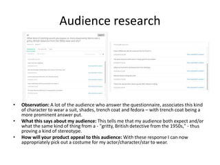
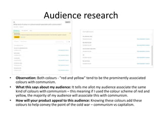
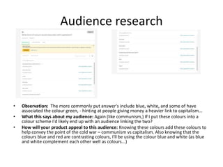
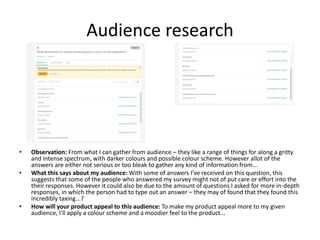
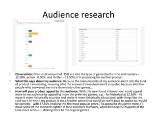
Research
Mathew-Burniston
Existing Product (Title Sequence)
Source:
https://www.youtube.com/watch?v=85_pl_2Ugjsn
Similarities:
• Using it's tile sequence, it hints at when the show is set.
• The tile sequence evolves around the main character (the man in
the suit.)
• They use the actors/cast members names.
Observations of the product:
• Music: They use "A Beautiful Mine" by "RDJ2"
• Lighting: In this title sequence, they use a lighter tone, rather than
using a dull – giving of more of a business feeling, whilst setting
tone to a less dark and grungy...
• Images: In the background they use photos reminiscent– the time
when the show is set.
• Style: They use a constant black and white color scheme for main
character in this title sequence – making him stand out from the
background. Whilst the background's main style and look set it's
self apart from the character and the text – hopefully drawing our
attention to those two things...
• Colours: The saturation on the colour is quite low and most of the
colours are limited, only using colours for some of the used pictures
and couple pictures.
• Fonts and text: It uses a both black and red colour scheme, whilst
using a bland and standard font ("Calibri.")
Audience Appeal:
• It uses an individual song used in the base of the title sequence –
meaning this title sequence is something quite new and
refreshing.
• They use compelling visuals and sticks to a consistent style – looks
professional.
Existing Product (Title Sequence)Source:
https://www.youtube.com/watch?v=TJ66bhKCWg8
Similarities:
• Much like title sequence here< I very much like the idea of having my title sequence move
round place and scenes – relevant to the show, e.g. because this is a fan concept of the show
Doctor Who, the shot evolve round the TARDIS (-the character's way of getting their selves
round, in each story,) whilst changing from different scenes of space (as this is a Sci-Fi.)
• I also like the idea of the main character being involved in the title sequence.
• Furthermore ,I like the idea of using different transitions –such as an ink styled transition (as
used through out this product...)
• They use the actors/cast members names.
Observations of the product:
• Music: Being a fan made product, they use a fan made of music – going with the visuals.
• Lighting: The lighting used in this is darker for the background, whilst keeping the text lighter
– to make it stand out the audience.
• Images: To remind the audience that the show (Doctor Who<) is a Sci-Fi, set in loads of
different parts of space, they use loads of scene including space,, with the TARDIS making
appearance (in a guided like fashion,) - linking with how the characters make their way
round. Also, part way into the sequence, they use silhouette of Jodie Whittaker's Doctor –
the character the sequence is based upon.
• Style: The style found with this a series of ink based transitions – connecting a series of scene
and images linked with the show. It also included some shot changes – linking in with the
beat...
• Colours: For the background they use colour scheme of blue, with a hint of green. By using a
colour scheme helps the piece all seamlessly belong together, as each scene doesn't differ
massively in comparison – yet animating the background an panning the camera, keeps the
sequence refreshing.
• Fonts and text: For the text (excluding the logo,) they use a bold white font. Although, with
the logo, they use bold a fiery yellow logo – making sure the logo stands out from the rest of
the text.
• On top of this, time the appearance of text to the timing of the beat, leaves a satisfying
result...
Audience Appeal:
• The bright colour scheme could be found enticing towards the product?
• It's quite individual and different from the rest – again may feel refreshing (like the last
product.)
Existing Produce (Pre-1990 Title Sequence)
Source:
https://www.youtube.com/watch?v=Ju_by-sC79c
Similarities:
• They use the actors/cast members names.
• The main character appearing in the sequence, along with other cast
members.
• I like the use of putting the characters personality into a title sequence
and creating imagery round the possible franchise of the product.
Observations of the product:
• Music: They use "License To Kill" by "Gladys Knight" - a son specially sung
for the sequence - rather than the other way around...
• Lighting: The lighting is dark to make images of appearing on our screen
– thus bringing our attention to these images
• Images: This title sequence is used to sum up the main character Bond,
to do this they use visuals of women and gambling. To remind us of this,
they use both imagery and text for 007 – the code name for James Bond.
• Style: Much like its predeceasing sequences – in the bond franchise, it
uses silhouettes mainly dark backdrop (usual silhouettes of women – in
connection with Bond with women.)
• Colours: In this product, we don’t have a colour scheme. However, they
use a set of reasonably low saturated colours - to avoid looking to
cartoonish, but still colourful enough to draw in an audience.
• Fonts and text: Throughout the sequence, we have flashed of credits - in
a readable white font, contrasting with the background, (which is dark.)
Audience Appeal:
• Though the colours aren't bright, there's a wide range of colours used.
• They use visuals to sum up the franchise, meaning there's a nostalgia
factors fans of the series.
Research Analysis
• What common features do the researched products have?
– A big part of what makes these title sequence is how they use an original style for their title sequence, making them iconic, which helps push the series as
more memorable – e.g. will now associate the used visuals (from the title sequences,) to their series. An example of this is in the "Doctor Who" fan title
sequence, with the iconic TARDIS flying through space will easily be linked and associated to the series as whole – along side the theme song - which should
always be iconic to a series –as this would help push this affect.
• The title sequence often ties in with the genre of the series – into the title sequence – such as the sci-fi elements of space in the "Doctor Who" fan title sequence....
• By giving the title sequence an individual style - it make it easier for the audience to identify the branding of the series; the style/genre/type of imagery used inform
the view of the product. Once a style is a established, the imagery can be developed – episode by episode and become part of the story telling experience this creates
viewers who actively interested in watching the title sequences.
– They use a consistent style of colours (as scene in the "License To Kill" title sequence – using not a colour scheme but a range of colour at the same point of
saturation;) where as the rest use a colour schemes (like the heavy use of back and white in the "Mad Men" title sequence, or the blue in the "Doctor Who"
fan title sequence.
• By using a colour scheme – this furthers the style and theme of the title sequence –similar to the common branding in the title sequence a colour style or look can
influence the audience, give atmosphere to the series and in extreme cases such as rotoscope sequences, colour schemes can become the colour pallet for the
animator. Deciding on a colour scheme early on in pre-production allows all the design teams (wardrobe, hair and make-up scenery an writing,) to develop a
uniforemed design aproach.
– The use may contain the main character or a representation of them in some visual form – such as the title sequence of "Man men" revolves around this
character – walking into a room, falling or sitting on a park bench. By including things likes this, it can tell us that the series is heavily about them – as title
sequences are often used to give our audience an incite the show, whilst also keeping a connection between episodes.
• From including either a representation or the use of the main character, it helps our audience both making the connection/assumption of their role as the main
character – whilst being allowed the opportunity to build on the charterer.
– They always include the main cast's names, if not more of the people who (in addition to the main cast,) made it work (as done in all of researched products
– acting as a mini credits that help push the series.)
• What aspects of the research will you include within your on work?
– For my final product I'll be implementing things like the ink transitions; the usage of the main character in the title sequence the cast's names in the titles;
the logo at the end of the sequence, along with additional cast members and scenery, taking a part in my product.
– My research has allowed me to develop an overview, of all the different elements to my product.
Existing Product (Poster)
Source:
Peaky Blinders, Series 2 DVD cover.
Similarities:
• It displays the main character In the center of the page.
• It uses a low saturation across the cover.
• The logo uses a run down effect.
Observations of the product:
• Lighting: The lighting on this cover provides quite a high contrast – making the shadows stronger.
• Images: The artwork on the cover is split into two parts, a top and a bottom – on the top half is
displayed the main character with two other characters in the background behind him – with the
colour through the center of the page. scheme used this gives an image of the whole devil and angel
thing that you'd usually see in children's cartoons. On the bottom half of the cover is a scene –
helping the audience have a further idea into what the series looks like. To split is blended using a
cloud affect,
• Colours: Across this piece they've chosen to use low saturation to avoid making this piece to colorful
– restricting it from looking too cartoonish and appeal less to a young audience. Furthermore, with
the cover, it has a colour scheme of a murky blue wash on the left and an orange tinge on the other
(the right side,)
• Fonts and text: The logo in center of the cover uses a plain white text, with an applied fade to give
the audience an idea of what to expect from the tone and characters background. The words "Peaky
Blinder" both tells us what the show is called and that it's about the peaky blinders. To add to this in
the top left corner, they use the BBC logo; next to the that (at the top of the piece,) they've put the
billing block; whilst at the bottom of the piece they use the DVD symbol, the included disk number ("2
disk set;) and at the center of the bottom they state the series ("series two.")
Audience Appeal:
• With quite a creatively and designed poster - differing from some poster from TV which would often
use a screenshot and some text to assemble the poster. e.g. because the poster uses good art work
to convey it's poster, an audience may be tempted to by it just on the basis of nice artwork.
• Also the poster's content will help appeal to fans of the action genre.
Existing Product (Poster)
Source:
Luther, Poster.
Similarities:
• It display the main character In the center of the page.
• They've added a grime aspect (showing a bit of the characters background as quite rough, whilst displaying a
particular setting for the TV show as quite gritty.)
• It uses an image of an empty street which if possible I'd be hoping to use?
• The logo uses a run down affect.
Observations of the product:
• Lighting: The lighting is on a reasonably high contrast – thus intensifying the shadows. On top of this, allot of the
shadows are allot stronger the than the light and the image is quite dark in the first - with evil coming out strong
as the darkness, and the small glimpse of light resenting the hope amongst the darkness (brought into the show
by the character from the poster - "Luther.")
• Images: In the center of the page is the main character Luther, with a progressive fade into a street scene with
stumbling man who look like our character Luther. With the street scene blended into the bottom of his coat it
almost like its under his coat (similar to the expression under his/her wing,) showing the he's protecting. In the
street is a character who appears to be Luther, their stumbling as if they'd just been a fight which displays the
action element side of the show. Because of the bleakness of the majority of the page, we cant help but draw our
attention to the character – once again reminding us about the character. This also shows the character as quite
isolated as he's the only character shown throughout the poster...
• Style: Through this poster they use multiple fade and texture that are run down, which sets both the tone and
mood.
• Colours: For the background they use a red colour with a yellow fade getting stronger around the character – this
provides imagery of using the two colours - by using the colour red they represent the blood from the murder
victims and evil; where's with the colour yellow fading in around the character Luther, represent hope and the
colour could represent holiness – so the characters like an angle watching over and making sure justice is
served...
• Fonts and text: The logo (the text) at the bottom, center of the poster use a plain white text, with an applied fade
to give the audience an idea of what to expect from the tone and character and their background. The words
"Luther" both tells us that that's the name of the show and that the show's about the character "Luther." Because
the show Luther is a name the audience can make the jump to – that's what the characters called.
Audience Appeal:
• With quite a creatively and designed poster - differing from some poster from TV which would often use a
screenshot and some text to assemble the poster. e.g. because the poster uses good art work to convey it's
poster, an audience may be tempted to by it just on the basis of nice artwork.
• Also the poster's content will help appeal to fans of the action genre.
Existing Product (Pre-1990 Poster)
Source:
The forbidden planet, film poster.
Similarities:
• It uses one of the characters that would highlight the genre (in this case, the poster is for a 50s science fiction
film.)
• They a version of the logo that almost touches either side of the poster in width.
Observations of the product:
• Lighting: Being in the 1950s, a time period where stories still had a damsel in distress for the hero of the story to
fall in love with... The girl in the yellow (Altaira – the damsel of the story,) is made lighter in both tone and colour
to highlight the innocents of her, as the robot (Robbie) carries her – almost parodying and cashing in on the
original King Kong film (-form 1933) trait in which a monster-ish brute takes of with the damsel of the story.
Furthermore (though the robbot/Robbie isn't a villain,) this is further more implied as they've made him a darker
tone (opposite to Altairia,) in an almost good vs evil fashion – the light vs the dark...
• Images: To further the implication they've positioned Altairia in a typical damsel, dramatic pose. Whilst taking
down her hair and applying makeup to the character to put an emphasis on the beauty of the character/actor.
Whilst drawing the gears in the clear dome (where is face and head would be positioned if he were a person,) to
make the piece look as if he was both angry and evil (without giving him a face.) Meanwhile, in the background
they've composed a really typical Science fiction scene, with fantastical alien planets, space, the surface of a new
and alien planet and an eccentric, futuristic building (in the bottom right.)
• Style: As this was a product made in the 1950s (in a time before digital editing,) this was made illustrated by
hand, giving this piece a stylized appearance – rather than the common film/tv poster we have and produce
today.
• Colours: The colours used in this are really saturated (again going with common practice of the times.) The
colours green and purple act like a colour scheme. These colours working quite closely to what could be
associated with genre – Sci-Fi.
• Fonts and text: For the logo, they've made the logo a bold yellow – so it'll stand out, from the rest of the piece....
At the bottom of the poster (being a film poster) they provide a billing board for the cast.
Audience Appeal:
• As this follows the classical tropes of the g science fiction and space-opra, it will appeal to them as this is a built
up collection of what the genre has to give.
Research Analysis
• What common features do the researched products have?
– All the products chosen to research follow the classic poster layout of placing the main character or characters in the centre with
logo either above or below them – this can be seen in any/all of the poster that I looked at, as all three do this. This also helps
tell the audience who the main character and cast are – in which the series will focus on...
– On top of this, they all use a bold version of their logo centre of the page (horizontally,) however, all the use it either in the top
(done with the - "Forbidden Planet" poster,) the centre (as done with the -"Peaky Blinders" poster,) or at the bottom (as done
with the "Luther" poster.) This make the logo more catchy to the eye – making it pop out/stand out to audiences – as it's bigger,
meaning it's easier to see...
– Both the "Luther and "Peaky Blinders" posters use transitions – whether it be the smoke connecting the two half of the "Peaky
Blinders" poster, or the grimy fade down from Luther, in the "Luther" poster. Transitions are a good way of blending two (or
more) things together that wouldn't naturally - e.g. it's the blending process.
• They use the grimy styled transition (for the "Luther" poster) - as it fits in with the genre of 'Luther" - a gritty crime drama.
• For the "Peaky Blinders" poster, they use a smoke screen – running through the centre of the piece, connecting the two scenes
(above and below) - the reason for using smoke through the centre of the piece, in connection of the times (industrial revolution.)
• Even though both dramas are set in different eras of history, they both use dark colour pallets to convey the same tones and mood
(street life, criminal underworld, good vs evil.)
• What aspects of the research will you include within your on work?
– All the products chosen to research follow the classic poster layout of placing the main character or characters in the centre with
logo either above or bellow them.
– Furthermore, the main majority of the posters display or mention the studio or company that produced the film/tv show.
– I will be using the same approach in colour scheme, as I hope to appeal to the same audience as both "Luther' and peaky
blinders.
Questionnaire Analysis
Audience research
• Observation: There is a 71.41% larger male (- with 85.70%) demographic that a female (- with 14.29%)
one.
• What this says about my audience: This of course proving that my male phychographic will be affective to
this male audience – because the people answering the questionnaire, will be my main audience. So
creating my final product to appeal to a male audience will help appeal to the audience that will be seeing
this.
• How will your product appeal to this audience: From seeing the gender ratio of (85.70%) male to a
(14.29%) female audience. Form this information, I can identify that I'd be appealing to the correct gender
for my phychographic.
Audience research
• Observation: Because my main audience are other students in my media class, the audience bulk from
ages 16 to 18.
- 16 Year olds = 37.50% - 17 Year olds = 37.50% - 18 Year olds = 12.50%
• What this says about my audience: Again, this proves to me that my phychographic will be quite affective
as the people answering the questionnaire are my main audience that I'll be appealing to.
• How will your product appeal to this audience: With this information I know that my demographic on age
appeal of ages around 16 to 18 year olds is correct, and that I can help appeal to my audience by appealing
to that particular age range.
Audience research
• Observation: From this I can see that people who answered my questionnaire are basically drawn in by
three main things:
- Music -Tenseness - Colours and appearance
Unfortunately the allot of the people who answered, didn't really specify what kind of "colours" they liked – nor "graphics" or "style" - they just
stated that that's what they wanted. This means that I'll most likely have to try and estimate what kind of thing they meant – using my
phschographic. However it was stayed that - "graphics, music = a sense of a excitement."
• What this says about my audience: This tells me that my audience are interested in a range of mediums
used in a title sequence (e.g. music and sound, appearance, colour scheme, mood, ect...)
• How will your product appeal to this audience: From the responses given from my questionnaire I can
identify where I need to focus my attention to in my final project (in terms of the title seuqnece.)
Audience research
• Observation: A lot of the audience who answer the questionnaire, associates this kind
of character to wear a suit, shades, trench coat and fedora – with trench coat being a
more prominent answer put.
• What this says about my audience: This tells me that my audience both expect and/or
what the same kind of thing from a - "gritty, British detective from the 1950s," - thus
proving a kind of stereotype.
• How will your product appeal to this audience: With these response I can now
appropriately pick out a costume for my actor/character/star to wear.
Audience research
• Observation: Both colours - "red and yellow" tend to be the prominently associated
colours with communism.
• What this says about my audience: It tells me allot my audience associate the same
kind of colours with communism – this meaning if I used the colour scheme of red and
yellow, the majority of my audience will associate this with communism.
• How will your product appeal to this audience: Knowing these colours add these
colours to help convey the point of the cold war – communism vs capitalism.
Audience research
• Observation: The more commonly put answer's include blue, white, and some of have
associated the colour green, - hinting at people giving money a heavier link to capitalism...
• What this says about my audience: Again (like communism,) If I put these colours into a
colour scheme I'd likely end up with an audience linking the two?
• How will your product appeal to this audience: Knowing these colours add these colours to
help convey the point of the cold war – communism vs capitalism. Also knowing that the
colours blue and red are contrasting colours, I'll be using the colour blue and white (as blue
and white complement each other well as colours...)
Audience research
• Observation: From what I can gather from audience – they like a range of things for along a gritty
and intense spectrum, with darker colours and possible colour scheme. However allot of the
answers are either not serious or too bleak to gather any kind of information from...
• What this says about my audience: With some of answers I've received on this question, this
suggests that some of the people who answered my survey might not of put care or effort into the
their responses. However it could also be due to the amount of questions I asked for more in-depth
responses, in which the person had to type out an answer – they may of found that they found this
incredibly taxing...?
• How will your product appeal to this audience: To make my product appeal more to my given
audience, I'll apply a colour scheme and a moodier feel to the product...
Audience research
• Observation: Only small amount of 25% are into the type of genre (both crime and mystery –
12.50%, action - 0.00%, and thriller – 12.50%,) I'm producing for my final product.
• What this says about my audience: Because the main majority of my audience aren’t into the kind
of product I am making, meaning allot the answers I'd received aren't as useful, because allot the
people who answered are more drawn into other genres...
• How will your product appeal to this audience: With this new found information I could appeal
more to my audience by appealing more the preferred genres, e.g. - for historical at 12.50% - I'd
make it more historically accurate and make it more historically educational with things like the
cold war (-in which my product is set.) Another genre that would be really good to appeal to, would
be comedy, - with 37.50% (making this the most popular genre.) To appeal to this genre more, I'll
make some of the moments lighter in tone and more humours, whilst till keep the majority of the
tone more serious – sticking more to my original genres.
Audience research
• Observation: With the feed back from the previous question, I can now understand that my audience prefer these
alternate genres because....
– History: They like the philosophy of knowing where they come from and how they can act on that.
– Comedy: For the same reason they like laughing... - (chosen by 37.50% of my audience...) However It's also been suggested by someone that
this may appeal to "others in the aspect that it's common detective show (found out by reviewing this persons answer's an individual – to
understand what genre they were talking about.)
– Crime and mystery: As they like to try and solve the mystery – with the characters in the show.
– Thriller: They find that it can be quite "exciting" and "mysterious" (again, found out by reviewing this persons answer's an individual – to
understand what genre they were talking about.)
• What this says about my audience: Much like the previous set of responses, this tells me that my audience is into
loads of different genres.... It also tells me that my audience like to let go and have a laugh – for at least the
majority.
• How will your product appeal to this audience: With this new found information I could appeal more to my
audience by appealing more the preferred genres, e.g. - for historical at 12.50% - I'd make it more historically
accurate and make it more historically educational with things like the cold war (-in which my product is set.)
Another genre that would be really good to appeal to, would be comedy, - with 37.50% (making this the most
popular genre.) To appeal to this genre more, I'll make some of the moments lighter in tone and more humours,
whilst till keep the majority of the tone more serious – sticking more to my original genres.
Audience research
• Observation: (Much like one of the previous questions, I've found that someone's most likely not
taken my questionnaire complete serious - "vibrant colours and make it seem like a children's show
then add in the violence to the show..." On top of this, when reading into this person's response, I'd
found that this person was the same person who did the last silly response.) However the rest of
the responses, suggested things like dark colours with the basic layout used for poster (in which the
character's in the foreground, with a big and bold logo.)
• What this says about my audience: These responses confirm that the most approved format is the
one commonly used – proving that the format still works...
• How will your product appeal to this audience: With these responses, I can now identify an
appropriate layout to use for my poster – using the basic and standard formatting used typically –
whilst keeping it neat.
Interviews
Interview 1
What kind of colour scheme would you like to see in a gritty, crime - drama and why?
Grey
What characteristics would you like to see in this kind of genre?
Really stern old guy lots of mystery.
What kind of things could I add to a poster (of this genre) to make it interesting?
Add some crime stuff.
What kind of things could I add to a title sequence (of this genre) it make
it interesting?
Like police tape and dead body.
What kind of genre (in TV) do you prefer personally?
I prefer horror.
Interview 1
• Observation: With this person, unfortunately, it's evident that
this person wasn't massively invested in answering this interview.
However, from what they have said, has points of liking your typical
crime drama tropes – e.g. grey colour schemes, corpses, ect... On
top of this, the person's pointed out they generally prefer the
horror genre.
• What this says about my audience: This says that my
audience aren't all that invested in the crime genre – meaning this
kind of genre is quite new to them and they only really understand
the tropes it provides.
• How will your product appeal to this audience: To
appeal more to my audience more by taking on their advice and
playing allot of than into my titles – e.g. colour schemes and
different images and objects.
Interview 2
What kind of colour scheme would you like to see in a gritty, crime - drama and why?
Grey, because it sets the mood for the drama and makes everything seem colourless
and more serious.
What characteristics would you like to see in this kind of genre?
Fedora, Long Coat, War veteran, smoker.
What kind of things could I add to a poster (of this genre) to make it interesting?
Smoke and Guns.
What kind of things could I add to a title sequence (of this genre) it make
it interesting?
Jump cuts and crime, to set the mood.
What kind of genre (in TV) do you prefer personally?
Detective Stories.
Interview 2
• Observation: This person into more quite 50s
stereotypical detective – with the fedora, the long coat and
the smoking.
• What this says about my audience: This person
being more into the genre, I can value his or opinion more as
they're into the genre as hey know what to expect and how I
could work on the parts – where other shows fail.
• How will your product appeal to this
audience: To appeal more to my audience more by taking
on their advice and playing allot of than into my titles – e.g.
colour schemes and different images and objects.
Audience ProfileCategory Demographic Content to appeal to this audience
Age Range
(Primary)
16 - 19
• Though the character's not of this age range – this audience may be able to relate to his isolated
personality – as stereotypically (as a teenager,) you become quite antisocial and isolate yourself more the
outer world..
• As the audience a re still quite young and there may be an educational element that will be provide to the
show, they will be able to learn from the show – about both the 60s generally and the cold war (from
Britain's perspective.) Also I'd like to apply some educational element into the murder victims corpses –
when they get analysed...
• Also, because this will be quite mature TV show, we may be faced with watershed (meaning the show may
be on quite late.) - as it includes violence and possibly strong language, with strong themes...
Age Range
(Secondary)
20+
• (Again,) because this will be quite mature TV show, we may be faced with watershed (meaning the show
may be on quite late.) - as it includes violence and possibly strong language, with strong themes...
• As this show is a show that evolves around the theme of character (especially that of our main character –
hence he's the lead,) my secondary audience will be able to appeal to them on basis that there likely to be
of similar age to the characters in the show.
Gender Male
• They stereotypically are drawn into the action and violence – in both film and television.
• As the character is a male (and follows a couple of stereotypes of,) the audience may find it easier to relate
to him (apposed to a female audience-) e.g. he's quite independent and isolated from society, but he does
however have a caring feeling's hidden (in which the show would touch on,) he could also be found to
never really crying, quite cruel and blunt (to those around him...)
Psychographic Type A
• They're quite typically quite concerned on their affect on the world around them – as my show would touch
on the topic on the morals of right and wrong, meaning this may appeal to them could relate to the show's
intentions.
• Again in their intentions – they want to make the world a better place, and my show following a drama
around a detective, the character's want for justice would be relatable to them.
• Also, being set in the 60s (-this being an era of peace,) it'll most likely have pacifist and anti-war messages
sent the audience – this being a change to society that'd save lives.
Psychographic Belonger • My psychographic type is "belongers," - as this is TV show, in which would likely pick a cult following or at
least an audience that are dedicated to tune in each week for each episode.
Social Status Middle Class
• With the main cast of character's not being of a higher class they views, aspirations and background will be
more understandable – as my audience have likely experienced similar things.
• Being "middle class," they will most-likely be able to afford a TV – in which the is would be aired – as it's a
TV program...
(When an audience can relate to a character, they often find it easer to put there selves in the character's shoes and the drama can feel more real– more than they would
when the could relate to character's emotions and motivations...)
Research Evaluation
Research Evaluation
• Give an overview of how you conducted your research. Discuss the strengths and weaknesses of
each method
– Product Research
By looking closely at other products (as we did here,) I can get a more professional sense of layout, colour schemes, text, fonts styles, ect...
-Then I can either act or improve on the things I either do or don’t like.
However, this could also mean I'm more likely to copy ideas and features, from the existing products – thus making my products less
original...
– Questionnaires
I produced my primary research by using a questionnaire on a website called Survey Monkey. On this this site produced a minimum of 10
questions and got a minimum of 5 people to answer it. My questions included exploring people's preferences and opinions on the to
mediums I was using – to see how I could best results I could, to appeal to my audience best. On top of this, to better understand my
audience – I asked for small profile of their age, gender and their typical presence in genre...
From my interviews and questioners I can gather information in regards to who my audience are, what there interested to an if I'm lucky,
the can often suggest some decent ideas that you could implement into my final project.
On the other hand, with both the questionnaires and interviews, people can give both silly any immature answers – thus messing with my
results and leaving me to decide which ones sound sensible.
– Interviews
From my interviews and questioners I can gather information in regards to who my audience are, what there interested to an if I'm lucky, the can
often suggest some decent ideas that you could implement into my final project.
On the other hand, with both the questionnaires and interviews, people can give both silly any immature answers – thus messing with my results
and leaving me to decide which ones sound sensible.
This is one of the disadvantages of small scale , primary research, I do not have the resources or time to conduct a large scale questionnaire...
Research Evaluation
– What sort of a response did you get?
For the main majority of my responses were actually quite sensible (excluding a
couple,) however allot or my responses were quite rushed and rather blunt....
– How did you distribute your survey? Give an advantage and a disadvantages
I produced my questionnaire on a website called Survey Monkey. On this this site
produced a minimum of 10 questions and got a minimum of 5 people to answer
it. My questions included exploring people's preferences and opinions on the to
mediums I was using – to see how I could best results I could, to appeal to my
audience best. On top of this, to better understand my audience – I asked for
small profile of their age, gender and their typical presence in genre...
To distributed this I both emailed it to my friend and teachers, whilst also getting
it put onto the website – Blackboard.

2. fmp research

  • 1.
  • 2.
    Existing Product (TitleSequence) Source: https://www.youtube.com/watch?v=85_pl_2Ugjsn Similarities: • Using it's tile sequence, it hints at when the show is set. • The tile sequence evolves around the main character (the man in the suit.) • They use the actors/cast members names. Observations of the product: • Music: They use "A Beautiful Mine" by "RDJ2" • Lighting: In this title sequence, they use a lighter tone, rather than using a dull – giving of more of a business feeling, whilst setting tone to a less dark and grungy... • Images: In the background they use photos reminiscent– the time when the show is set. • Style: They use a constant black and white color scheme for main character in this title sequence – making him stand out from the background. Whilst the background's main style and look set it's self apart from the character and the text – hopefully drawing our attention to those two things... • Colours: The saturation on the colour is quite low and most of the colours are limited, only using colours for some of the used pictures and couple pictures. • Fonts and text: It uses a both black and red colour scheme, whilst using a bland and standard font ("Calibri.") Audience Appeal: • It uses an individual song used in the base of the title sequence – meaning this title sequence is something quite new and refreshing. • They use compelling visuals and sticks to a consistent style – looks professional.
  • 3.
    Existing Product (TitleSequence)Source: https://www.youtube.com/watch?v=TJ66bhKCWg8 Similarities: • Much like title sequence here< I very much like the idea of having my title sequence move round place and scenes – relevant to the show, e.g. because this is a fan concept of the show Doctor Who, the shot evolve round the TARDIS (-the character's way of getting their selves round, in each story,) whilst changing from different scenes of space (as this is a Sci-Fi.) • I also like the idea of the main character being involved in the title sequence. • Furthermore ,I like the idea of using different transitions –such as an ink styled transition (as used through out this product...) • They use the actors/cast members names. Observations of the product: • Music: Being a fan made product, they use a fan made of music – going with the visuals. • Lighting: The lighting used in this is darker for the background, whilst keeping the text lighter – to make it stand out the audience. • Images: To remind the audience that the show (Doctor Who<) is a Sci-Fi, set in loads of different parts of space, they use loads of scene including space,, with the TARDIS making appearance (in a guided like fashion,) - linking with how the characters make their way round. Also, part way into the sequence, they use silhouette of Jodie Whittaker's Doctor – the character the sequence is based upon. • Style: The style found with this a series of ink based transitions – connecting a series of scene and images linked with the show. It also included some shot changes – linking in with the beat... • Colours: For the background they use colour scheme of blue, with a hint of green. By using a colour scheme helps the piece all seamlessly belong together, as each scene doesn't differ massively in comparison – yet animating the background an panning the camera, keeps the sequence refreshing. • Fonts and text: For the text (excluding the logo,) they use a bold white font. Although, with the logo, they use bold a fiery yellow logo – making sure the logo stands out from the rest of the text. • On top of this, time the appearance of text to the timing of the beat, leaves a satisfying result... Audience Appeal: • The bright colour scheme could be found enticing towards the product? • It's quite individual and different from the rest – again may feel refreshing (like the last product.)
  • 4.
    Existing Produce (Pre-1990Title Sequence) Source: https://www.youtube.com/watch?v=Ju_by-sC79c Similarities: • They use the actors/cast members names. • The main character appearing in the sequence, along with other cast members. • I like the use of putting the characters personality into a title sequence and creating imagery round the possible franchise of the product. Observations of the product: • Music: They use "License To Kill" by "Gladys Knight" - a son specially sung for the sequence - rather than the other way around... • Lighting: The lighting is dark to make images of appearing on our screen – thus bringing our attention to these images • Images: This title sequence is used to sum up the main character Bond, to do this they use visuals of women and gambling. To remind us of this, they use both imagery and text for 007 – the code name for James Bond. • Style: Much like its predeceasing sequences – in the bond franchise, it uses silhouettes mainly dark backdrop (usual silhouettes of women – in connection with Bond with women.) • Colours: In this product, we don’t have a colour scheme. However, they use a set of reasonably low saturated colours - to avoid looking to cartoonish, but still colourful enough to draw in an audience. • Fonts and text: Throughout the sequence, we have flashed of credits - in a readable white font, contrasting with the background, (which is dark.) Audience Appeal: • Though the colours aren't bright, there's a wide range of colours used. • They use visuals to sum up the franchise, meaning there's a nostalgia factors fans of the series.
  • 5.
    Research Analysis • Whatcommon features do the researched products have? – A big part of what makes these title sequence is how they use an original style for their title sequence, making them iconic, which helps push the series as more memorable – e.g. will now associate the used visuals (from the title sequences,) to their series. An example of this is in the "Doctor Who" fan title sequence, with the iconic TARDIS flying through space will easily be linked and associated to the series as whole – along side the theme song - which should always be iconic to a series –as this would help push this affect. • The title sequence often ties in with the genre of the series – into the title sequence – such as the sci-fi elements of space in the "Doctor Who" fan title sequence.... • By giving the title sequence an individual style - it make it easier for the audience to identify the branding of the series; the style/genre/type of imagery used inform the view of the product. Once a style is a established, the imagery can be developed – episode by episode and become part of the story telling experience this creates viewers who actively interested in watching the title sequences. – They use a consistent style of colours (as scene in the "License To Kill" title sequence – using not a colour scheme but a range of colour at the same point of saturation;) where as the rest use a colour schemes (like the heavy use of back and white in the "Mad Men" title sequence, or the blue in the "Doctor Who" fan title sequence. • By using a colour scheme – this furthers the style and theme of the title sequence –similar to the common branding in the title sequence a colour style or look can influence the audience, give atmosphere to the series and in extreme cases such as rotoscope sequences, colour schemes can become the colour pallet for the animator. Deciding on a colour scheme early on in pre-production allows all the design teams (wardrobe, hair and make-up scenery an writing,) to develop a uniforemed design aproach. – The use may contain the main character or a representation of them in some visual form – such as the title sequence of "Man men" revolves around this character – walking into a room, falling or sitting on a park bench. By including things likes this, it can tell us that the series is heavily about them – as title sequences are often used to give our audience an incite the show, whilst also keeping a connection between episodes. • From including either a representation or the use of the main character, it helps our audience both making the connection/assumption of their role as the main character – whilst being allowed the opportunity to build on the charterer. – They always include the main cast's names, if not more of the people who (in addition to the main cast,) made it work (as done in all of researched products – acting as a mini credits that help push the series.) • What aspects of the research will you include within your on work? – For my final product I'll be implementing things like the ink transitions; the usage of the main character in the title sequence the cast's names in the titles; the logo at the end of the sequence, along with additional cast members and scenery, taking a part in my product. – My research has allowed me to develop an overview, of all the different elements to my product.
  • 6.
    Existing Product (Poster) Source: PeakyBlinders, Series 2 DVD cover. Similarities: • It displays the main character In the center of the page. • It uses a low saturation across the cover. • The logo uses a run down effect. Observations of the product: • Lighting: The lighting on this cover provides quite a high contrast – making the shadows stronger. • Images: The artwork on the cover is split into two parts, a top and a bottom – on the top half is displayed the main character with two other characters in the background behind him – with the colour through the center of the page. scheme used this gives an image of the whole devil and angel thing that you'd usually see in children's cartoons. On the bottom half of the cover is a scene – helping the audience have a further idea into what the series looks like. To split is blended using a cloud affect, • Colours: Across this piece they've chosen to use low saturation to avoid making this piece to colorful – restricting it from looking too cartoonish and appeal less to a young audience. Furthermore, with the cover, it has a colour scheme of a murky blue wash on the left and an orange tinge on the other (the right side,) • Fonts and text: The logo in center of the cover uses a plain white text, with an applied fade to give the audience an idea of what to expect from the tone and characters background. The words "Peaky Blinder" both tells us what the show is called and that it's about the peaky blinders. To add to this in the top left corner, they use the BBC logo; next to the that (at the top of the piece,) they've put the billing block; whilst at the bottom of the piece they use the DVD symbol, the included disk number ("2 disk set;) and at the center of the bottom they state the series ("series two.") Audience Appeal: • With quite a creatively and designed poster - differing from some poster from TV which would often use a screenshot and some text to assemble the poster. e.g. because the poster uses good art work to convey it's poster, an audience may be tempted to by it just on the basis of nice artwork. • Also the poster's content will help appeal to fans of the action genre.
  • 7.
    Existing Product (Poster) Source: Luther,Poster. Similarities: • It display the main character In the center of the page. • They've added a grime aspect (showing a bit of the characters background as quite rough, whilst displaying a particular setting for the TV show as quite gritty.) • It uses an image of an empty street which if possible I'd be hoping to use? • The logo uses a run down affect. Observations of the product: • Lighting: The lighting is on a reasonably high contrast – thus intensifying the shadows. On top of this, allot of the shadows are allot stronger the than the light and the image is quite dark in the first - with evil coming out strong as the darkness, and the small glimpse of light resenting the hope amongst the darkness (brought into the show by the character from the poster - "Luther.") • Images: In the center of the page is the main character Luther, with a progressive fade into a street scene with stumbling man who look like our character Luther. With the street scene blended into the bottom of his coat it almost like its under his coat (similar to the expression under his/her wing,) showing the he's protecting. In the street is a character who appears to be Luther, their stumbling as if they'd just been a fight which displays the action element side of the show. Because of the bleakness of the majority of the page, we cant help but draw our attention to the character – once again reminding us about the character. This also shows the character as quite isolated as he's the only character shown throughout the poster... • Style: Through this poster they use multiple fade and texture that are run down, which sets both the tone and mood. • Colours: For the background they use a red colour with a yellow fade getting stronger around the character – this provides imagery of using the two colours - by using the colour red they represent the blood from the murder victims and evil; where's with the colour yellow fading in around the character Luther, represent hope and the colour could represent holiness – so the characters like an angle watching over and making sure justice is served... • Fonts and text: The logo (the text) at the bottom, center of the poster use a plain white text, with an applied fade to give the audience an idea of what to expect from the tone and character and their background. The words "Luther" both tells us that that's the name of the show and that the show's about the character "Luther." Because the show Luther is a name the audience can make the jump to – that's what the characters called. Audience Appeal: • With quite a creatively and designed poster - differing from some poster from TV which would often use a screenshot and some text to assemble the poster. e.g. because the poster uses good art work to convey it's poster, an audience may be tempted to by it just on the basis of nice artwork. • Also the poster's content will help appeal to fans of the action genre.
  • 8.
    Existing Product (Pre-1990Poster) Source: The forbidden planet, film poster. Similarities: • It uses one of the characters that would highlight the genre (in this case, the poster is for a 50s science fiction film.) • They a version of the logo that almost touches either side of the poster in width. Observations of the product: • Lighting: Being in the 1950s, a time period where stories still had a damsel in distress for the hero of the story to fall in love with... The girl in the yellow (Altaira – the damsel of the story,) is made lighter in both tone and colour to highlight the innocents of her, as the robot (Robbie) carries her – almost parodying and cashing in on the original King Kong film (-form 1933) trait in which a monster-ish brute takes of with the damsel of the story. Furthermore (though the robbot/Robbie isn't a villain,) this is further more implied as they've made him a darker tone (opposite to Altairia,) in an almost good vs evil fashion – the light vs the dark... • Images: To further the implication they've positioned Altairia in a typical damsel, dramatic pose. Whilst taking down her hair and applying makeup to the character to put an emphasis on the beauty of the character/actor. Whilst drawing the gears in the clear dome (where is face and head would be positioned if he were a person,) to make the piece look as if he was both angry and evil (without giving him a face.) Meanwhile, in the background they've composed a really typical Science fiction scene, with fantastical alien planets, space, the surface of a new and alien planet and an eccentric, futuristic building (in the bottom right.) • Style: As this was a product made in the 1950s (in a time before digital editing,) this was made illustrated by hand, giving this piece a stylized appearance – rather than the common film/tv poster we have and produce today. • Colours: The colours used in this are really saturated (again going with common practice of the times.) The colours green and purple act like a colour scheme. These colours working quite closely to what could be associated with genre – Sci-Fi. • Fonts and text: For the logo, they've made the logo a bold yellow – so it'll stand out, from the rest of the piece.... At the bottom of the poster (being a film poster) they provide a billing board for the cast. Audience Appeal: • As this follows the classical tropes of the g science fiction and space-opra, it will appeal to them as this is a built up collection of what the genre has to give.
  • 9.
    Research Analysis • Whatcommon features do the researched products have? – All the products chosen to research follow the classic poster layout of placing the main character or characters in the centre with logo either above or below them – this can be seen in any/all of the poster that I looked at, as all three do this. This also helps tell the audience who the main character and cast are – in which the series will focus on... – On top of this, they all use a bold version of their logo centre of the page (horizontally,) however, all the use it either in the top (done with the - "Forbidden Planet" poster,) the centre (as done with the -"Peaky Blinders" poster,) or at the bottom (as done with the "Luther" poster.) This make the logo more catchy to the eye – making it pop out/stand out to audiences – as it's bigger, meaning it's easier to see... – Both the "Luther and "Peaky Blinders" posters use transitions – whether it be the smoke connecting the two half of the "Peaky Blinders" poster, or the grimy fade down from Luther, in the "Luther" poster. Transitions are a good way of blending two (or more) things together that wouldn't naturally - e.g. it's the blending process. • They use the grimy styled transition (for the "Luther" poster) - as it fits in with the genre of 'Luther" - a gritty crime drama. • For the "Peaky Blinders" poster, they use a smoke screen – running through the centre of the piece, connecting the two scenes (above and below) - the reason for using smoke through the centre of the piece, in connection of the times (industrial revolution.) • Even though both dramas are set in different eras of history, they both use dark colour pallets to convey the same tones and mood (street life, criminal underworld, good vs evil.) • What aspects of the research will you include within your on work? – All the products chosen to research follow the classic poster layout of placing the main character or characters in the centre with logo either above or bellow them. – Furthermore, the main majority of the posters display or mention the studio or company that produced the film/tv show. – I will be using the same approach in colour scheme, as I hope to appeal to the same audience as both "Luther' and peaky blinders.
  • 10.
  • 11.
    Audience research • Observation:There is a 71.41% larger male (- with 85.70%) demographic that a female (- with 14.29%) one. • What this says about my audience: This of course proving that my male phychographic will be affective to this male audience – because the people answering the questionnaire, will be my main audience. So creating my final product to appeal to a male audience will help appeal to the audience that will be seeing this. • How will your product appeal to this audience: From seeing the gender ratio of (85.70%) male to a (14.29%) female audience. Form this information, I can identify that I'd be appealing to the correct gender for my phychographic.
  • 12.
    Audience research • Observation:Because my main audience are other students in my media class, the audience bulk from ages 16 to 18. - 16 Year olds = 37.50% - 17 Year olds = 37.50% - 18 Year olds = 12.50% • What this says about my audience: Again, this proves to me that my phychographic will be quite affective as the people answering the questionnaire are my main audience that I'll be appealing to. • How will your product appeal to this audience: With this information I know that my demographic on age appeal of ages around 16 to 18 year olds is correct, and that I can help appeal to my audience by appealing to that particular age range.
  • 13.
    Audience research • Observation:From this I can see that people who answered my questionnaire are basically drawn in by three main things: - Music -Tenseness - Colours and appearance Unfortunately the allot of the people who answered, didn't really specify what kind of "colours" they liked – nor "graphics" or "style" - they just stated that that's what they wanted. This means that I'll most likely have to try and estimate what kind of thing they meant – using my phschographic. However it was stayed that - "graphics, music = a sense of a excitement." • What this says about my audience: This tells me that my audience are interested in a range of mediums used in a title sequence (e.g. music and sound, appearance, colour scheme, mood, ect...) • How will your product appeal to this audience: From the responses given from my questionnaire I can identify where I need to focus my attention to in my final project (in terms of the title seuqnece.)
  • 14.
    Audience research • Observation:A lot of the audience who answer the questionnaire, associates this kind of character to wear a suit, shades, trench coat and fedora – with trench coat being a more prominent answer put. • What this says about my audience: This tells me that my audience both expect and/or what the same kind of thing from a - "gritty, British detective from the 1950s," - thus proving a kind of stereotype. • How will your product appeal to this audience: With these response I can now appropriately pick out a costume for my actor/character/star to wear.
  • 15.
    Audience research • Observation:Both colours - "red and yellow" tend to be the prominently associated colours with communism. • What this says about my audience: It tells me allot my audience associate the same kind of colours with communism – this meaning if I used the colour scheme of red and yellow, the majority of my audience will associate this with communism. • How will your product appeal to this audience: Knowing these colours add these colours to help convey the point of the cold war – communism vs capitalism.
  • 16.
    Audience research • Observation:The more commonly put answer's include blue, white, and some of have associated the colour green, - hinting at people giving money a heavier link to capitalism... • What this says about my audience: Again (like communism,) If I put these colours into a colour scheme I'd likely end up with an audience linking the two? • How will your product appeal to this audience: Knowing these colours add these colours to help convey the point of the cold war – communism vs capitalism. Also knowing that the colours blue and red are contrasting colours, I'll be using the colour blue and white (as blue and white complement each other well as colours...)
  • 17.
    Audience research • Observation:From what I can gather from audience – they like a range of things for along a gritty and intense spectrum, with darker colours and possible colour scheme. However allot of the answers are either not serious or too bleak to gather any kind of information from... • What this says about my audience: With some of answers I've received on this question, this suggests that some of the people who answered my survey might not of put care or effort into the their responses. However it could also be due to the amount of questions I asked for more in-depth responses, in which the person had to type out an answer – they may of found that they found this incredibly taxing...? • How will your product appeal to this audience: To make my product appeal more to my given audience, I'll apply a colour scheme and a moodier feel to the product...
  • 18.
    Audience research • Observation:Only small amount of 25% are into the type of genre (both crime and mystery – 12.50%, action - 0.00%, and thriller – 12.50%,) I'm producing for my final product. • What this says about my audience: Because the main majority of my audience aren’t into the kind of product I am making, meaning allot the answers I'd received aren't as useful, because allot the people who answered are more drawn into other genres... • How will your product appeal to this audience: With this new found information I could appeal more to my audience by appealing more the preferred genres, e.g. - for historical at 12.50% - I'd make it more historically accurate and make it more historically educational with things like the cold war (-in which my product is set.) Another genre that would be really good to appeal to, would be comedy, - with 37.50% (making this the most popular genre.) To appeal to this genre more, I'll make some of the moments lighter in tone and more humours, whilst till keep the majority of the tone more serious – sticking more to my original genres.
  • 19.
    Audience research • Observation:With the feed back from the previous question, I can now understand that my audience prefer these alternate genres because.... – History: They like the philosophy of knowing where they come from and how they can act on that. – Comedy: For the same reason they like laughing... - (chosen by 37.50% of my audience...) However It's also been suggested by someone that this may appeal to "others in the aspect that it's common detective show (found out by reviewing this persons answer's an individual – to understand what genre they were talking about.) – Crime and mystery: As they like to try and solve the mystery – with the characters in the show. – Thriller: They find that it can be quite "exciting" and "mysterious" (again, found out by reviewing this persons answer's an individual – to understand what genre they were talking about.) • What this says about my audience: Much like the previous set of responses, this tells me that my audience is into loads of different genres.... It also tells me that my audience like to let go and have a laugh – for at least the majority. • How will your product appeal to this audience: With this new found information I could appeal more to my audience by appealing more the preferred genres, e.g. - for historical at 12.50% - I'd make it more historically accurate and make it more historically educational with things like the cold war (-in which my product is set.) Another genre that would be really good to appeal to, would be comedy, - with 37.50% (making this the most popular genre.) To appeal to this genre more, I'll make some of the moments lighter in tone and more humours, whilst till keep the majority of the tone more serious – sticking more to my original genres.
  • 20.
    Audience research • Observation:(Much like one of the previous questions, I've found that someone's most likely not taken my questionnaire complete serious - "vibrant colours and make it seem like a children's show then add in the violence to the show..." On top of this, when reading into this person's response, I'd found that this person was the same person who did the last silly response.) However the rest of the responses, suggested things like dark colours with the basic layout used for poster (in which the character's in the foreground, with a big and bold logo.) • What this says about my audience: These responses confirm that the most approved format is the one commonly used – proving that the format still works... • How will your product appeal to this audience: With these responses, I can now identify an appropriate layout to use for my poster – using the basic and standard formatting used typically – whilst keeping it neat.
  • 21.
  • 22.
    Interview 1 What kindof colour scheme would you like to see in a gritty, crime - drama and why? Grey What characteristics would you like to see in this kind of genre? Really stern old guy lots of mystery. What kind of things could I add to a poster (of this genre) to make it interesting? Add some crime stuff. What kind of things could I add to a title sequence (of this genre) it make it interesting? Like police tape and dead body. What kind of genre (in TV) do you prefer personally? I prefer horror.
  • 23.
    Interview 1 • Observation:With this person, unfortunately, it's evident that this person wasn't massively invested in answering this interview. However, from what they have said, has points of liking your typical crime drama tropes – e.g. grey colour schemes, corpses, ect... On top of this, the person's pointed out they generally prefer the horror genre. • What this says about my audience: This says that my audience aren't all that invested in the crime genre – meaning this kind of genre is quite new to them and they only really understand the tropes it provides. • How will your product appeal to this audience: To appeal more to my audience more by taking on their advice and playing allot of than into my titles – e.g. colour schemes and different images and objects.
  • 24.
    Interview 2 What kindof colour scheme would you like to see in a gritty, crime - drama and why? Grey, because it sets the mood for the drama and makes everything seem colourless and more serious. What characteristics would you like to see in this kind of genre? Fedora, Long Coat, War veteran, smoker. What kind of things could I add to a poster (of this genre) to make it interesting? Smoke and Guns. What kind of things could I add to a title sequence (of this genre) it make it interesting? Jump cuts and crime, to set the mood. What kind of genre (in TV) do you prefer personally? Detective Stories.
  • 25.
    Interview 2 • Observation:This person into more quite 50s stereotypical detective – with the fedora, the long coat and the smoking. • What this says about my audience: This person being more into the genre, I can value his or opinion more as they're into the genre as hey know what to expect and how I could work on the parts – where other shows fail. • How will your product appeal to this audience: To appeal more to my audience more by taking on their advice and playing allot of than into my titles – e.g. colour schemes and different images and objects.
  • 26.
    Audience ProfileCategory DemographicContent to appeal to this audience Age Range (Primary) 16 - 19 • Though the character's not of this age range – this audience may be able to relate to his isolated personality – as stereotypically (as a teenager,) you become quite antisocial and isolate yourself more the outer world.. • As the audience a re still quite young and there may be an educational element that will be provide to the show, they will be able to learn from the show – about both the 60s generally and the cold war (from Britain's perspective.) Also I'd like to apply some educational element into the murder victims corpses – when they get analysed... • Also, because this will be quite mature TV show, we may be faced with watershed (meaning the show may be on quite late.) - as it includes violence and possibly strong language, with strong themes... Age Range (Secondary) 20+ • (Again,) because this will be quite mature TV show, we may be faced with watershed (meaning the show may be on quite late.) - as it includes violence and possibly strong language, with strong themes... • As this show is a show that evolves around the theme of character (especially that of our main character – hence he's the lead,) my secondary audience will be able to appeal to them on basis that there likely to be of similar age to the characters in the show. Gender Male • They stereotypically are drawn into the action and violence – in both film and television. • As the character is a male (and follows a couple of stereotypes of,) the audience may find it easier to relate to him (apposed to a female audience-) e.g. he's quite independent and isolated from society, but he does however have a caring feeling's hidden (in which the show would touch on,) he could also be found to never really crying, quite cruel and blunt (to those around him...) Psychographic Type A • They're quite typically quite concerned on their affect on the world around them – as my show would touch on the topic on the morals of right and wrong, meaning this may appeal to them could relate to the show's intentions. • Again in their intentions – they want to make the world a better place, and my show following a drama around a detective, the character's want for justice would be relatable to them. • Also, being set in the 60s (-this being an era of peace,) it'll most likely have pacifist and anti-war messages sent the audience – this being a change to society that'd save lives. Psychographic Belonger • My psychographic type is "belongers," - as this is TV show, in which would likely pick a cult following or at least an audience that are dedicated to tune in each week for each episode. Social Status Middle Class • With the main cast of character's not being of a higher class they views, aspirations and background will be more understandable – as my audience have likely experienced similar things. • Being "middle class," they will most-likely be able to afford a TV – in which the is would be aired – as it's a TV program... (When an audience can relate to a character, they often find it easer to put there selves in the character's shoes and the drama can feel more real– more than they would when the could relate to character's emotions and motivations...)
  • 27.
  • 28.
    Research Evaluation • Givean overview of how you conducted your research. Discuss the strengths and weaknesses of each method – Product Research By looking closely at other products (as we did here,) I can get a more professional sense of layout, colour schemes, text, fonts styles, ect... -Then I can either act or improve on the things I either do or don’t like. However, this could also mean I'm more likely to copy ideas and features, from the existing products – thus making my products less original... – Questionnaires I produced my primary research by using a questionnaire on a website called Survey Monkey. On this this site produced a minimum of 10 questions and got a minimum of 5 people to answer it. My questions included exploring people's preferences and opinions on the to mediums I was using – to see how I could best results I could, to appeal to my audience best. On top of this, to better understand my audience – I asked for small profile of their age, gender and their typical presence in genre... From my interviews and questioners I can gather information in regards to who my audience are, what there interested to an if I'm lucky, the can often suggest some decent ideas that you could implement into my final project. On the other hand, with both the questionnaires and interviews, people can give both silly any immature answers – thus messing with my results and leaving me to decide which ones sound sensible. – Interviews From my interviews and questioners I can gather information in regards to who my audience are, what there interested to an if I'm lucky, the can often suggest some decent ideas that you could implement into my final project. On the other hand, with both the questionnaires and interviews, people can give both silly any immature answers – thus messing with my results and leaving me to decide which ones sound sensible. This is one of the disadvantages of small scale , primary research, I do not have the resources or time to conduct a large scale questionnaire...
  • 29.
    Research Evaluation – Whatsort of a response did you get? For the main majority of my responses were actually quite sensible (excluding a couple,) however allot or my responses were quite rushed and rather blunt.... – How did you distribute your survey? Give an advantage and a disadvantages I produced my questionnaire on a website called Survey Monkey. On this this site produced a minimum of 10 questions and got a minimum of 5 people to answer it. My questions included exploring people's preferences and opinions on the to mediums I was using – to see how I could best results I could, to appeal to my audience best. On top of this, to better understand my audience – I asked for small profile of their age, gender and their typical presence in genre... To distributed this I both emailed it to my friend and teachers, whilst also getting it put onto the website – Blackboard.

Editor's Notes

  • #3 Choose a historical product (pre-1990) similar to your own and annotate it Type of image- studio/location, angle, effects, post-production Use of lighting/composition/mise en scene/costume/props/location/colours/fonts etc. Audience appeal- how does it make its audience want to buy/watch/play it?
  • #4 Choose a historical product (pre-1990) similar to your own and annotate it Type of image- studio/location, angle, effects, post-production Use of lighting/composition/mise en scene/costume/props/location/colours/fonts etc. Audience appeal- how does it make its audience want to buy/watch/play it?
  • #5 Choose a historical product (pre-1990) similar to your own and annotate it Type of image- studio/location, angle, effects, post-production Use of lighting/composition/mise en scene/costume/props/location/colours/fonts etc. Audience appeal- how does it make its audience want to buy/watch/play it?
  • #7 Choose a historical product (pre-1990) similar to your own and annotate it Type of image- studio/location, angle, effects, post-production Use of lighting/composition/mise en scene/costume/props/location/colours/fonts etc. Audience appeal- how does it make its audience want to buy/watch/play it?
  • #8 Choose a historical product (pre-1990) similar to your own and annotate it Type of image- studio/location, angle, effects, post-production Use of lighting/composition/mise en scene/costume/props/location/colours/fonts etc. Audience appeal- how does it make its audience want to buy/watch/play it?
  • #9 Choose a historical product (pre-1990) similar to your own and annotate it Type of image- studio/location, angle, effects, post-production Use of lighting/composition/mise en scene/costume/props/location/colours/fonts etc. Audience appeal- how does it make its audience want to buy/watch/play it?
  • #29 Discuss the existing product research, surveys and interviews
  • #30 Discuss the responses you got from your survey Discuss distributing your evaluation digitally