Downloaded 116 times
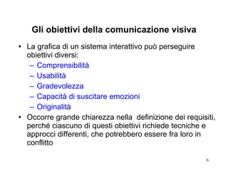

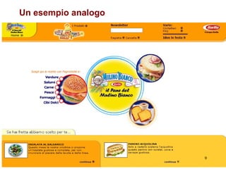
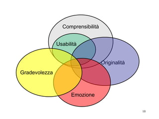
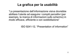


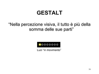


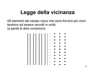
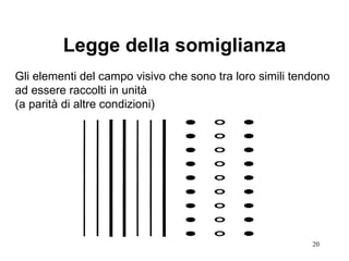
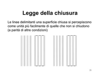
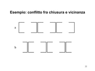
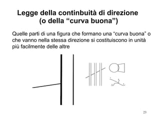
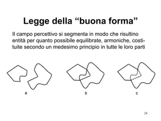
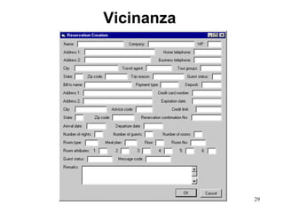
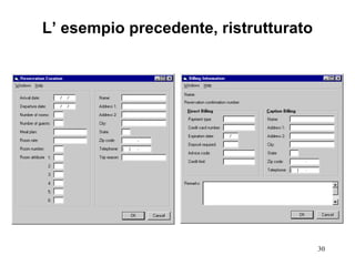


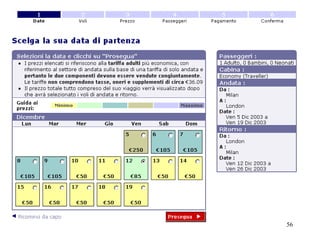
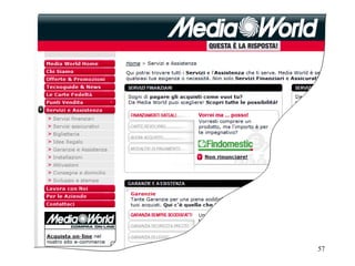

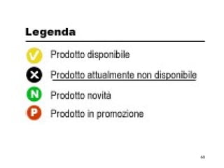
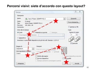
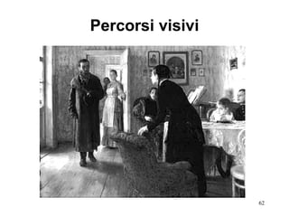
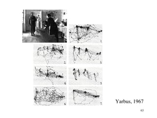
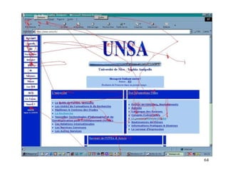
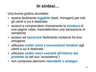


La lezione si concentra sui principi fondamentali del design grafico delle interfacce per l'interazione uomo-macchina, evidenziando l'importanza della comunicazione visiva. Viene discusso il ruolo delle leggi della Gestalt nel design, sottolineando come la presentazione dell'informazione influenzi la usabilità e la comprensibilità. Alla fine, si enfatizza che una buona grafica deve essere leggibile, strutturata semplicemente e coerente per gli utenti.


