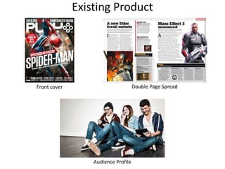
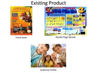
The color schemes, photography, and content of the magazines were analyzed. For the teenage gaming magazine, black and white colors were used to make the title and text stand out, and dynamic character photos appealed to the target audience. The fishing magazine for retirement-aged men used natural colors and a casual writing style. The children's gaming magazine featured bright colors and simple explanations of games. Common features identified were a main cover image, attention-grabbing slogans, and more emphasis on images over text on the cover versus inside spreads. Aspects to include are large titles, flashy slogans, and bright colors.


![Presentation1 [autosaved]](https://cdn.slidesharecdn.com/ss_thumbnails/presentation1autosaved-180329155155-thumbnail.jpg?width=640&height=640&fit=bounds)


