This document contains the writer's choices and reasoning for various images to feature on different pages of a music magazine layout.
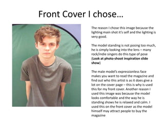
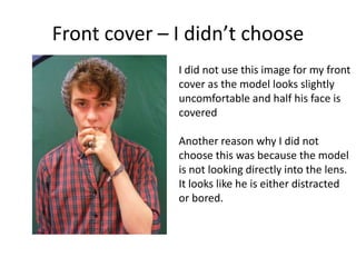
For the front cover, the writer chose an image of a male model with an expressionless face to intrigue readers into learning more. Another image was not selected as the model appeared uncomfortable.
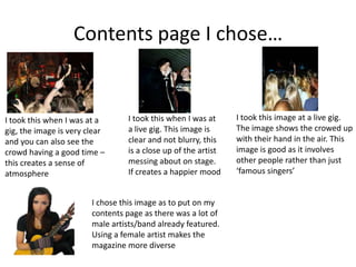
An image taken at a live gig showing an artist and crowd enjoying themselves was picked for the contents page to set an atmospheric mood.
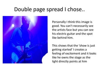
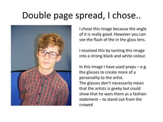
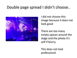
For a double page spread, one image was selected where the artist is lit by spotlights on stage, creating excitement. Another was chosen in black and white to remove a flash, and props were used to give the artist personality. A blurry photo with empty space