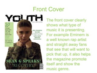
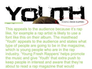
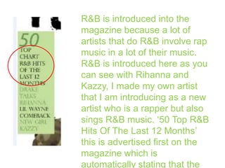
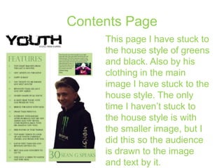
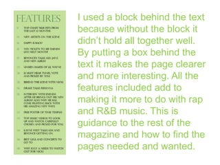
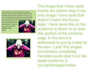
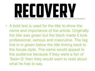
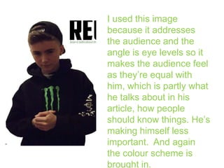
Q2: How did you
attract/address your
audience?
Front Cover
The front cover clearly
shows what type of
music it is presenting.
For example Eminem is
a well known rap artist
and straight away fans
that see that will want to
pick that up, it also helps
the magazine promote
itself and show the
music genre.
This appeals to the audience because it’s rap
like, for example a rap artist is likely to use a
font like this on their album. The masthead
‘Youth’ appeals to the audience and states what
type of people are going to be in the magazine,
which is young people who are in the rap
industry. ‘Young Fresh Rappers’ helps promote
the music and give ‘Youth’ that extra push to
keep people in interest and aware that they’re
about to read a rap magazine that would
I have used this image
because he is directing
the audience by looking at
the camera. He is wear a
camouflage jacket which
implies danger and
masculinity. I have used
someone who wouldn’t be
typically associated with
rap music. Normally
young blank males are
sued but I’ve used the
opposite to that when I do
use a typical black male
there is a variety and
The font style links in with the camouflage
jacket that Sean G is wearing. I have changed
the font type for ‘Recovery’ to highlight the
interview name and that it is an import part of
the text and what it is about so by changing the
text is shows this. The word recovery is also in
quote because it is a word that Sean G says
and again stating the name of the interview.
R&B is introduced into the
magazine because a lot of
artists that do R&B involve rap
music in a lot of their music.
R&B is introduced here as you
can see with Rihanna and
Kazzy, I made my own artist
that I am introducing as a new
artist who is a rapper but also
sings R&B music. ‘50 Top R&B
Hits Of The Last 12 Months’
this is advertised first on the
magazine which is
automatically stating that the
Contents Page
This page I have stuck to
the house style of greens
and black. Also by his
clothing in the main
image I have stuck to the
house style. The only
time I haven’t stuck to
the house style is with
the smaller image, but I
did this so the audience
is drawn to the image
and text by it.
I used a block behind the text
because without the block it
didn’t hold all together well.
By putting a box behind the
text it makes the page clearer
and more interesting. All the
features included add to
making it more to do with rap
and R&B music. This is
guidance to the rest of the
magazine and how to find the
pages needed and wanted.
I used an image of him
smiling to give a positive
impact. I have done the
opposite to what a typical
rap and R&B magazine
would do because it still
applies to the same people
just has more of a positive
feel to it. I got ‘Sean G’ to
wear green and black to it
fits in the with the house
style. Also I have used a
long shot so it fits in with
the layout and shows more
The image that I have used
beside the editors blog is the
only image I have used that
doesn’t match the house
style. I have done this so the
audience is drawn in to read
this section of the contents
page. In the text it is
addressed to young males by
the term ‘Lads’ this singles
out females completely.
Females could read it but the
target audience is
young/teenaged males.
Article
I have again
stuck to the
house style to
show the reader
that it all still
connected. This
green was
originally brought
in because of the
green clothing
worn. Green is
• A bold text is used for the title to show the
name and importance of the article. Originally
the title was green but the black made it look
professional, serious and masculine. The tag
line is in green below the title linking back to
the house style. The same would appeal to
the audience because if they were a fan of
‘Sean G’ then they would want to read about
what he has to say.
I used a green text to briefly explain the article.
There isn’t that much green text used of this
page, its very much black and while with hints
of green. The green appeals to the audience
because it draws the audience in. the text also
appeals to the audience because it briefly tells
you what is included in the article.
I used this image
because it addresses
the audience and the
angle is eye levels so it
makes the audience feel
as they’re equal with
him, which is partly what
he talks about in his
article, how people
should know things. He’s
making himself less
important. And again
the colour scheme is
brought in.

Question 2 for evaluation

  • 1.
    Q2: How didyou attract/address your audience?
  • 2.
    Front Cover The frontcover clearly shows what type of music it is presenting. For example Eminem is a well known rap artist and straight away fans that see that will want to pick that up, it also helps the magazine promote itself and show the music genre.
  • 3.
    This appeals tothe audience because it’s rap like, for example a rap artist is likely to use a font like this on their album. The masthead ‘Youth’ appeals to the audience and states what type of people are going to be in the magazine, which is young people who are in the rap industry. ‘Young Fresh Rappers’ helps promote the music and give ‘Youth’ that extra push to keep people in interest and aware that they’re about to read a rap magazine that would
  • 4.
    I have usedthis image because he is directing the audience by looking at the camera. He is wear a camouflage jacket which implies danger and masculinity. I have used someone who wouldn’t be typically associated with rap music. Normally young blank males are sued but I’ve used the opposite to that when I do use a typical black male there is a variety and
  • 5.
    The font stylelinks in with the camouflage jacket that Sean G is wearing. I have changed the font type for ‘Recovery’ to highlight the interview name and that it is an import part of the text and what it is about so by changing the text is shows this. The word recovery is also in quote because it is a word that Sean G says and again stating the name of the interview.
  • 6.
    R&B is introducedinto the magazine because a lot of artists that do R&B involve rap music in a lot of their music. R&B is introduced here as you can see with Rihanna and Kazzy, I made my own artist that I am introducing as a new artist who is a rapper but also sings R&B music. ‘50 Top R&B Hits Of The Last 12 Months’ this is advertised first on the magazine which is automatically stating that the
  • 7.
    Contents Page This pageI have stuck to the house style of greens and black. Also by his clothing in the main image I have stuck to the house style. The only time I haven’t stuck to the house style is with the smaller image, but I did this so the audience is drawn to the image and text by it.
  • 8.
    I used ablock behind the text because without the block it didn’t hold all together well. By putting a box behind the text it makes the page clearer and more interesting. All the features included add to making it more to do with rap and R&B music. This is guidance to the rest of the magazine and how to find the pages needed and wanted.
  • 9.
    I used animage of him smiling to give a positive impact. I have done the opposite to what a typical rap and R&B magazine would do because it still applies to the same people just has more of a positive feel to it. I got ‘Sean G’ to wear green and black to it fits in the with the house style. Also I have used a long shot so it fits in with the layout and shows more
  • 10.
    The image thatI have used beside the editors blog is the only image I have used that doesn’t match the house style. I have done this so the audience is drawn in to read this section of the contents page. In the text it is addressed to young males by the term ‘Lads’ this singles out females completely. Females could read it but the target audience is young/teenaged males.
  • 11.
    Article I have again stuckto the house style to show the reader that it all still connected. This green was originally brought in because of the green clothing worn. Green is
  • 12.
    • A boldtext is used for the title to show the name and importance of the article. Originally the title was green but the black made it look professional, serious and masculine. The tag line is in green below the title linking back to the house style. The same would appeal to the audience because if they were a fan of ‘Sean G’ then they would want to read about what he has to say.
  • 13.
    I used agreen text to briefly explain the article. There isn’t that much green text used of this page, its very much black and while with hints of green. The green appeals to the audience because it draws the audience in. the text also appeals to the audience because it briefly tells you what is included in the article.
  • 14.
    I used thisimage because it addresses the audience and the angle is eye levels so it makes the audience feel as they’re equal with him, which is partly what he talks about in his article, how people should know things. He’s making himself less important. And again the colour scheme is brought in.