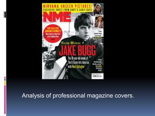
The document analyzes the design elements of a professional magazine cover. The masthead is prominently displayed at the top left to identify the magazine. Below it are the date and price. The main image stands out as the only black and white photo in a colorful design. A limited color scheme of yellow, red, and white is used throughout. Important text is highlighted through color or background to draw the eye. Circular puffs advertise featured stories, and smaller images with quotes entice readers to learn more inside.
2. Masthead
The masthead is placed at the top left hand corner
as this is how the readers will recognise the
magazine when it is in the shelves in a shop, this
has to be the boldest thing so it’s the first thing
noticed, this is why the title of this magazine is in big
block letters and all one colour so it is eye catching
and engaging to see. Underneath this is the date
and price of the magazine so you know how current
it is and how much you are paying for it.
3. Main Image
The main image is an image of the
featured artist in this case Jake
Bugg, that is in black and white, this
stands out because it doesn’t fit in
with the colour scheme at all and is
probably so it look different and
unique, the greyscale picture is good
to use because as everything else is
in colour or bordered with colour is
doesn’t blend in with the rest of the
cover and your attention is not taken
away from it after you notice it
4. Colour Scheme
This colour scheme of magazines
usually sticks to three main colours, in
this case yellow, red and white. There
is text with a bright background to
make it stand out an some of the text
is in different colours if it is the name
of an artist or something important
that they want you to pick up on. For
example there is a small section of
text about Jake Bugg going to
America with Noel Gallagher and
because he is famous his name is in
a different colour font to the rest of the
text.
5. Puff
There is a circular puff underneath
the title to show a features story, this
one is about an upcoming tour and a
competition to win tickets to attend, it
is featured on the front page along
with what page it is on inside the
magazine because it is a big feature
story and something new they want
everyone to know about.
6. Buzzword
There is a smaller less important story
in small text in the bottom right corner
above the barcode bit buzzwords such
as ‘BIG’ are used to show it is still a
good story and features an interview
with famous artists.
7. Smaller Images
In the top right corner there are small
images bordered in white to help
them stand out of an artist with a
quote from him underneath to show
that there is a story about him
included and the quote shows that it
may be an interview so fans of the
artist would be more interested to
find out what’s going on and what
the story is about to follow up the
quote that they read on the cover.