2. 1. In what ways does your media product use, develop or challenge forms
and conventions of real media products?
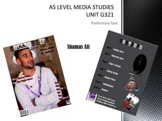
Similarities
Masthead
Main
Image
Cover lines
Coloured
background
and similar
colours are
used for
fonts (black,
white and
red)
Barcode
Logo
3. Differences
The student I have chosen
appears to be posing, crossed
arms with a smile. He is also
looking away giving an effect
he is aiming for something
whereas Trey Songz has a
mean look on his face and is
flexing off his body.
The title I have used is
not as big as the title
‘VIBE’ have used, I have
also used a sub heading
however ‘VIBE’ has not.
Although the
backgrounds are both
coloured, I have used the
back of an office to
create a more student
feel. ‘VIBE’ has used a
mosaic black background,
this draws more focus to
Trey Songz thus drawing
in the intended audience
even more.
‘VIBE’ has a picture of the
previous magazine on the
front.
5. Differences
The colours I have used
for the title make it
stand out and give it a
retro feel, however ‘Half
Court’ have gone with
straight black.
‘Half Court’ have a
plain white
background
whereas I have a
grey one, I chose
this as it makes the
text stand out and
look clear.
Different shapes for
pictures used, I
chose different
shapes to provide
variety.
Advertisement used
to get people to
subscribe.